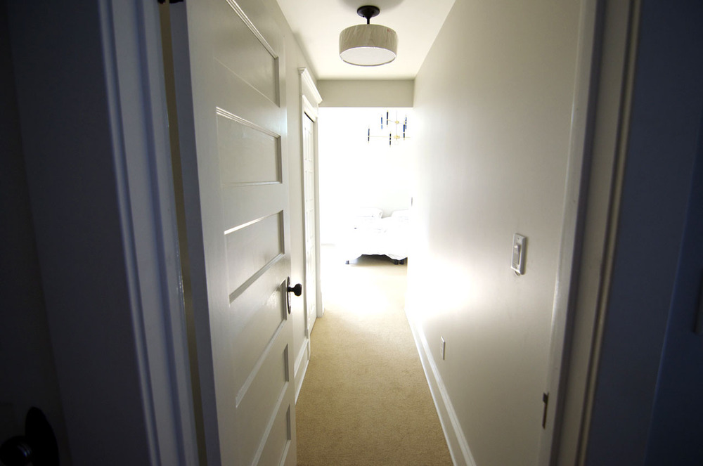
Welcome to our master bedroom … almost.
Two weeks ago we announced that Emily Henderson is coming to the Curbly House to make it beautiful. Just reading that last sentence makes me want to do a Shannon Miller floor routine circa 1992. The chance to work with Emily is amazing, and we feel like the luckiest home-owners on the block (I think we are)! You will not believe the cool things we have planned for the bedroom. Read on, friends, to find out.
The Potential
Our entire home renovation process has been surreal. When Bruno and I first began dating, we’d walk through our neighborhood and ogle all the beautiful renovation projects, noting all the neglected homes we’d love to take under our wing. We’ve always thought of ourselves as the “crazy cat ladies” of houses. If we ever win the lottery, we’ll buy a dozen houses, fix them up, and then give them to owners who will promise to love them until the end of time.
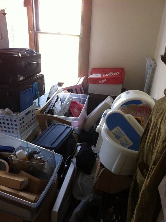
This is what the master bedroom used to look like. Junk!
So, when we found our undernourished, neglected little gem of a house two years ago, we felt ridiculously fortunate. We’ve worked really hard – doing a lot of the work ourselves – and that’s allowed us to create the house of our dreams much earlier in life than we would have ever imagined.
The Planning
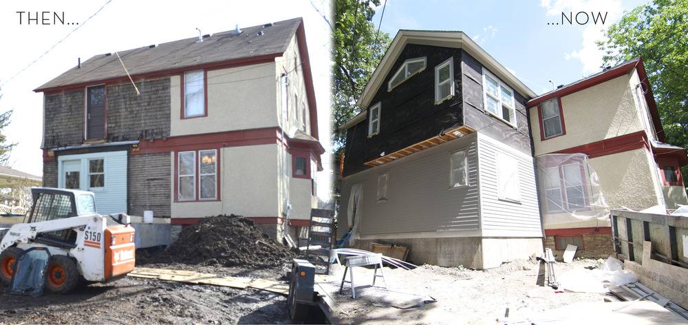
In planning this year’s big addition, we initially thought the expansion would only include a kitchen. But our contractor said adding another level would be a good idea, and there was a decreasing marginal cost to the added square footage.
One blueprint led to another, and thus became the master bedroom we never really thought we’d have.
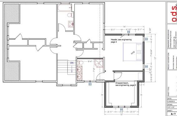
Our master bedroom floor plan, drawn up by the awesome Will Orfield of Orfield Drafting

Framing is done…
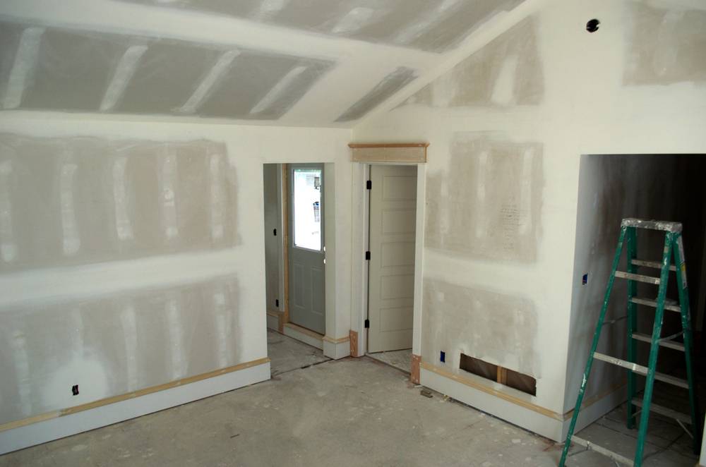
And then sheetrock.
Now, we’ve moved in to this amazing master bedroom with airy vaulted ceilings, and most of the time we feel like we’re on vacation. But the space is huge-er than any bedroom we’ve ever inhabited, so figuring out furniture and decor sent Bruno and I into no man’s land which, fortunately, also happens to be Emily-Henderson-land!
The Paint
We did know we wanted a neutral color on the walls. I love the idea of using neutrals on the walls, and adding color with furniture, decor, and artwork. And Emily agreed.
So I started by searching for Sherwin Williams Sea Salt (the color we used, and loved, in our sun room) on the Sherwin-Williams Color Visualizer tool. From there, I clicked around the palette of coordinating colors. That led me to Sherwin-Williams Crushed Ice (SW 7647), and I was instantly intrigued.
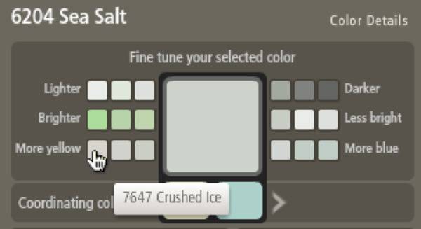
I took a little Pinterest journey (ok, Pinterest bender) to see if I could find any more “color families” for this color. I found this paint palette by Vim & Vintage:
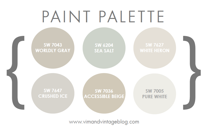
I brought this color collection into our Sherwin-Williams store and gathered swatches for three colors: White Heron, Crushed Ice, and Pure White (we wanted to avoid a beige-y neutrals, which is why I didn’t collect them all!). At home, the swatches went on the wall and Crushed Ice was the clear winner.
Furniture
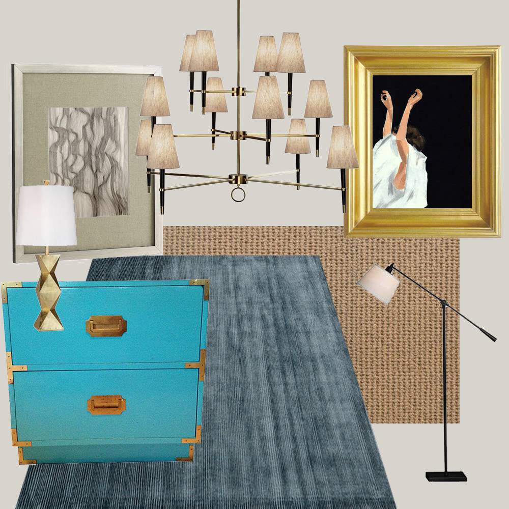
From there Emily and her team started sharing their magical vision for the room: luxurious, deep blues, touches of gold, and a hint of vintage. We were thrilled to start getting weekly Craigslist alert e-mails from Emily and her assistants.

We got some campaign dressers from Craigslist that are going to become bedside tables. They’ll be painted a color I would have never thought to use, and we can’t wait for you to see them in the final room reveal!
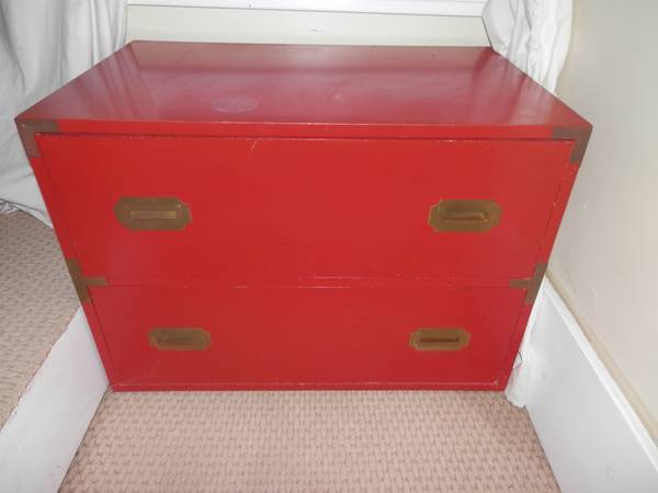
This little guy has a bright white companion. Smell ya later, ugly colors!
Lighting
Emily then guided us through the lovely world of lighting. We hooked up with the fine folks at Lamps Plus to select some truly stunning lighting elements. Here are some of the ones we considered (you’ll have to wait for the reveal to see what we picked!):

Jayne Oat Beige Glazed Ceramic lamp, Jonathan Adler Meurice chandelier, and Gough Brown Bronze and Rust lamp from LampsPlus.com
Floor Coverings
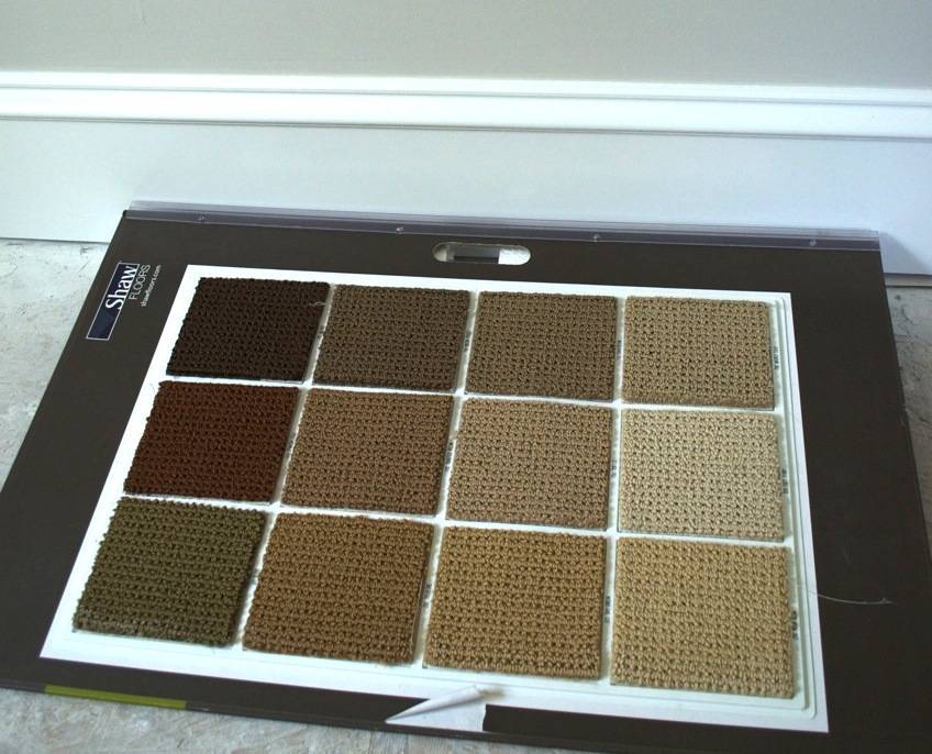
Alas, because of construction deadlines, we had to go ahead and choose the bedroom carpet on our own, sans-Emily. We thought we wanted to go for something natural like sisal, until we saw some of the price tags. Woop. Sisal costs money.
So we went with something a bit safer (ahem; cheaper), a style called ‘Artistic Sensibility’ in a color called ‘Washed Silk’. Kind of cheesy sounding on both counts, but it looks great:
We’re also excited to be working with Loloi Rugs on this project. They have the world’s most gorgeous rugs, and we’ll be layering one over our carpet to bring more color and texture into the room (here’s a link to their latest catalog).
Window Coverings
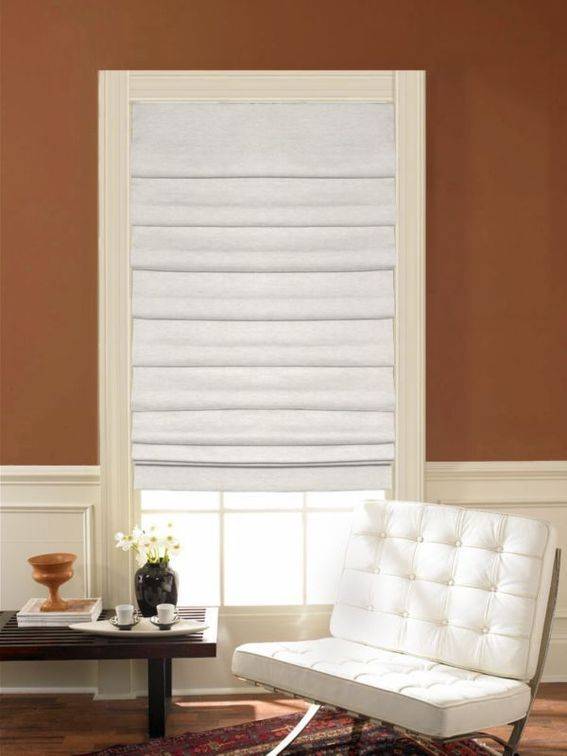
The light-filled master bedroom also needs some serious window coverings. At Emily’s suggestion, we looked into doing Roman shades from Blinds.com. After some searching, we decided we liked the Laura Ashley Soft Fold in a color called Cameo Apple Blossom. Here’s the sample picture on the site:
I wanted to see what it might look like with our color (SW 7647), so I pulled the sample image into the Sherwin-Williams Color Visualizer, and here’s what I got!
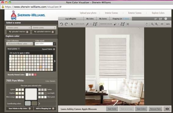
Here’s a bigger version:
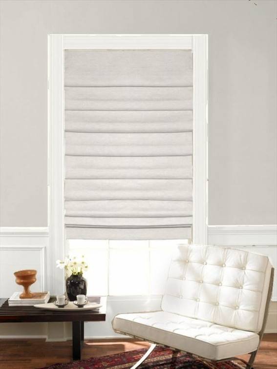
Not bad for ten minutes of work! And it helped us visualize how the wall color would work with the shades.
At this very moment, the wall paint, carpet, and chandelier are the only elements that have actually been installed, but I can already see the room’s amazing potential.
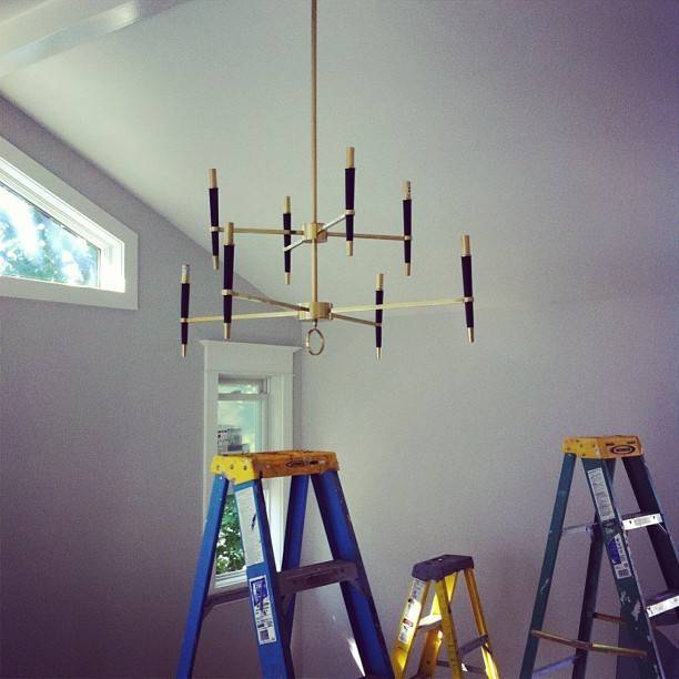
Here’s a little taste of what we’ve got cookin’ in our bedroom. Can you even believe it?
