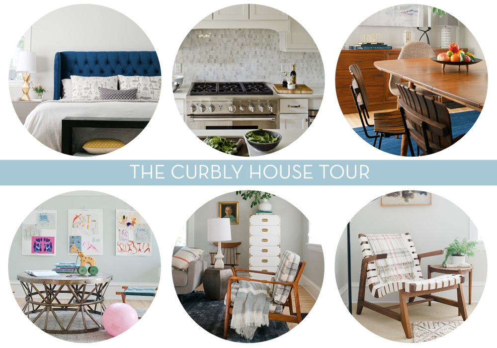
This house tour is a long time coming. We’ve officially been in our “finished” house for one year, and we thought we’d celebrate with a big old fashioned house tour. So we’re going to show you the super-clean, polished, sparkly version of The Curbly House…which looked like this exactly once, before we, you know, started living in it again!
Of course, no tour would be complete without a nod to one’s roots, so we’re posting the ‘before’ photos of every room, because it’s important to acknowledge the past and – in our case – never repeat it. Here we go!
The Living Room
Before: Oh, sad, dark, dreary Edward Hopper-esque room, you were depressing and needed to lighten up a little.
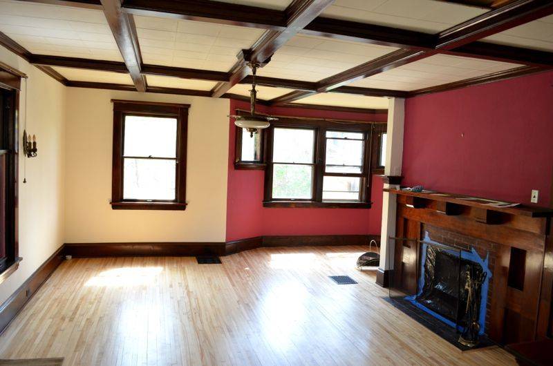
After: Hello, gorgeous, feather-light room! You are so lovely and inviting; our very own watercolor.
We were fortunate to work with the super-fun, super-talented, queen of design, Ms. Emily Henderson, on this room and several others (namely: the master bedroom, sunroom, and dining room). Many hugs and high-fives go out to this gorgeous gal!
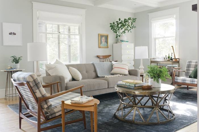
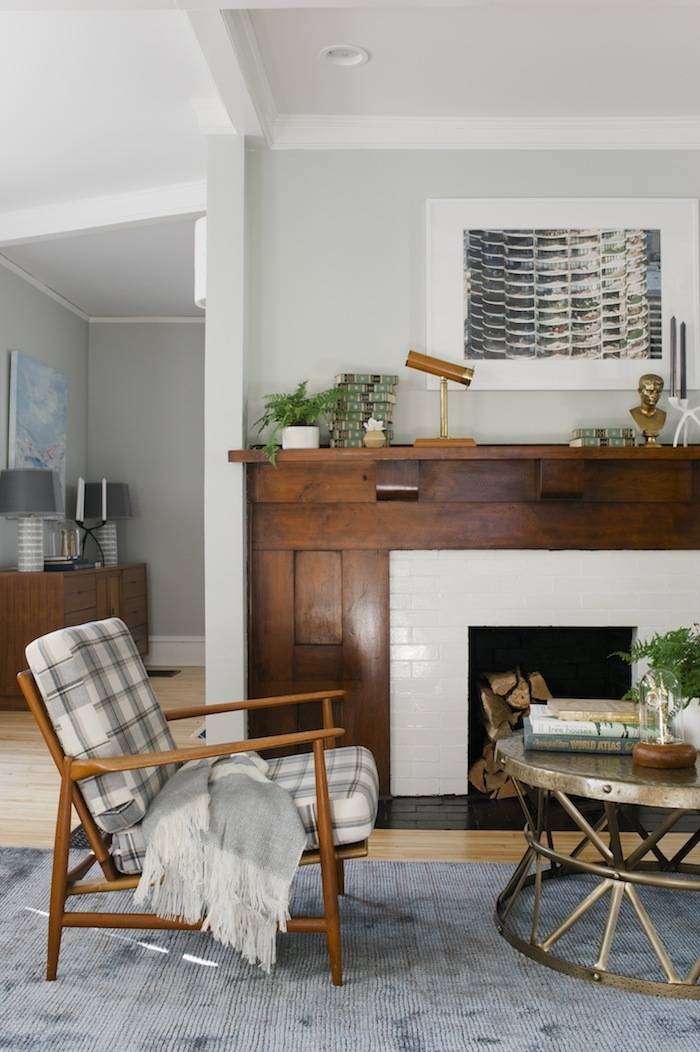
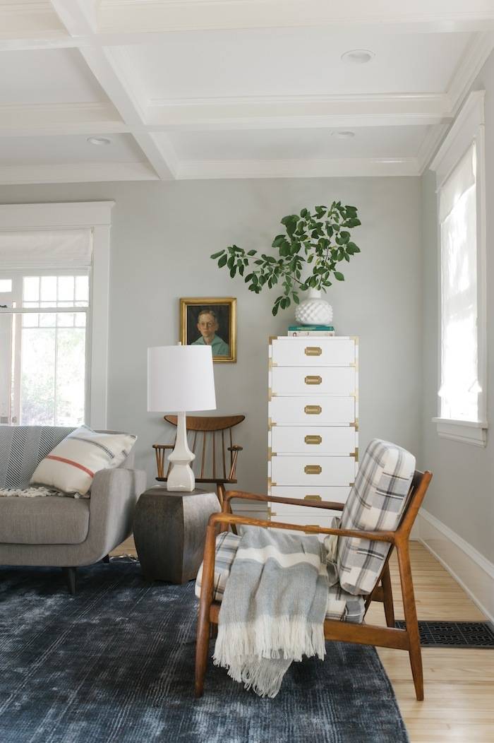
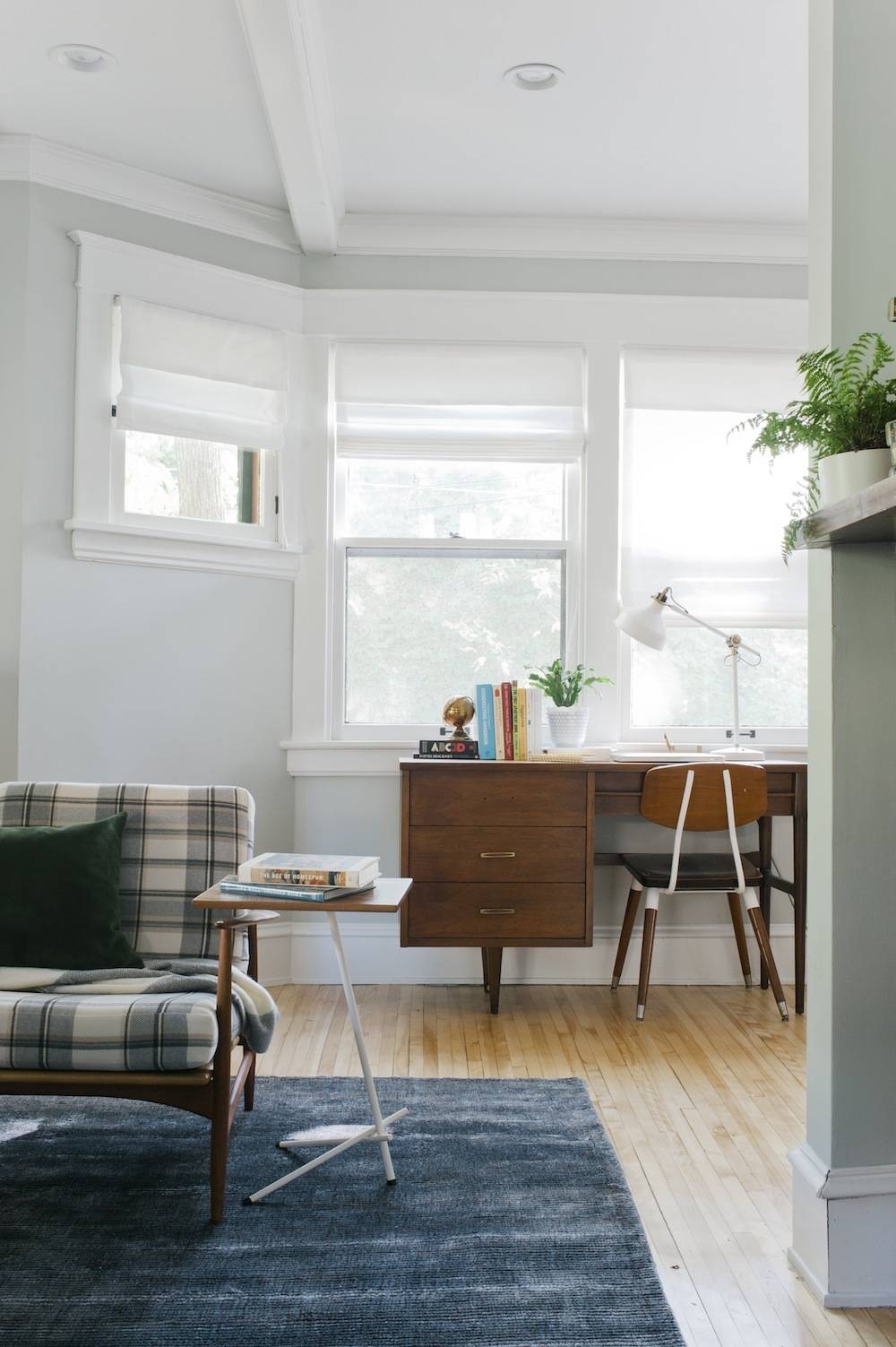
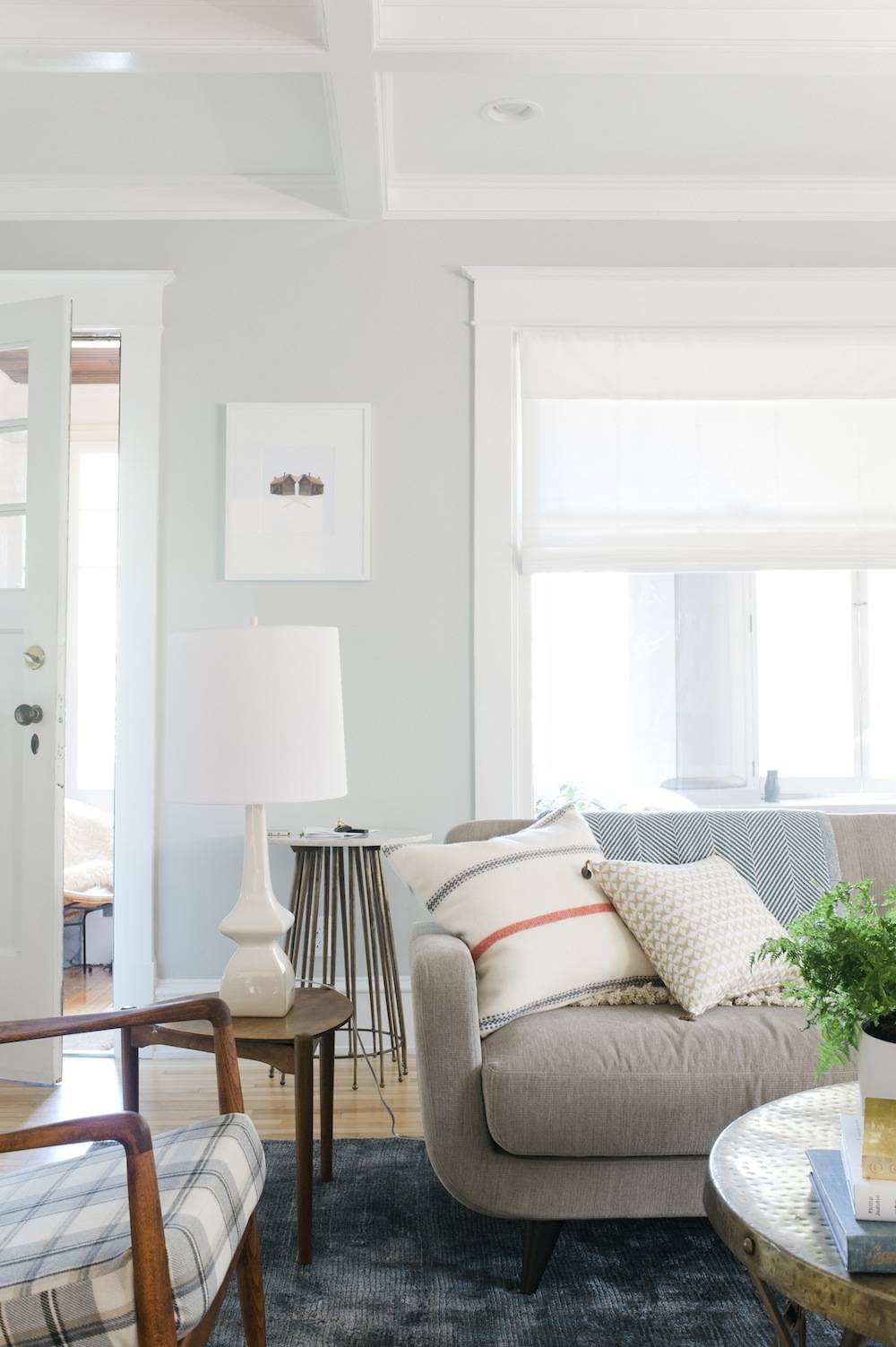
Living Room Resource List:
- Wall Color: Sherwin-Williams Aloof Gray SW 6197
- Trim Color: Sherwin-Williams Pure White
- Rug: Contemporary Luxe in Blue Steel from Loloi Rugs
- Blinds: Laura Ashley Soft Fold Roman shades in Casualle Milk from Blinds.com
- Sofa: Room & Board Anson Sofa in Vessel Cement
- Danish Chairs: Family Hand-me-down/vintage (free/$80, plus $400 in fabric and upholstery)
- Kaleidoscope on Mantel: Vintage (Loft Antiques)
- Porcelain Succulents on Mantel: Waterstone Succulents
- Majorette in Cloche: Vintage (Hunt & Gather)
- Pot for Fern: Skars Tall bowl in white from CB2
- Candle Holder: Tri Taper Candle Holder from CB2
- Bronze Bust: Vintage (Hunt & Gather)
- Photo over Mantel: Corncob Building by our friend John Kingman
- Books: Vintage
- Blanket Basket: Vintage (Hunt & Gather)
- Pouf: West Elm
- Coffee Table: Metal Smith’s Drum Coffee Table (and here’s a similar one at Overstock)
- Bar Cart: Blue Ocean Traders
- Giraffe Decanter: Vintage (Loft Antiques)
- Marble Top Entry Table: Blue Ocean Traders
- Desk: Family Hand-me-down
- Desk Chair: Craigslist, $40
- White Table Lamps: Jayne Oat Beige Glazed Ceramic
- Threaded House Art: Happy Red Fish
- Wood Triangular Side Tables: Vintage
- Laptop Side Table: Pix Table by OCD Furniture from Forage Modern Workshop
- Desk Lamp: RANARP Work Lamp from IKEA
- Campaign Dresser: Vintage ($80) (painted with Sherwin-Williams Pure White SW 7005 Latex Enamel)
- Boy Painting: Vintage (Loft Antiques)
- Windsor Chair: Vintage (Free with Craigslit-ed Dining Table)
- Dimpled Vase: Kabasa Vase from CB2
- Flannel Pillow: Fairbault Wool Pillow Cover – Ticking Stripe from West Elm
- Gold Star Pillow: Nate Berkus Star Ikat Pillow
- Throw: Herringbone Throw by Brahms Mount from Forage Modern Workshop
- Metal Drum Table: Vintage (Hunt & Gather)
The Sun Room
Before: This was the room of 99 problems; falling ceiling tiles and chewed mullion windows were among them. But, ample natural light wasn’t.
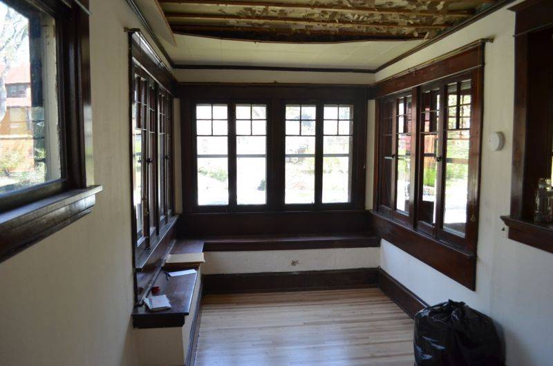
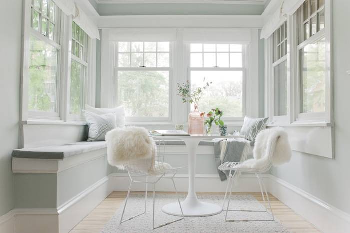
After: New windows, new paint, new ceiling, new walls, new bench, and a reconfigured space completely transformed this sunny nook.
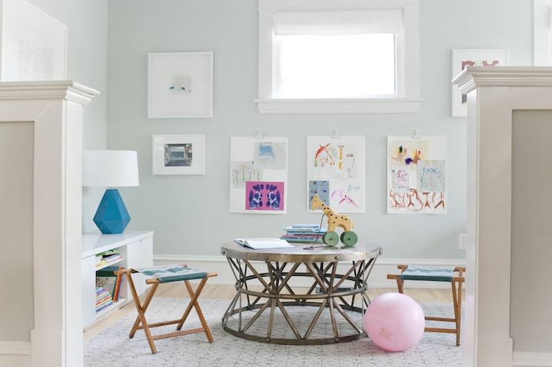
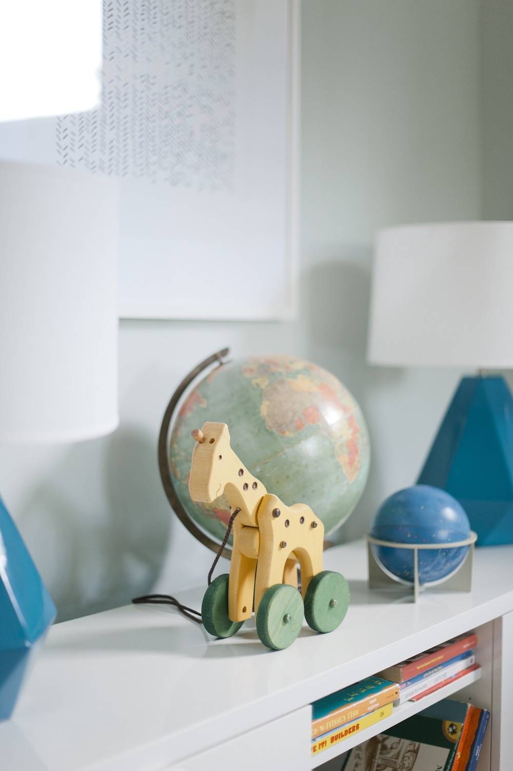
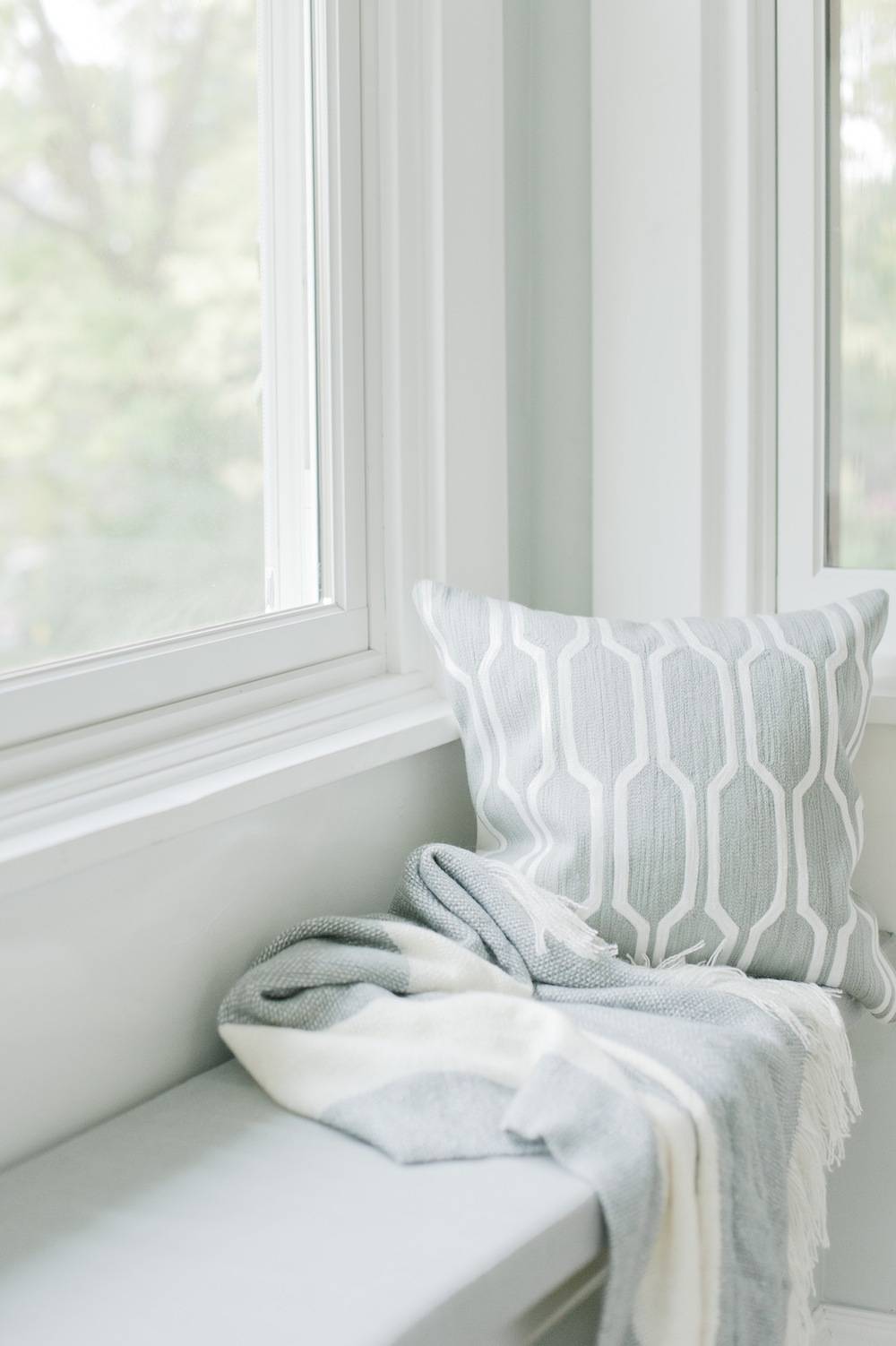
Sun Room Resource List:
- Wall Color: Sherwin Williams Sea Salt SW 6204
- Trim Color: Sherwin Williams Pure White
- Turquoise Table Lamps: Thumbprints Jewel Cast Metal from LampsPlus.com
- Media Storage: BYÅS TV unit from IKEA
- Tulip Table: DOCKSTA table from IKEA
- Bertoia Chairs: Vintage (Craigslist for $200, then sandblasted for $100 and powder coated for $75)
- Sheepskin Throws: Rens Sheepskin from IKEA
- Blinds: Laura Ashley Soft Fold Roman shades in Casualle Milk from Blinds.com
- Coffee Table: Metal Smith’s Drum Coffee Table (and here’s a similar one from Overstock)
- Camping Stools: Vintage
- Art: Above Media Storage: Minted for West Elm
- Art: Curbly House Drawing by Danielle Krysa
- Art: Library by the Sea by Jeremy Miranda
- Throw Pillow: Honeycomb Crewel Pillow from West Elm
- Throw: Favorite Striped Throw from West Elm
- Pink Vase: Goodwill
Dining Room
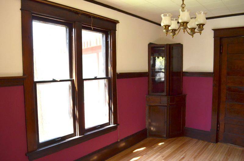
Before: This tiny cramped room was begging to be opened up so that it could breathe a little bit.
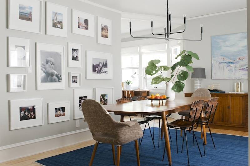
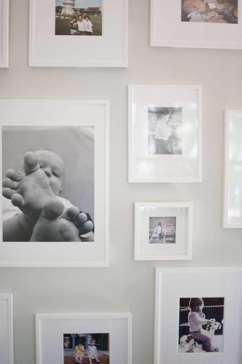
After: We now eat dinner in this room almost every night. It’s a family space. The gallery wall of family photos is the heart of the room, and the entire downstairs.
Also, because we get asked about the practicality of a rug underneath a table where small children eat, the truth is: it’s great! The wool is still kickin’.
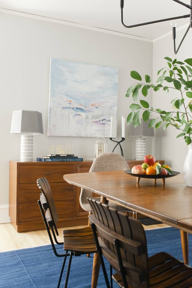
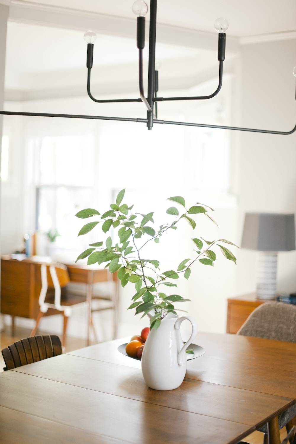
- Wall Color: Sherwin-Williams Aloof Gray SW 6197
- Trim Color: Sherwin-Williams Pure White
- Chandelier: Sonneman Tempo from LampsPlus.com
- Rug: Anzio Denim from Loloi Rugs
- Table: Conant Ball Norsemates (Craigslist for $380)
- Slat Wood Chairs: Arthur Umanoff (Craigslist for $175)
- Captains’ Chairs: Forza Taupe Twill Mid-Century Style Accent Chairs at Overstock
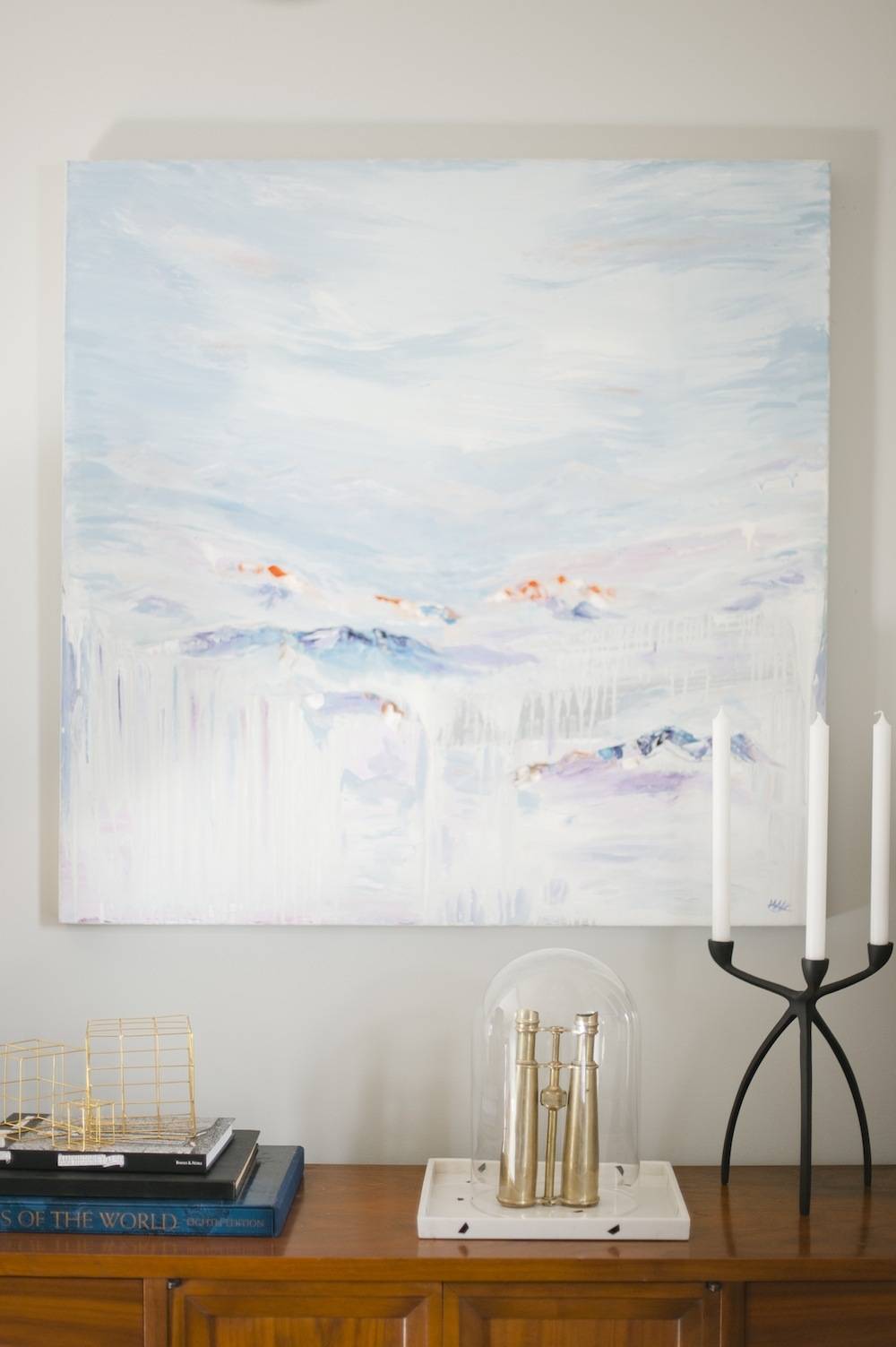
- Painting above Credenza: Mountains of Things by Mo Negm at Saatchi Online
- Art: “Long Legs” and “To The Night” by Claire Elaesser (wall not shown, but we included them in our Inspiration board)
- Blinds: Laura Ashley Soft Fold Roman shades in Casualle Milk from Blinds.com
- Credenza: Lane (Craigslist for $260)
- Gallery Wall: Family photos printed at Costco, IKEA frames
- Lamps on Credenza: Nate Berkus Crosshatch Lamp with Threshold Hexagon Lamp Shade from Target
- Candle Holder: Tri Taper Candle Holder from CB2
- Binoculars: Vintage
- Black and White Tray: Nate Berkus Marble Print Decorative Tray from Target
- Gold Wire Sculptures: Three Piece Brass Wire Cube Set from CB2
- Black Wood Foot Dish: Vintage (Hunt & Gather)
Kitchen
Before: I get a little teary thinking about this old, decrepit kitchen. And, not for sentimental reasons. I loathed this room for its lack of appliances (no oven, no stove, and one 10amp outlet that required a trip to the fuse box every time we ran the microwave). I don’t miss its color and mysterious animal smells either.
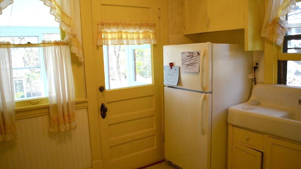
After: This is the room in the house that makes me pinch myself every time I walk into it. It’s a kitchen, a family room, the place homework is done after school, and the place our friends congregate during dinner parties. It’s the most used and most loved room in our house.
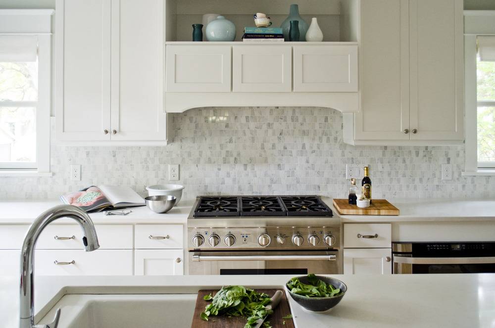
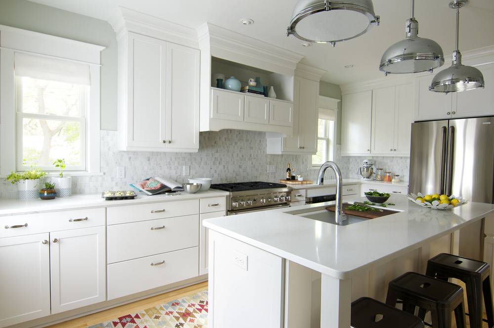
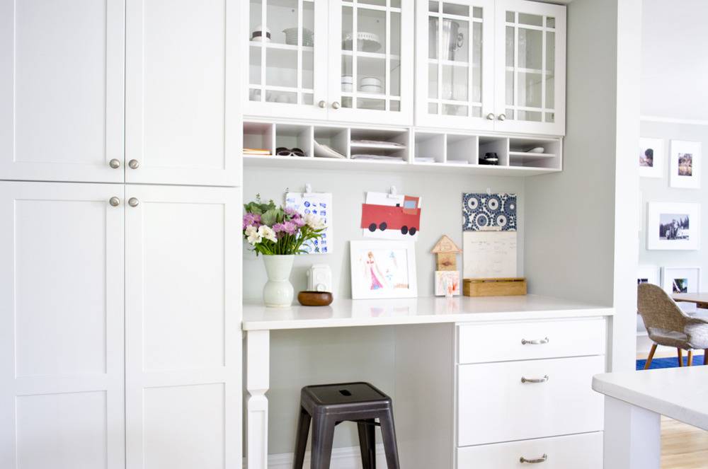
- Cabinets: Winstead Maple in White from Aristokraft
- Backsplash: Oriental White Echelon by Olympia Tile
- Pulls & Knobs: H314 Pull and H316 Knob from Aristokraft
- Paint: Sherwin-Williams Aloof Gray SW 6197 (walls) and Sherwin-Williams Pure White SW 7005 (trim)
- Sink: Kohler Indio Under-mount single bowl kitchen sink in white
- Faucet: Kohler Sensate Touchless Kitchen Faucet
- Countertops: Caesarstone Frosty Carrina
- Shades: Laura Ashley Flat Fold Roman Shades from Blinds.com in Casualle Milk Sugar
- Pendant Lights: Hinge Pendant No. 804 by Quorum International
- Runner: Indo Hand-Knotted Kilim runner from Overstock
- Stools: Tabouret Charcoal Grey counter-height stools
- Planters: Threshold Stoneware Geo Print Utensil Holder from Target
- Wall Herb Planters: Arcadia Round Wall Planter from Wayfair
- Range: Thermador 36-inch Professional Series Pro Harmony Standard Depth All Gas Range
Mudroom & Bath
After: These two things are true about these two rooms:
1. There is nothing overrated about a mudroom.
2. Here’s a joke that’s no joke: We were really urine-ing for a half-bathroom on the first floor; now that we have one we feel a great sense of relief.
Technically, there’s no ‘Before” here because the mudroom and half-bath were born out of our addition.
Apologies for the absence of ‘After’ photos of the half-bathroom; they are forthcoming once I decide which Rifle Paper Co. wallpaper to place on the walls.
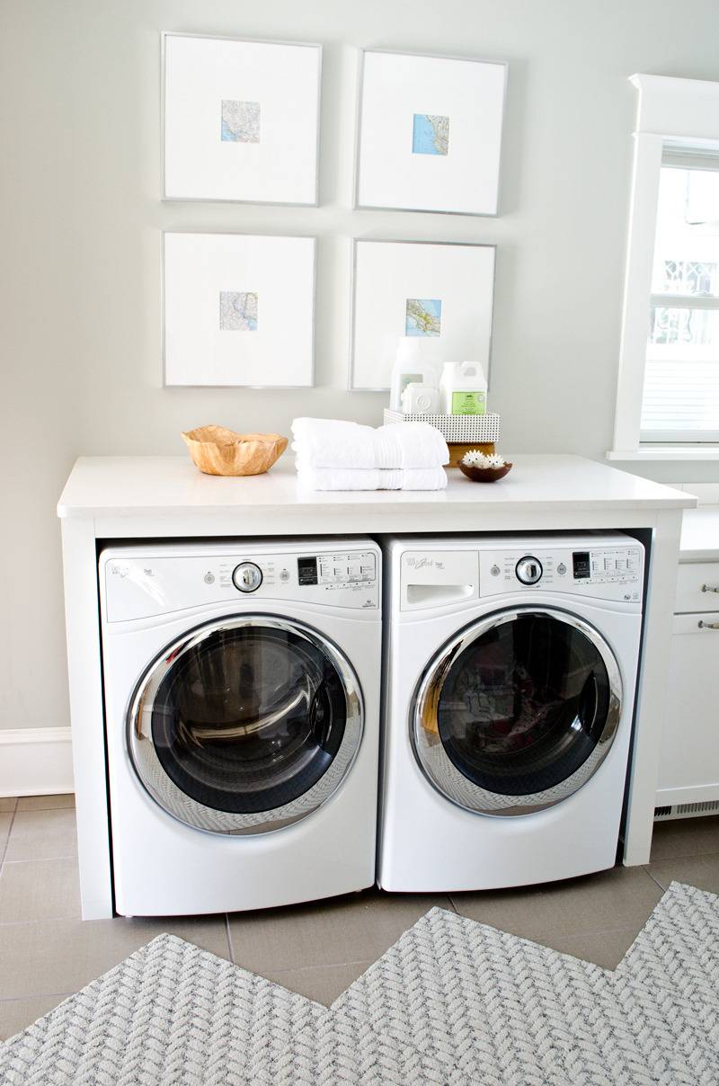
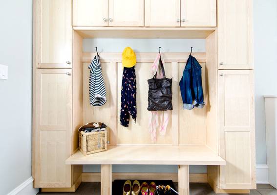
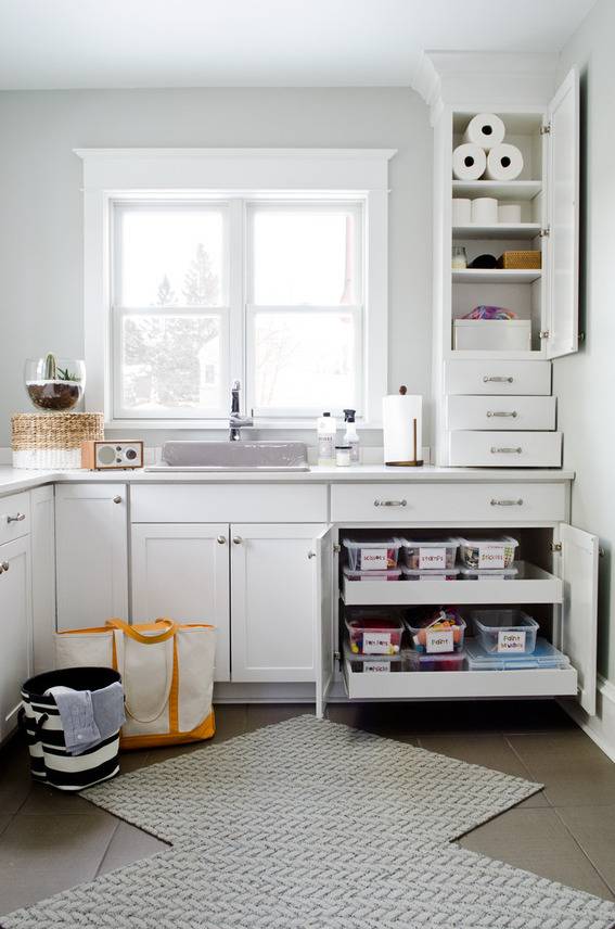
Mudroom & Laundry Resource List:
- Bench and Storage System: Aristokraft, Cabinet Style: Benton, Finish: Fawn
- Laundry Cabinetry: Aristokraft, Cabinet Style: Shaker, Finish: White
- Utility Sink: Bayview by Kohler
- Utility Faucet: Evoke by Kohler
- Paint: Sherwin-Williams’ Aloof Gray (SW 6197)
- FLOR Carpet Squares: Roadside Attraction in Dew
- Countertops: Caesarstone’s Frosty Carrina
- Tile: MS International Fiandra Olive
- Washer and Dryer: Whirlpool Duet
- Dryer Balls: Kikkerland Dryer Hedgehog Balls
- Driftwood Bowl: Homegoods
- Artwork: Atlas Maps in 18×18″ Target frames
Master Bedroom
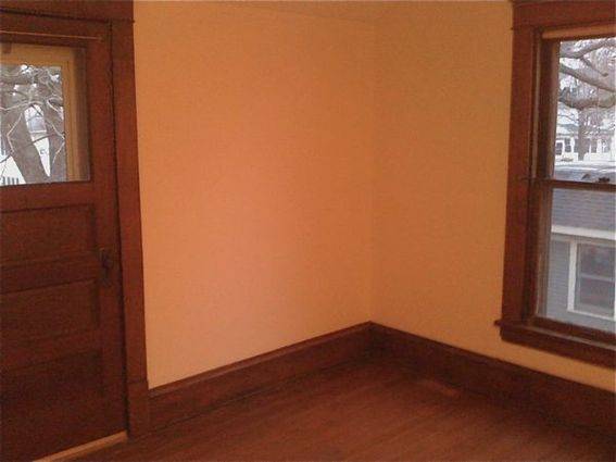
Before: Prior to being our bedroom, our master bedroom was a storage room. And by storage room, I mean, junk room. And, by junk room, I mean the room that could have landed us on an episode of Hoarders. Here’s the empty room the first time we walked through the house (please excuse the gritty phone picture):
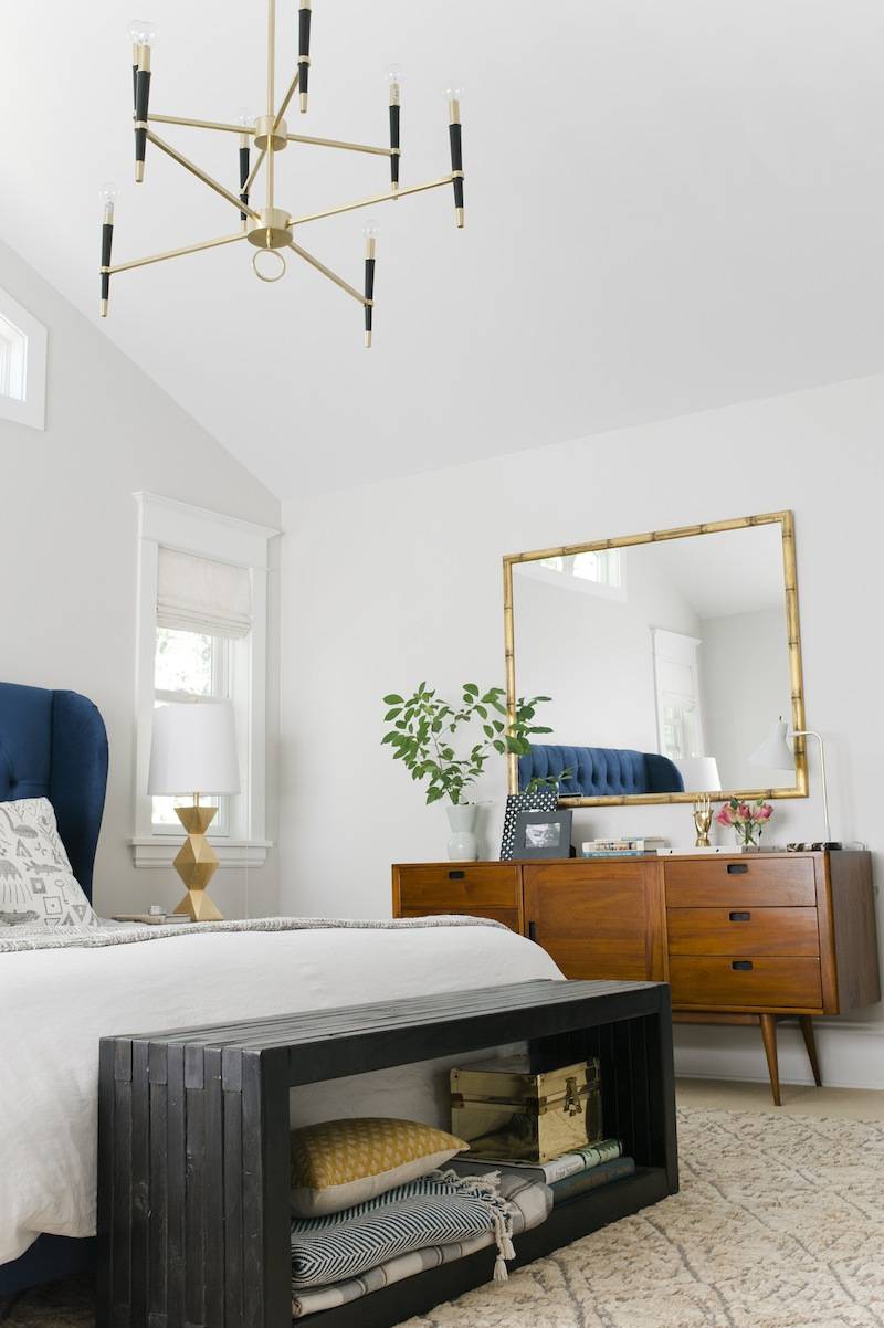
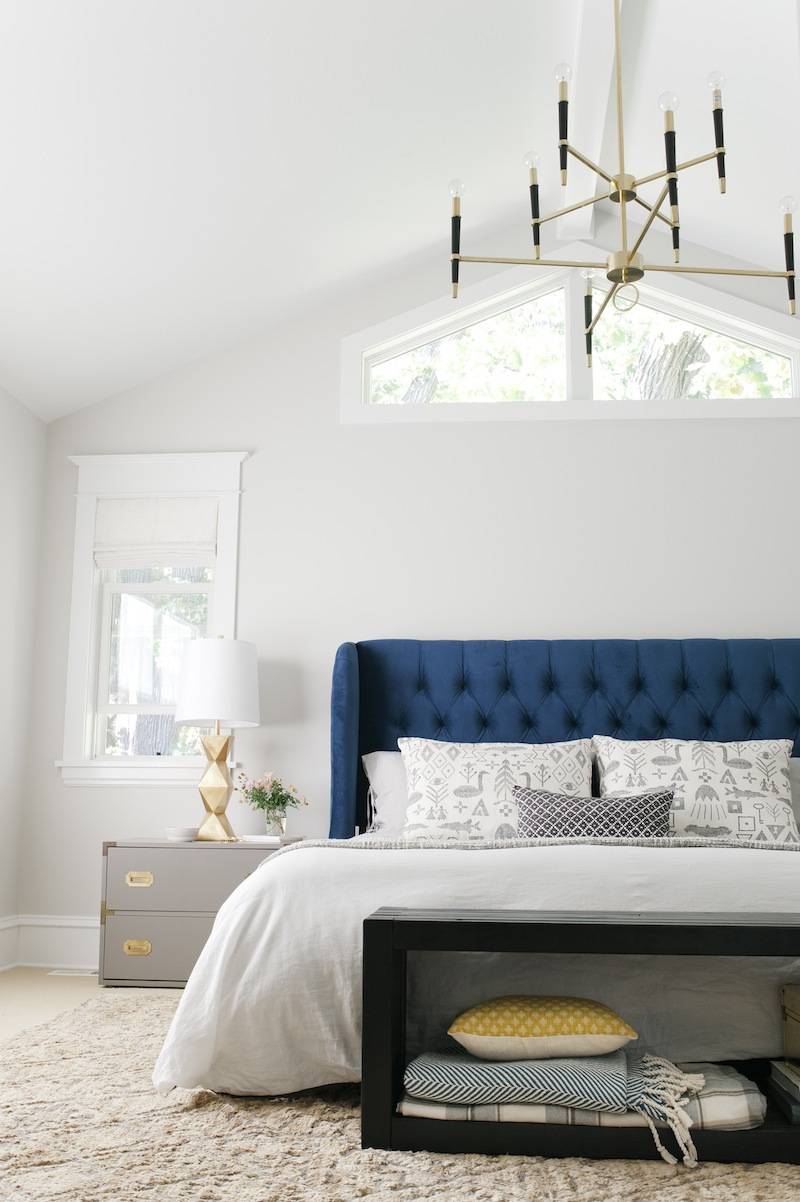
After: In my dreamiest of dreams, I never believed I would sleep in a bedroom so beautiful. And, there’s a chandelier! And, you know I sing Sia’s “Chandelier” every time I enter the room.
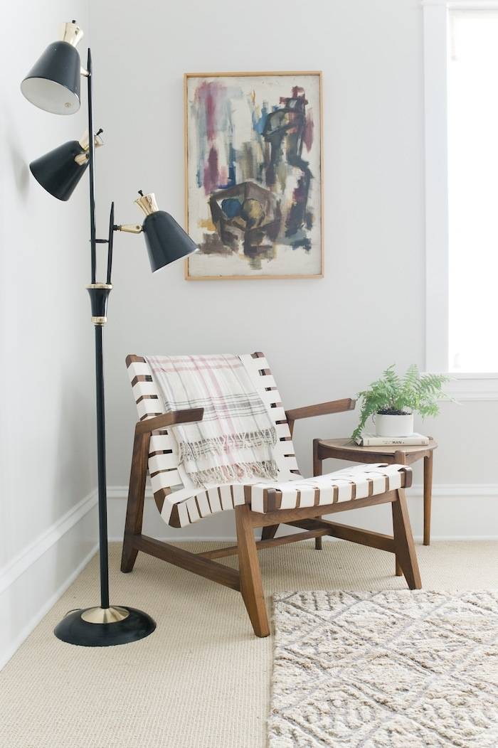
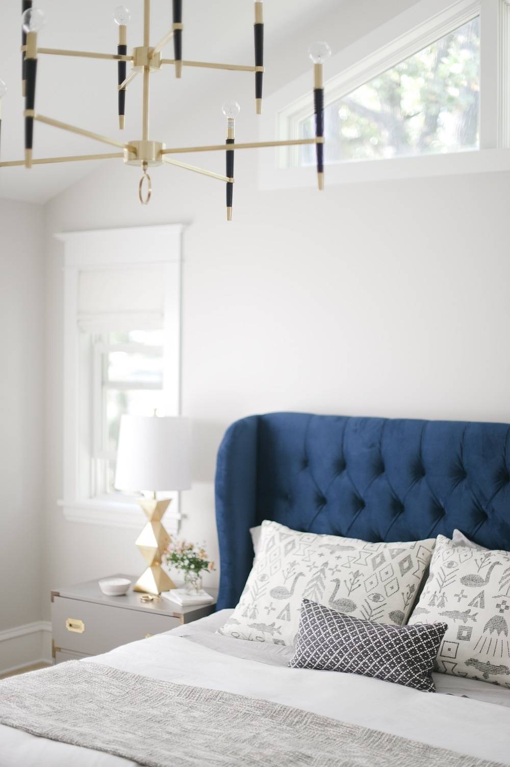
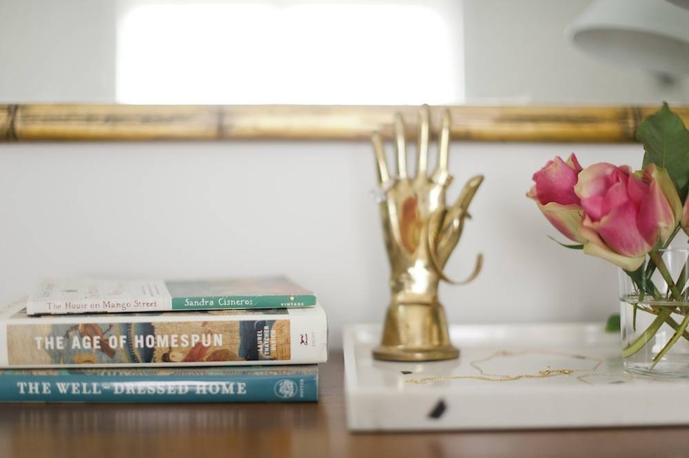
Bedroom Resource List:
- Wall Color: Sherwin-Williams Crushed Ice SW 7647
- Trim Color: Sherwin-Williams Pure White
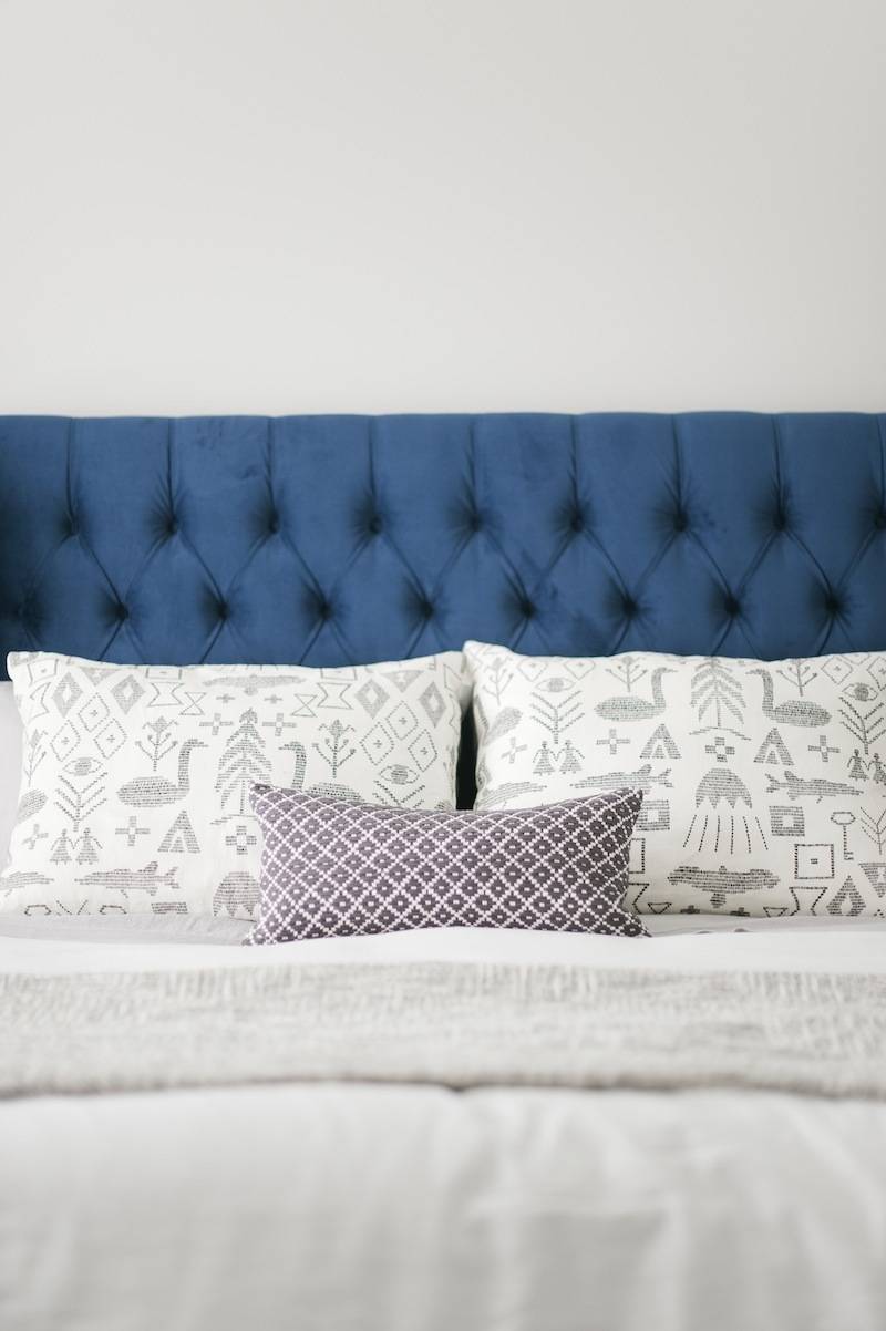
- Bed: Brompton Tufted Wingback Bed in Navy from Target
- Blinds: Laura Ashley Soft Fold Roman shades in Cameo Apple Blossom from Blinds.com
- Rug: Transitional Sahara from Loloi Rugs
- Chandelier: Jonathan Adler Ventana Brass Large Contemporary Chandelier from LampsPlus.com
- Sheets: French Belgian Linen Shale King Sheets from
- Blanket on Bed: Sterling Blanket from CB2
- Throw Pillows: Maailman Synty from Forage Modern Workshop and CB2
- Duvet Cover: Linen Cotton King Duvet from West Elm
- Mirror: Vintage (Hunt & Gather, $180)
- Credenza: Blue Ocean Traders
- Lounge Chair: Rapson Greenbelt Lounge from Forage Modern Workshop
- Campaign Dressers: Vintage (Craigslist for $100, then painted in Sherwin Williams Gauntlet Gray SW 7019)
- Bench: Forage Modern Workshop
- Pillow below Bench: Hand-Loomed Diamond Pillow from West Elm
- Gold Box: Vintage (Mall of St. Paul)
- Bedside Table Lamps: Ripley Gold Table Lamp from LampsPlus.com
- Dresser Lamp: Nate Berkus for Target
- Dresser Tray: Nate Berkus Marble Print Decorative Tray from Target
- Brass Hand: Vintage
- Picture Frames on Credenza: Target
- Vase: Celadon Ceramic Vase from West Elm
- Plaid Throw Blanket on Chair: HERMINE Throw from IKEA
- Corner Side Table: Vintage
- Brass & Black Lamp: Vintage (Hunt & Gather)
- Pot for Plant: CB2
- Abstract Painting: Vintage (Mall of St. Paul, $40)
Little Boy’s room
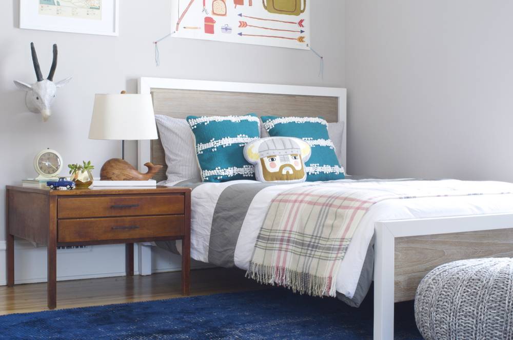
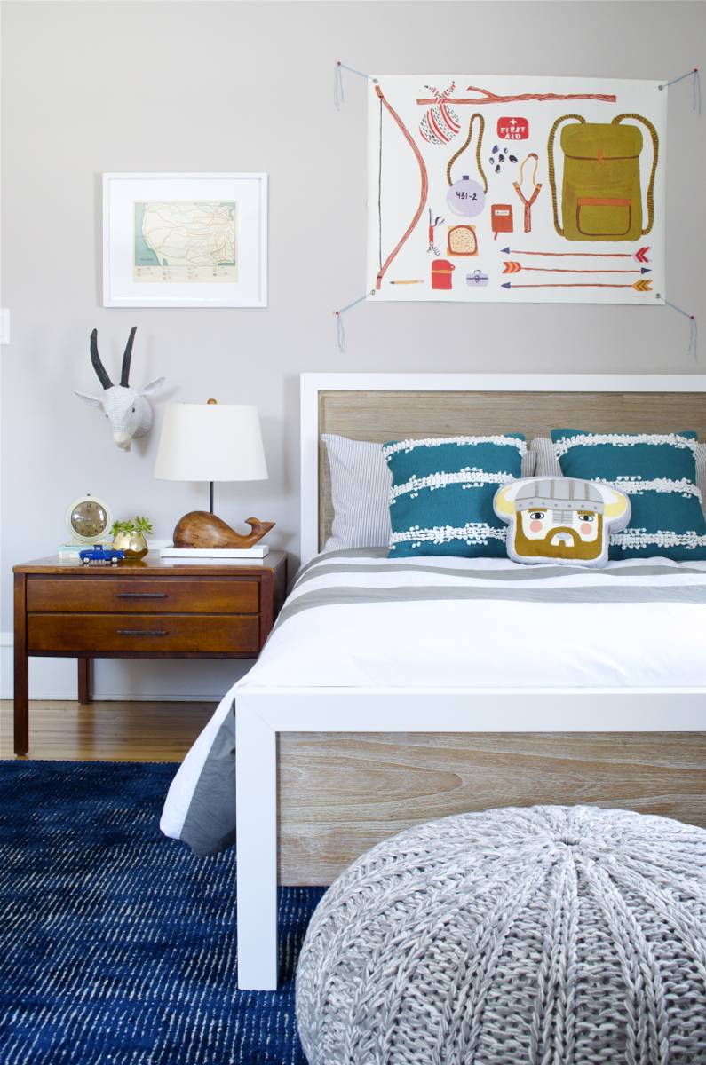
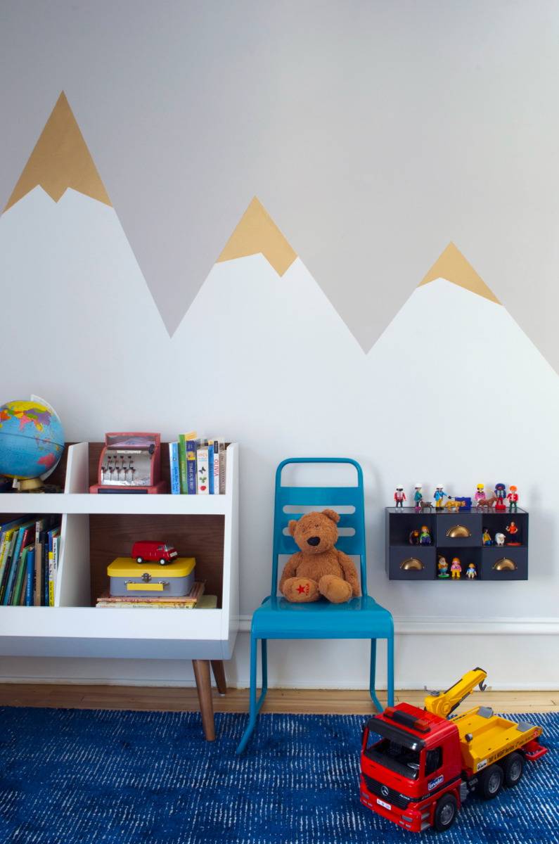
Before: The day after we closed on the house two rows of acoustic ceiling tiles fell from the ceiling of this room. It was clearly begging for change.
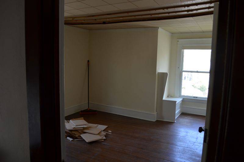
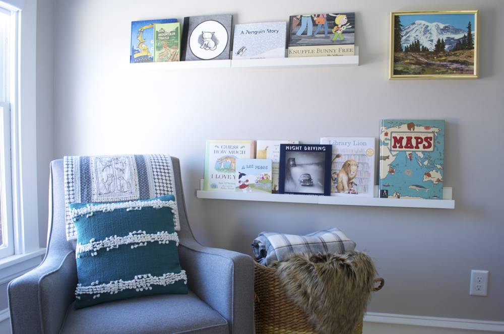
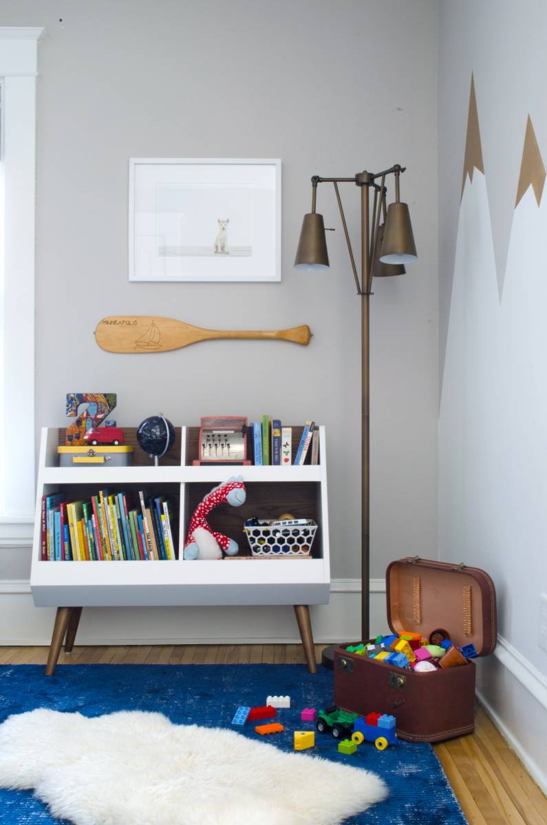
After: We wanted to design a room that captured our son’s sense of adventure, while feeling grounded in classic design. Hence, the mountains with a hint of mid-century modern.
Little Girl’s room
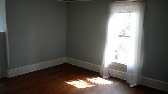
Before: During our closing with the relator, the daughter of the woman who previously owned the house told us that she once sat in this room and cried because it was her birthday and none of the children she invited came to her party. She told us that, for her, the house was full of sad memories. I panicked and feared we were making a terrible mistake purchasing a house full of sorrow. I then bought sage smudge in bulk and paraded through the house like a boss. I also placed little bowls of sea salt in all the corners to absorb the sadness (this, admittedly was a little cray-cray). If you look closely, you can see one of my sadness-trapping bowls in the picture.
After No. 1: This sweet, little bedroom is just like our daughter: joyful and bright. And, so far we’re batting 1000 for birthday parties.
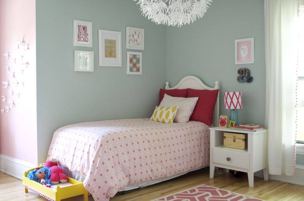
- Wall Colors: Blue (Sherwin Williams Rainwashed) and Pink (Sherwin Williams Lotus Flower)
- Rug: Crow’s Feet Rug in pink by Land of Nod
- Bedding: Dwell Studio Medallion
- Settee: angelo:Home Dover Settee
- Wall Flowers: Umbra
- Ceiling Light: MASKROS Pendant Lamp from Ikea
- Nightstand Lamp: Target base with a DIY shade
- Print: Mischief Maker by dkim
- Print: Believe It by dazeychic
- Print: Hearts Screenprint by sassandperil
- Print: 10 Mil Besos by thebigharumph
- Print: A is for Adventure (free printable from The Handmade Home)
- Print: Spoonflower fabric
- Letter “a”: Anthropologie Pinwale Alphabet
- Curtains: Sailcloth Panel by Pottery Barn Kids (white) with these pom-poms
- Bookshelf Lamp: Room Essential Tripod Base Lamp from Target
- Framed Je T’aime: Card from Rifle Paper Co.
After No. 2: As our girl grows, so does her style. In 2016, we gave her room a new look.
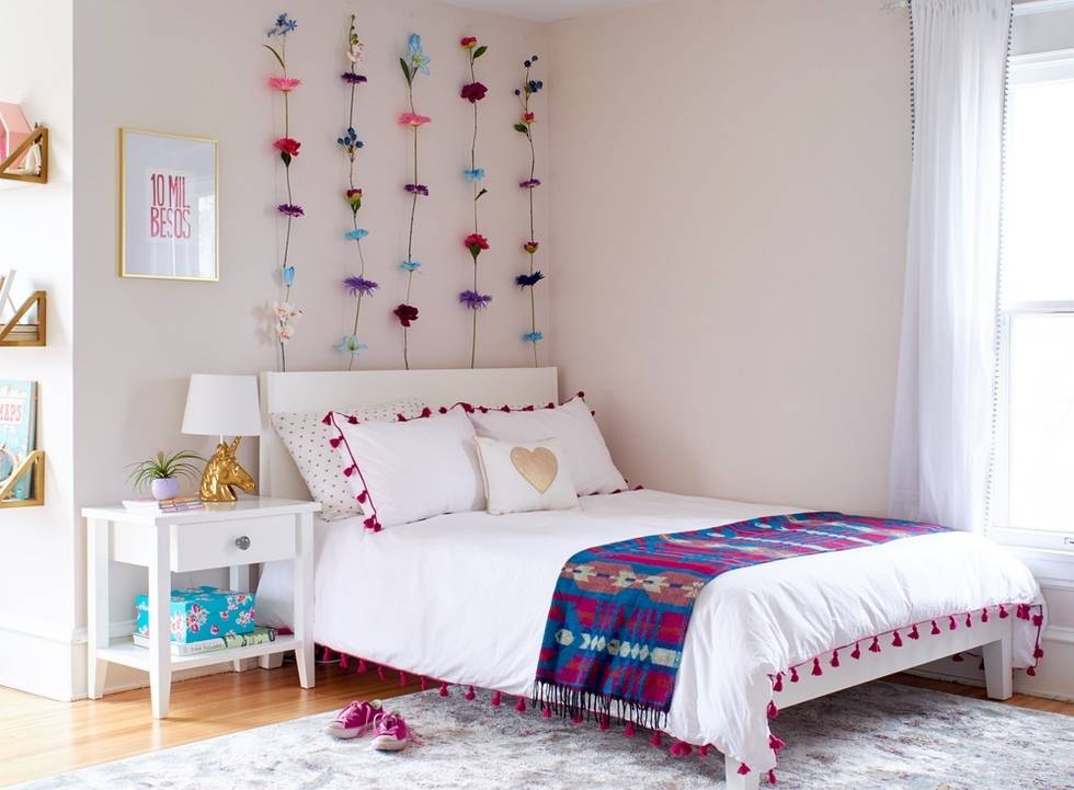
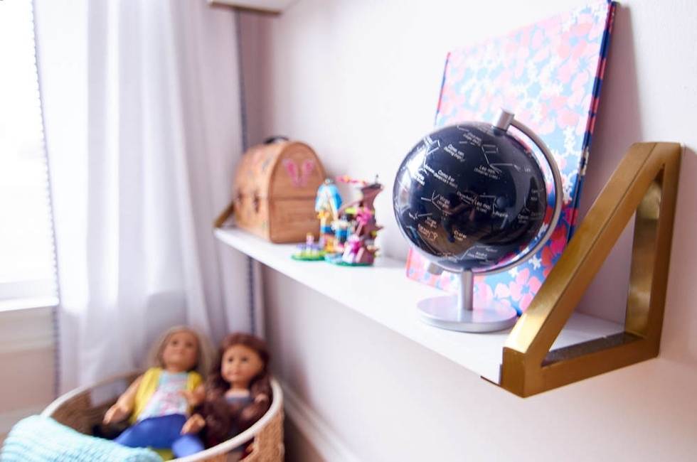
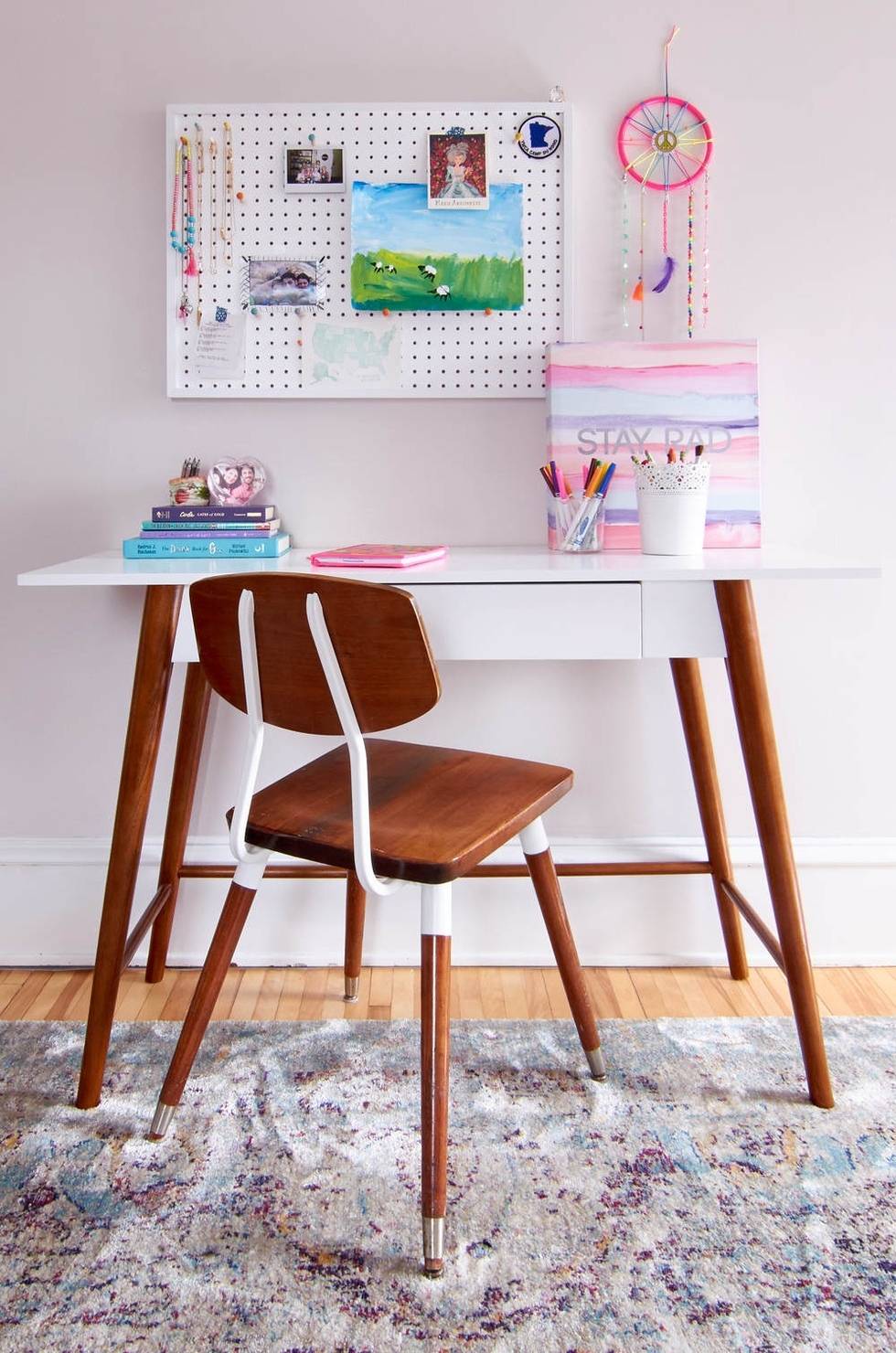
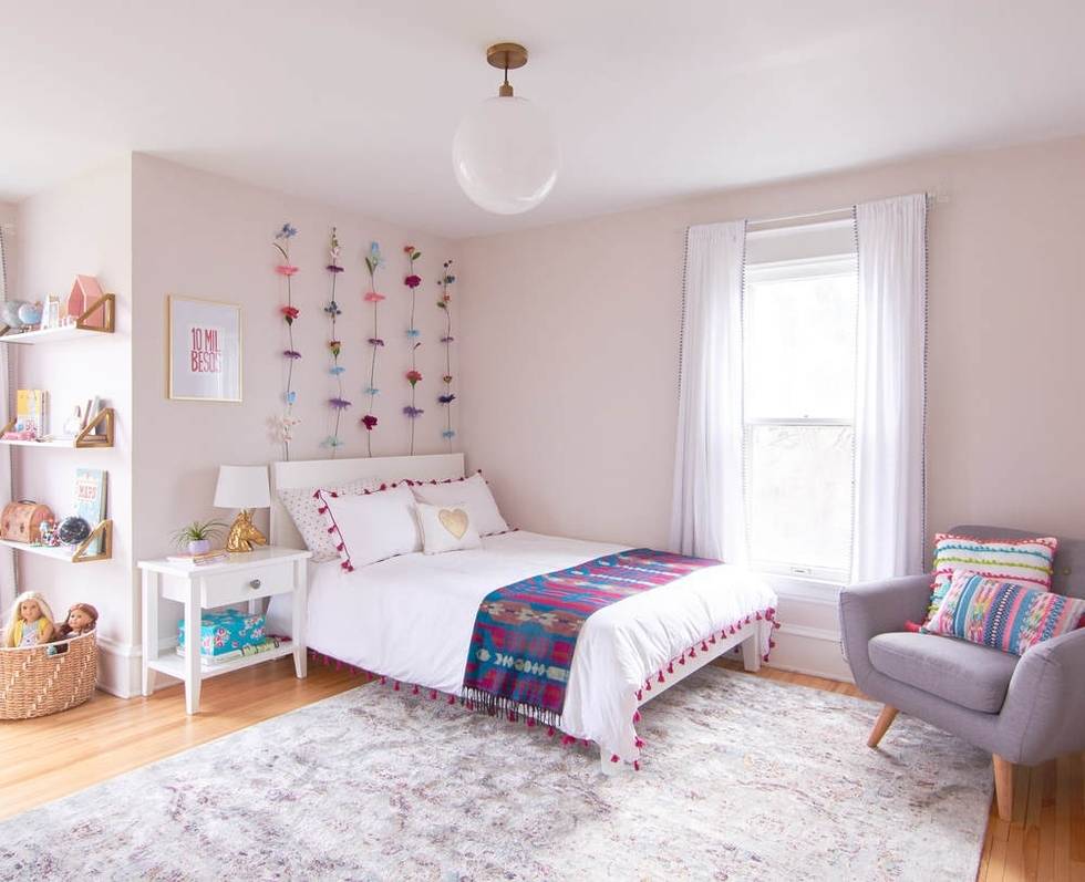
Child’s Bedroom Resource List (Act II):
- Wall Color: Sherwin-Williams’ Simple White (SW 7021)
- Rug: Anastasia Collection in Silver/Plum by Loloi
- Bookshelf: Modern Modular Frame by Land of Nod
- Wall Shelves: Gold Standard Wall Shelves by Land of Nod
- Bed + Mattress: IKEA NORDLI Full-Size Bed + Aveline Mattress from LexModBedding: Metallic Heart Sheets + Tassel Duvet in Berry
- Throw: Montara Throw
- Toss Pillows: Pom-Pom Pillow + Tassle Pillow + Heart Pillow
- Pendant Light: Globe Pendant in Milk Glass (14″)
- Desk: Porter Mid-Century Modern Writing Desk
- Lounge Chair (Gold): Domino Lounge Chair by Land of Nod
- Reading Chair: Mid-Century Chair with Colored Buttons
- Bedside Table: Land of Nod, Discontinued (Similar here)
- Lamp: Pillowfort Unicorn Lamp
- Wall Art: 10 Mil Besos + Mischief Maker
- Desk Organizer Pegboard: Discontinued (Here’s a similar one)
- Desk Chair: Vintage
- Curtains: Mini Fringe Curtain Panel by Nate Berkus
Storage Room
Before: This former bedroom was drab, bright yellow, and filled with thousands of bobby pins. Seriously, a truckload of bobby pins. They still mysteriously come up through the floorboards.
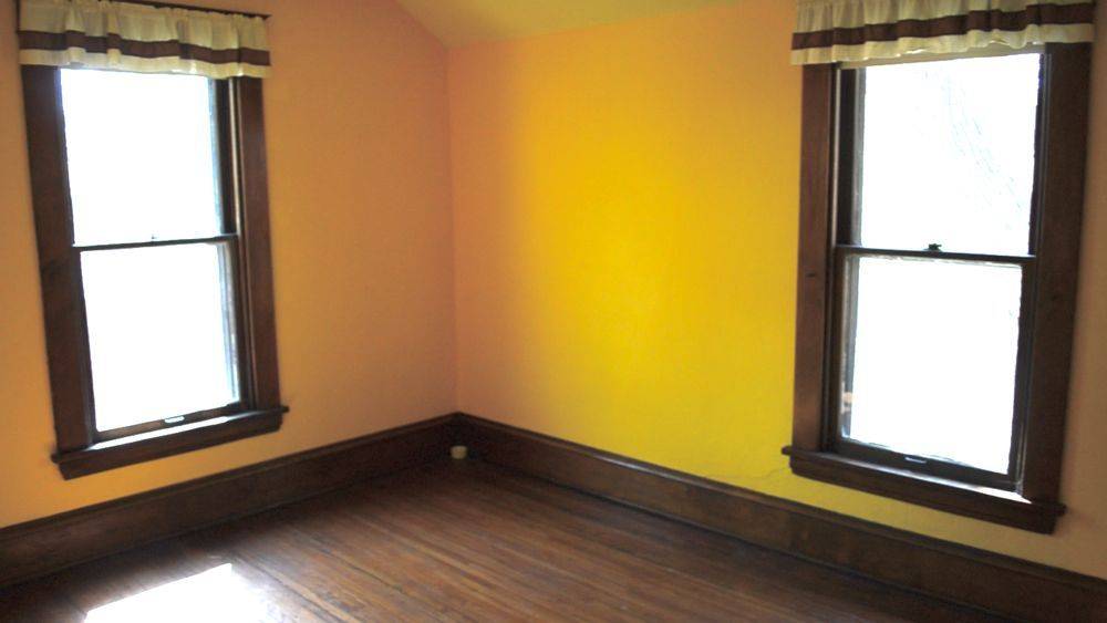
After: Our ‘Bonus Room’ (that acted as a catch-all reservoir for far too long), finally became our cozy family den.
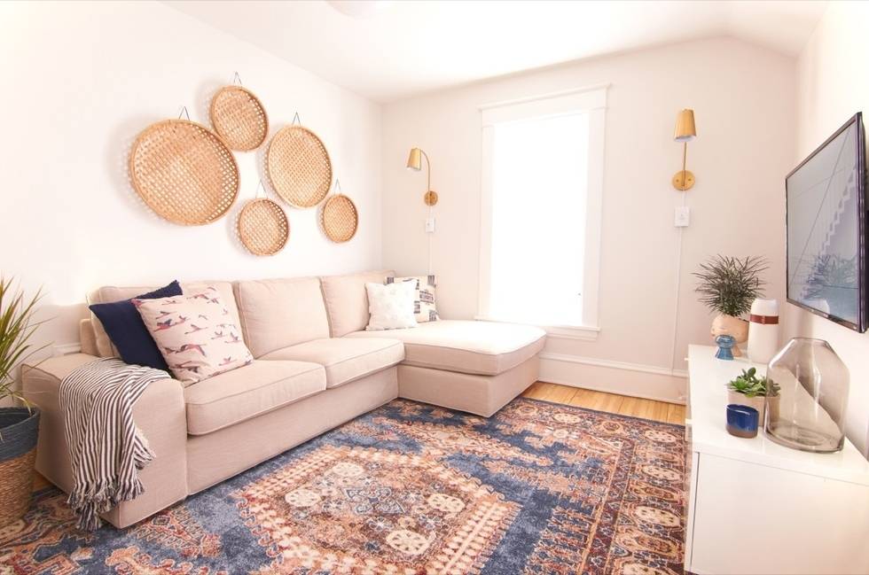
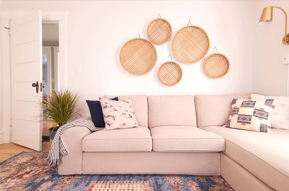
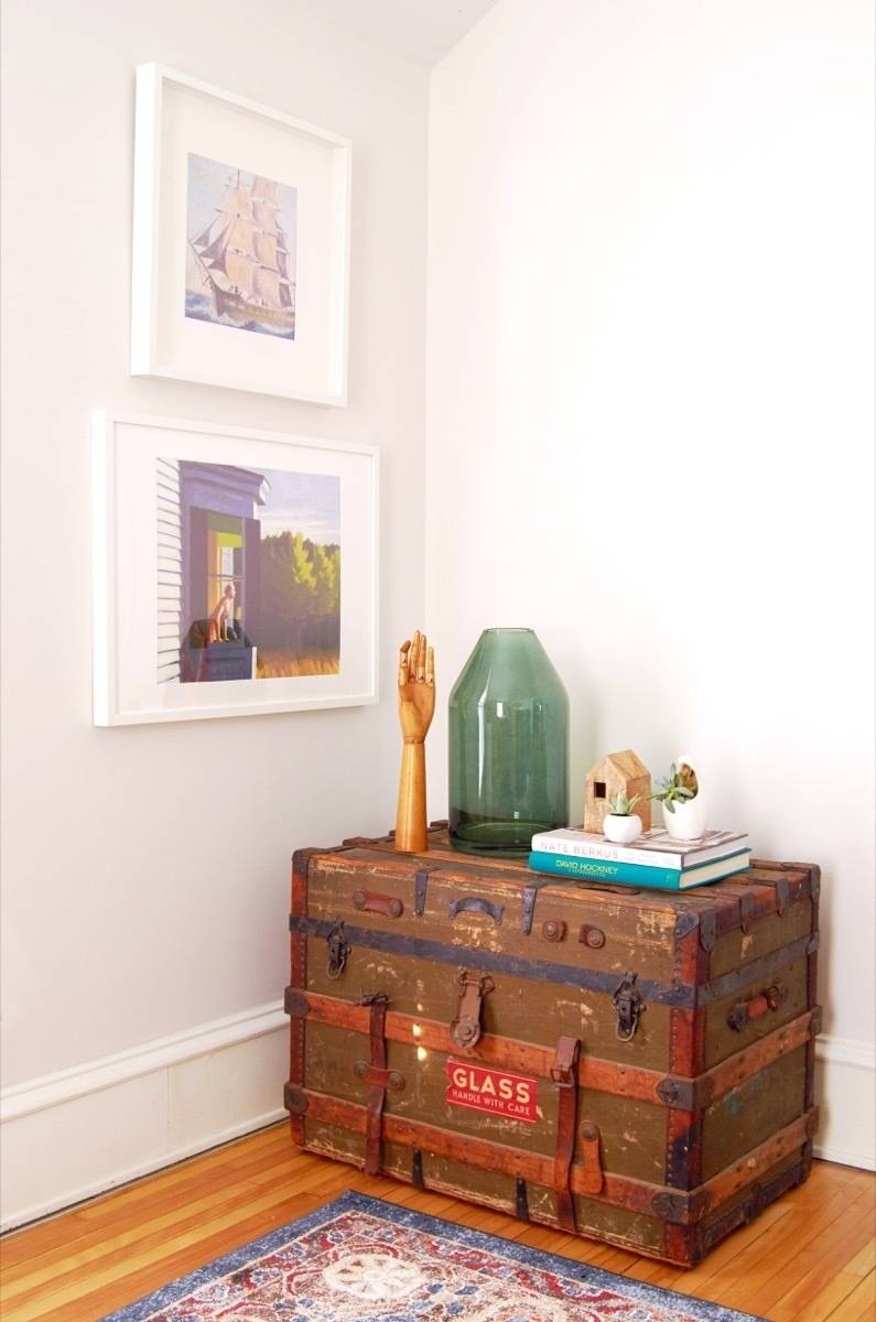
Den Resource List:
- Paint: Sherwin-Williams Origami White (SW 7636)
- Rug: Arcadia Rug (8×10)
- Sofa: KIVIK with Chaise in Hillard Beige
- Hanging Baskets: Hearth & Hand Flat Rattan Wall Art
- Pendant: Large Sculptural Glass Globe Pendant
- Sconces: Sully Warm Brass Plug-in Sconce
- Toss Pillows: Waraniene, Navy, Cream, Birds
- Throw: TUVALIE
- Trunk: Vintage find from our neighbors!
- Face Planter: Head of a Lady Resin Planter
- Artwork: Edward Hopper + Ship
Kid’s Bathroom
Before: This bathroom was full of problems, and they were all hidden beneath the raised floor that we tripped over every single time we entered the room.
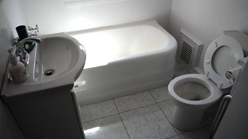
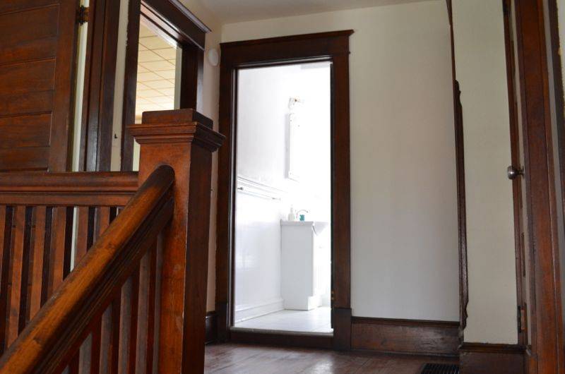
After: Every single wall, floor, pipe, tile, chimney stack, etc. was removed from the old bathroom to make way for the new one!
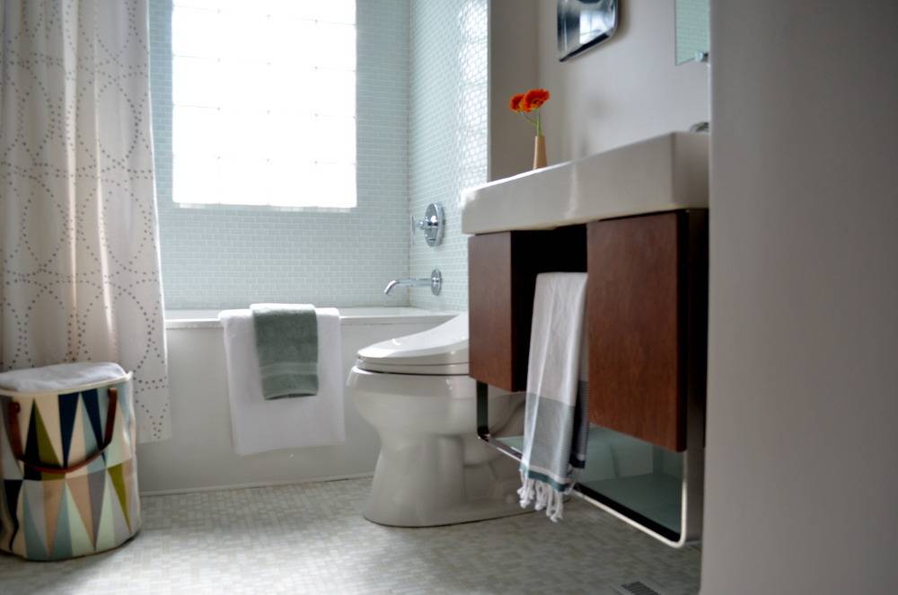
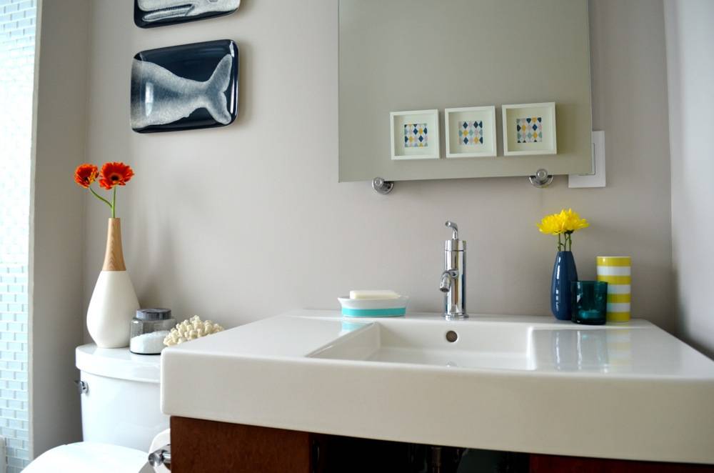
- Paint: Sherwin-Williams Alpaca (finish: eggshell)
- Shower Tiles: Modwalls’ Lush 1×4 Cloud Tile
- Floor Tile: Modwalls’ Brio Blend White Linen
- Vanity: Kohler Traverse (Color: Ostrich)
- Sink: Kohler Traverse
- Bathtub: Kohler Underscore Alcove Bath
- Toilet: Kohler Cimmaron Two-Piece Elongated Toilet
- Bidet: Kohler C3 Toilet Seat with Bidet (and yes, you need one of these)
- Bathroom Fixtures: Kohler Purist Collection
- Shower Curtain: West Elm’s Nile Shower Curtain
- Hamper: Ferm Living Spear Basket
- Shower Shelf: Gatco Latitude II
- Whale Art: Thomas Paul Whale Tray
- Vase: West Elm’s White Ceramic Vase + Wood Top
- Succulent Vases: Arcadia Garden Products’ Round Wall Planter
- Coral: Nate Berkus for Target
- Wall Art: Ferm Living Harlequin Tea Towel (color copied and reduced)
- Whale Bath Toy Holder: Boon Whale Pod
- Wall Art Frames: Ikea Ribba
- Cup: West Elm’s Modern Stripe Tumbler
Thanks for sticking with us this far. If you have questions about products, designs, or DIYs, please let me know in the comments! For more on the process of re-doing our house, check out the entire Curbly House Section!
A tremendous bouquet of thanks goes out to the wonderful, stunningly-talented photographer, Melissa Oholendt, who makes magic with her camera.
Do you have a source for the great backsplash tiles in the kitchen? They look like keystone marble or something like that… So great!
Absolutely beautiful
It’s beautiful…I hope you don’t mind if I copy your choice of paints. Lovely, lovely! Job well done!
It’s really something. How did you choose paint colors? In your pictures they all seem to work together. Do you have a trick. Well done, you guys!
I just found your house on Pinterest. I love it! It’s amazing to see all the work you put into it – beautiful!
Thanks, Lin, MaryBeth and Araceli!
Absolutely gorgeous! It is amazing how the dark colors made everything feel gloomy and old and just paint in those wonderful colors brought new life to this old home. Love, love, love it! Your designer is the best!
Thanks, Gale!
I love your house, what you’ve done is so impressive!
I recently moved and am redecorating my living room and having a bit of trouble balancing the television. I’m wondering where you’ve placed your television since it isn’t shown in pictures.
Oh, the difficult decision of where to place the tele! We ended up putting it in the sun room (on top of the low, white storage credenza). Additionally, we added a small sofa on the other side of the play table.
Love what you have done here! We also just bought an old craftsman house that is full of that dark dreary wood trim everywhere, we are in the middle of painting it all out white and can’t wait to see the end result. Hope it looks as good as your house
absolutely beautiful home… and decorated so lovely!
Thank you, @georgia! Such kind words!
Hmmm. While I applaud your effort, your decorationing skills need serious help. Sorry but the furniture choices you made were almost all so dang cheap looking. Lone exceptions was the headboard of your master bed. But then you got such cheap looking bedside tables and other furniture that it was just pitiful looking. Expensive, classy furniture does NOT need to be costly$$. It just takes an eye for classy design. Please check out classsy websites as you need help.
Anonymous, it’s no wonder you didn’t sign your name. Anyone with spelling and grammar that atrocious, not to mention rudeness, surely wouldn’t want to be identified! Why would you ever write something so unkind and insensitive?
Anonymous,
You are rude. Please find within yourself the desire to refrain from trolling. Bullies are not cool.
Dear Alicia,
The effort put into this home is phenomenal. I would LOVE to live in a home so well designed. Well done! This looks fantastic.
Dear Ros and Lin, Thank you! XO
Hi Olivia, We used an eggshell finish on the living and master bedroom walls. We used a high gloss enamel on all of the trim work. Hope this helps!
Hi! Beautiful home!
I really love the simple clean range hood your cabinet designer put together…so many are so fussy but yours is really lovely.
What is the model of the ventilation hood insert you used? I didn’t see that listed. Thanks so much!
Hi Alicia! Thank you so much for sharing these pictures of your beautiful home. We are building a new home and chose SW Crushed Ice for the entire home except the laundry room and master bedroom before I saw your pictures. The laundry room will be Sherwin Williams Sea Salt and the master bedroom will be Sherwin Williams Pediment. We were agonizing over the trim color and thought we wanted Pure White. I was so excited to see you had posted the trim color as well as the wall colors. I can now confirm we picked the right colors and they look so beautiful. Thanks!
Alicia,
Your home is lovely and an inspiration for those of us who are in the process of remodeling or redoing our homes. I am going to use one or two of you chosen paint colors in my home. Thank you for sharing and enjoy the fruits of your labors!
Tami: Thank you! I’m feeling very excited about your color choices. They will look beautiful!
Lin: Thank you for the kind feedback. I’m glad you’re going to use some of the same paint colors in your home; I think you’ll love them!
beautiful home! well done, so great to see the differences. maybe it’s my browser but i can’t see the list for the girl’s bedroom, which i love, particularly the paint colours – could you tell me what they are?? congrats again on fantastic choices and work 🙂
beautiful home! well done, so great to see the differences. maybe it’s my browser but i can’t see the list for the girl’s bedroom, which i love, particularly the paint colours – could you tell me what they are?? congrats again on fantastic choices and work 🙂
@lani – thanks for the comment! We’ve fixed the resource section. The colors you’re interested in are: Blue (Sherwin Williams Rainwashed) and Pink (Sherwin Williams Lotus Flower)
I’ve been thinking hard about how to say what desperately needs to be said without the appearance of “trolling” or “bullying.” There is no reason your family should care that I personally would choose about 90% of the BEFORE photos over the AFTER photos. But I think a large contingent of home-lovers would agree that you should have left that particular house to someone who would have appreciated all of the awesome craftsman details and rich original solid wood. Very few things deserve praise less than painting over quality, intact vintage woodwork. I hope at the very least that you salvaged the built in china cabinet and big old farm sink. It is good that you are happy with your surroundings now — if only you had just bought some dime-a-dozen place that was bland from the start, it wouldn’t have robbed the rest of us of a piece of architectural heritage.
Hi, Amanda,
I appreciate the fact that you took care to comment in a careful and sincere way. I realize painting the woodwork in our home was a controversial choice. But, let me assure you that we love our home, treasure its character, took great care in the decisions we made, and stand by them. Our spaces reflect the people we are and the things we love. Beauty really is in the eye of the beholder and I hope you love your home as much as we love ours.
Amanda, why would you feel the need to post such a snarky comment?! The remodeling that was done only added beauty to this home. Do you think Alicia and her family purchased this home for others to enjoy? No, I think Not! They purchased and breathed new life into it so THEY could enjoy it. My mother always said, “if you can’t say something nice, don’t say anything at all.”
Hi Alicia – Your home redesign is stunning! I was curious to know what type of branch leaf you have in the white vase on top of your white and gold-trimmed chest in the living room. It’s beautiful and I’d love to find the tree myself!
Thanks so much,
Kelsey
Hello, LOVE your home!! Is there any chance you can share whether you painted the ceiling in your master bedroom SW Crushed Ice as well, or is it Pure White like the trim, or something else? We are repainting our house and we, too, have a vaulted ceiling in the master bedroom and are painting a light neutral color. I can’t decide whether to do the ceiling Pure White (the color of our trim as well!) or the ceiling the same color as the walls. In some of your pictures, I think the ceiling is white, and in others I think it matches the walls. Whatever you guys did, it looks GREAT, and I would love to know! Thanks so much for opening your home to us. :). (I apologize for the double post–I accidentally posted this first under an entry of yours that had nothing to do with the master bedroom…)
Hi Amanda! Thanks for the nice comment! Our ceilings are all SW Ceiling Bright White (SW 7007). Thanks and good luck with your project!