Interior decorators and home stagers hold the secret to making small spaces seem bigger. It may seem like a mystery, but there are concrete tricks of the trade that are routinely used to ‘stretch’ the walls out a few extra feet. It’s all about the visual feel of things.

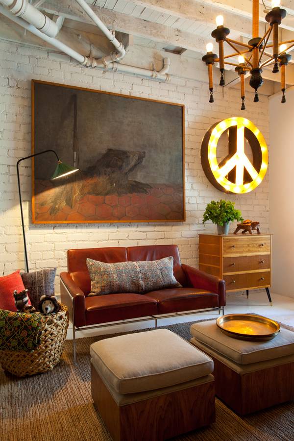
1. Use a variety of patterns around the room. This keeps the eyes moving, which gives the visual feel of spaciousness. You don’t want everything to be the same scale, and you don’t want to cover a large piece of furniture with a very large print. Mixing patterns can be tricky for most people. One thing I do is look through clothing catalogue photos to see what colors, prints and patterns I like. Then I break down what they’ve done with color and pattern and figure out how to translate it into an interior. To infuse a room with pattern, use a variety of fabric, texture, materials and surfaces. Don’t overdo it.
2. Obviously, clear out the clutter. “Things” start accumulating in rooms. Take an objective view and make the decision to take some pieces out of the lineup. You don’t have to get rid of them, just store them a way for a while. For instance, I have a collection of green pottery that’s in my dining room hutch. I get so excited when I find another piece, I can’t bear to pass it up. However, if the truth be told, they are losing their appeal since there are so many. Less is more.
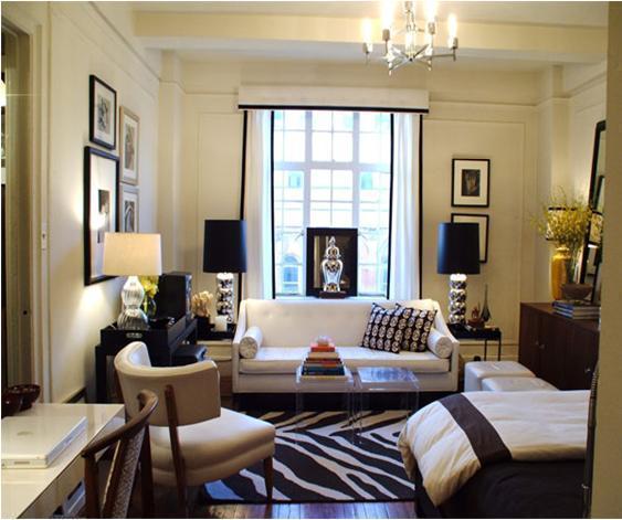
3. If you’re lucky enough to get to furnish your small space from scratch, choose pieces with low arms and legs showing. You’ll get a much more open feel if there’s space around and below furniture. One thing you don’t want is a big boxy sectional to work around. In a small space, there’s almost no way to make that mass seem less. Leave the traffic pattern open and don’t block lovely window views. Remember, you want the eyes to keep moving around the room, not get stopped by an out of proportion overstuffed arm chair that you have to step around to get into the kitchen.
4. Lighting can really make a difference in how closed in, or open a room looks. Two things to consider are the lamp heights and the kind of bulbs in the lamps. I used to only use the yellow, warm light bulbs in our lamps, but have since discovered that a whiter warm light opens up the space more than yellow. I’ve also struggled with lamp heights. I buy lots of vintage lamps to use around the rooms. At different heights they attract the eyes, but to no good effect. They seemed disjointed. Then, last Fall I sprang for two matching vintage lamps to flank my sofa and it’s amazing how much more unified and unobstructed the view is. It has a feel of unclutteredness.

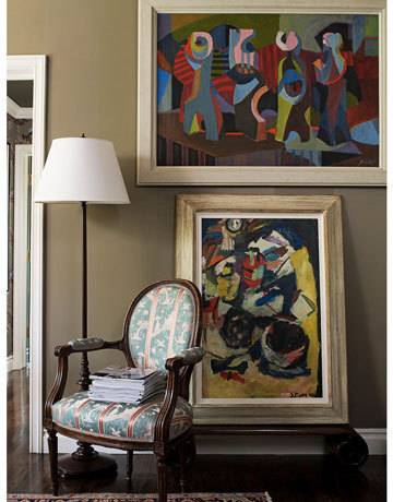
5. Arrange wall art in an organized way. OK, this may be personal opinion, but when I see a wall full of wonderful collections that have some alignment or order, it looks as though there was some considered arrangement of items, which makes me perceive each item as valuable and part of a whole. When I see a haphazard hanging arrangement, it feels cluttered. like the goal was just to fill up the wall with stuff. Again, it could be personal taste, but when you’re able to think things through and carefully edit the number of things you put in a room, chances are the room won’t be overcluttered.
