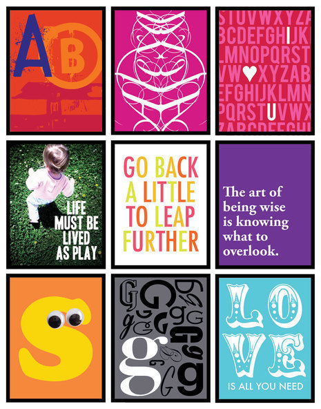
I have to admit something: I LOVE FONTS! I guess being a graphic designer has a little to do with that. I’m always scoping out typeography posters online, vintage distressed signage, and cool magazine layouts using fonts in an unusual way.
One thing I’ve been noticing a lot of late are simple font posters in the vein of “Keep Calm and Carry On”. A super simple typed sentiment that a lot of places online are fetching for a pretty penny. The thing about it is that most people can make these posters themselves if they just were given the idea and know how. That’s why I decided to bring you 9 different ways to make DIY wall art out of fonts! I kept them super simple and accessible…something you can do in less than thirty minutes and print out and frame.
Before you begin
Before you start any of these project, it is helpful if you already have a copy of Adobe Photoshop or Adobe Illustrator. Adobe also has a less expensive version of Photoshop called Photoshop Elements. These programs will make it much easier to achieve positive results; however it’s not to say you couldn’t get the same results from a word processing program like Word. It just may take a bit more time troubleshooting to figure out the setup.
Any of these projects can be printed to larger poster print sizes. You may just have to stop by your local printshop or copy center to have it done for a small price. You might also consider printing it to a wide format printer if you want it larger than a traditional 11×17 size. Talk to the printshop about specifics if you have printing issues/concerns.
Also, I suggest that if you’re not already familiar with kerning, leading, and tracking, that you do a bit of homework. This can step up your typeography knowledge and ultimately help you achieve better results in creating your own font wall art!
1. Go Grunge
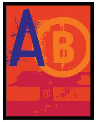
There are a slew of grunge and graffiti style type faces out there complete with drips, spray paint effects, and distressed characters. They look great on their own or jumbled and tilted on top of each other. Mix and match letters and numbers for a textured effect. I chose to do initials in the example above.
2. Fancy Font Flip
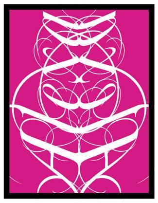
At first glance, the image above just looks really decorative and cool in a Rorschach test kinda way. If you take another look, you will notice that I flipped and mirror my name side by side. It’s a fun way to use the loops and swirls of cursive typeface (this one was downloaded for free and is called Mutlu Ornamental) to create custom art. If you stare at it long enough, you may even find shapes or images in it that you didn’t know was there just like a Rorschach test!
3. For Repeat’s Sake
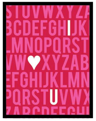
Repetition also makes a strong statement on a wall. Any word, phrase, or series of letters or numbers will be sure to catch the eye. I chose to run the type off the edges of the frame and also embed a not too secret message as well. Actually, the heart for this one was a dingbat font I downloaded called Heart Things 3. There are enormous variety of wingding-like fonts online as well that can be used in wall art projects. I found a slew on www.dafont.com.
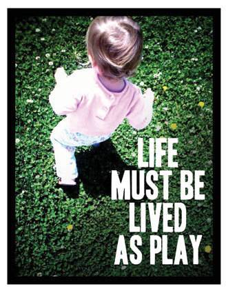
4. A Picture is Worth a Thousand Words
Take a page from the glossy magazine sitting on your coffee table, and place your type over top of a photo. A quote or phrase that captures the mood of the photo can be a way to add more life/meaning to that image. And though it appears I spent a lot of time editing this photo (burning the edges/saturating it, etc.), I didn’t. This photo was taken and processed using my iPhone. I’m all about doing it the easy way!! You can also take this look off the wall and it would make a great printed invite, cover to a photo book, etc. The possibilities are endless.
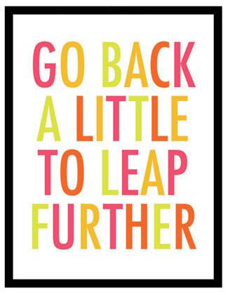
5. It’s a Colorful Life
Enlarge a phrase/quote/name using your favorite font and set it in a bright colorful palette of colors! It adds a playful touch to your wall art and will make a cheerful accent! This treatment particular looks good on a white or black background. If you’re not sure what color combos work best together, the web site Kuler has great color palettes to get you inspired and think outside your normal color box!
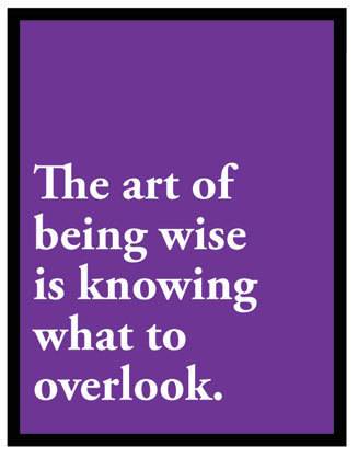
6. Tis a Font to be Simple
Follow the K.I.S.S. principle (Keep it simple stupid) and use a tried and true font that looks good everytime (my suggestion is Helvetica Bold or Garamond Bold that I used above). Type out your favorite phrase or saying, then right or left justify it. It lets your phrase take center stage and make a powerful statement. Leave it simple in black and white or do as I did and type it on a solid colored background. Sometimes simple really is better.
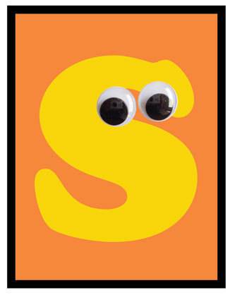
7. Get Googly
I’m a sucker for googly eyes. It immediately gives inanimate objects personality, so why not try it on a font? Heehee. This would make an adorable accent to a child’s room or really anywhere if you embrace kitschy, cute stuff as much as I do. By the way, the font used here is Cooper Standard. You can even purchase multiple paper maché letters from your local craft store, paint, then add the googly eyes in a grouping on the wall. What a fun way to spell out a name!
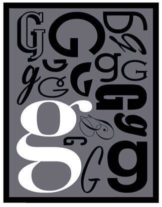
8. Fontapalooza
If you are a bit of a fontaholic, then this wall art is for you! You simply take the same letter over and over, changing up the font for each one. I chose one letter to be a focal point as you can see, then arranged all the other letters in different sizes and shapes around it. This would make a great personalized gift for just about anyone, especially that hard to buy for person!!
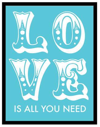
9. Breaking up is not that hard to do
Break up a word (set in an visually interesting font) into a couple different lines to make a interesting statement. In this one, I took a line from a classic Beatles tune, set it in “Circus” font, and finished off the saying in a simple San Serif.
Hope this inspires you to make your own font wall art. Now you can make your own art that’s totally your “type”!
