The distinct colors, shapes, and textures of the 1970s give interiors from that era a unique energy. Currently, the decade’s distinct vibe is coming back, and influencing current trends in a big way. Yes, 70s style might be considered over-the-top now, but comb through examples from that era and you will find pieces and inspiration that will bring new liveliness to your space all while fitting in to your current decor. Keep scrolling for some rad eye candy!
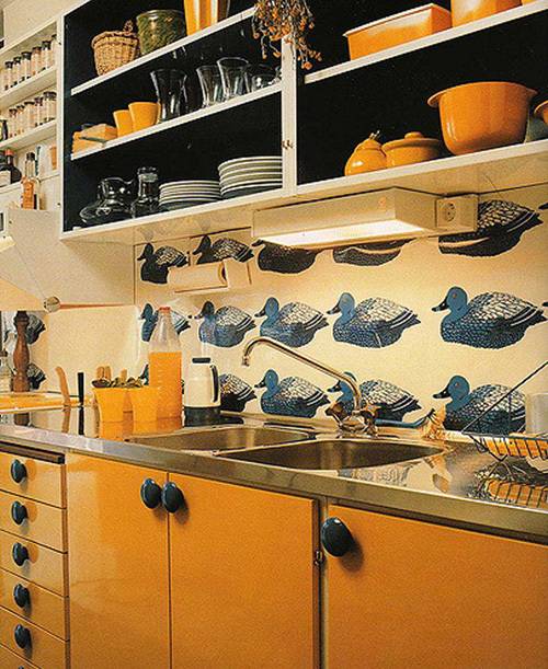
1. This open shelving would work well in most modern kitchens, and though the clunky under-cabinet lighting and neon artificial orange drink can stay in the past, the stainless countertop and integrated sink would be a welcome revival. Sure, it’s not for everyone, but I think those blue waterfowl and chunky cabinet hardware are just the perfect amount of quirk.
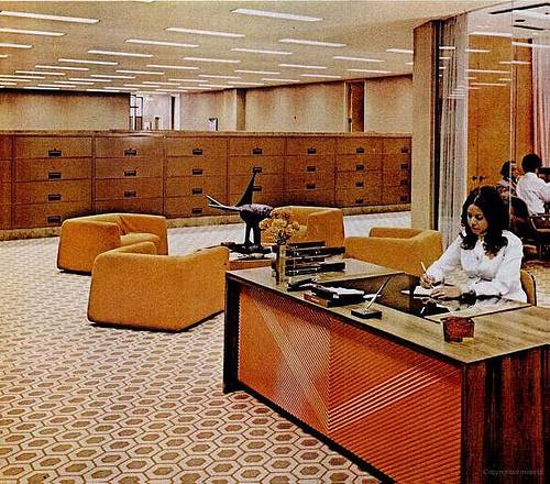
2. This amazing space was in the Johnson Publishing building in Chicago. The interior is all kinds of boxy, low-slung cool. Too much of this proportion would overwhelm most modern living spaces, but introducing one or two squared-off pieces could look very fresh and serve as excellent foil for other shapes. The reception desk totally reminds me of the Tachuri collection at Target.
Here is an interesting article about the building , written before it was turned into apartments, that includes more photos!
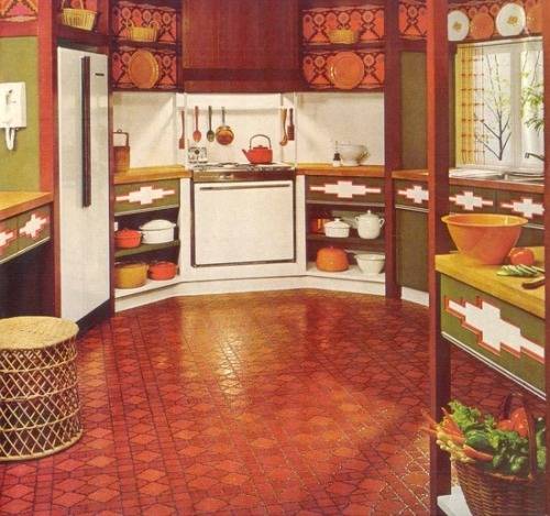
3. Sure, this kitchen looks wacky in a way that skips past ‘fun’ and lands directly at ‘unhinged,’ but it still has things to teach us. For instance, the eye needs a place to rest. Here, the white appliances and backsplash ground the space – albeit not quite enough. Also, the placement of those open shelves is very practical and the stoneware looks great. The psychology of the color red is associated with energy and danger and its presence is said to raise heart and respiration rates. I can only conclude that the interior designer who specified this linoleum was keen to encourage food fights. Hopefully those aztec inlays wipe down easy!
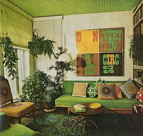
4. These graphic prints and the arc lamp are super interesting. They helpfully distracted my attention from the creepy carpet. The green is very fresh and certainly abundant, but at the forefront of my mind that age-old question lingers: How many mandala textiles are too many mandala textiles?
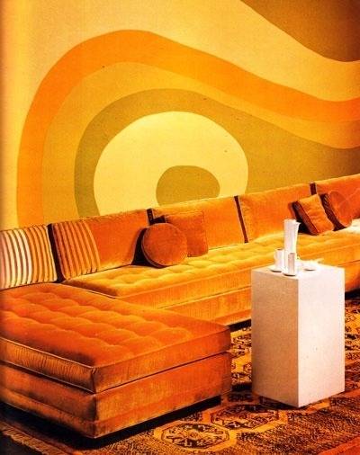
5. The Oompa Loompas called and they want their living room back! While I certainly enjoy the color orange, surely this much of it cannot be healthy for anyone. Still, taken individually, the wall mural and that sectional (the stripe detail! the tufting!) are stunning.
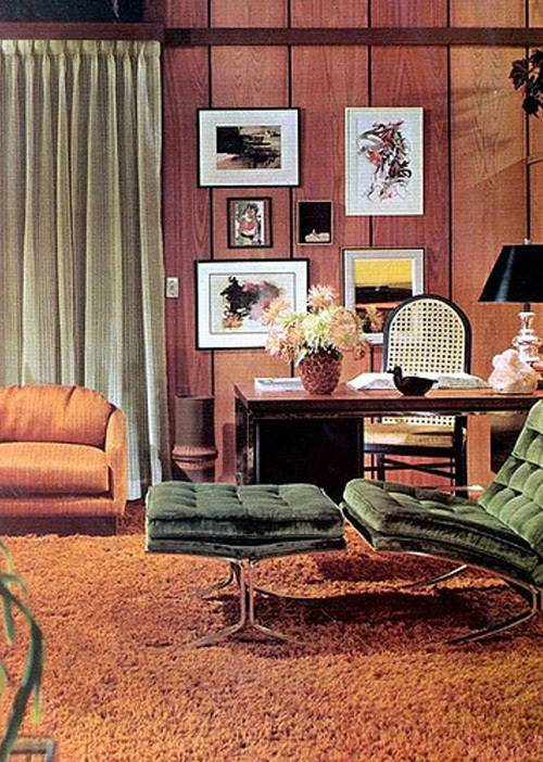
6. A Barcelona chair and ottoman upholstered in velvet is very unusual, and it looks great here – especially combined with the fantastic wide paneling. That impeccable gallery wall would be at home here in 2018 and beyond.
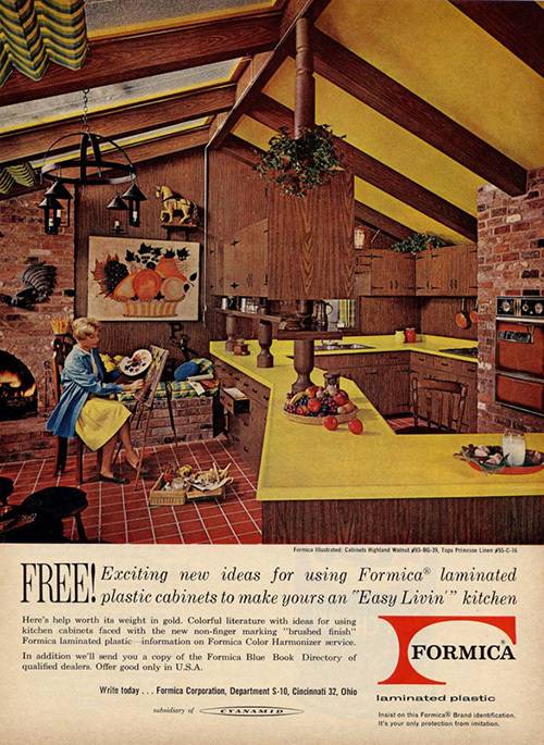
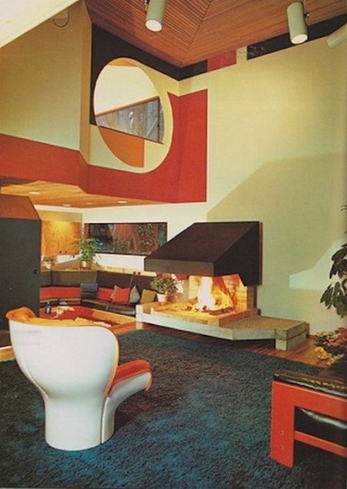
7. The pitch of the ceiling with those skylights and exposed timber is very handsome, but I cannot get behind what looks to be the countertop equivalent of a butterfly roof.
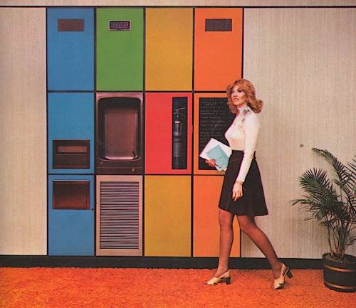
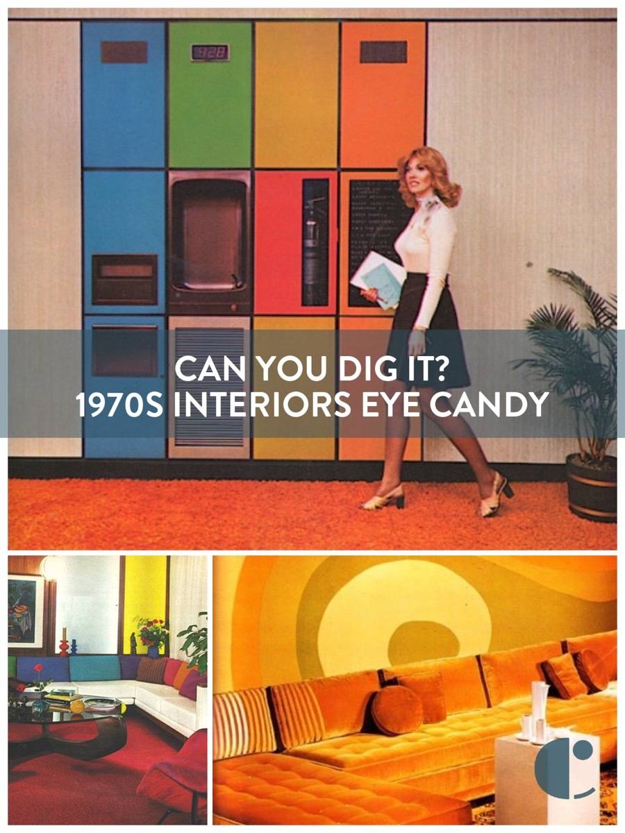
8. This is such an excellent concept, and if the saturation of the cabinets was turned down a few notches and that tripping hazard of a carpet was removed, this would really sing. Obviously the women and her a-line skirt and fantastic hair needs to stay.
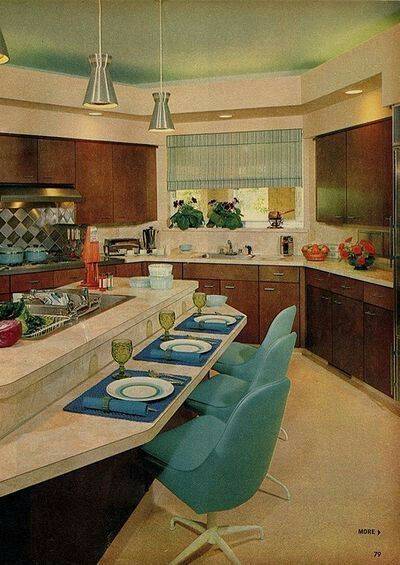
9. This layout, with an additional sink and eating area at the island, was ahead of its time. The slab cabinet doors are beautiful and very sleek. Will a tectonic shift in the design world happen and turn popular opinion from shaker style to flat front doors? Time will tell, and I am rooting for the underdog.
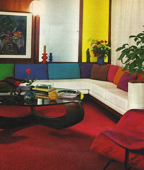
10. Again, this carpet is very intense, but that couch is superb as well as the coffee table. The womb chair in the corner looks to be velvet and incredibly comfortable. You would have a hard time getting your guests to leave if they sat down there. Maybe their increased heart and respiration rate in reaction to the rug would keep them from getting too comfortable.
Are you looking for more retro charm? Here are 20 Kitschy Kitchens You’ll Love and some of our favorite Midcentury Fireplace Design Ideas.
The 70s were cool. I’m trying to figure out how to recapture that time and keep the dark wood grain paneling walls using old techniques that made the style work. It does seem if you can put a lot of big white framed art on the walls and then go hard on blues, greens, and yellow. It’s harder then you think finding people that don’t paint it but reinvent the style and make it work.