The 2017 Curbly House is done! It went on the market last weekend, and (to my surprise and delight), we’ve already had several showings. After two-and-a-half months of intense renovation work, it feels a little weird this week, knowing there’s nothing left to do except blog about it. I keep checking my ‘To-Do’ list, and it’s all crossed off, which is my JAM!
Scroll down for the full, room-by-room reveal of the 2017 Curbly House, along with complete product lists (from our featured vendor partner, Hayneedle) and details about how we transformed each space.
(All photos by M.E. Gray unless noted)
Dining Room
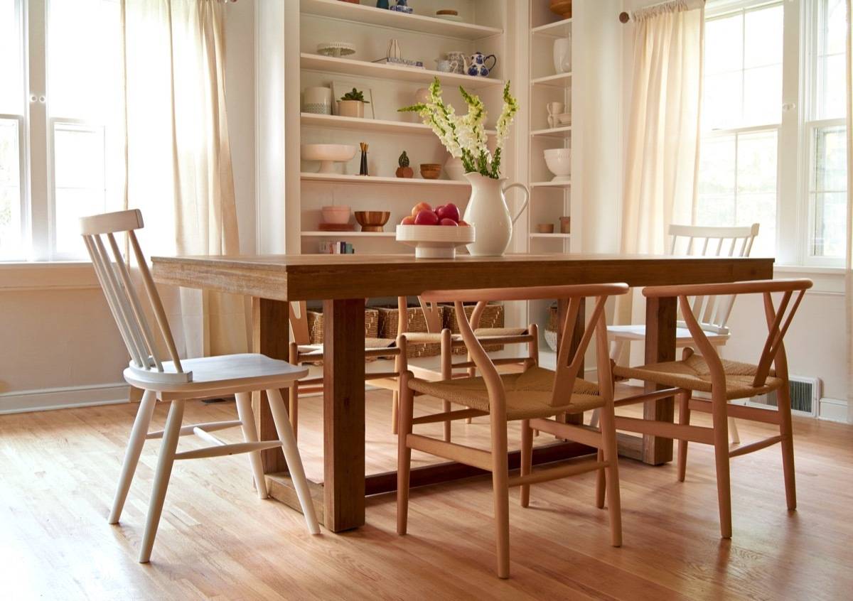
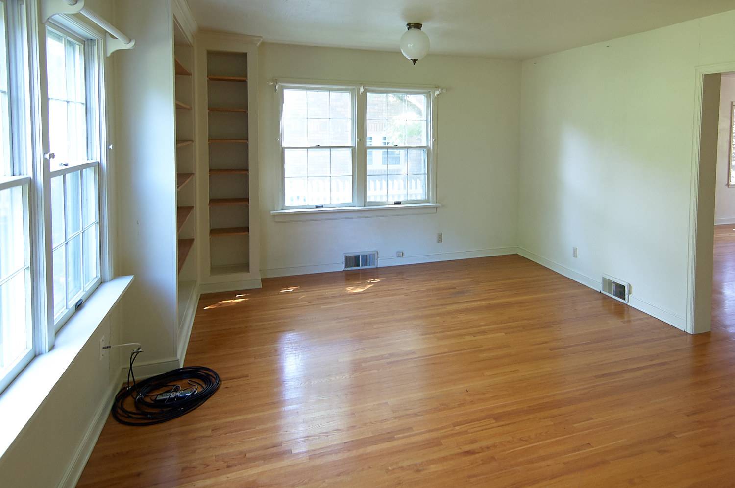
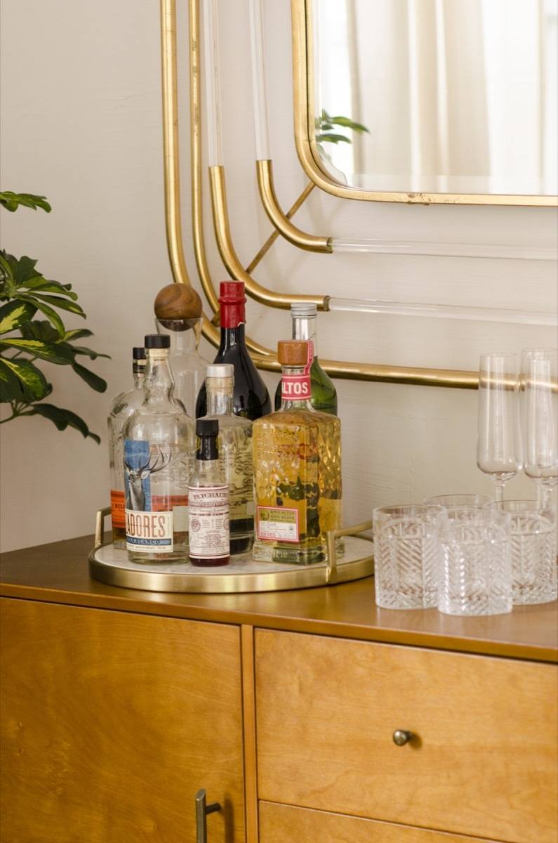
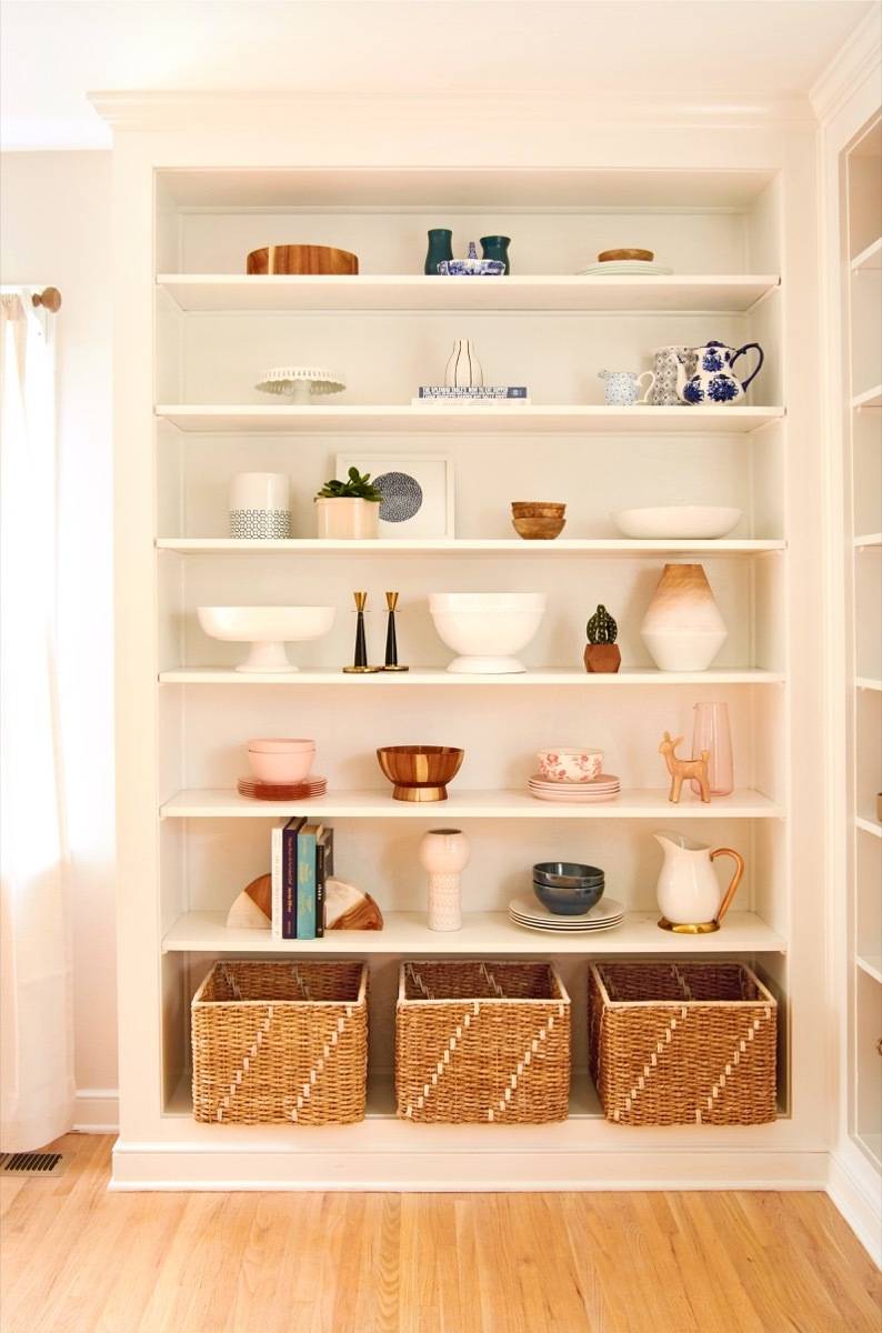
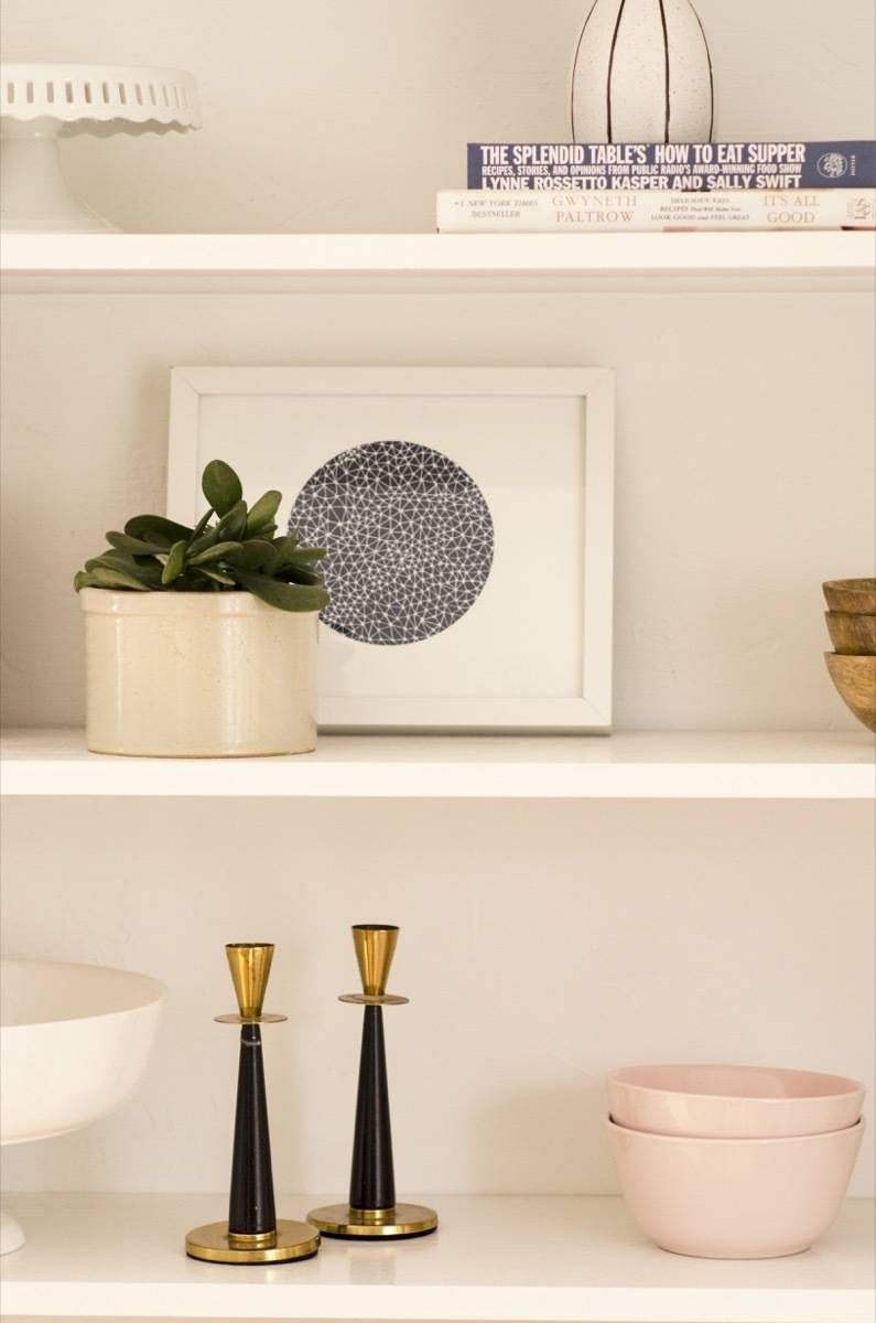
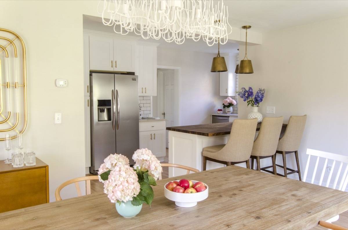
The Curbly House dining room had all the right ingredients to become a focal point for the entire home: big east-and-south-facing windows, a large open plan, and a great built-in shelving unit ripe for styling (and lots of paint). But it also had a weird closet in one corner (who needs a closet in the dining room?) and multiple ancient, sparking light fixtures.
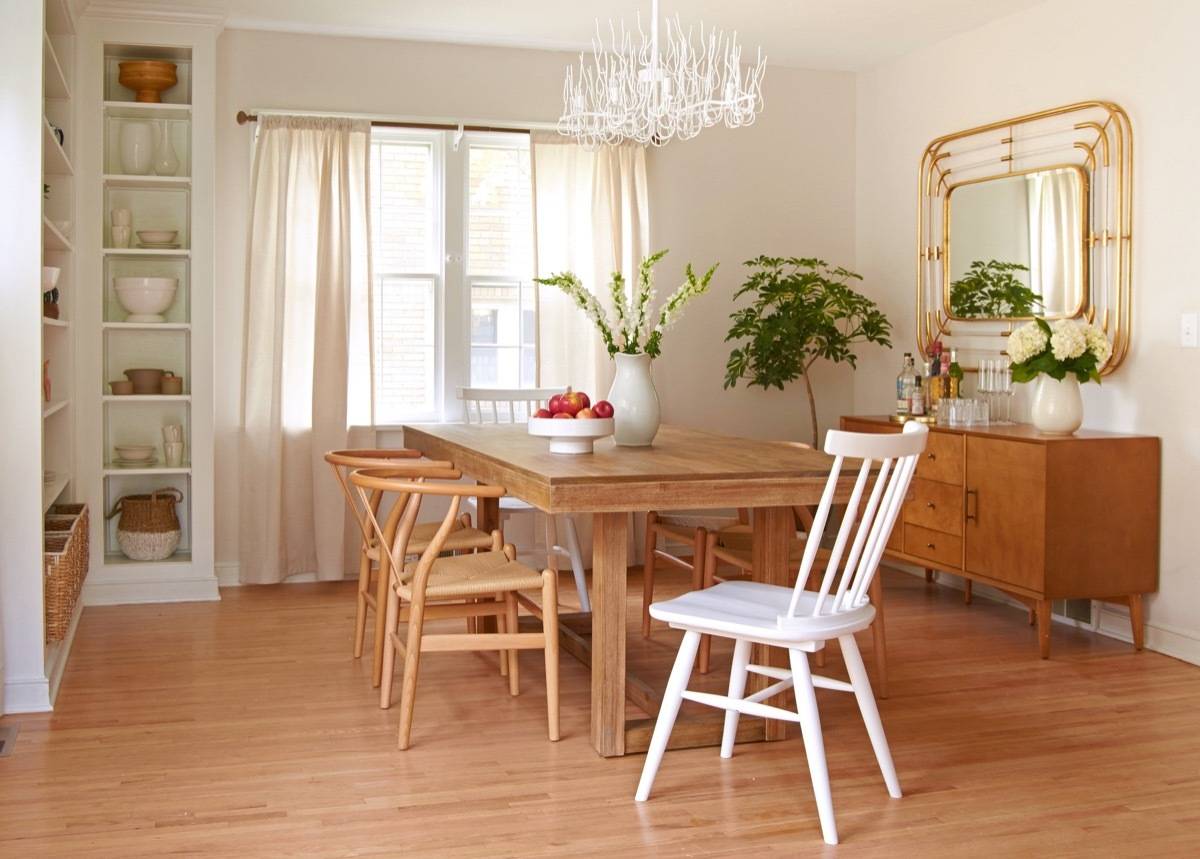
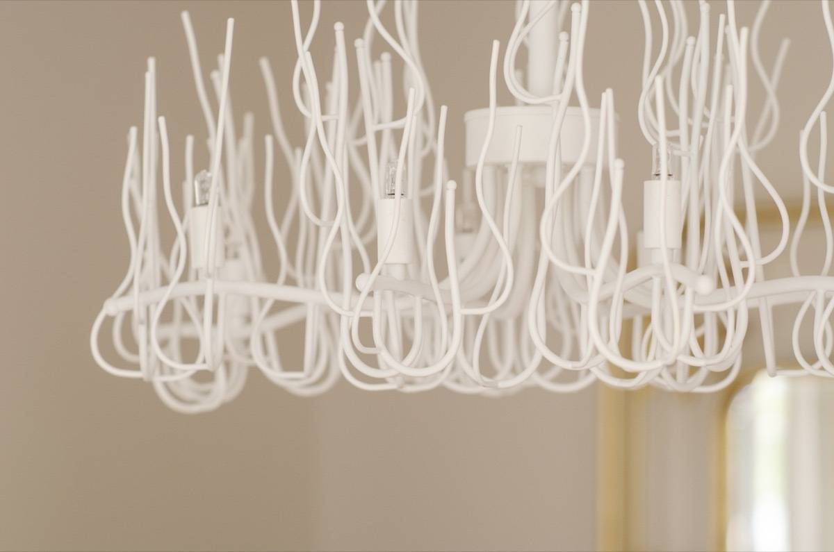
I came up with a plan to style the room in a whole new way, with a unique, attention-getting chandelier over a chunky trestle table to ground the space. And we tore down a wall between this room and the kitchen, creating a huge live/eat/work space that flows seamlessly.
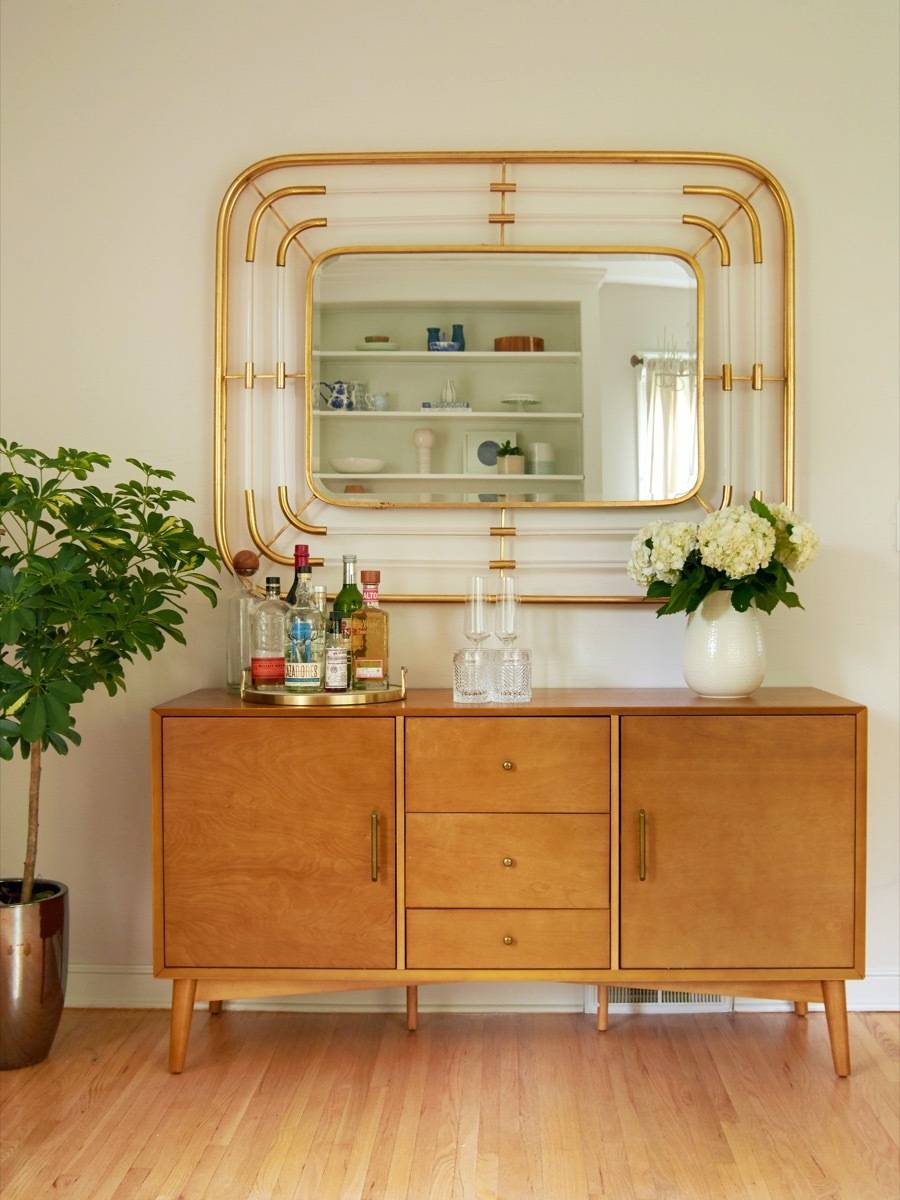
As with several other rooms in the house, all the furniture in this room is from our friends at Hayneedle (click here to shop the entire house). We loved working with them on this project because their products are curated, eclectic (hey, chandelier!), stylish (hey, table and chairs!), and shopping their site is the opposite of overwhelming (which is exactly what you need when you’re designing an entire home). Scroll down to see all the before and after pics, and get a full product list:
Products
- Table: Coaster Furniture Elmwood Dining Table
- Captain’s Chairs: Belham Living Windsor Dining Chair
- Dining Chairs: Baxton Studio Wishbone Dining Chair
- Chandelier: Dainolite Sophora Chandelier
- Sideboard: Crosley Landon Buffet
- Mirror: Uttermost Bayo Gold Wall Mirror
- White vessel: Urban Trends Round Flower Pot
- Wall paint: Sherwin-Williams Simple White SW 7021
- Trim paint: Sherwin-Williams Pure White SW 7005
Living Room
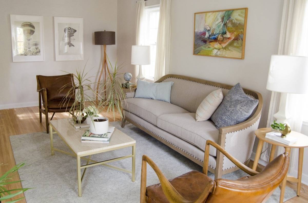
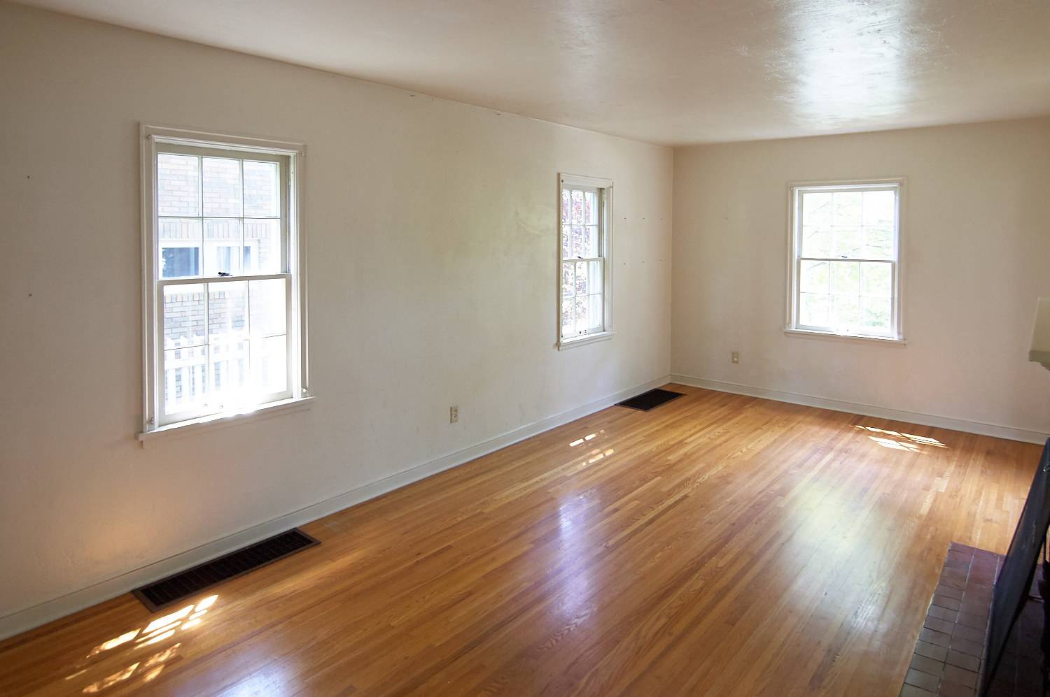
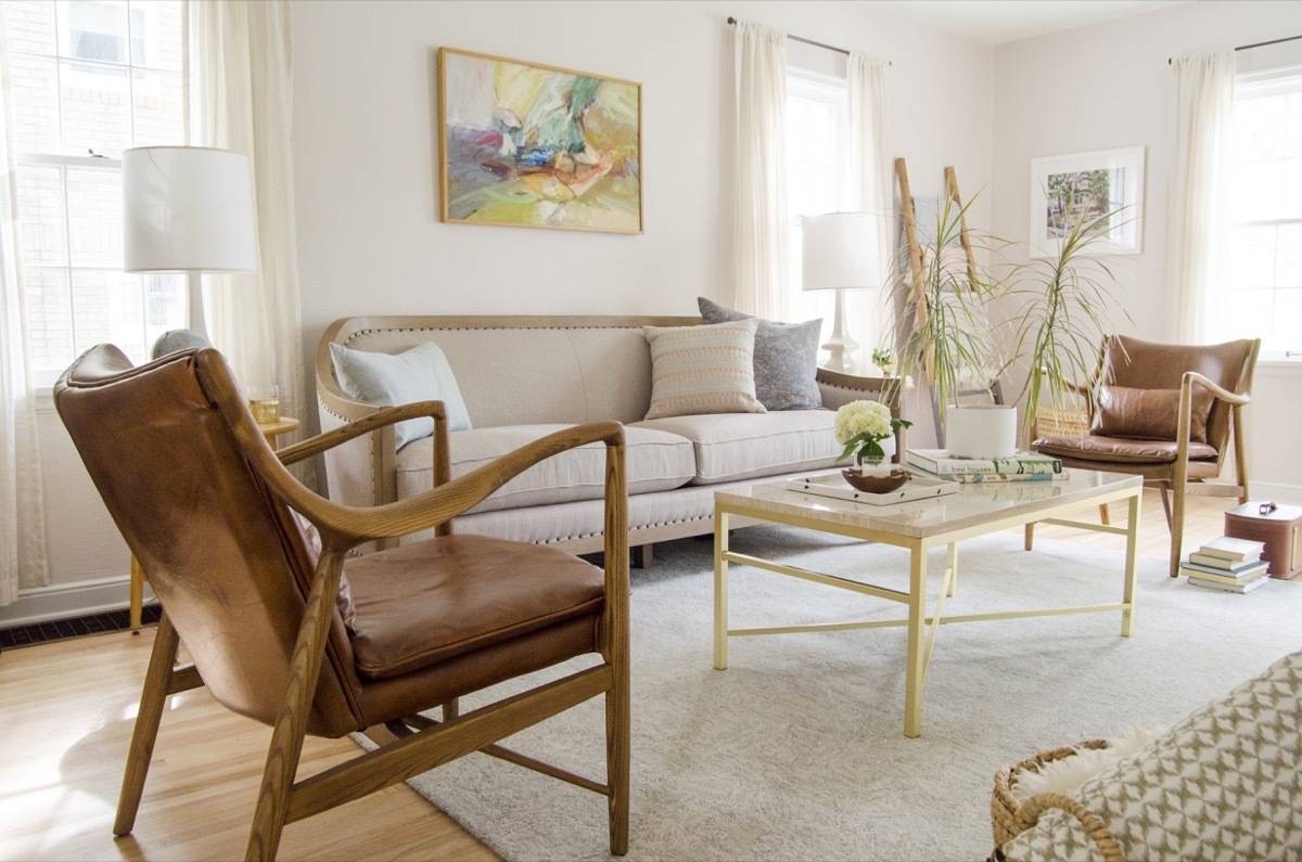
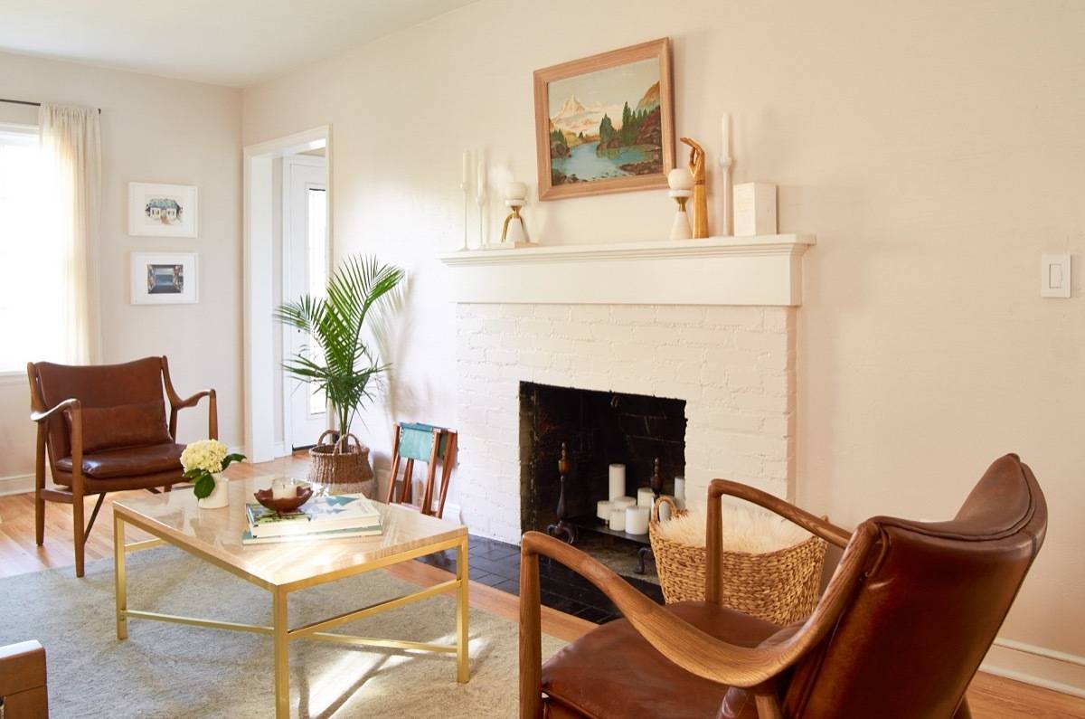
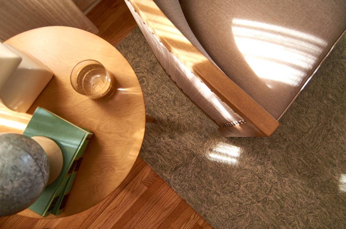
The living room is the first room you see when you enter the home, and I wanted it to set the tone for the entire house. It was the first room I created a mood board for, and it was the design blueprint for the entire first floor, which set the tone for the whole house. The living room had shaded, south-facing windows which gave it a calm, quiet feel we loved. A big oak tree just outside keeps the harsh southern light out, but sprinkles bright streaks of afternoon rays across the newly-refinished hardwood floors.
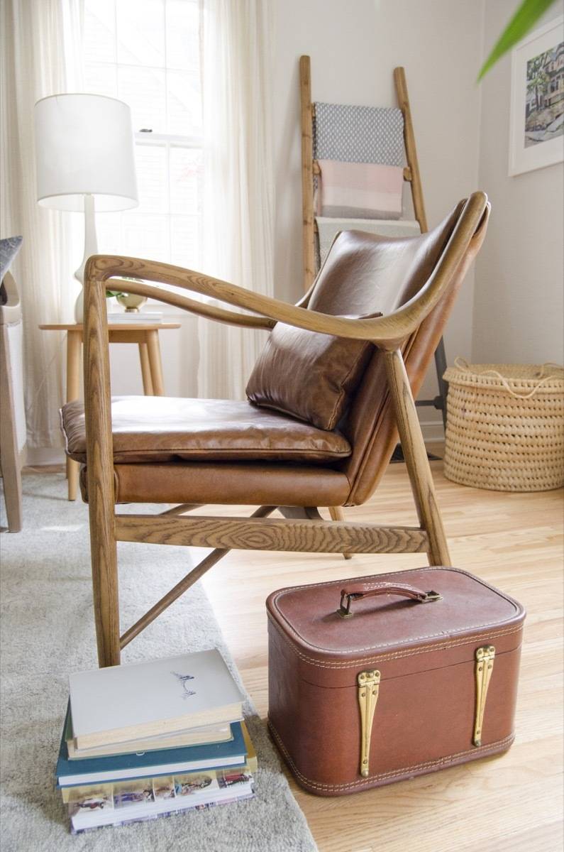
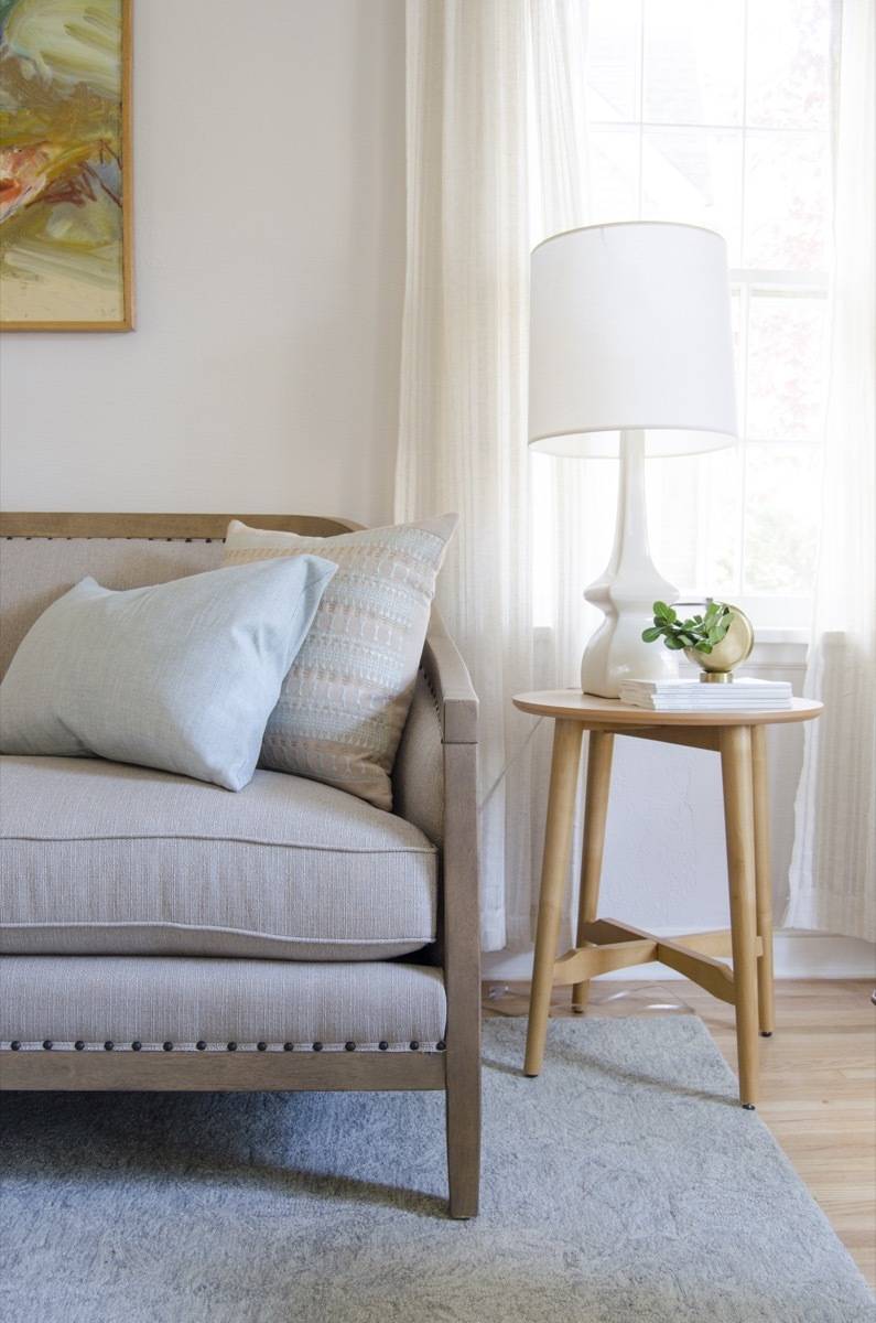
I chose a color palette that was muted and neutral, something that would let the sunshine do its thing without getting in the way. The focal point of the room is the gorgeous sofa, with its clean, curved lines and nailhead trim. But, in my view, the leather chairs are the showstoppers: they draw a comment from everyone who walks through the house. And, in case you’re curious, they’re very well-made and comfortable to sit upon. We’ve owned plenty of original mid-century-style chairs, and these definitely feel like heirloom pieces.
Shop this look on Hayneedle, and grab a pair of those chairs before they’re out of stock (’cause I’m pretty sure they will be soon):

Products
- Leather chairs: Right2Home Wood Frame Arm Chair
- Sofa: Belham Living Harper Sofa
- Coffee table: Southern Enterprises Orinda Cocktail Table
- Side tables: Belham Living Darby Mid Century Modern End Table – Pecan Finish
- Rug: Loloi Nyla Area Rug – Beige/Blue
- Floor lamp: Catalina Lighting Preston Floor Lamp
- Baskets: Quest Products TAG Two Tone Tall Basket
- Baskets: DecMode Sea Grass Basket
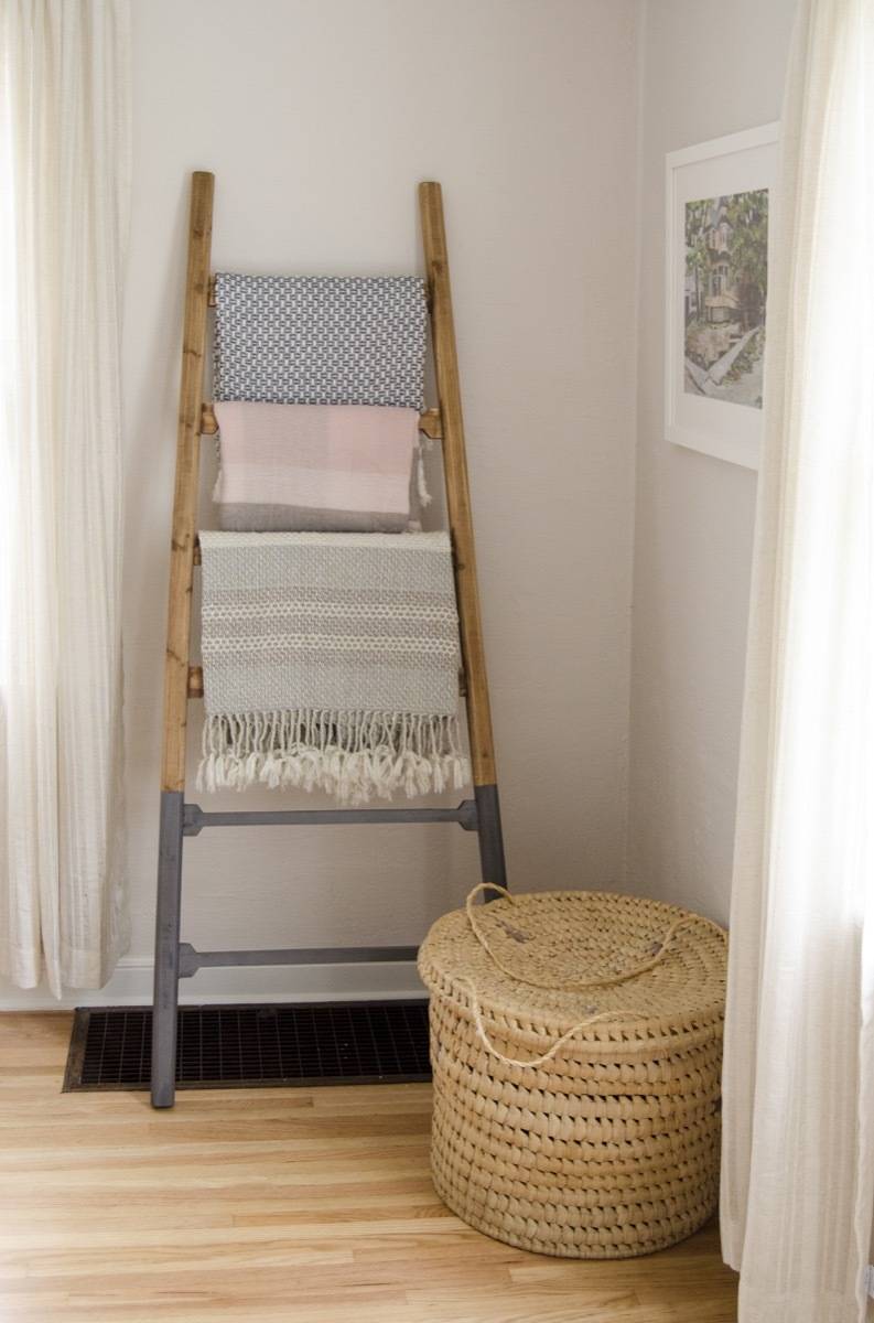
- Blanket ladder: Teton Home Decorative Wooden Ladder
- Throw blanket: Jaipur Lovell Striped Wool Throw
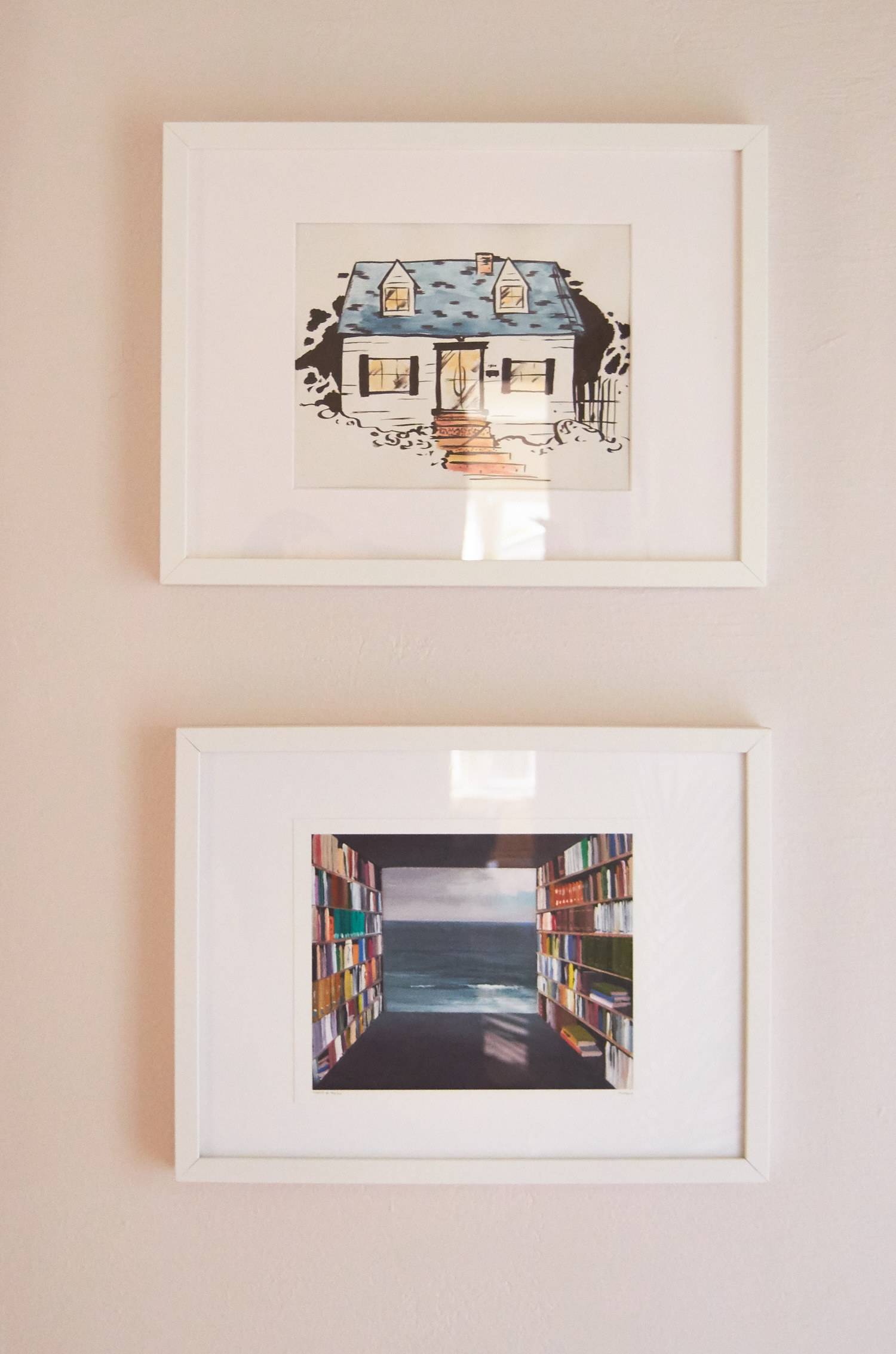
- Abstract Painting by Marion Spirn
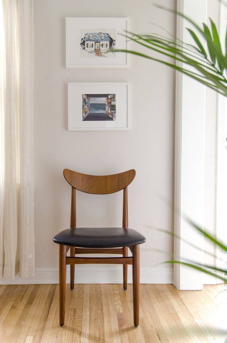
- House Portrait by M.E. Gray
- Library by the Sea Print by Jeremy Miranda
- Wall paint: Sherwin-Williams Simple White SW 7021
- Trim paint: Sherwin-Williams Pure White SW 7005
Master Bedroom
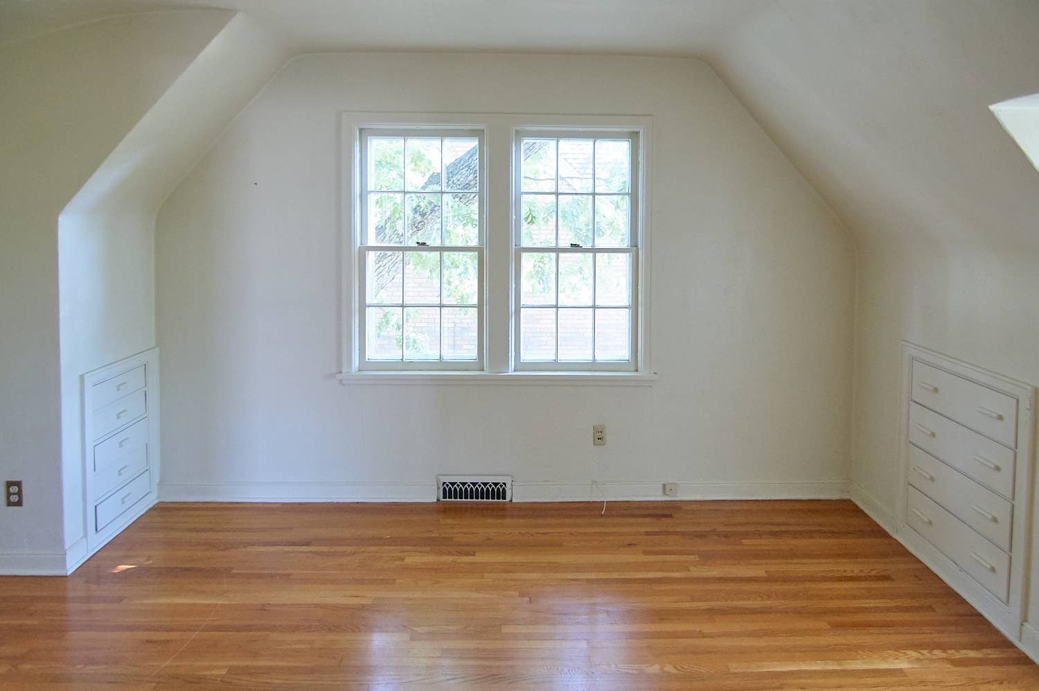
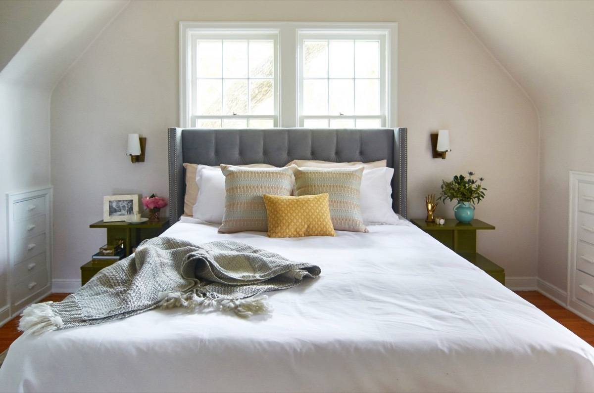
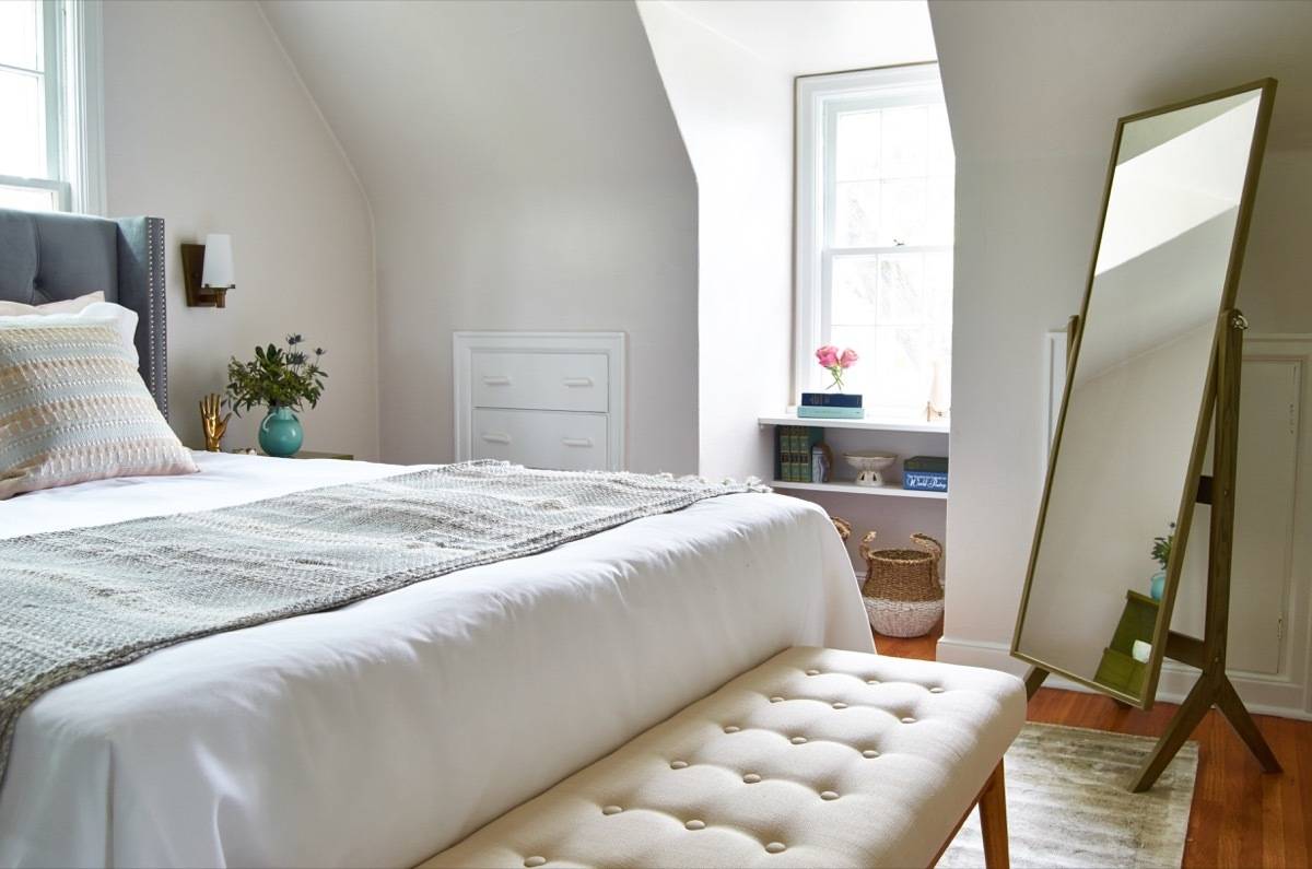
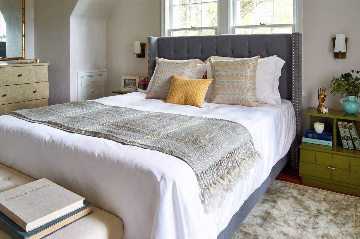
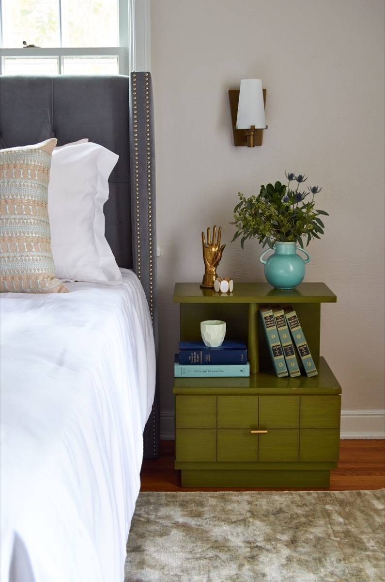
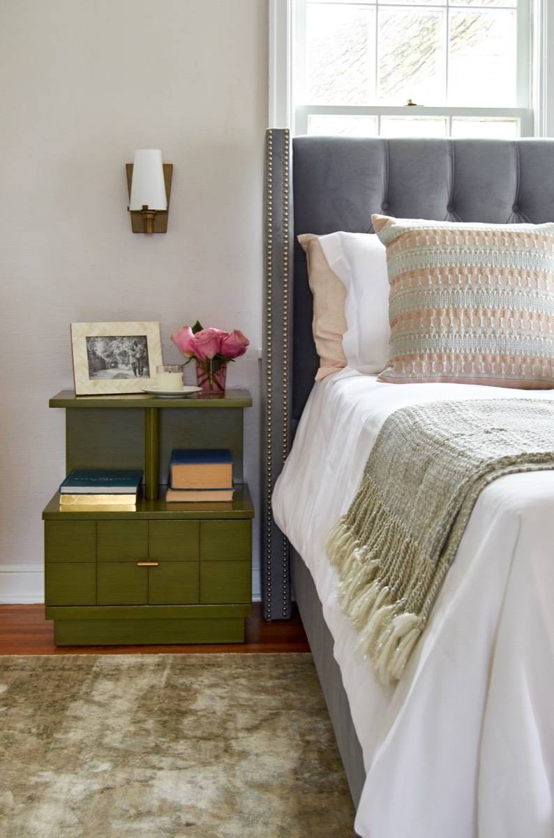
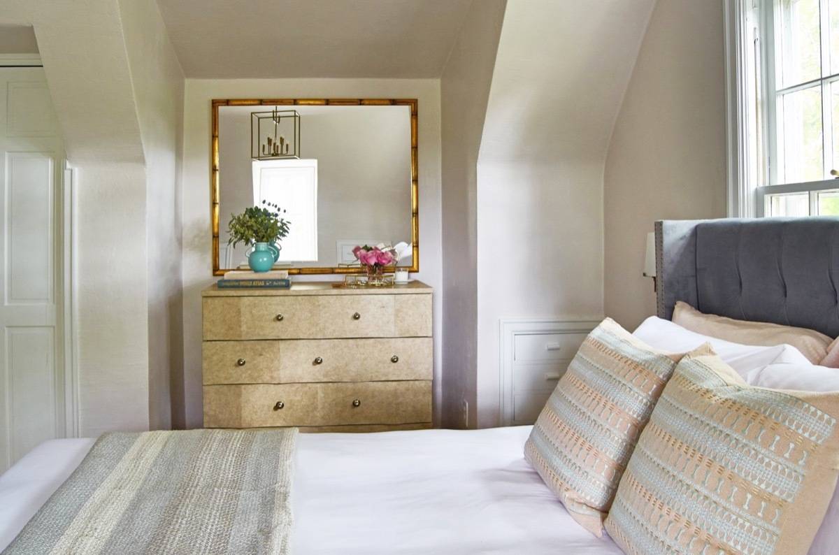
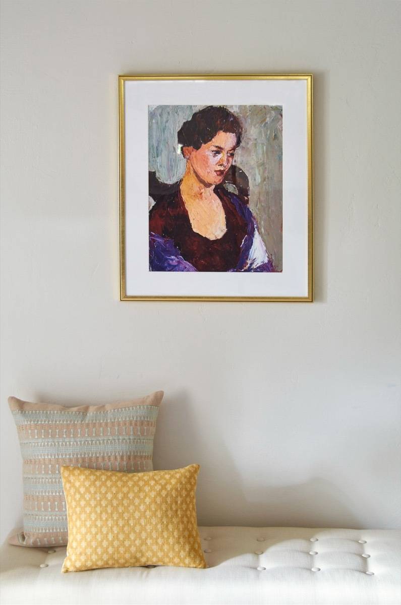
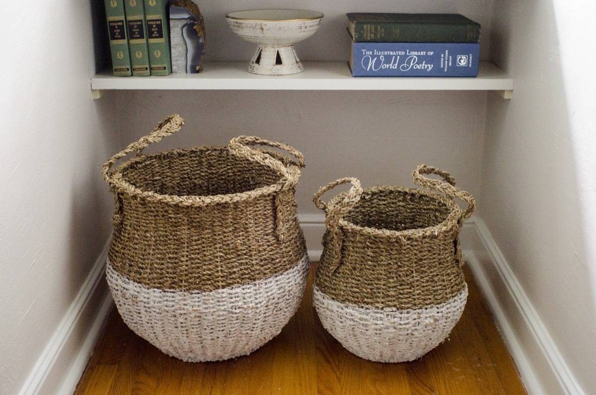
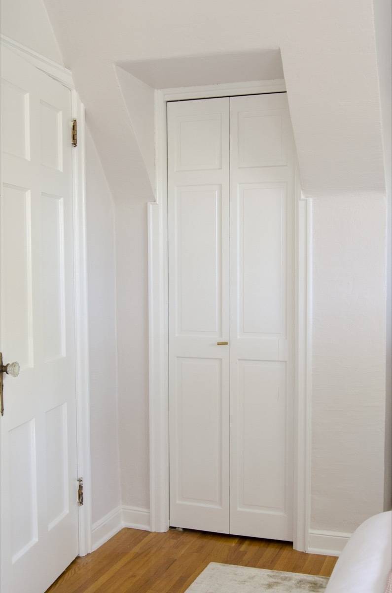
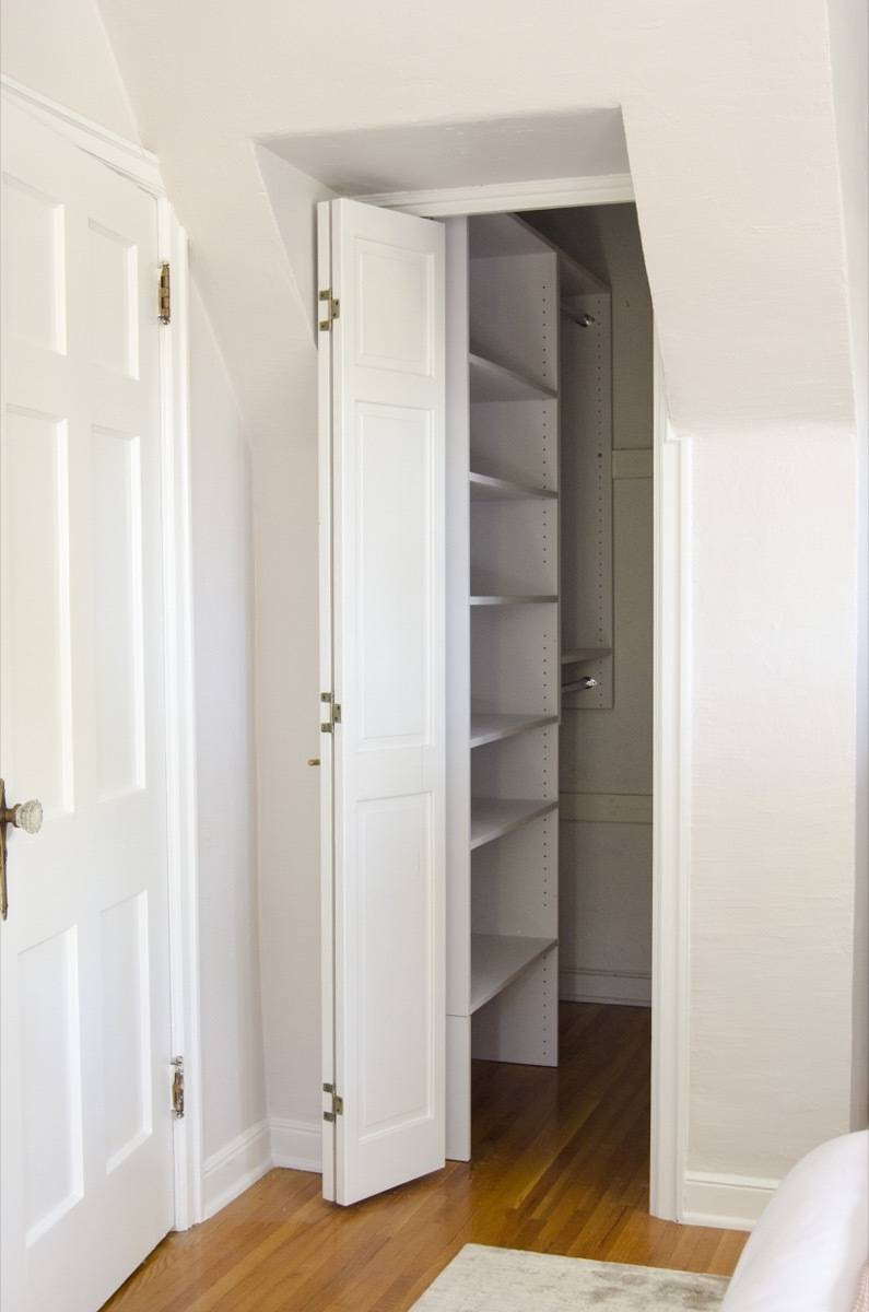
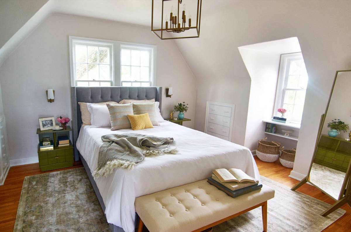 The master bedroom has just about as much ‘character’ as you can squeeze into a room. The ceiling lines, the big windows, the charming gable-end nook, and built-in drawers scattered throughout. These are the kinds of architectural details that are so hard to come by in new construction, and while some of them are weird and funky (and hard to design around), that’s exactly the point: this room is anything but an empty box. It comes with its own opinions about how it should look, and the interplay between the designer and the room is what makes things interesting, and ultimately, beautiful.
We teamed up with Hayneedle to outfit this room with a delicate design that takes full advantage of the 100-year-old quirks inherent to the home. The house sits atop a hill, and from the bedroom windows you have a full view of the fall foliage and, in the distance, the Minneapolis skyline (picture a soft-toned heart-eye emoji here, please). It’s a perfect retreat, with incredible afternoon sunlight, and although it’s not a huge bedroom, it has two (modest) walk-in closets and enough space for a spacious dresser.
Shop the products in this room on Hayneedle, but don’t expect to find the skyline view for sale: you have to buy the whole house to get that one (now, insert the winky face emoji).
Products
- Bed: Diamond Tufted Wingback Velvet Upholstered Bed With Nailhead Trim
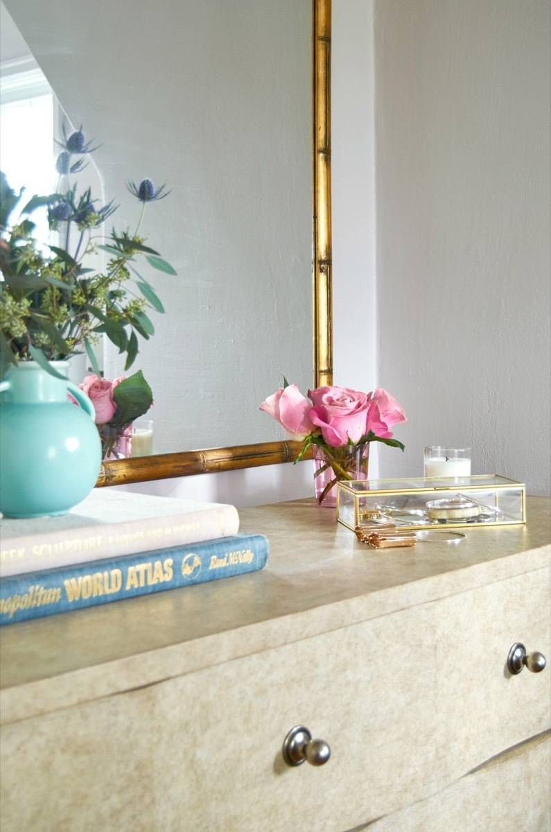
- Dresser: Coastal Living Resort by Stanley Furniture Ocean Breakers Dresser
- Side tables: vintage
- Rug: Loloi Lyle LYLELK-04 Indoor Area Rug
- Sconces: Designers Fountain Hyde Park
- Bench: Belham Living Darby Mid Century Modern Upholstered Bench
- Mirror: Belham Living Modern Cheval Mirror – Driftwood
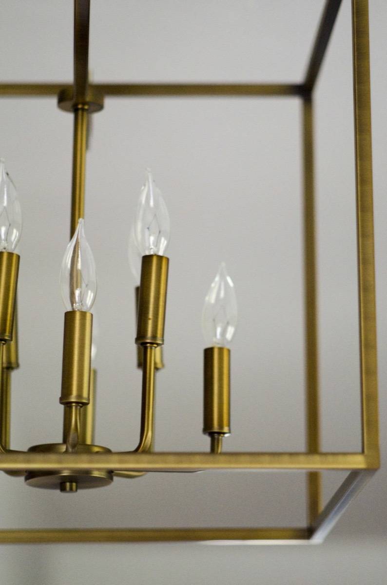
- Chandelier: Designers Fountain Uptown Chandelier
- Pillow: Rizzy Home Textured Stripe Decorative Pillow
- Duvet: Linen Duvet Mini Set by Harbor House
- Bedding: Superior Cotton Rich Solid Duvet Cover Set
- Closets: Modular Closets
- Wall paint: Sherwin-Williams Simple White SW 7021
- Trim paint: Sherwin-Williams Pure White SW 7005
Kitchen
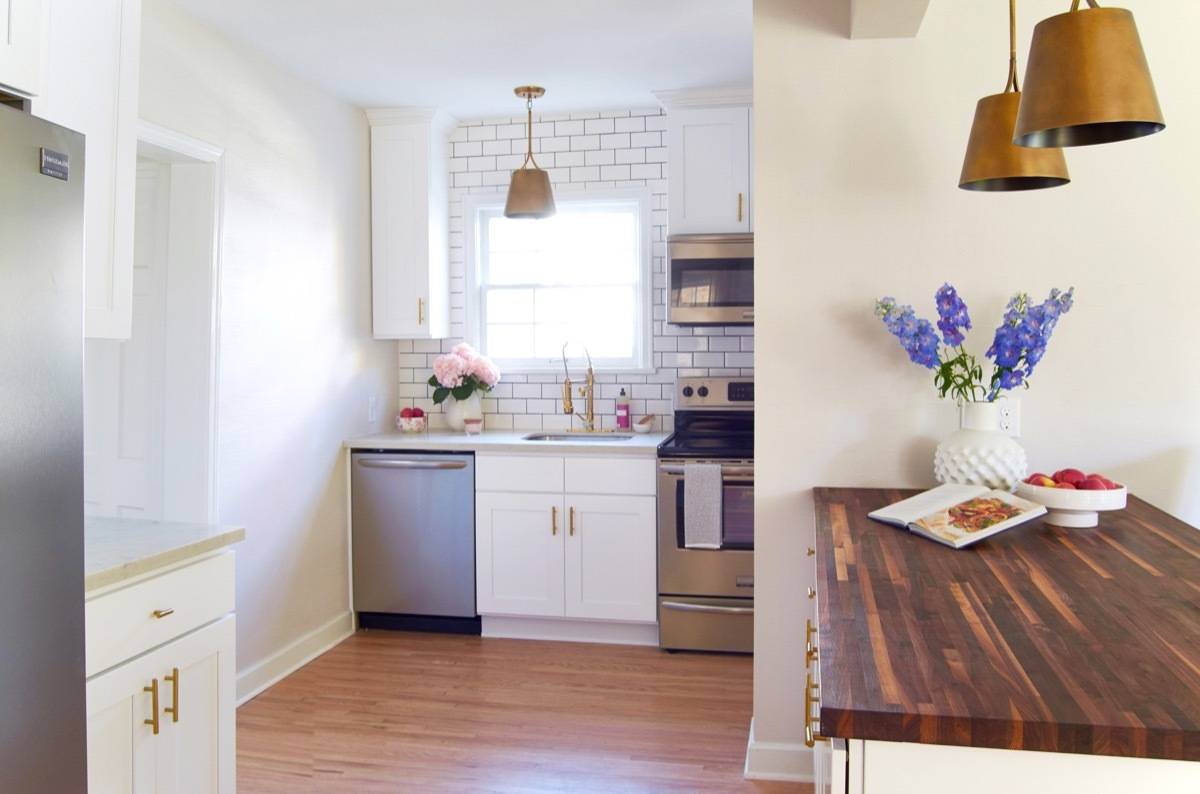
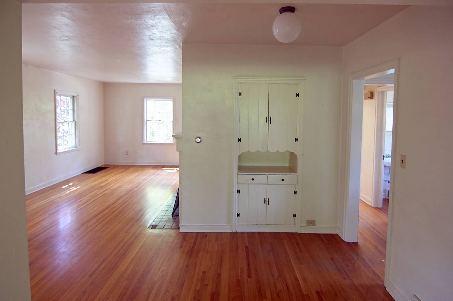
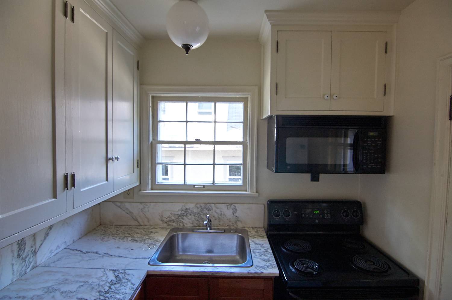
The kitchen! The kitchen! Oh, have mercy! I am beyond the horizon thinking about the transformation we were able to achieve in this room. When we walked through the house for the very first time, it was – honestly – easy to just overlook the kitchen. Where was it?! Did we miss it? It was tiny! In a wee closet. Just about seven feet by seven feet (which is basically like a cubic version of LeBron James), with an exterior door opening right into the space, blocking the fridge and the stove. I’m not exaggerating when I say that you couldn’t comfortably fit two people in the kitchen at once.
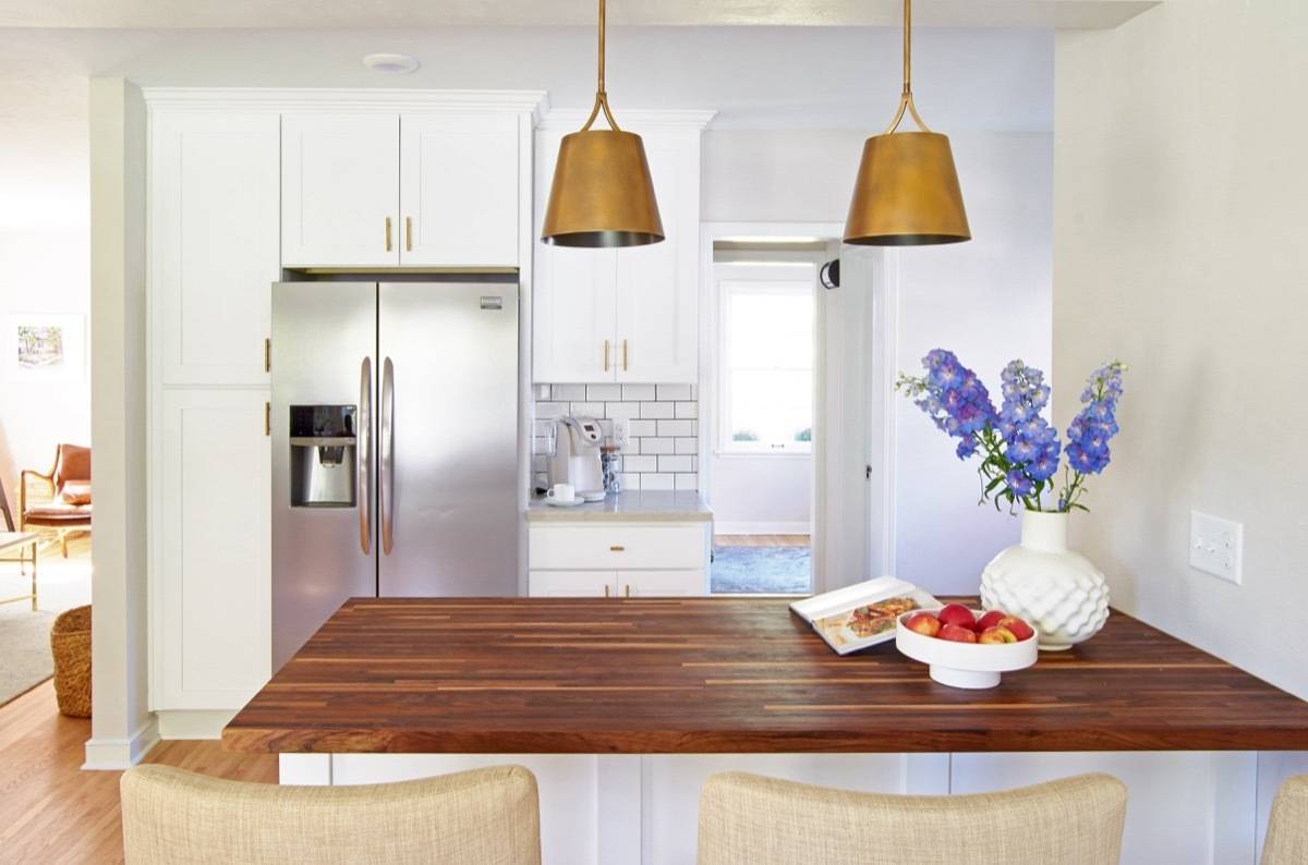
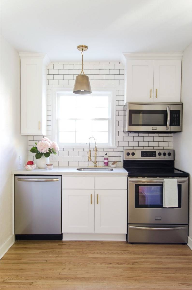
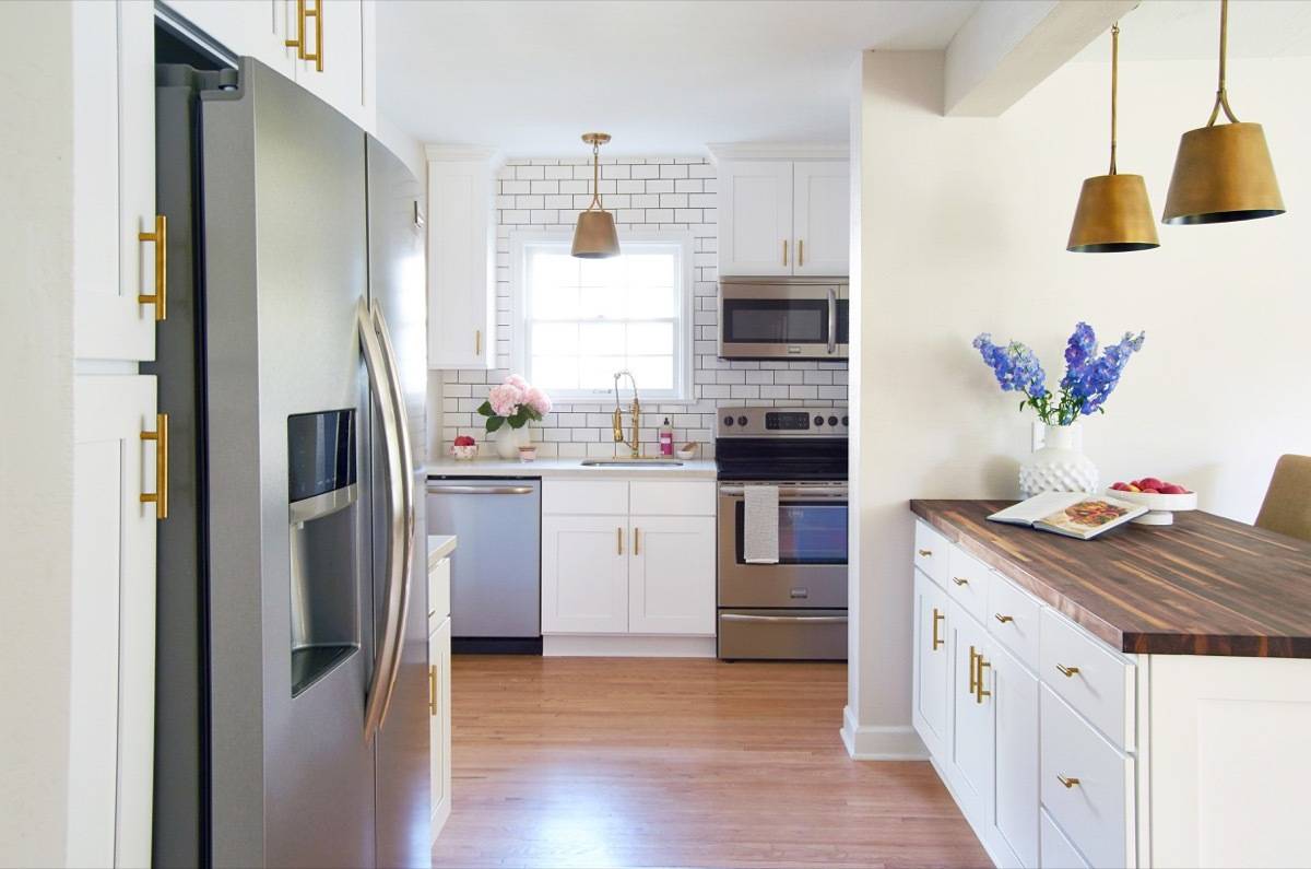
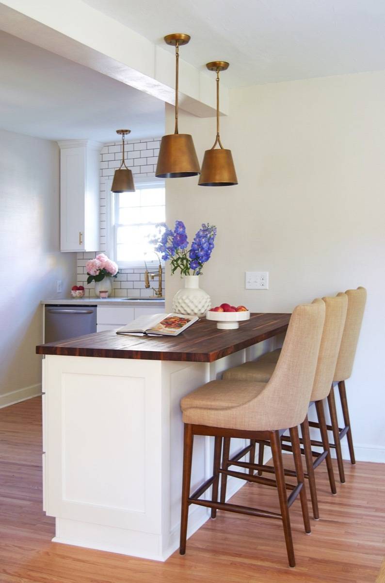
We knew this would be our biggest challenge in the remodel. We played around with lots of different plans, but finally settled on one that we thought we could pull off without moving any plumbing (important to help keep the cost down). We tore down a wall between the kitchen and the dining room, creating an amazing butcher block-top island (from our partners at Lumber Liquidators).
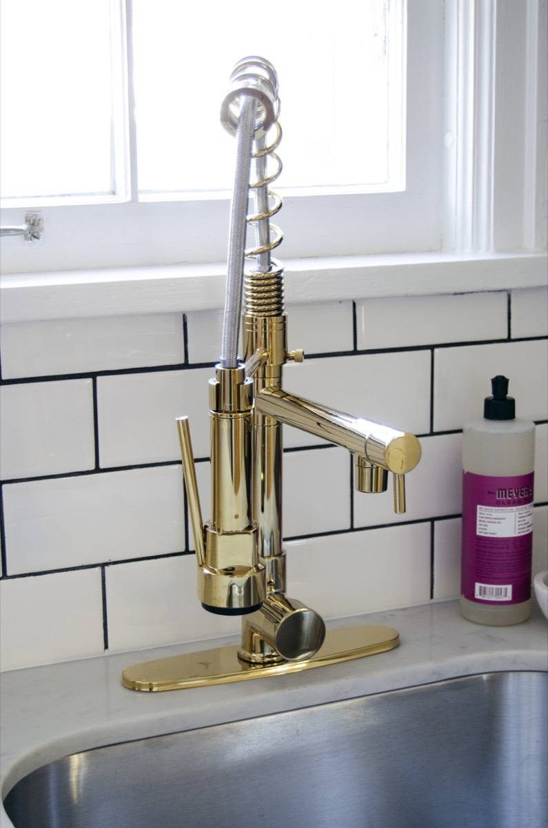
Then we took a very classic (dare I say, simple?) white shaker cabinet and elevated it with shiny brass hardware, and a very bold black-grouted subway tile backsplash. The pendants, from Lamps Plus, complete the elegant look, drawing your eye around the room and casting a soft, golden glow (even when they’re turned off).
Let me digress for a brief moment with this PSA: Lighting is everything! Your lighting is a ceiling sculpture, a work of art, and you are doing no one any favors by selecting boring, basic, flush-mount boob lights, or snazzy, tiny marbley-colored pendants. Go big with your lighting! It’s totally worth it! Do you see these charming, brass pendants? They take your breath away! They demand respect! They are perfect! Thank you!
Here’s a look at what the kitchen had to offer (nothing!) before we got to it, and how it looks now (all the BIG heart GIFs, etc…):

Products
- Appliances: Frigidaire Gallery Collection
- Faucet: Rozin LED Light Pull Down Spray Kitchen Sink Faucet
- Pendant lights: Kichler Maclain 10″ Wide Natural Brass Mini Pendant
- Cabinet hardware: Goldenwarm Brushed Brass Cabinet Cupboard Drawer Door Handle Pulls
- Stools: Belham Living Carter Mid Century Modern Upholstered Counter-Height Stool
- Wall paint: Sherwin-Williams Simple White SW 7021
- Trim paint: Sherwin-Williams Pure White SW 7005
The Exterior Entries
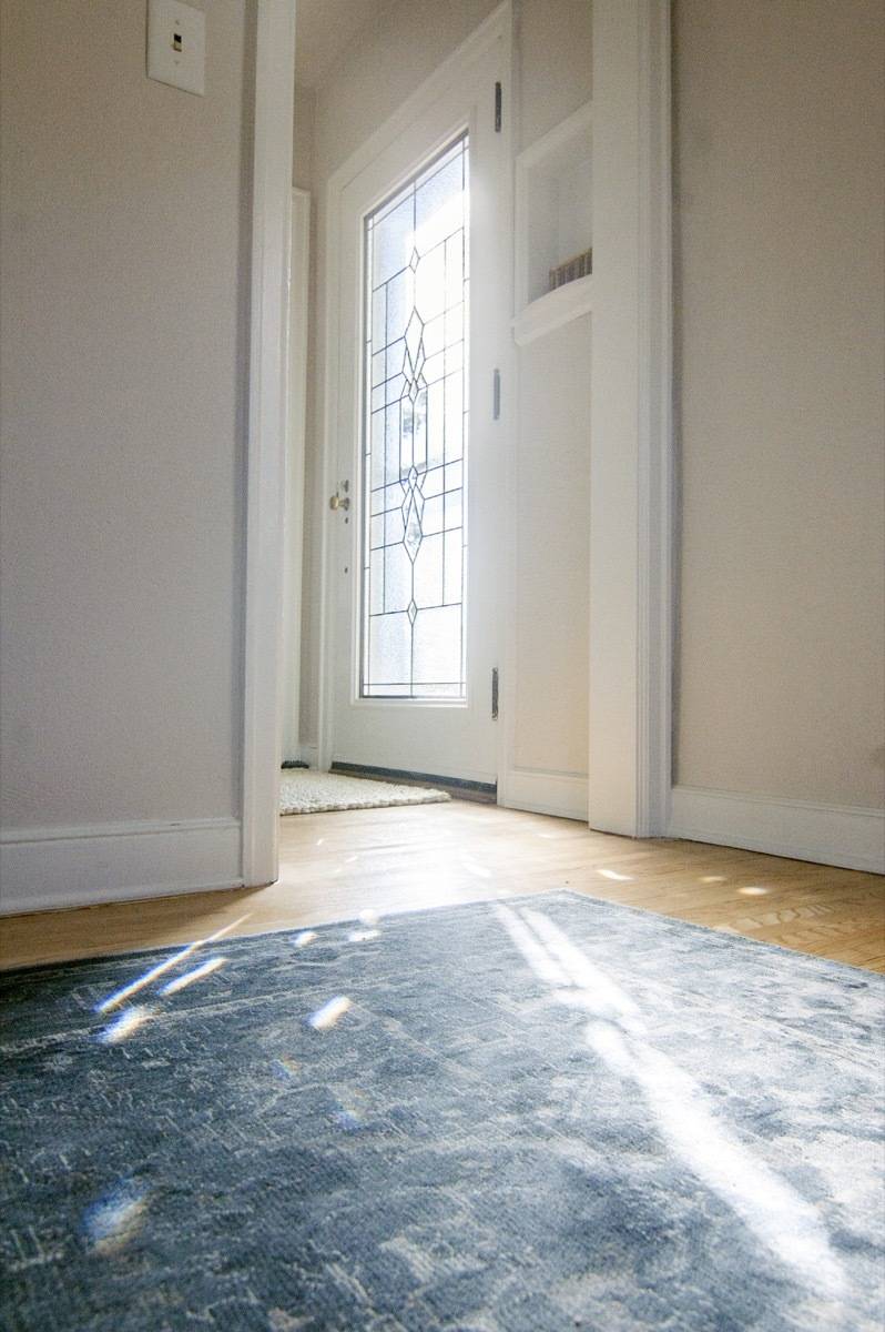
I will grant you that heading is a little awkward (I couldn’t think of another way to title it), but you know what’s not awkward? That absolutely stunning new front door we put in (on) this house! And the best part? It’s not really a new door at all; it’s the same old door with a new glass insert from Zabitat.
Take a look at what an incredible difference this insert makes:
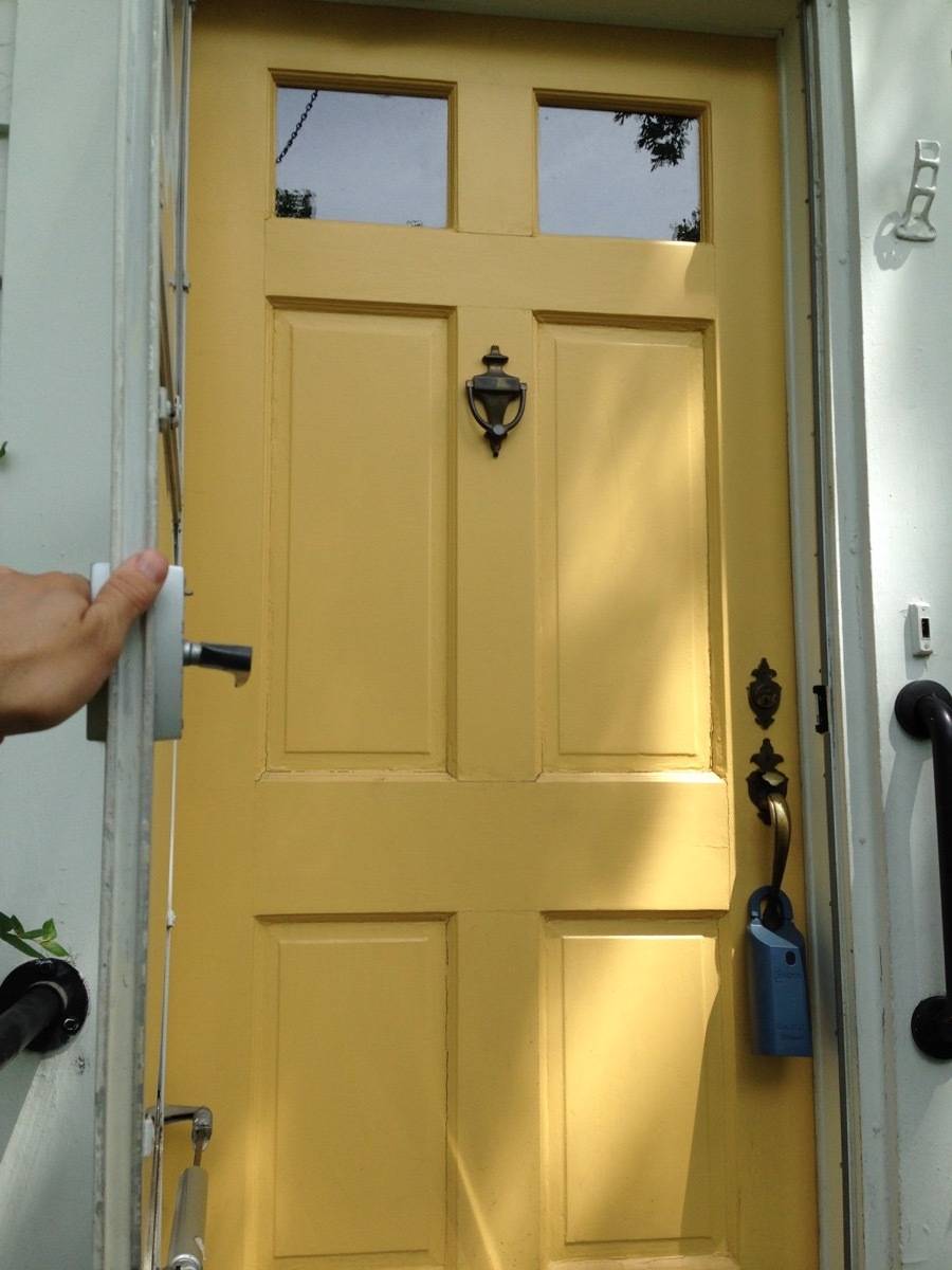
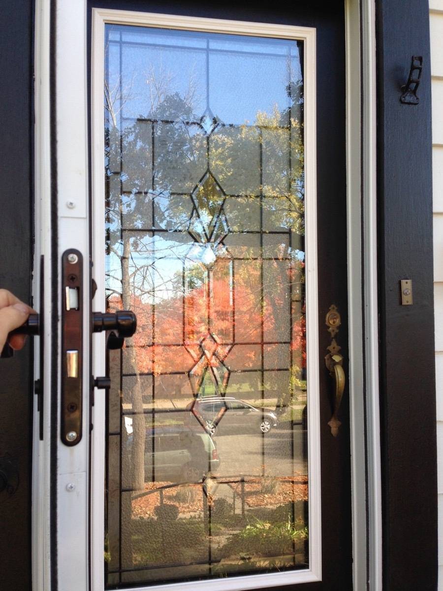
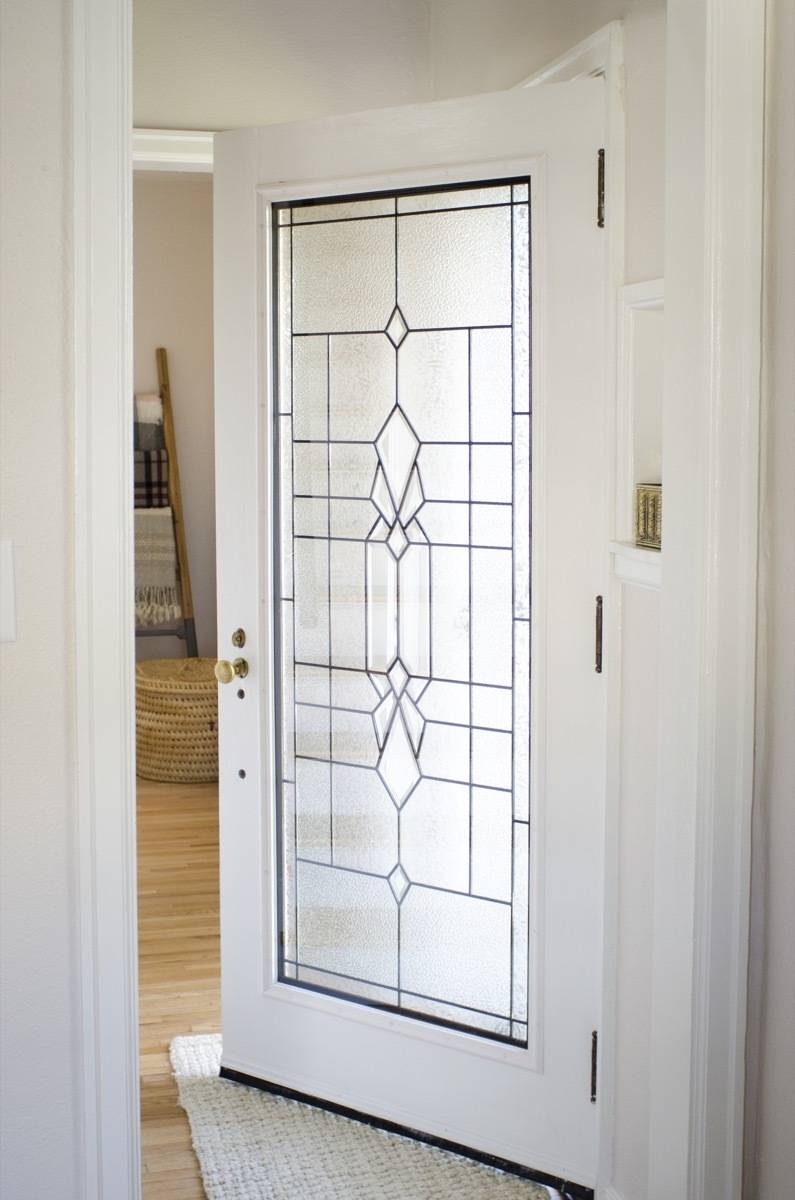
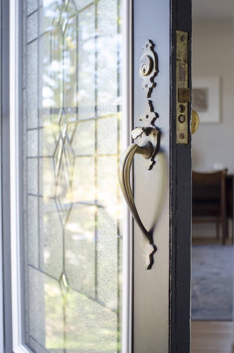
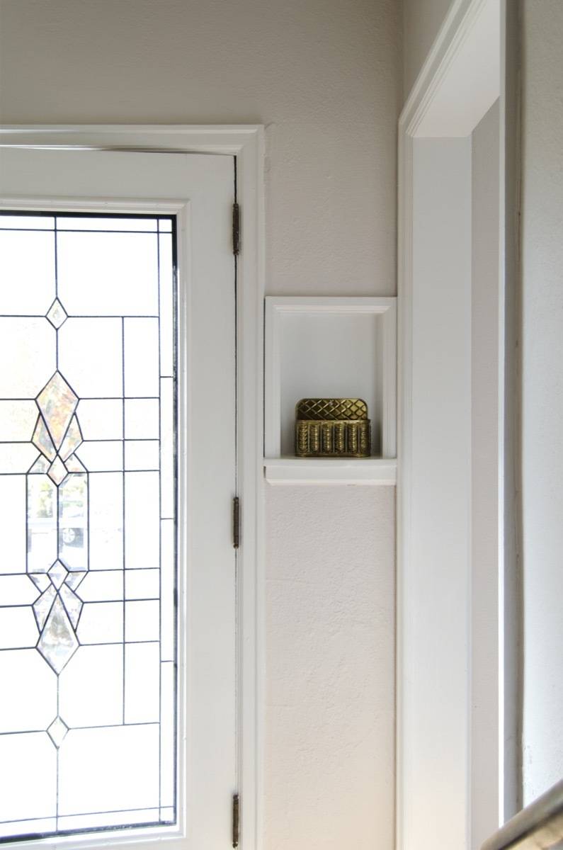
Above: it’s the little details that give a home true character. Things like original door handles, and this charming little entryway nook.
The cool thing about this glass insert is that it’s a totally DIY-able project. Anyone who can handle a jigsaw (and Bruno says, that’s anyone) can do this in about two hours. You simply cut out the middle part of your old door, set the new insert in place, and fasten all the screws. The carefully-designed trim pieces give you lots of leeway to make your cuts, so it’s pretty hard to screw up.
We liked the front door insert so much, we decided to try one on the new back door as well:
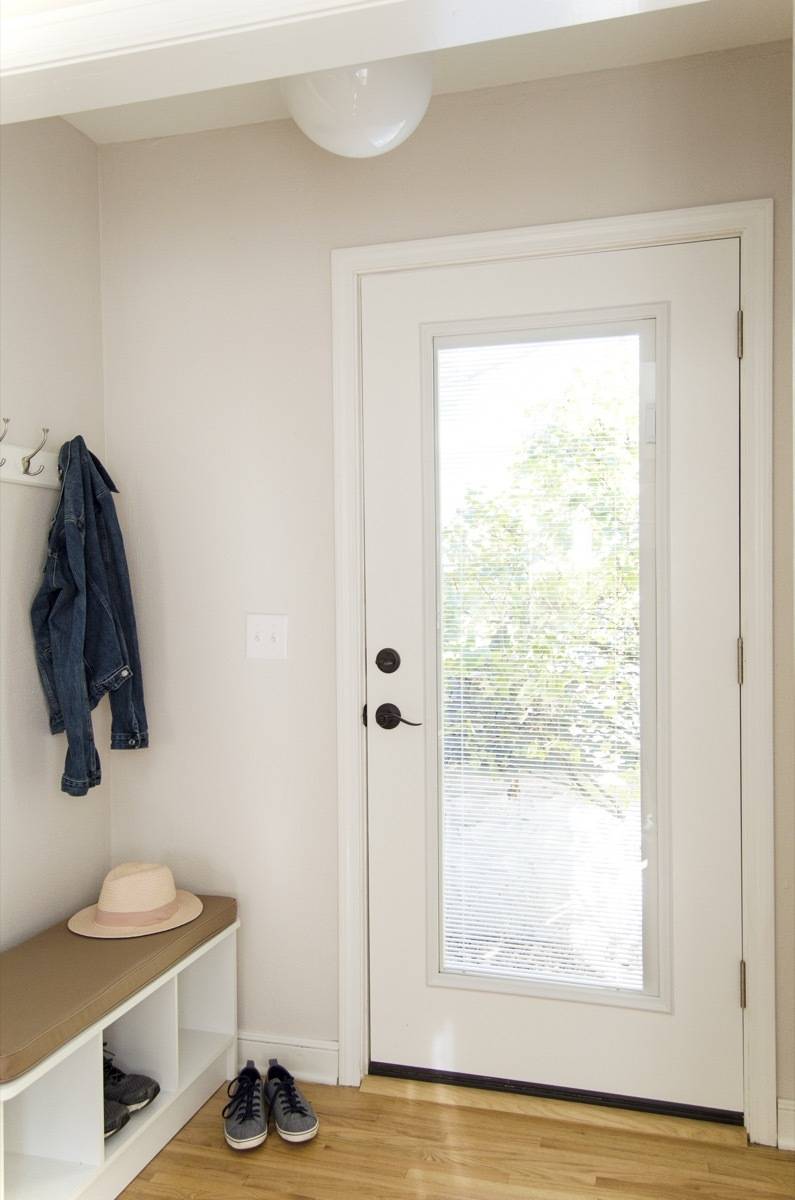
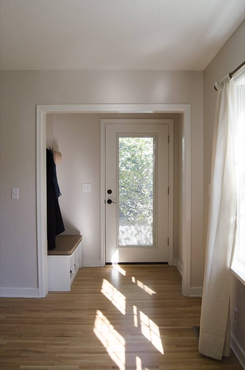
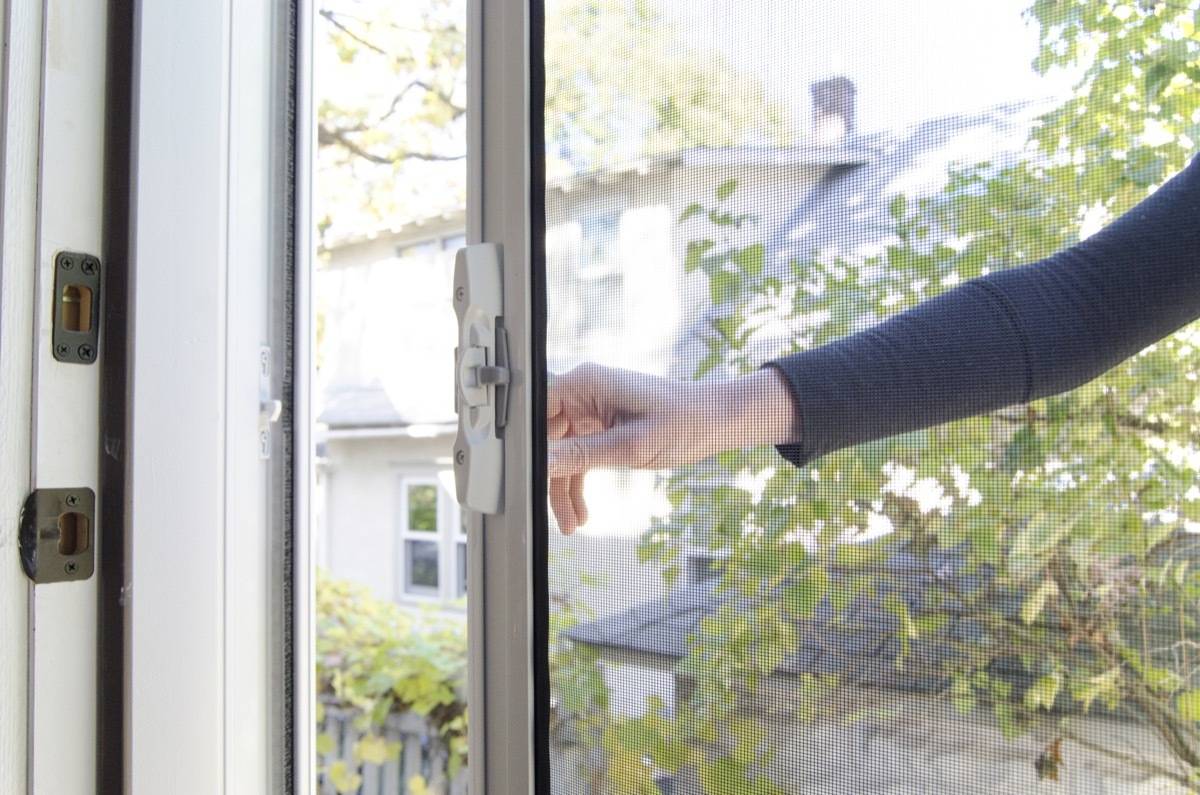
This one has built-in blinds (enclosed within the door glass, so they never get dirty). The rear-door glass insert allows lots more light into the dining room, which we love. We added a Brisa retractable screen here too, so in the summer, the dining room will get lots of cross-ventilation and feel open and airy.
Outside

Well … the people who lived here before did not like grass. And I get it, grass can be kind of a pain to take care of, but this yard was a f’real jungle (front and back):

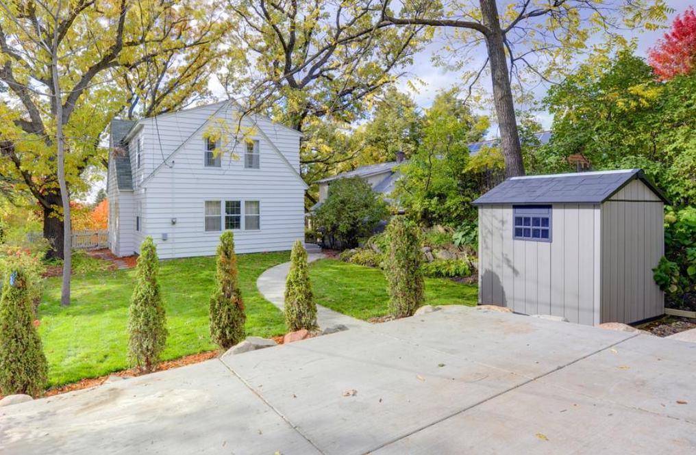
We envisioned a family with kids living in this house, so we knew the yard would need at least some usable play space. Also, we added a storage shed for bikes, lawn mowers (and snow blowers), as well as a big two-car parking pad and brand new sidewalk.
Before this backyard transformation, the only way in and out of the house was up the long front steps. In the winter, that would’ve been a real hassle for someone carrying groceries. Now, there’s a convenient place to park off the back alley, and access to the rear door is easy (and flat).

Trim and shutters are SW 6258 Tricorn Black.
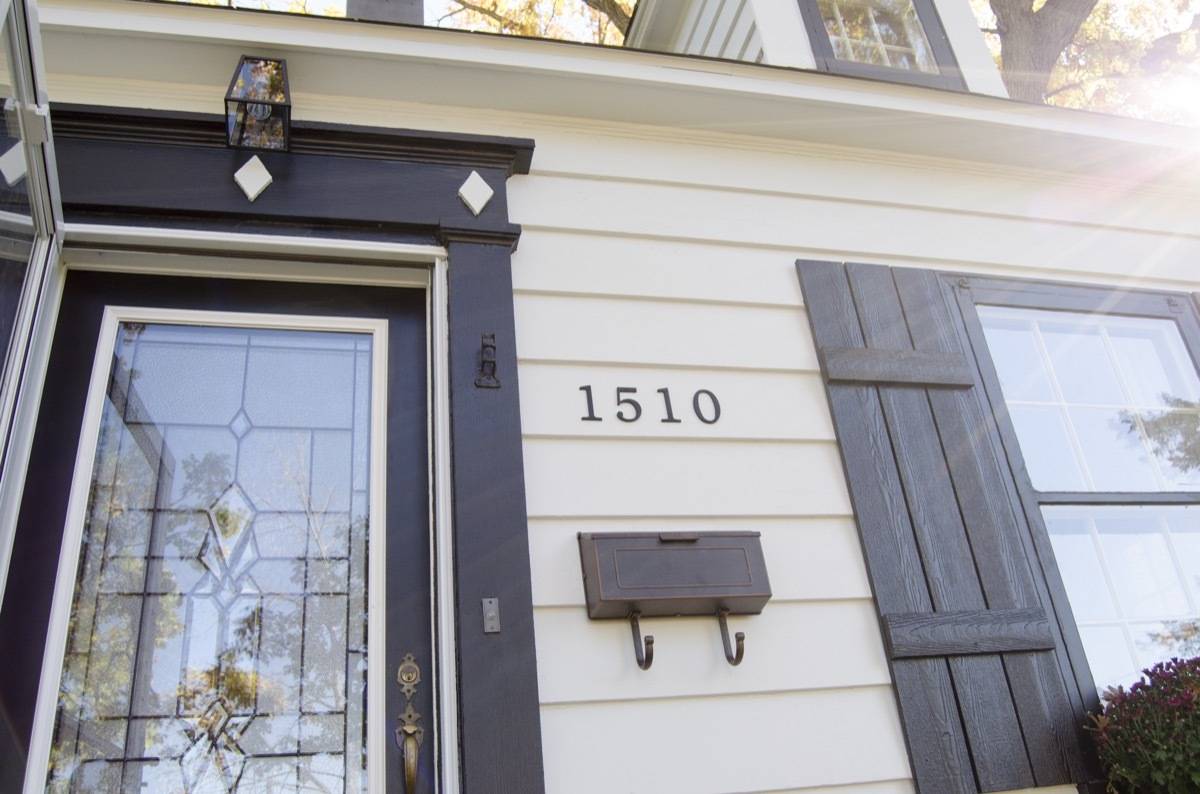
Those shutters were a quick DIY project that Bruno pulled together. Just a few exterior trim boards from the hardware store, measured and cut to length to make board and battens. Don’t they look sharp?
Boy’s Room
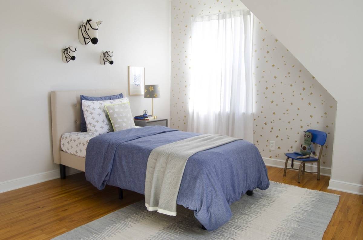
The narrative for the next three rooms (the children’s bedrooms) is going to sound like Groundhog Day, because that’s how I feel about their design. While designing these rooms, I discovered that it’s tricky business to create beautiful spaces for children that exist only in your mind. I suppose that’s true of all design, but for me, these rooms had to straddle “adorable/stylish/childlike” without being too specific. So, I followed a brand-driven template for the rooms that worked pretty well. Each child’s room is a pie-chart divided evenly between Target, Rugs USA (or Amazon), and Land of Nod. All three companies hit children’s decor out of the park. So, I came up with a system, and repeated it. Do I fear they’re formulaic? A little bit, but I also LOVE everything I chose and believe they’re primed for little touches of extra character the new owners will add.
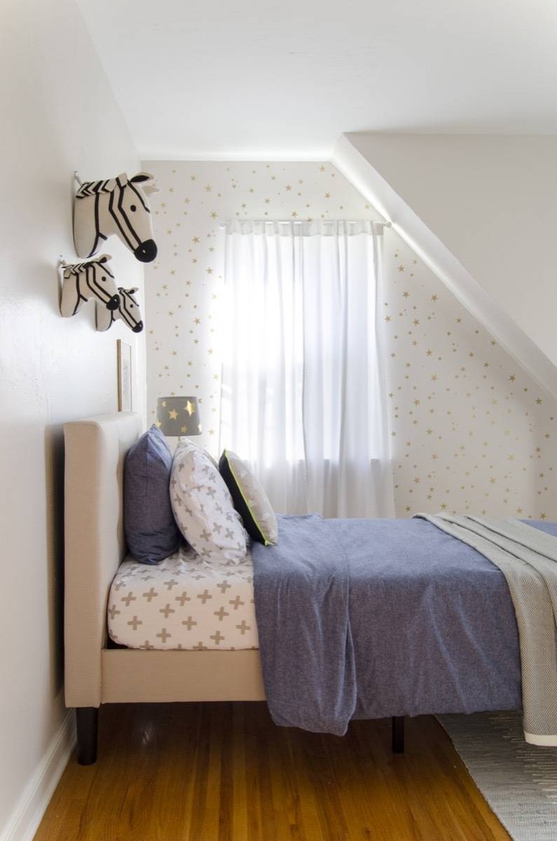
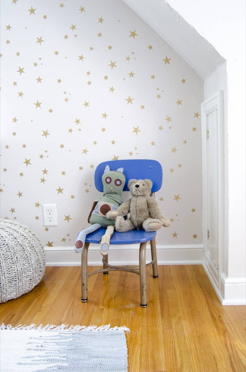
My favorite part of the little’s boys room (we called it this, but obviously, it’s ready for any child) is the starry accent wall. I love the symbolism of a starred wall – you can reach for them, wish on them, and more. I love the way the wall creates a focal point of the room, but remains neutral and pretty chill.
The rest of the design feels soothing, with grays and blues, and hints of gold. You can read more about the thought that went into this room here (the post is complete with a stenciling tutorial, if that’s your cup of tea).
Products
- Star Accent Color: Martha Stewart Metallic Multi-Surface Gold Paint
- Star Stencil
- Rug: Safavieh Montauk Collection Handmade Flatweave Rug
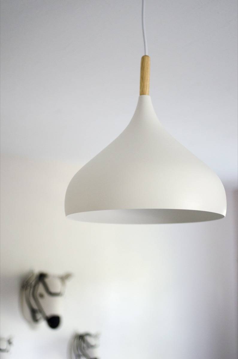
- Pendant Light: Felton White Aluminum & Wood Pendant
- Bed: Zinus Upholstered Button Tufted Platform Twin
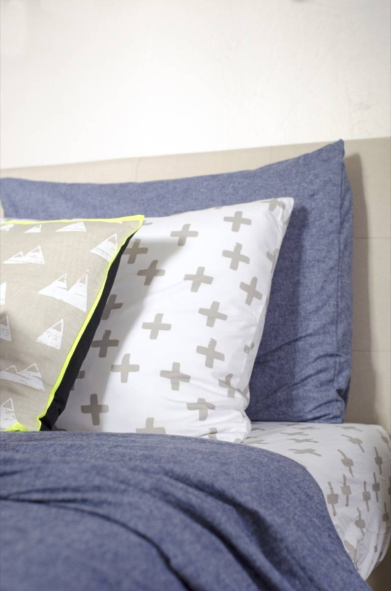
- Bedding: Plus Sign Sheets (Sheets) Chambray Cover (Duvet)
- Toss Pillow: Mountain Throw Pillow
- Curtains: Early Edition Black Dot Curtain
- Artwork: Vintage Paintings and Railway Map
- Animal Heads: Zebras
- Nightstand: Discontinued (Similar)
- Star Lamp
- Round Nightlight
- Bookshelf
- Chair: Vintage
- Baskets
- Wall Bookshelves
- Round Display Shelf
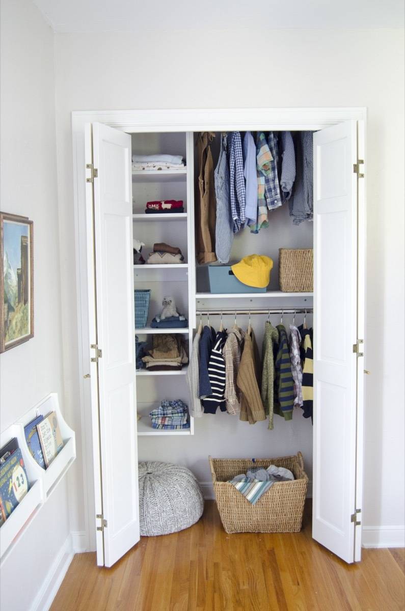
- Closet System: Modular Closets
- Wall paint: Sherwin-Williams Simple White SW 7021
- Trim paint: Sherwin-Williams Pure White SW 7005
Girl’s Room
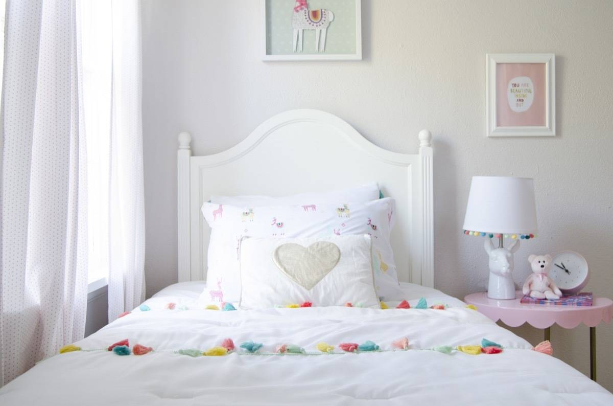
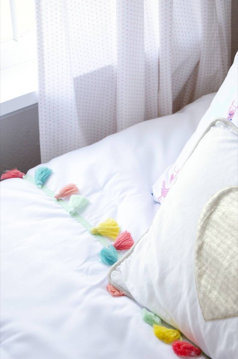
I wanted this room to feel joyful (and ultra-flexible). I centered the design around a bright, yellow rug, and lots of tassels and llamas. The pops of colors are vibrant and wowee(!), but the room is balanced with lots of light neutrals that make it feel like it’s a part of the same house. I love this! I love it so much because the only thing its missing is a child with a big personality to elevate the whole look.
Here’s what it looked like before:
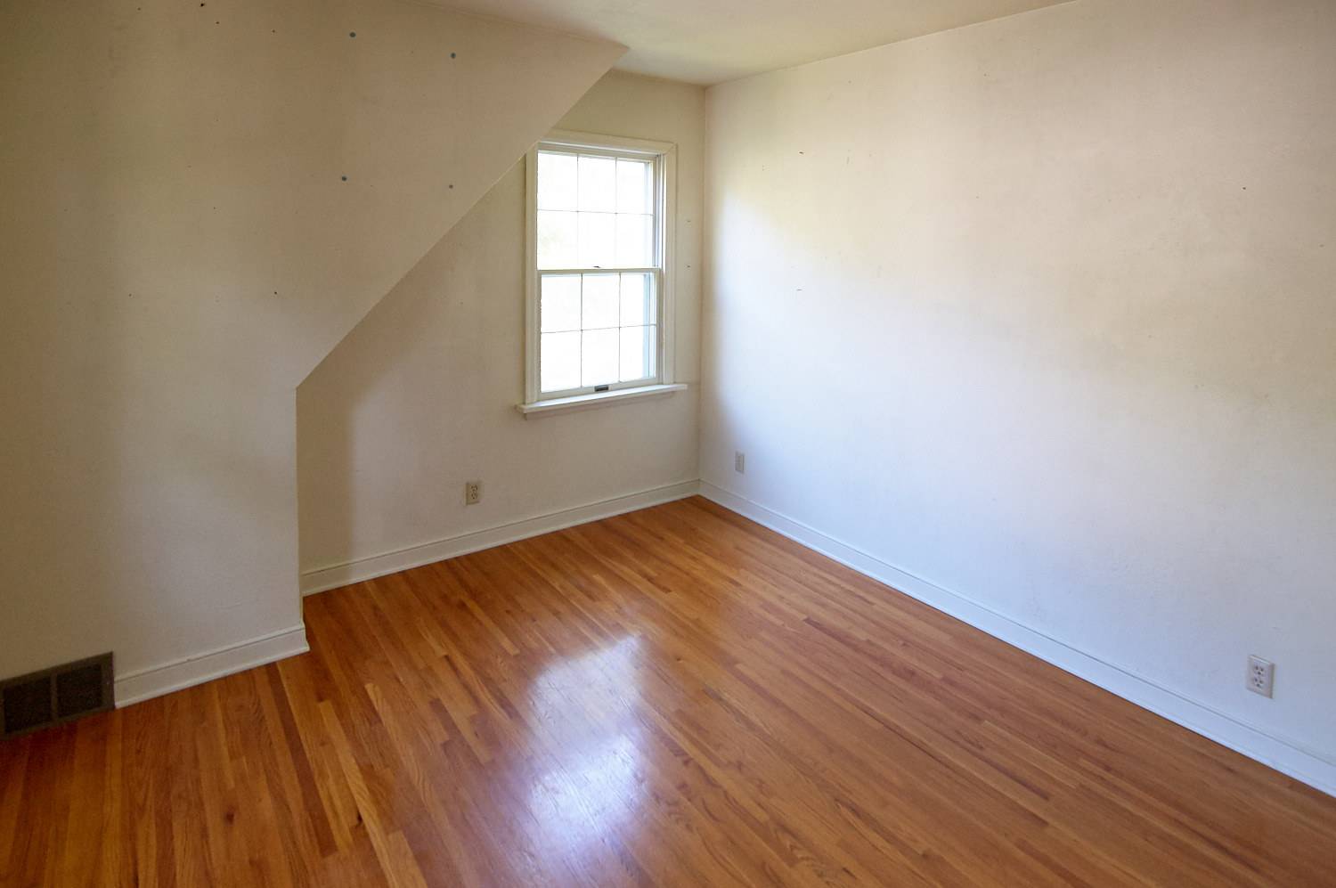
And now:
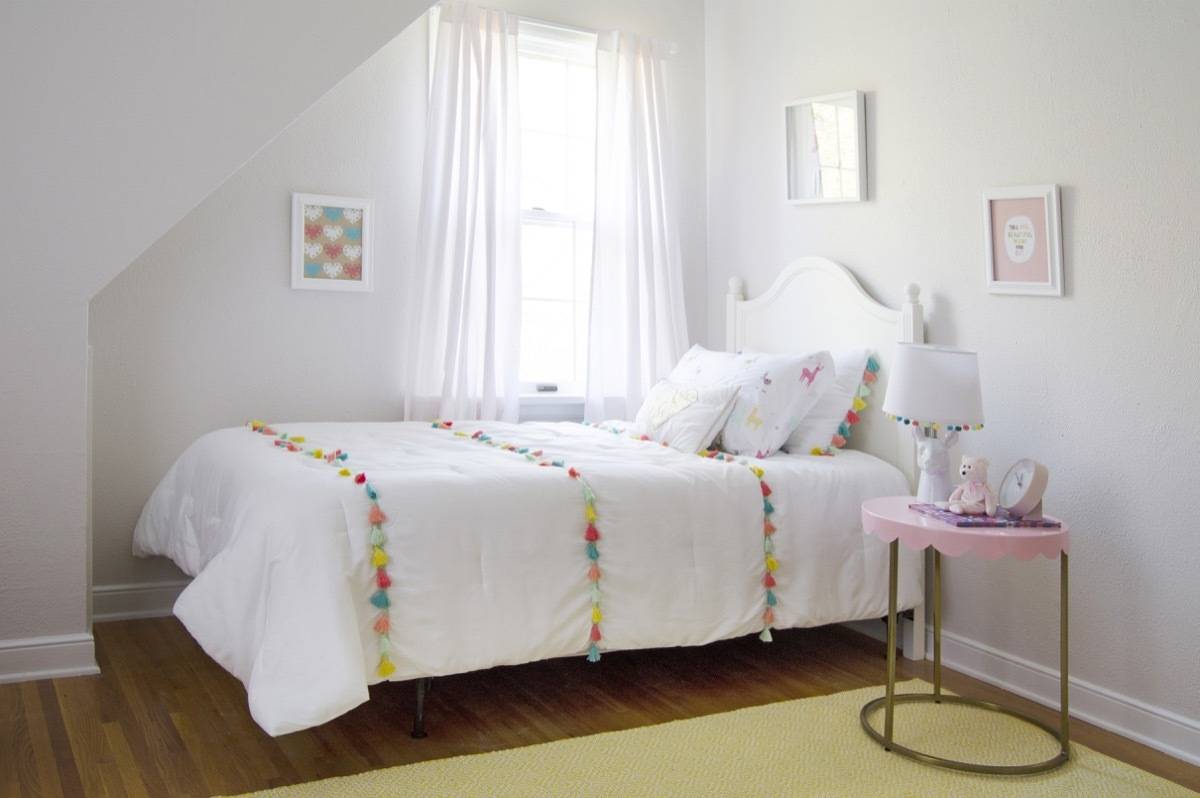
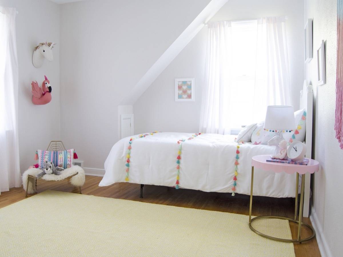
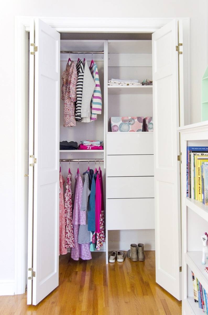
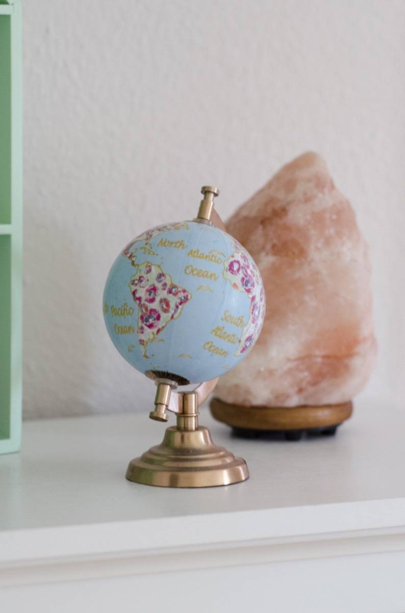
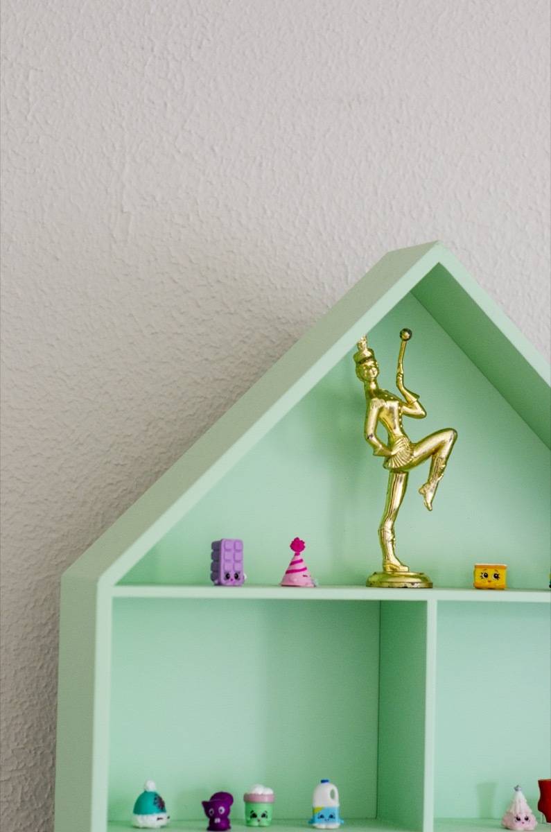
Products
- Bedding: Llama Sheets (Sheets) Tassel Set (Comforter)
- Rug: Diamond Cotton Check Flatwoven Rug
- Pendant Light: Felton White Aluminum & Wood Pendant
- Curtains: Early Edition Pink Dot Curtains
- Toss Pillow: Gold Heart
- Nightstand: Scallop Pink & Gold
- Lamp: Llama Lamp
- Bed: Discontinued (Similar)
- Lounge Chair: Domino Chair (gold no longer available)
- Art: Llama, Wall Hanging, Busts, Hearts Print, Beautiful Print
- Wall paint: Sherwin-Williams Simple White SW 7021
- Trim paint: Sherwin-Williams Pure White SW 7005
Nursery
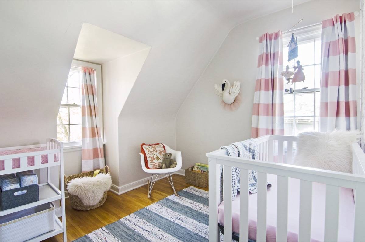
This sweet room is the smallest in the house, but the space is perfect for a wee one. The room is located steps from the master bedroom, and set apart from the other two children’s bedrooms. It’s sweet and simple, easily adapted, but also lovingly put together. While there’s nothing over-the-top about the room, it was a real throwback for me. It reminded me so much of the way we put our daughter, Ayla’s nursery together. We wanted her room to feel open and minimal, because she was new, and we didn’t want to send her a strong message from the start (rather, we wanted the room to grow into, and mirror, her).
So, I hit repeat with this room. I wanted it to feel beautiful and basic. I want it to be filled with love, and I think the space is ripe for that kind of transformation. I am in love with the accent wall (the wallpaper is removable), and the light fixture (its twin is a gold version that’s located a floor below in the office). The room is functional and exactly what you need for a tiny child.
When we bought the house, the room looked like this:
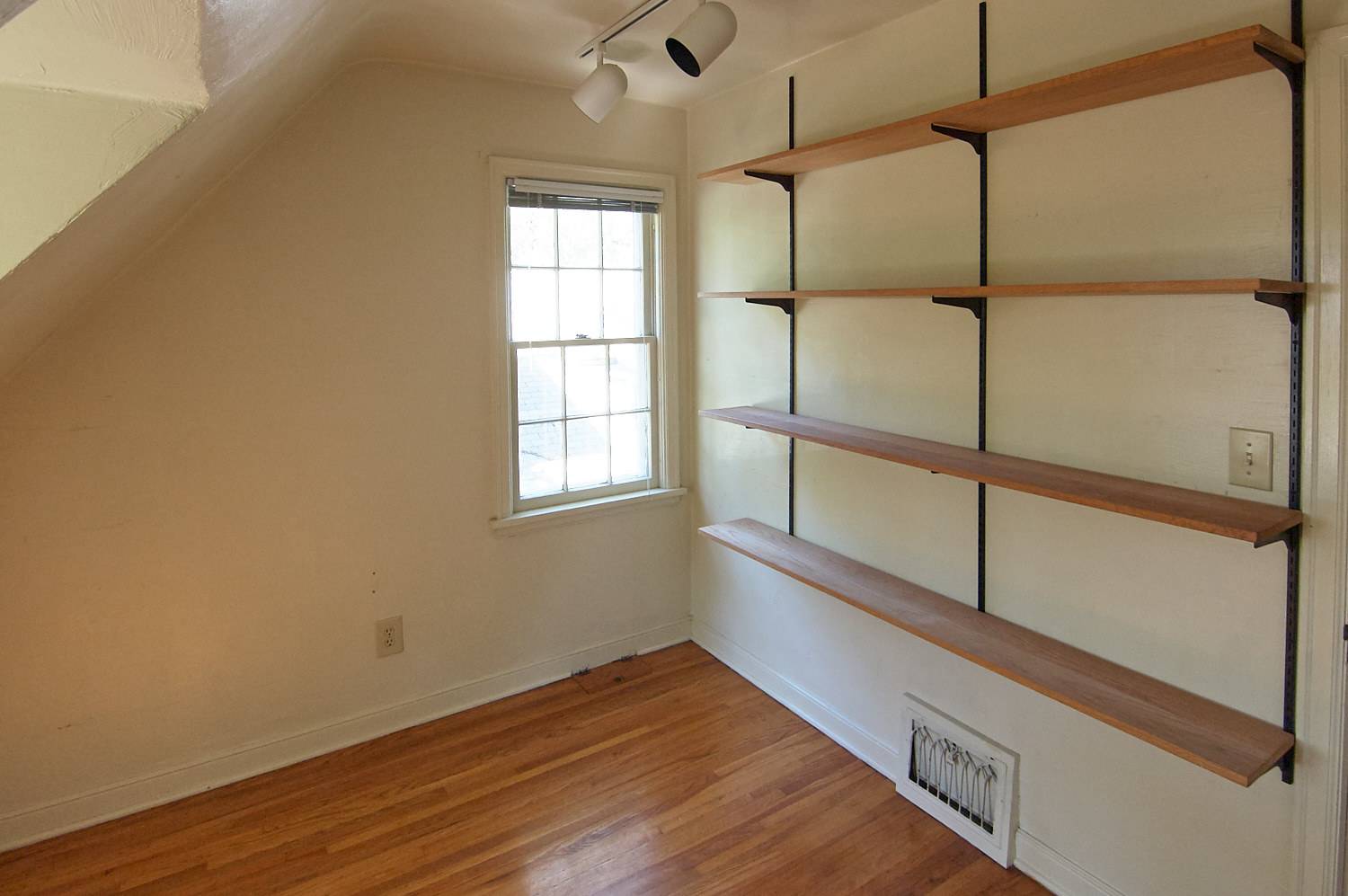
As ridiculously retro as those track lights were, we had to let them go:
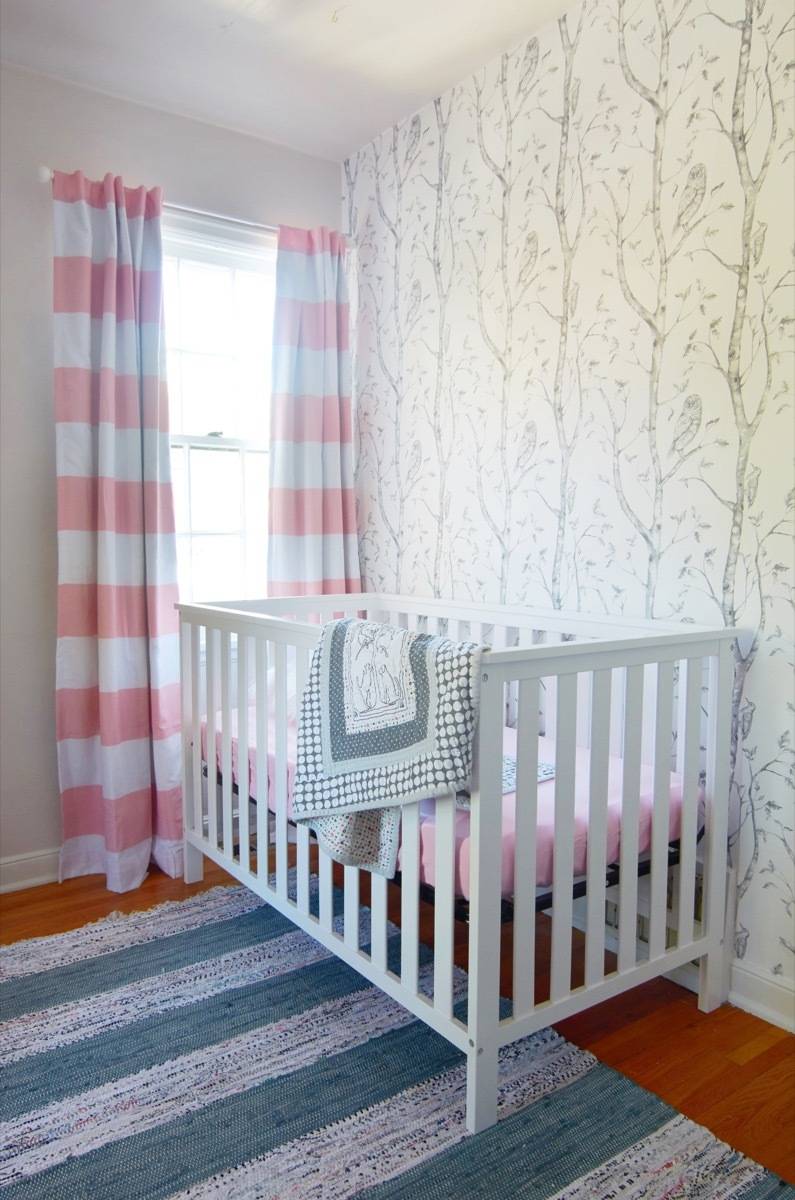
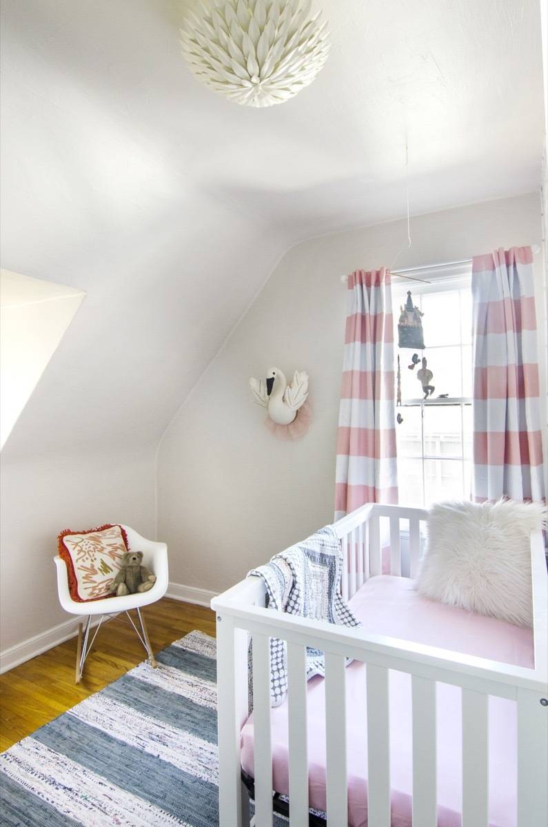
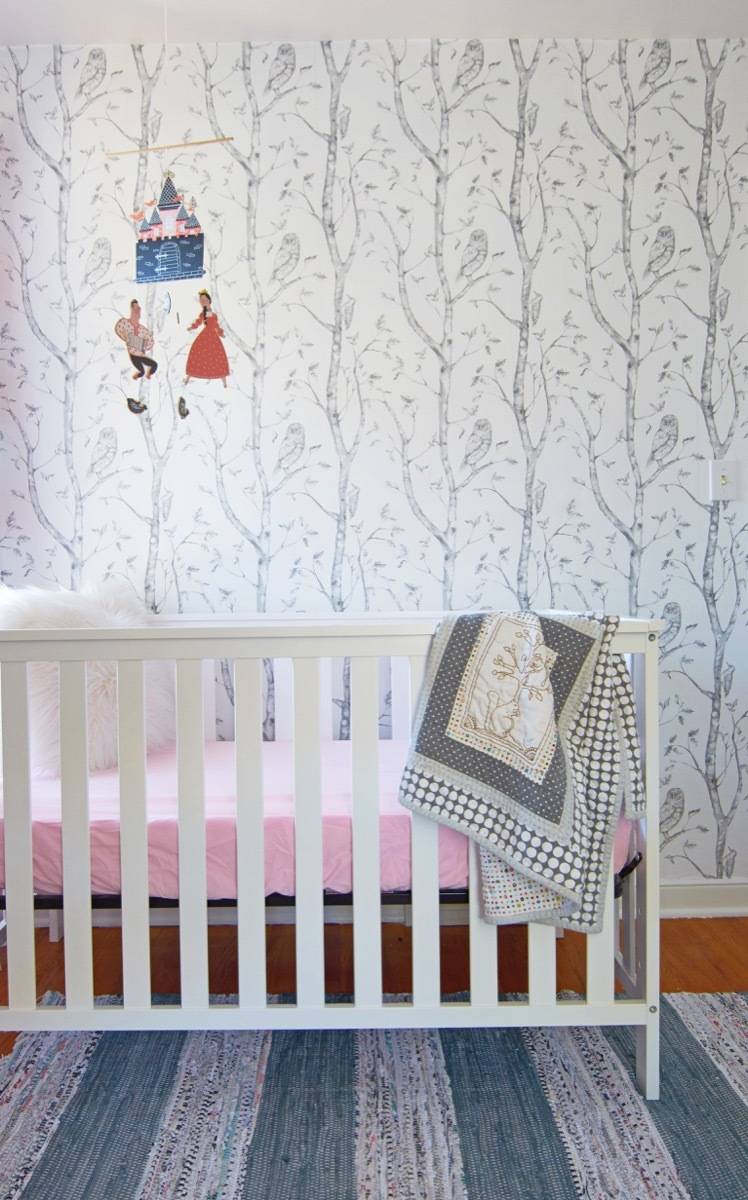


Products
- Accent Wallpaper: Wall Pops Gray Woods Peel & Stick Wallpaper
- Ceiling light: Crystorama Broche 16″W Leaves Matte White Ceiling Light
- Rug: Safavieh Gray & Ivory Flat Cotton Rug
- Rocking Chair: Modway Rocker
- Curtains: Twill Light Blocking Curtain (Pink)
- Mobile: Royal Charm Mobile
- Swan Bust
- Wall paint: Sherwin-Williams Simple White SW 7021
- Trim paint: Sherwin-Williams Pure White SW 7005
Bathroom
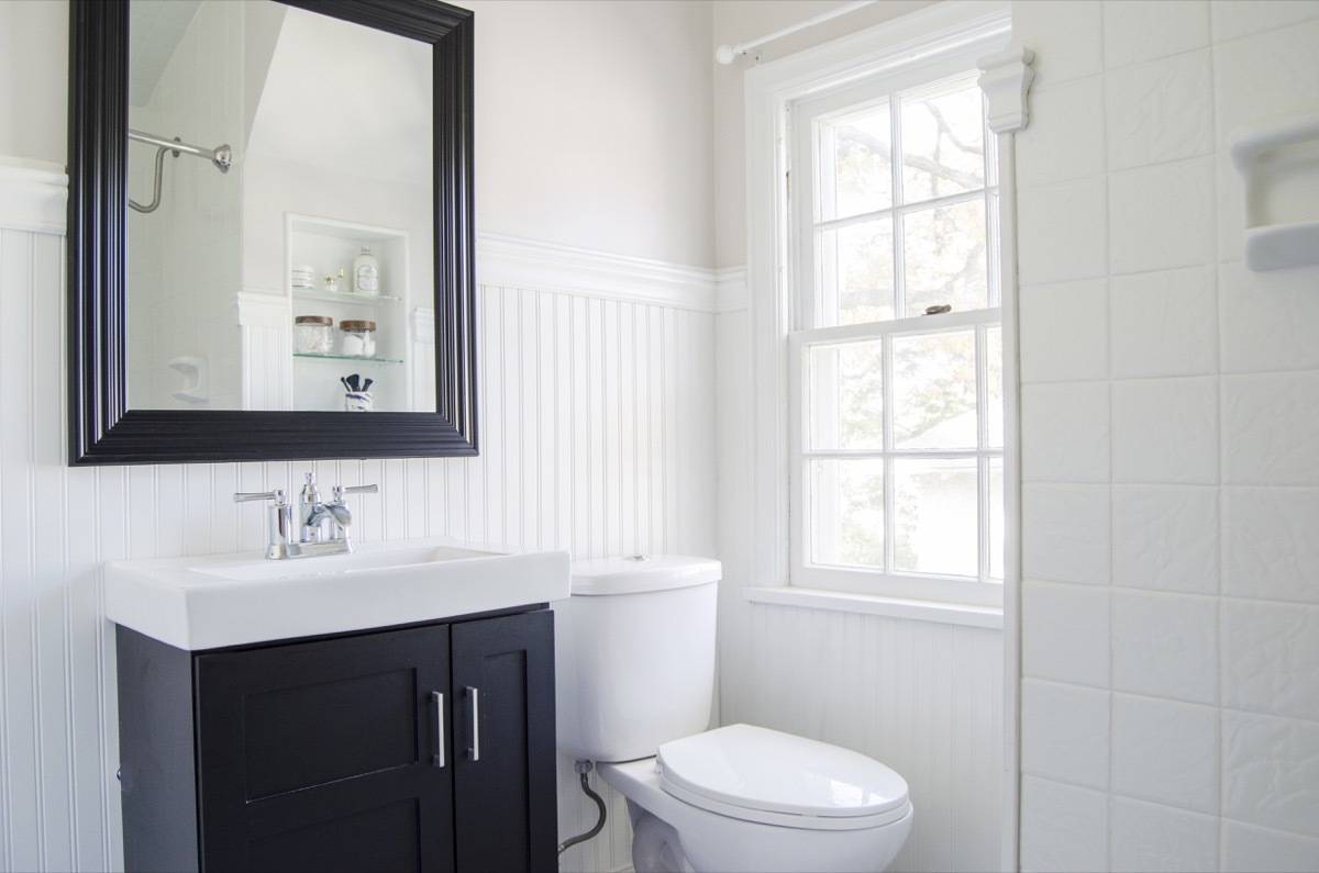
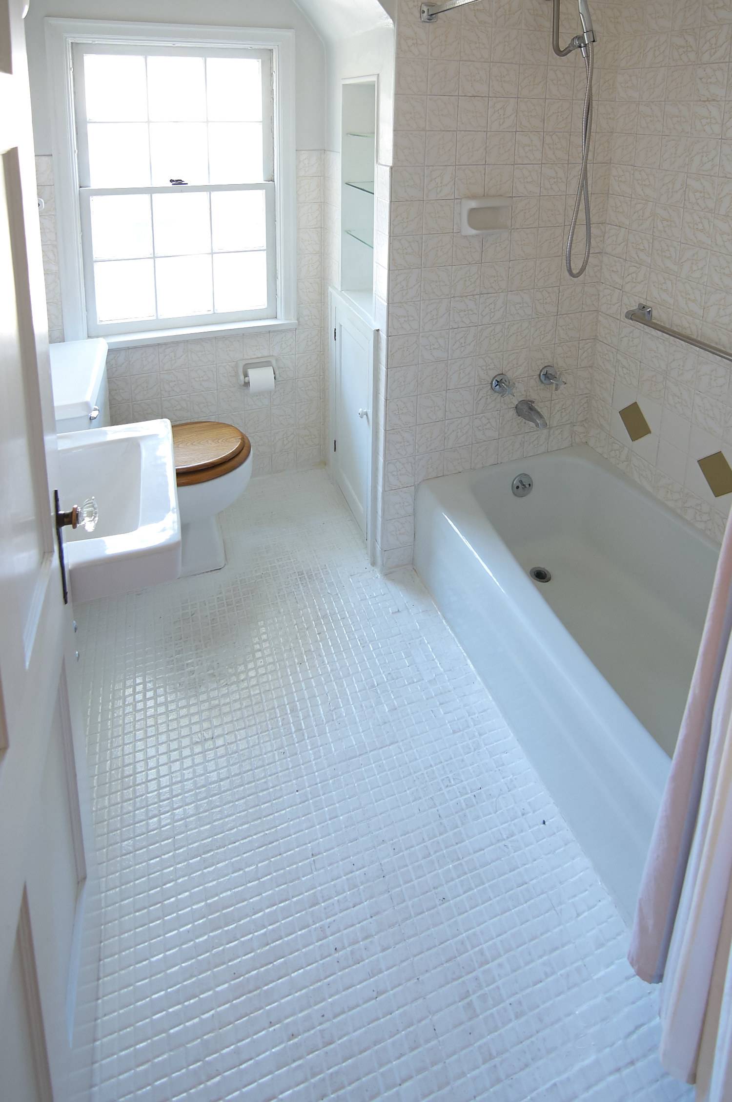
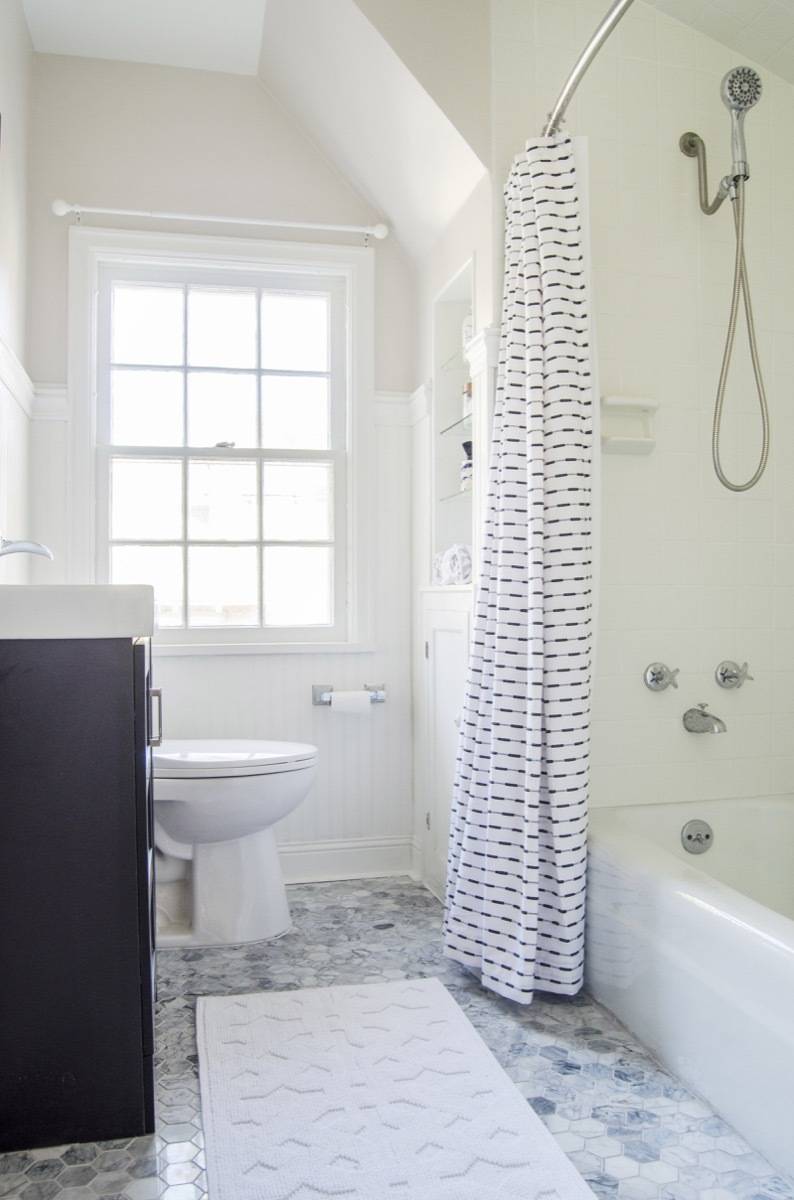
I’ll be honest: I wish we could’ve done a lot more with the upstairs bathroom (the downstairs will be revealed in a later post). I wish we could’ve doubled the size, rebuilt all the plumbing, put in a double-vanity … the list goes on and on. But every home renovation (especially a flip) requires prioritizing, staying on budget, and making tough decisions. In this case, drastically improving the bathroom would’ve required some serious structural changes to the house (and losing a bedroom), as well as tons of plumbing and HVAC costs. It just wasn’t possible given the scope of what we wanted to do, and the timeframe we were working on.
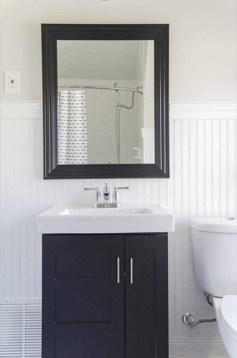
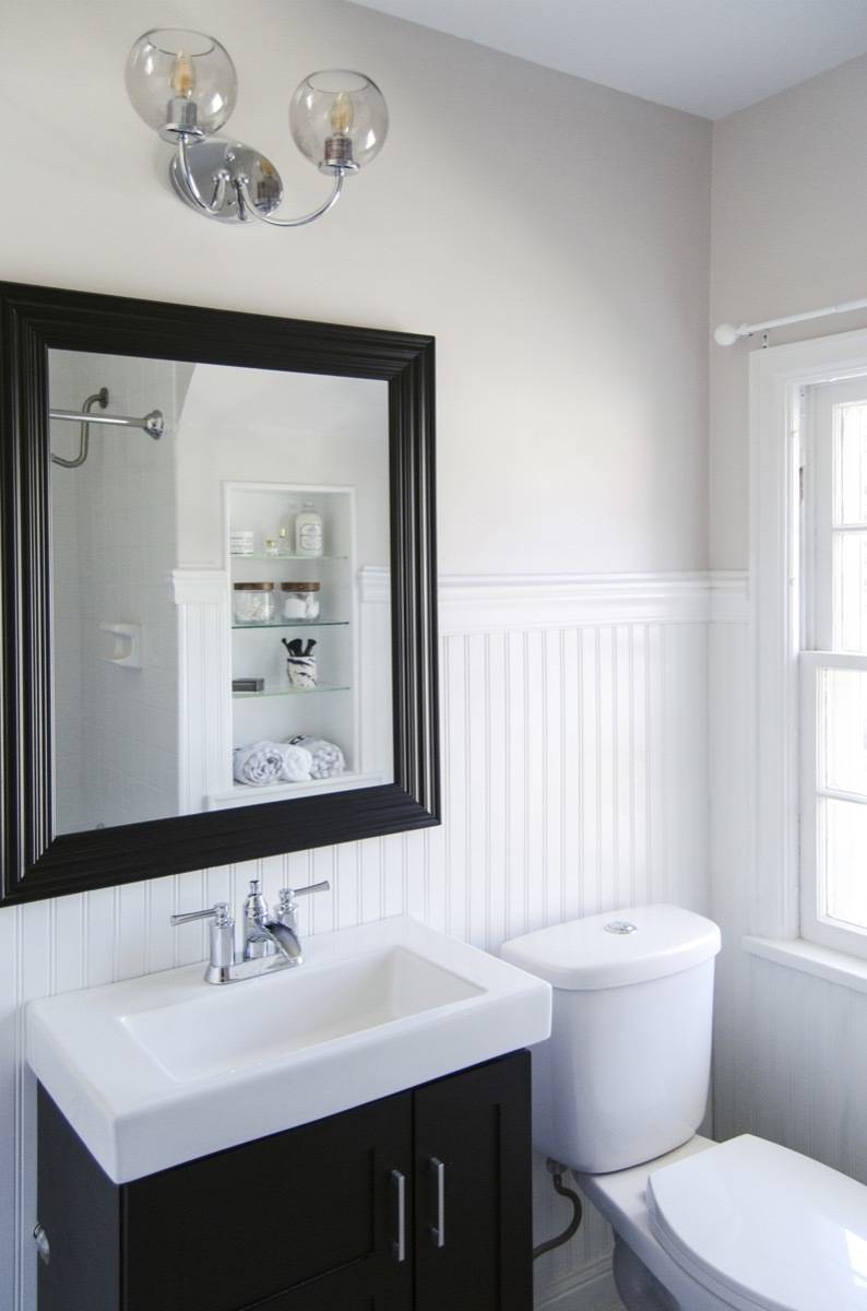
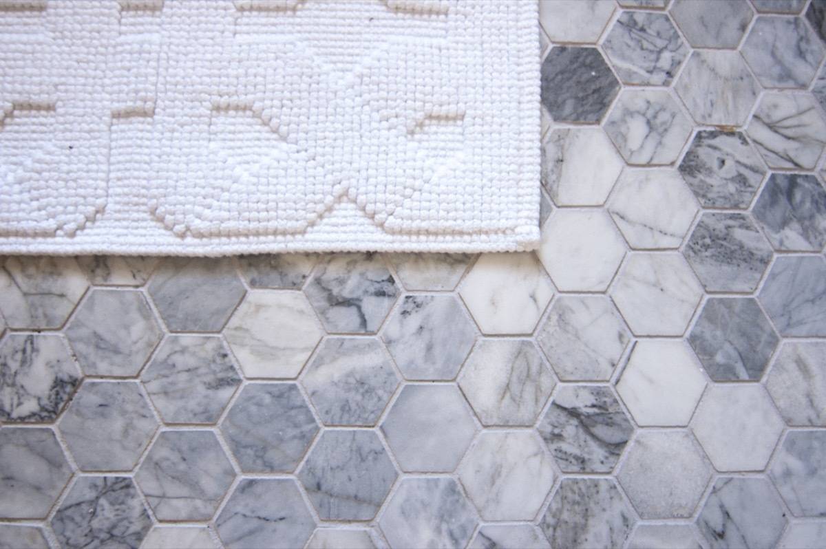
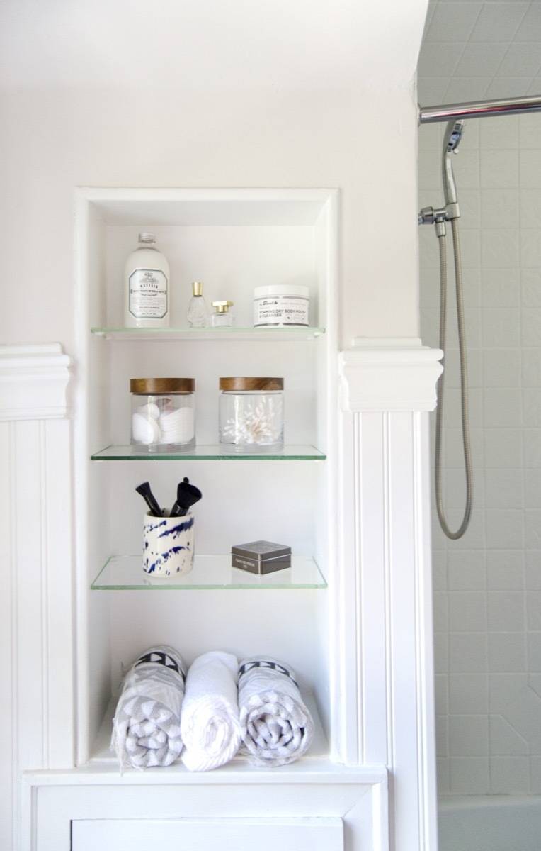
So, with the apologies out of the way, let me say that I really love what we were able to do with this room! We added bead board wainscoting, a new marble tile floor, and Bruno and Jon worked way harder than anyone wants to admit to get an actual vanity in there (as opposed to the tiny wall-mounted sink it had before).
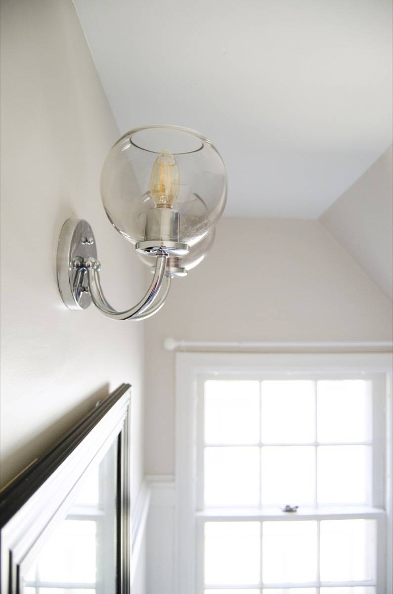
Throw in a new faucet, a dual-flush toilet, a flowy curtain, and a really pretty light fixture, and the bathroom feels like a completely new space. As you can see, it’s a big improvement over what we started with:
Products
- Vanity light: George Kovacs Exposed 2-Light 15 1/2″W Chrome Bath Light
- Ceiling light: Possini Euro Design Opal Glass 10 1/4″ Wide Ceiling Light
- Faucet: Delta Dawson Lavatory Faucet
- Floor tile: Polished 3″ Hexagon Oriental white Marble Mosaic
- Shower curtain: Threshold by Target
- Bath mat: Jacquard Geometric Woven Bath Mat White
Office
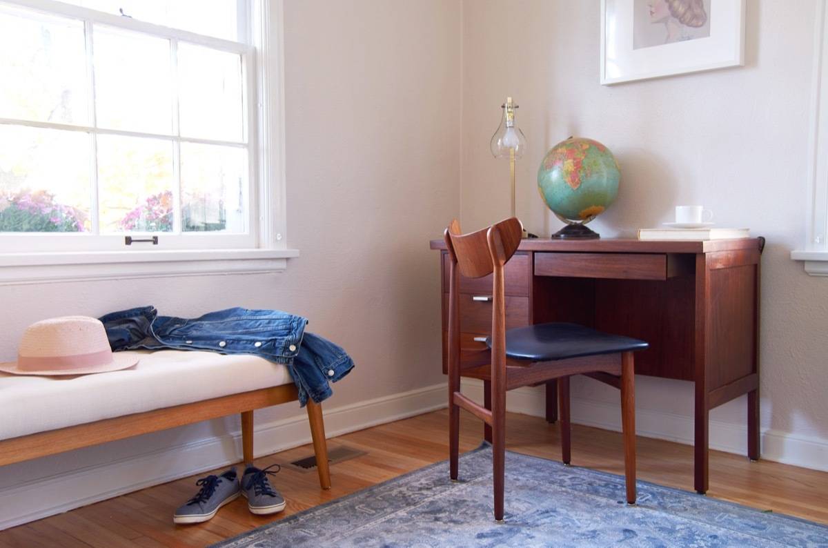
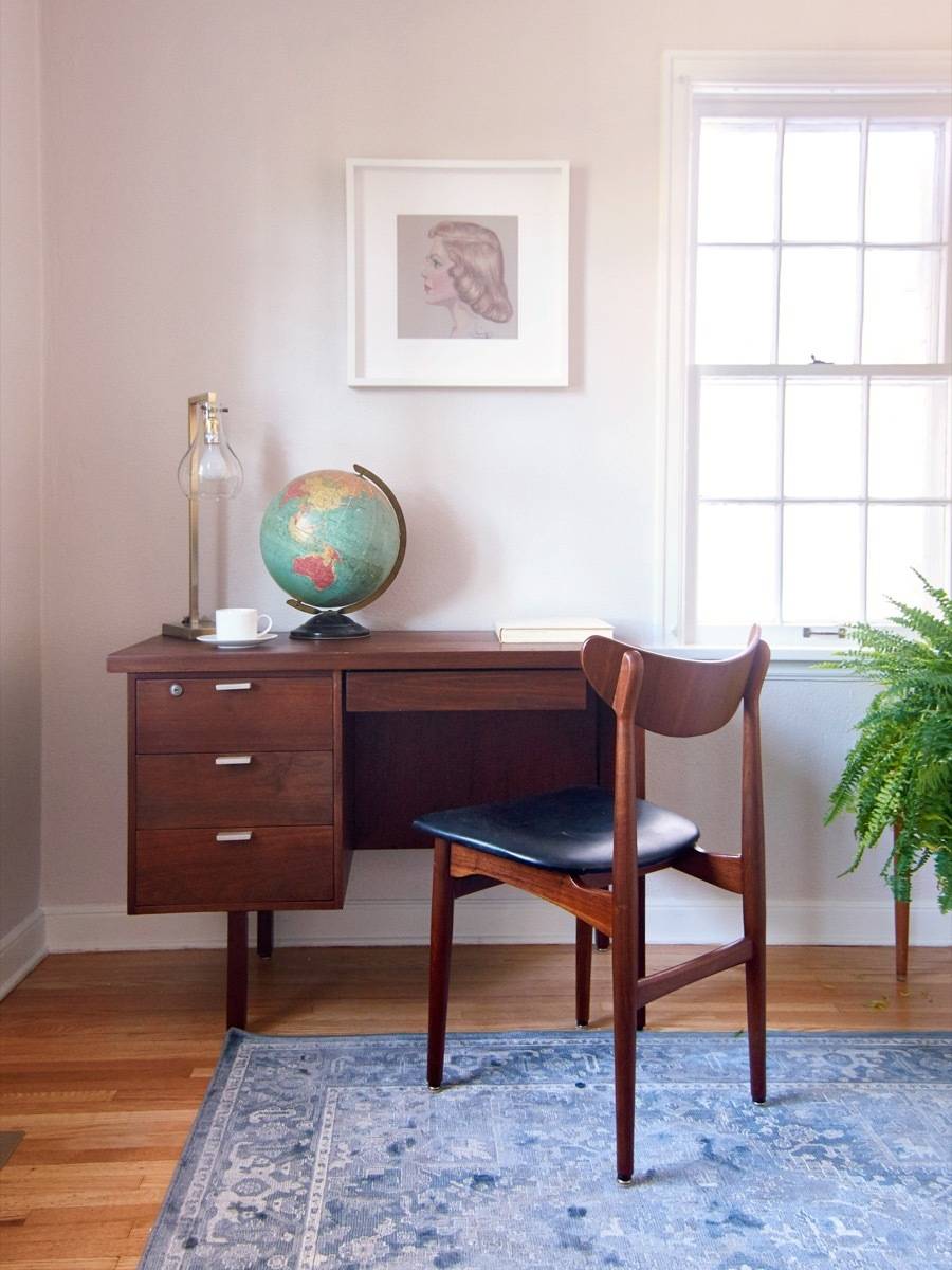
For a not-very-huge house, the Curbly House actually packs in a lot of rooms! One of those is this first-floor ‘bonus’ room, which the previous owners appear to have used as an eating space, but we’re treating like an office or family work space. It’s a place to go through mail, check your e-mail, do homework, write blog posts (wait, that’s our family), etc.
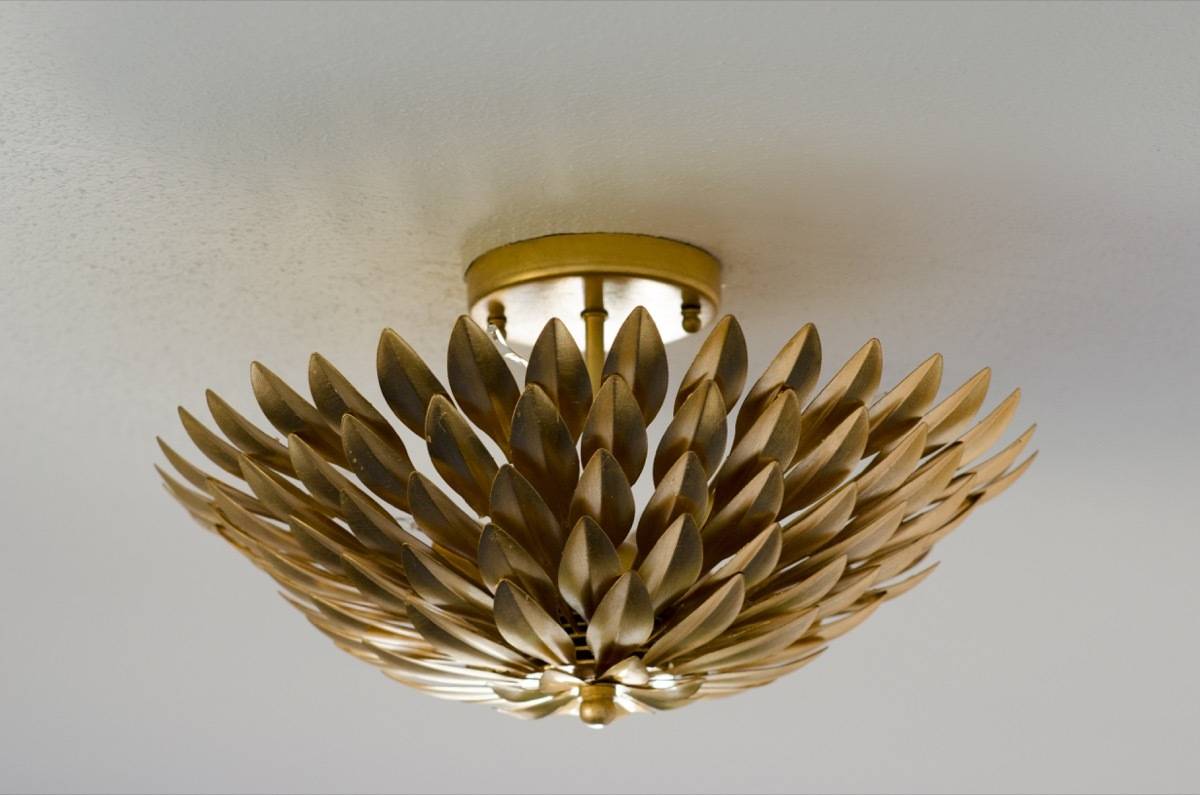
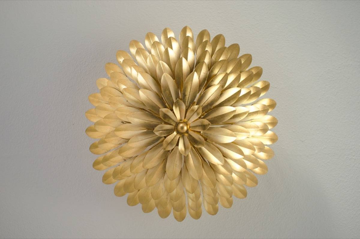
There wasn’t much to do here except paint, add some well-designed furniture (that desk & chair were a Craiglist steal at $145), and top everything off with a really nice, eye-catching light fixture. Check it out:
Products
- Desk: vintage
- Rug: Safavieh Vintage Indoor Area Rug
- Bench: Belham Living Darby Mid Century Modern Upholstered Bench
- Ceiling light: Crystorama Broche 16″ Wide Antique Gold Ceiling Light
- Wall paint: Sherwin-Williams Simple White SW 7021
- Trim paint: Sherwin-Williams Pure White SW 7005
So, here we are at the very end of the post. We’ve been working toward this moment for nearly ten weeks, and somehow it feels anticlimactic to just end it with an ordinary paragraph. But that’s what blog posts do … they end. And so do house renovation projects, like the 2017 Curbly House.
Although today we mark the completion of this project, it’s also an opportunity to celebrate, and look ahead to what’s coming next. Doing a large-scale home renovation was equal parts challenging and rewarding, we’re already dreaming of doing another one. So as soon as we’re able to, we’ll let you in on what our plans are for the next Curbly House.
Finally, I can’t wrap up this series without acknowledging all the hard work of the people who made this possible: Jon Peterson and Bruno (for being crazy enough to push this idea in the first place and for being two of the hardest-working people I know); M.E. Gray, for doing anything and everything she was called on to do, and for doing it with joy; Chantal Nason, for pitching in with hard work and great ideas; and Chris Gardner, for holding down the Curbly fort. And of course, thanks to our families, for putting up with long stressful weeks of late work nights and twists and turns.
This project was completed in cooperation with several brand partners, who donated products for us to use in the home remodel. We’re grateful for their support: Hayneedle, Sherwin-Williams, Purdy, LampsPlus, Zabitat, and Lumber Liquidators. This post may contain affiliate links (learn more).

It looks so amazing guys, congrats!
Thanks Faith!
Amazing transformation. Well done. I’d love to live here, if I didn’t live in the tropics 🙂
Looks amazing! I graduated from Luther Seminary, so I’ve walked by this house a million times. Glad to see it so lovingly restored. It’s in a fabulous neighborhood–hope it sells fast!