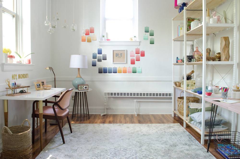
Not so long ago – 16 months to be exact – we revealed our old, new studio space. It was a beautiful, sun-filled room that offered us a space to be creative and a way to separate our work life from our home life. It was quiet and peaceful, blocks from our house, and a stone’s throw from our children’s schools. But when the building changed ownership and major renovations loomed, it was impossible for us to remain. That was more than a little heartbreaking for us.
We searched high and low for the perfect new space, realizing along the way that there’s no such thing. The perfect place is the one you make perfect.
So we packed boxes, made 36 round trips between the old space and the new, swore we would hire movers next time, and never looked back.
The perfect place is the one you make perfect.
Today, as I write this post in our new studio I can tell you that it is glorious and perfect. But it took a long time to get to this place. Up until a month ago it was not much more than a stack of organized boxes, one semi-styled shelving unit, and a couple of desks with rolling chairs.
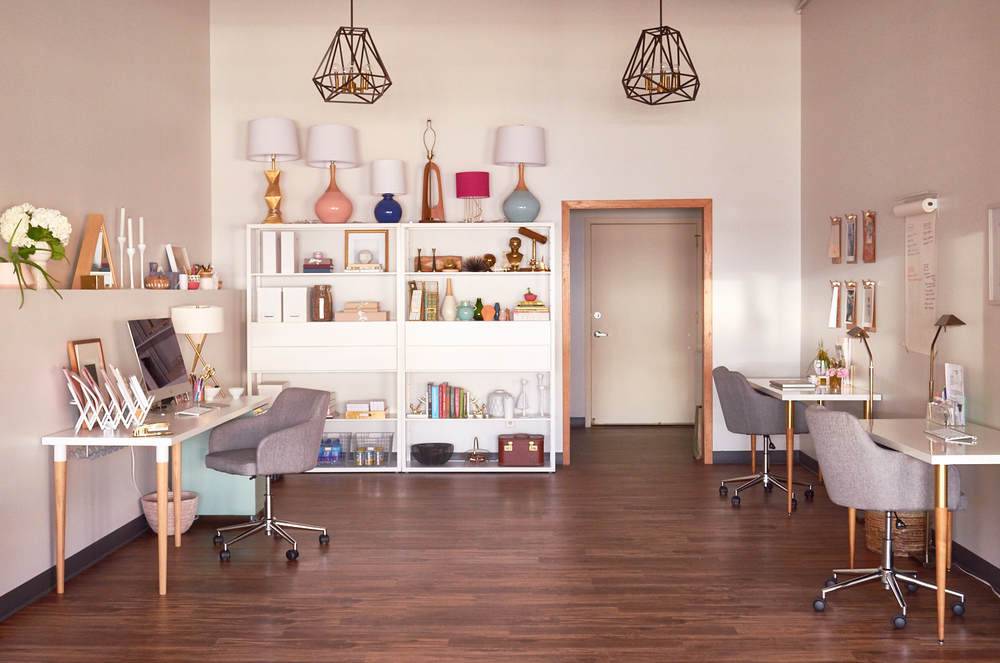
I had a hard time figuring out the design of the space because it’s so large. I love an open floor plan more than anything, but struggled with how to create different spaces in a large L-shaped room. There was an obvious area (the bottom of the L if we’re running with that analogy) further away from the street, that seemed like an obvious work space. We arranged our desks there and it felt right from the beginning. But much of the L remained, and to be perfectly honest, I had no vision when it came to its flow and function.
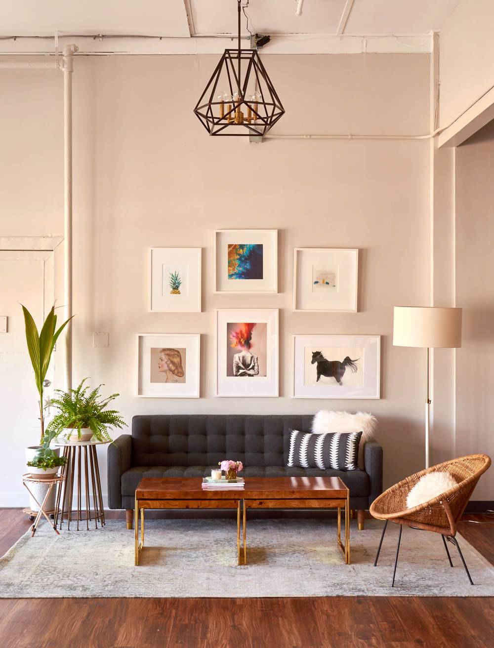
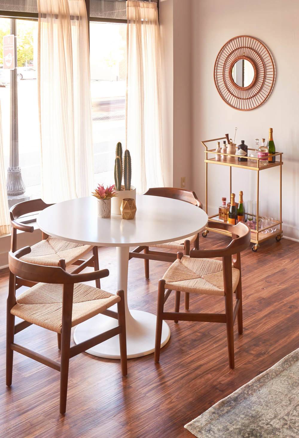
Lounge area (above) and lunch table (right).
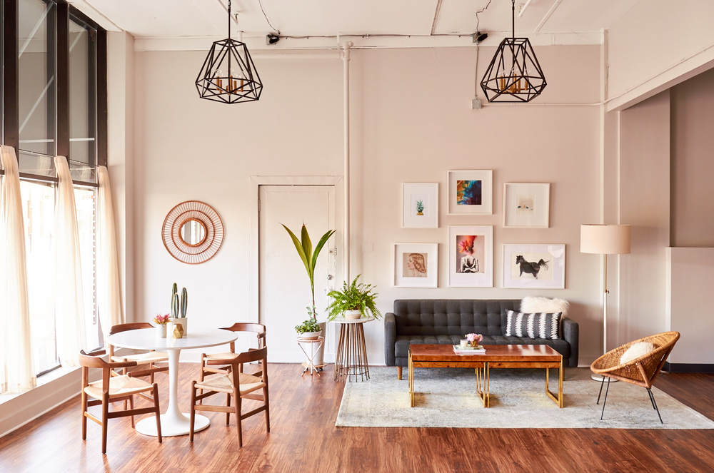
So, we started playing around with furniture arrangements. And, it looked a lot like Ross, Chandler, Rachel and their couch. We knew we wanted an area that felt cozy, like a lounge of sorts, as well as a place to hold meetings. Initially, I planned to keep those areas separate, but they sort of accidentally morphed together in a natural way, and now I love the way they’ve teamed up.
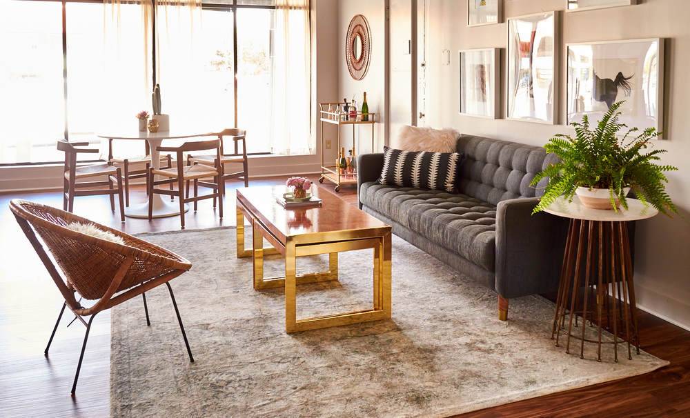
A large portion of the space remains open and airy, which is exactly what we need. We do a lot of messy projects, DIYs, and photography, and those things require having open space that’s flexible and re-configurable. That’s exactly what we’ve got! While part of the space can feel chaotic and disastrous, the rest remains beautiful. Words can not describe how much my brain loves this.
Here’s a brief description of how we organized the space, and some of the tricks we used to make it feel cohesive:
- The entire space feels unified, open and airy because it has neutral walls and consistent flooring. We went light on the walls with a soft gray (Sherwin-Williams Crushed Ice 7647). It has the clean feel of white, but the versatility of gray (depending on the light it morphs from warm to cool, and allows the artwork and mirrors we have on the walls to stand out).
- We went much darker on the floors. The planks have texture and knobby-ness. The rich brown tones warm up the entire room. In the beginning, we considered a cement or white floor, but I’m continually grateful we went the wood route.
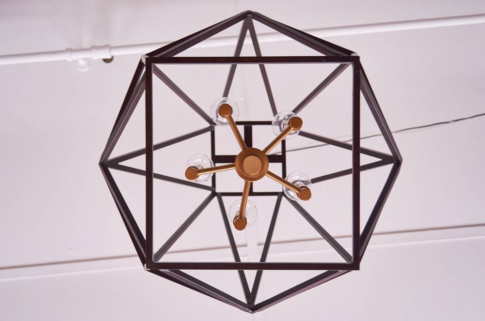
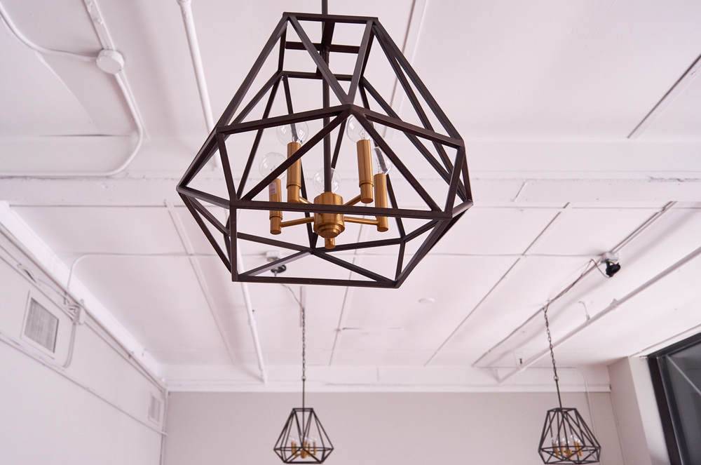
- The light fixtures are the most beautiful, eye-catching elements in the space. They’re sculptural, modern, and a little bit industrial. The two metals, oil rubbed bronze (which reads ‘black’) and bronze (which reads ‘gold’), work well together and make the fixtures stand out. Every person who enters the room comments on them and I’d like to shake the hand of the person who designed them because they are a stroke of lighting brilliance.
We skipped the traditional teardrop-shaped chandelier bulb in favor of a round one; it makes all the difference in the world, giving the fixtures a distinctly modern feel. - We used a large area rug to frame the lounge area. We moved our beloved Loloi Anastasia rug over from the old space, and it quickly found a happy home here. It houses the sofa and coffee table (I could devote an entire blog post and even write a novel about my devotion to that coffee table and all its warm wood goodness).
- While the area rug frames the horizontal space of the lounge area, the combination of the sofa (and flanking plant and lamp) and a simple gallery wall visually frames the space vertically. I love the way the gallery wall works: We broke a lot of rules about symmetry and balance when we put it together. It’s quirky and a little off kilter, but it’s delightful.
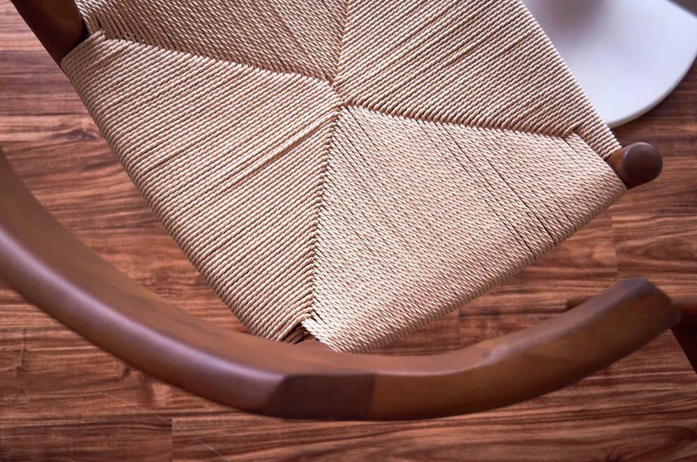
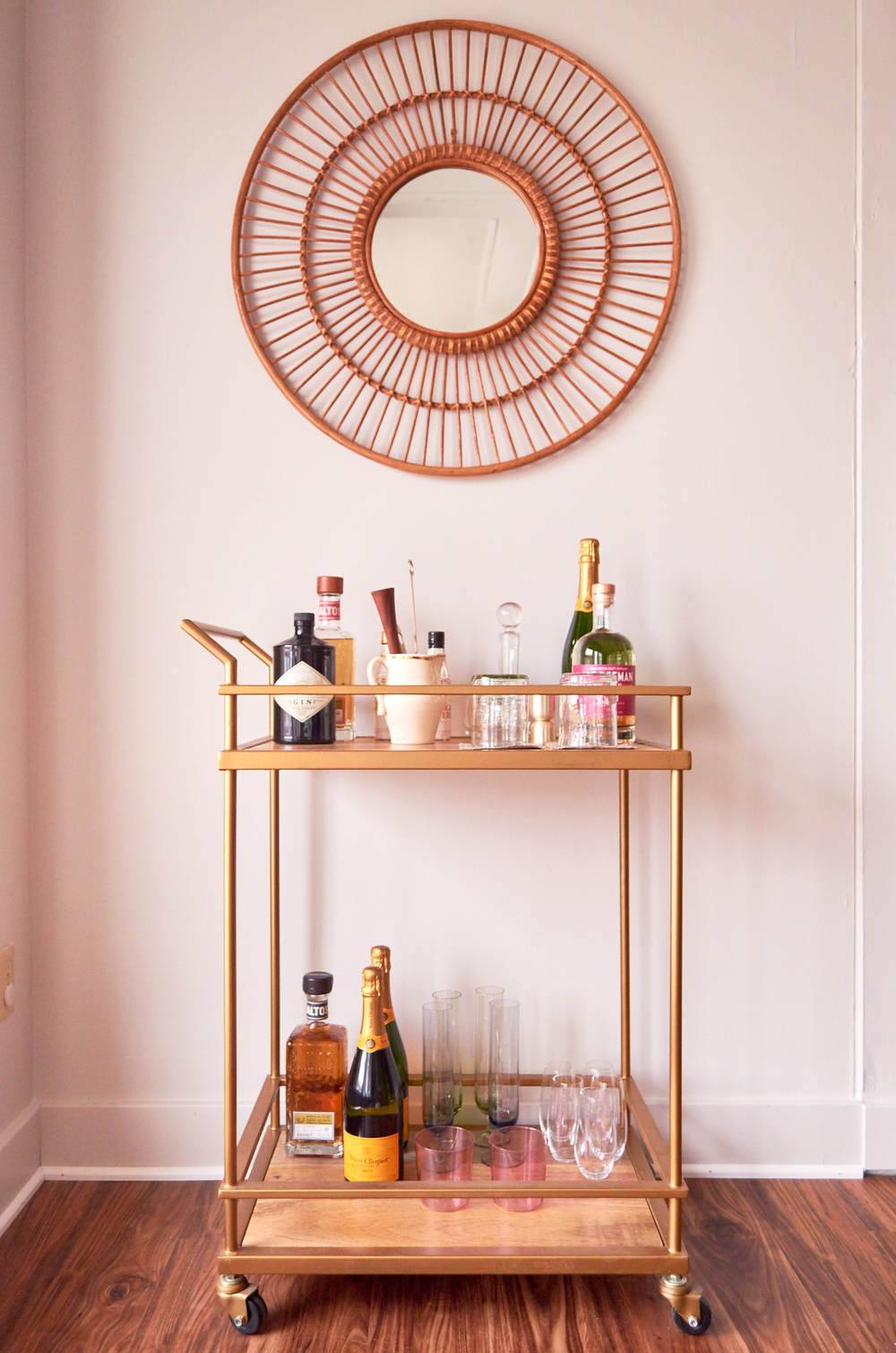
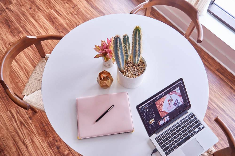
- The meeting area came together easily. It’s separate from (but in eyesight of) the work area. It gets a healthy dose of sunshine, and the bar cart and walnut chairs give it a meant-to-be feel.
Product List
Wall Color: Sherwin-Williams Crushed Ice (SW7647)
Chandeliers: Hawking Bronze Pendant Chandelier
Desks (and Legs): LINNMON Tops (Small and Large) + Prettypeg Legs
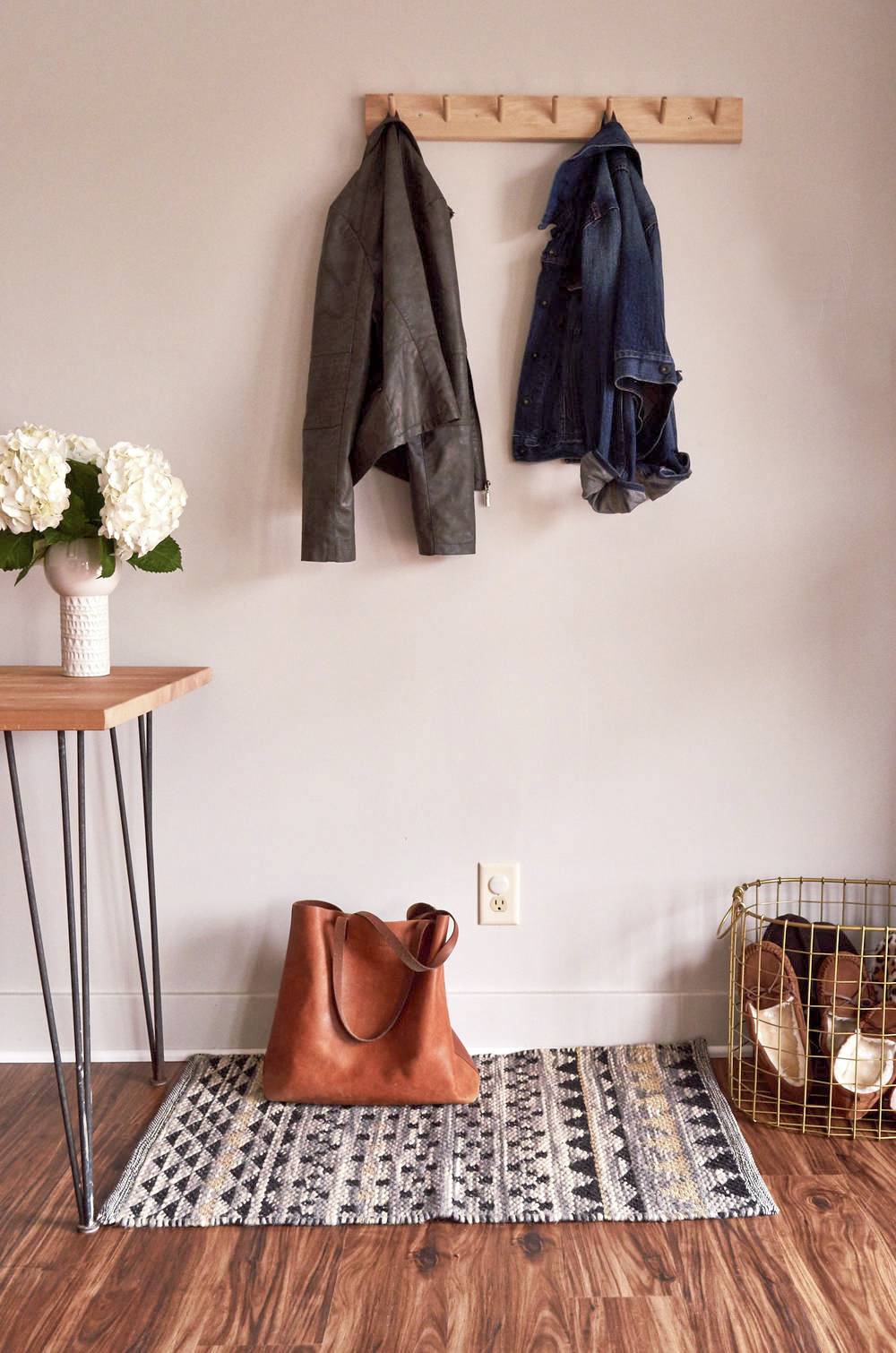
Wall-Mounted Paper Roll: Up Against the Wall Paper Holder
Desk Floor Lamps: Brass Pharmacy Floor Lamps
Desk Table Lamp: Mid-Century Tripod Table Lamp
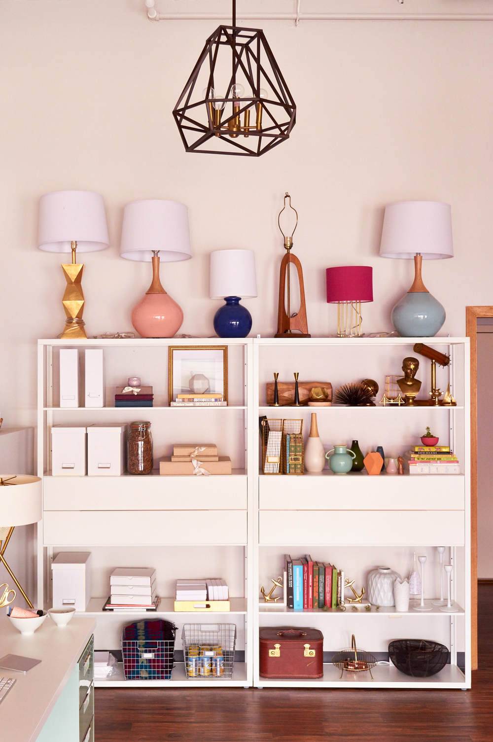
Bookshelves: FJALKINGE
Curtains: Leno Weave Sheers
Desk Chairs: Upholstered Desk Chair
Sofa: Landry Dark Gray Sofa
Floor Lamp: Telescoping Floor Lamp
Toss Pillows: Global Lumbar Pillow
Side Table: Discontinued, but this one is stunning!
Coffee Table: Dwell Studio Newell Nesting Cocktail Table
Wicker Accent Chair: Vintage
Tulip Table: DOCKSTA
Walnut Accent Chairs: Ranger Mod Walnut Accent Chairs
Bar Cart: Discontinued, but we love this one!
Wicker Mirror: Discontinued, but this one’s a beauty!
Record Stand: KALLAX + Prettypegs
Round Mirror: Brass Mirror
Gallery Wall (+Prints): RIBBA Frames + assorted prints and photo prints from Unsplash.com
We’re beyond excited to be in this new studio, and hopefully we’ll be here for a long time to come.
Beyond beautiful! Congratulations Alicia & Bruno!!
It looks so inviting and yet elegant at the same time… amazing job!!
Thank you, Lindsey and Faith!
All of it looks so amazing! I love that vintage accent chair!
Congrats on the move! Everything looks perfect. My favorite is the dining nook!
Thanks Cat!