Okay, kids. This is it! My big, bold, dramatic bathroom makeover is finally ready to face the cameras (and the Internet). So, in the words of Samuel L. Jackson, “hold onto your butts” — I’m about to drop some serious style up in this room.
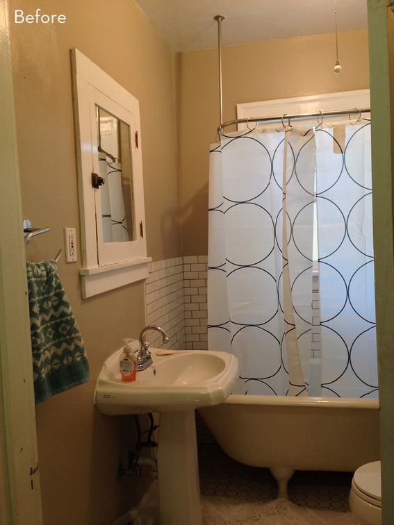
But, first! Another ‘before’ shot from earlier in the game:
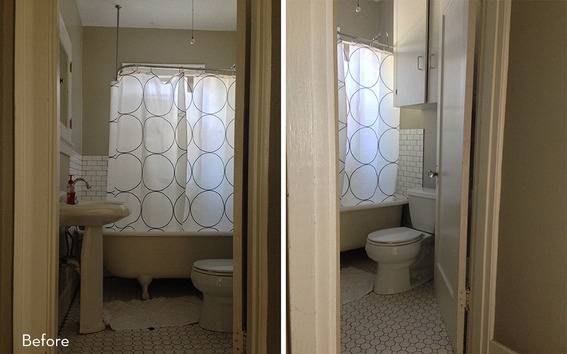 Capree Kimball
Meh. The ‘after’, though? Well, see it for yourself:
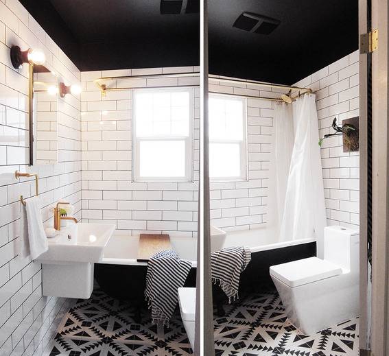 Capree Kimball
BOOM. Black and white and brass all over, just like I promised. Wait, what’s that? You want to see more? Okay then…
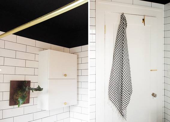 Capree Kimball
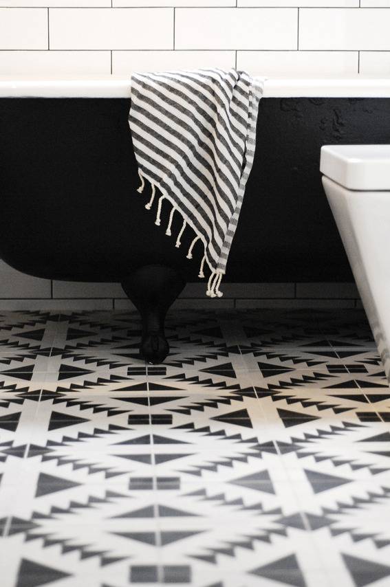 Capree Kimball
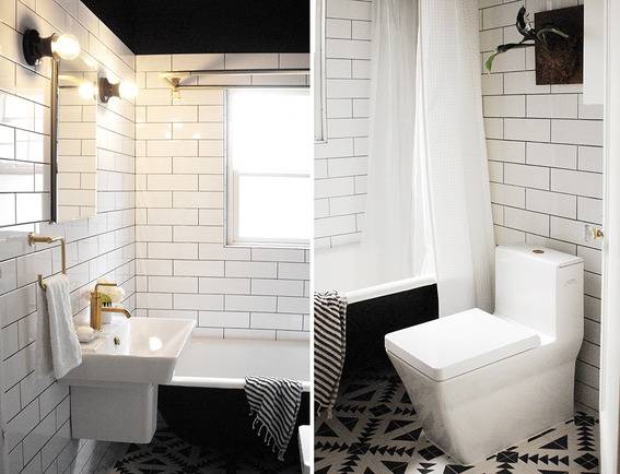
As I mentioned earlier this week, the original bathroom had suffered at the hands of a shoddy makeover by its previous owners (which isn’t readily apparent in the ‘before’ photos, but trust me: broken tiles everywhere, leaky plumbing, mildew for days, and really low quality materials overall). That, and it just wasn’t our style. So, when Lowe’s reached out with the opportunity to work with them on a bathroom makeover, the answer was a big, fat “OMG YES”.
 Capree Kimball
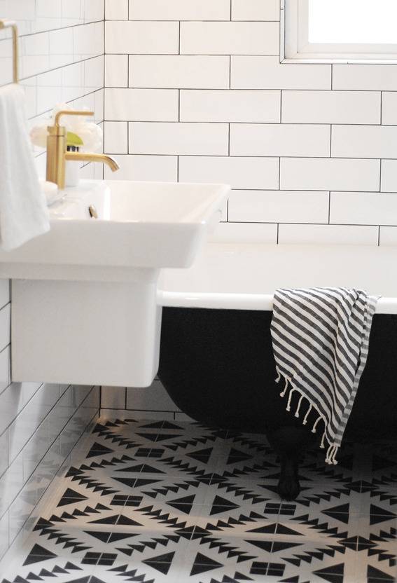
When we got started, there were a few absolutes: we were keeping the original cast iron tub (because, HELLO, it’s a cast iron clawfoot tub!! You can’t not keep it.), the floor needed to be a statement piece, and there was going to be as much brass as we could get our greasy little hands on.
 Capree Kimball
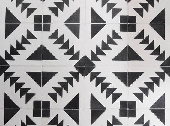
I quickly got to work scouring the Interwebz for the perfect floor tile, when I found The One: a bold, black and white patterned cement tile that was inspired by traditional quilting blocks. It blew my mind the second I saw it. So, with our ‘statement piece flooring’ all decided on, I hit up Lowe’s to bring the rest of the drama this space so desperately needed.
 Capree Kimball
 Capree Kimball
Since this is a rather small bathroom, I knew I wanted a wall-mounted, semi-pedestal style sink (to open up the floor as much as possible and reduce the visual space the sink would occupy) as well as one that was pretty modern. We ended up going with the Reve series by Kohler for both the sink and toilet.
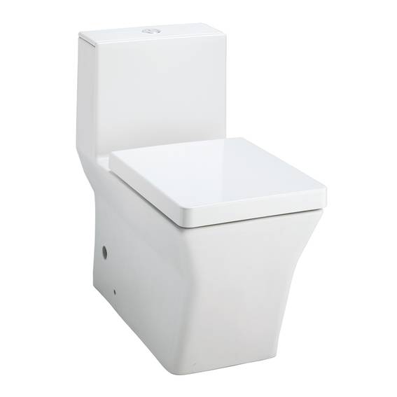
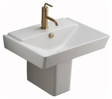
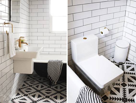 Capree Kimball
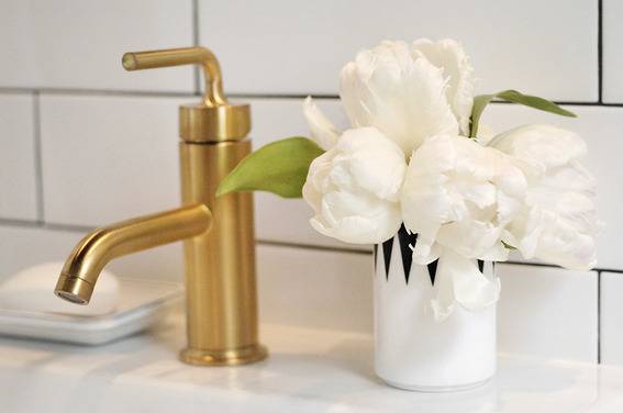
Once all the major pieces were figured out, it was time to start hoarding all the brass fixtures and accents I could find. We chose Kohler’s Purist series in Vibrant Moderne Brushed Gold for the faucet, hand towel ring, and toilet paper holder as well as a few other brass pieces to finish up the space.
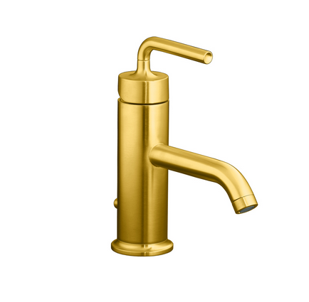
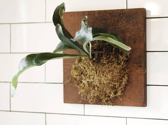 Capree Kimball
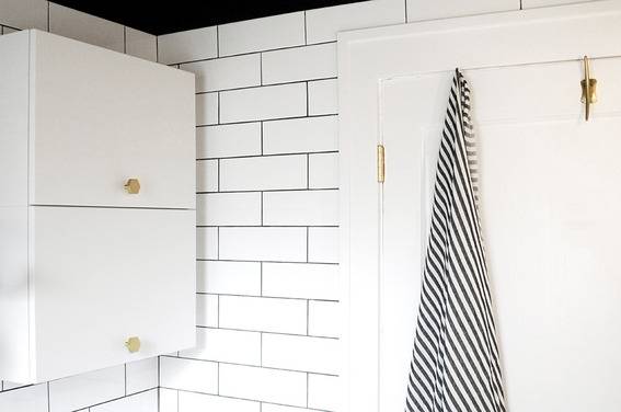 Capree Kimball
The original bathroom had a small splash wall around the tub, but since this makeover was all about the drama, we chose to use an over-sized subway tile, black grout, and to enclose the room *almost* up to the ceiling (which we painted black). The end result is a clean space that feels much larger.
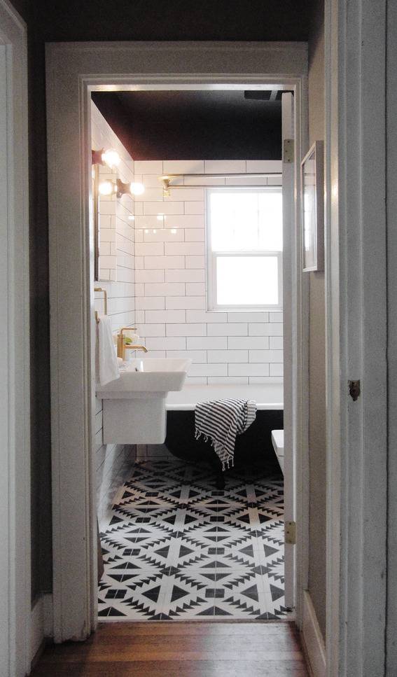 Capree Kimball
And there you have it! Our dark and dramatic bathroom makeover in all its patterned, brassy glory. Let me know what you think in the comments below! Meanwhile, you can keep up with other 29th Avenue projects and progress on Instagram with the hashtag #29thAVE.
Materials and Source List
- Floor tile: Tulum from Cement Tile Shop
- Wall tile: Allen + Roth 4×12 White Ceramic Wall Tiles
- Ceiling paint: Allen + Roth for Valspar ‘Tuxedo Tie’
- Door/trim paint: Valspar ‘Bistro White’
- Tub: original (But! Kohler makes a really beautiful cast iron, clawfoot tub you can check out right here. Warning: she’s a little pricey.)
- Shower rod and faucet: Barclay Polished Brass 2-Handle Bath and Shower Faucet
- Shower head: Victorian Polished Brass Shower Head
- Sink: Kohler ‘Reve’ in White
- Faucet: Kohler ‘Purist’ in Vibrant Moderne Brushed Gold
- Toilet: Kohler ‘Reve’ in White
- Medicine cabinet: Kohler 20×26″ Aluminum Recessed Medicine Cabinet
- Light fixtures: Alabax ‘Small, Black’ from Schoolhouse Electric
- Light bulbs: G80-15 Clear Bulb from Schoolhouse Electric
- Wall cabinet: Lillangen Wall Cabinet from IKEA
- Bathroom fan: Broan 0.8-Sone 80-CFM
- Hand towel holder: Kohler ‘Purist’ in Vibrant Moderne Brushed Gold
- Toilet paper holder: Kohler ‘Purist’ in Vibrant Moderne Brushed Gold
- Towel hooks: Streamline Hook in Bronze from Anthropologie
- Wall cabinet knobs: Hex Knob 1.5″ in Natural Brass from Schoolhouse Electric
- Trash can: Strapats Pedal Bin in Matte White from IKEA
- Towels: Pestemal Fouta Turkish Towel from Overstock
A huge, huge thank you to the awesome people at Lowe’s (I now feel confident in my ability to special order just about anything) as well as our friendly local contractor (‘sup Ryan!) for making sure we weren’t stuck living in a portable toilet for the rest of our lives.
This project is sponsored by Lowe’s and I’m excited to get their help renovating our bathroom. However, all opinions are mine alone.
kiss my brass, this is gorgeous! i love it on so many levels!
That is a pretty impressive before and after. Very modern yet old school with the foot tub. Ha, I’m not sure what I think of the plant on the board for wall decor but art is just that, personal taste:). Nicely done.
Thanks guys!
Thanks Anne! We were still finishing things up this morning, so the wall art/decorating side of things is just what I had available! 🙂
@joyce Thanks lady friend!
AHMAZING
Nicely done
Amazing. When do I move in?
Love the tub. LOVE the black ceiling. Great job.
I’m flying into town just to take a bath in that tub. The room is stunning, Capree!
Can’t quite tell what bulbs are in the fixtures, but consider doing your eyes a favor and switching them out for the shielded ones. It’ll give a nicer light throw for the mirror, too. (My experience.)
So, where do you keep all your stuff? Shampoo bottles, cleaners? I can’t imagine those two cabinets can hold everything.
That black ceiling is daring… love how it came together. Glad you kept the claw foot tub! Also, that floor tile is SICK!
Thanks for your comment, Joan! The bulbs actually have a nice, even illumination on the mirror and don’t hurt our eyes, but that’s definitely something to consider!
Thanks Bruno and Alicia!!
Thanks Dono!
Ian – So glad you like it, mister! 😀
Gah! Thanks Jaime!
Very nice bathroom make-over. Love the black & white, so fresh, clean & classy looking. Keeping the clawfoot tub was truely a great decision, as it adds an element of charm to the over all feel of the room. I love that. Your project turned simply amazing, very well done. Thank you for posting all the great pics.
Loooove!!
This is a mid-century home? It is 80’s Deco or Disco, but it is not mid-century… and as a Scandinavian, I can assure you it isn’t that, either. Sorry guys, for me it is too over the top with the B&W theme; it has been taken much too far.
The room has so many sharp edges now… there is no balance of soft edges or textural elements to contrast. You have black grout to highlight/sharpen the tiles; I would have used a soft white. There is a square sink and toilet… plus all those sharp edges in the tile pattern. The room is abrupt instead of calming.
I would have only used the tile pattern as a trim or feature element… not all over the entire floor. I would never have painted the tub underlay in black… nor the ceiling. It is much too much.
If this bathrrom were in my own house, I would re-grout over the dark grout (you can do this quite easily) in a soft white, repaint the tub underlay back to a soft white. I’d remove all “hard” black/white elements, like the ceiling, that striped towel and the metal trash can. I’d add in Turkish, off white towels and a woven natural waste basket. I’d also add a nice textural rug in the middle… in soft white to pull down some of the “loudness” in those blue-ish white you have in the tiles.
Scandinavian mid-century design is all about ergonomic and natural elements. We unite the outdoors and indoors in harmonious synergy. We do not make anything loud or sharp.
A bathroom is supposed to be a place to relax. You bathe and have “bodily functions” while you are there. Don’t you want to be relaxed when you do both/either?
I hope you will take my comments to heart. I am a designer, a mid-century expert, and a Scandinavian.
I love the Flying Geese Floor tile that you have done. All of the quilters in the world would love this.
Hi Mimi,
Thanks for taking the time to comment. I never said anything about my home being Mid-Century Modern (for the record, it was built in 1925), I’ve only ever said I was inspired by Scandinavian aesthetics (again, not Mid-Century Scandinavian design), of which there is more than one variety and style. If you don’t want to remodel your bathroom in a bold, black and white color scheme with geometric elements, that’s your choice and right. I, for one, love my bathroom and wouldn’t change a thing about it. It perfectly reflects my style and tastes and, quite frankly, I do find it relaxing to be in because I genuinely love everything about it — it’s my favorite room in our home and I would hang out in there all day if I could! The ideal bathroom you describe in your comment is, indeed, the quintessential Mid-Century Scandinavian design style and I won’t argue with that, only that that is not what I claimed my bathroom was. So, yes, you are an expert on Mid-Century Scandinavian design principles, and that is awesome! Keep being true to your style and I’ll keep being true to mine.
Thanks Marty! I’ve always had an affinity for quilting (though not the talent), so I was excited to find a tile that paid tribute to that!
I do not hope to cause a problem, but I also saw your article with a descriptive text of MidCentury Modern and a bathroom remodel metioned. It is no longer there. Very Weird! Perhaps it was an ad place under your text that looked just like copy?
I can see by your portrait that you like graphic lines and contrast.
However, I (personally) also think there is just a bit too much negative and positive, visually speaking. There are a lot of sharp angles to contend with, at least as the images depict. Often real life is a different situation.
I actually like the suggestion of adding texture to make it softer. If it were “my bathroom”, I think I’d also ditch the stripes and black ceiling/tub. But, I think I’d put in a Moroccan rug and some colored glass. Maybe a little Boho wouldn’t hurt? I think if you ask 100 people to design a Black & White bath, you’d get that many distinct variations.
Coco Chanel wisely advised that you remove one accessory before you leave to go out. That philosophy always holds true for me.
The important thing is: you love your home and clearly worked very hard to achieve what your imagination conceived.
Bravo!
Thank you for your very thoughtful comment, Anonymous!
Amazing space. LOVE the tile!!! You did a great job. Thanks for sharing 🙂
I enjoy the effort and thought that went into this redo. However (PERSONALLY) I find almost exclusive black and white rather harsh and the bathroom very small. However this does not take away from the thought,planning, and pride of ownership so obviously displayed. I love the the tub and ceiling too. Thank you so much.
Except for the curve of the tub, everything else is so square and angular – sink, toilet, tile, vanity, floor. I think the floor is too “busy” for the walls – maybe if the wall grout were white, it would cut down on all the sharp visual lines. I don’t mean to criticize everything here. It’s just not to my taste as far as bathrooms go.
Thanks Wallis!! So glad you like it. 🙂
Thanks for your comment, Numi!
I’m surprised at how much I love that black ceiling. With the tile up so high and then the black ceiling, it’s just such a dramatic statement! Love it, great job!
This is so gorgeous, Capree! I absolutely love it.
If Mimi was such a great designer, she would have some grasp of the idea that PERSONAL TASTE is the most important element of home design. She obviously failed that class.
Your bathroom is obviously a GREAT reflection of YOU, Capree…
Well done!!!!!!!!!!!!! 🙂
Fantastic job! Excellent design concepts!
Mimi I would like to see your portfolio, can you provide a web site so everyone can view your mid-century, scandinavian designs that you seem to think are so amazing. Everyone could wallow in your greatness.
Commenters: there is no need for the snarky comments addressed to Mimi. Does every single comment on here have to be about how great and fabulous the bathroom is? Apparently so. But if that is the case, why have comments at all? Surely someone can not like this bathroom while at the same time appreciating the time and effort that went into it, as well as the most important part: that the homeowner loves it.
Claud, is there any need for your snarky comments attacking the snarky comments directed at Mimi’s snarky comments…?
See how that works…
No, Anon, I don’t see how that works. I think you can be civil and still not have to agree with everything that someone posts.
Thanks for the comments, everyone! And, please, there is no need for personal attacks or snark here. Thoughtful, constructive comments are always appreciated, though! 🙂
Capree – Nice job! It looks absolutely fantastic…
Hi, I’m researching easy, inexpensive ways to refinish my small bathroom and love how it’s mostly white but the black on the ceilings what a great idea! Makes the room look so much bigger. Getting rid of the huge vanity will help but don’t know if it’s tiled or not, probably not which means having to tile that space. I’ve been thinking about putting up silver or white tin tiles but may go for the black or pewter because the upstairs unit leaks so just patch up with drywall and cover the ugly texture and go for the darker wall color, gray or black. I wish I could paint my bathroom tiles a white and use a black grout pen to fill it in. Is it possible to paint over bathroom wall/floor tiles? Any suggestions for this single, 50yo woman condo owner? Love this blog!
WOW, that flooring and brass jewelry definately pop. I would’t have thought to go that way. Your bath has an atmosphere that evokes an emotional response, I like that. I also like the mix of sleek modern fixtures with the clawfoot tub combined with the B&W scheme plus I like the unexpected black on the ceiling.
Thank you so much for sharing! This is such an interesting product combination! Love the contmeporary lines of Kohler’s Reve line matched with your vintage bath. Love the personality, well done and thank you for the list of resources!!!
Thanks everyone!!
This bathroom is fabulous …well done! Love the brass..just when one thinks brass is dated you single handedly bring it back in style.. way to go!
Gorgeous! Stunning! Amazing! I can’t think of any other ways to describe your bathroom makeover. I’m blown away and may or may not have pinned almost every image. So inspiring! Great job! 🙂
I love how it turned out! I am doing a bathroom and about to buy those same wall tiles, were you happy with them? I saw a comment somewhere that they scratched easily, did you notice that? Thanks so much!
I think this is the sexiest bathroom I’ve ever seen.
I love love love the black white and brass combo, but I absolutely hate that toilet and would be worried this design will be dated fairly quickly. Overall though, great job, MAJOR improvement!
Those floor tiles are jaw dropping. The original tub is wonderful. Glad you kept it.
So beautiful! I love the floor tile and the Purist faucet from Kohler is one of my favourites, especially in that finish. Great work.
Thanks for all the comments, everyone!!
Tamara — I love the tile we used on the walls and haven’t had any issues with scratching!
Especially love the shot showing your rich hallway wood floor as you enter the bathroom…your colours, patterns and of course the brass make it feel like a world unto itself. Curious to know your thinking behind bringing the black ceiling paint slightly down to wall to meet the tile. It’s a small detail that really adds subtle interest. Just discovering your blog through another favourite one…Smitten Studio.
I love the re-do especially the floor tiles. The one thing I would change is the shower curtain. The upper part of the room is too bare. You know how great the black and white striped towel looks in there, as you moved it to be in most of the pictures. That’s the shower curtain this room cries out for. Black and white stripes.
I loved it so much I copied it! Same floor and wall tile, and I went with the alternate style of the gold Purist fixtures. I have a built-in tub so I opted for a new shower door with gold trim and installed a vanity for storage. I’m so pleased with it. Thank you for the inspiration and for provdiing such a detailed item list–that really helped.
Hi! I love your bathroom design and am just wondering how you’re liking the concrete tiles after living with them for awhile. How are they holding up? Would you recommend cement tiles?
Your bathroom has been a big inspiration for me and I’ve chosen a similiar tile from the Cement Tile Shop, but am a little nervous to pull the trigger since I don’t have experience with this kind of tile!
Hi Lynn! I am still very much in love with these cement tiles! One piece of advice: make sure you seal them super super well BEFORE installing. They will hold up much better that way and be easier to clean. Also, they need to be re-sealed about once a year after that. Hope that helps!
Ooh, Dana!! I want to see pics!
Where did you get your shower curtain rings to match the rod? P.S. LOVE this design—great job!!
LOVE all of this! Question: do you like the cement tiles for your floor? I’m considering the same company but I can’t decide if cement will have the look that I want. Is it good with moisture?
omg. just seeing this bathroom. going to copy it! you did an amazing job!!!!! thanks for posting this!
I really like the look you came up with for your bathroom, great job. How high from the ceiling did you stop the tile and start the black paint? It looks like 4″ to 6″ if I can tell from the photo? Thanks!
Hi!! Where did you get the brass push button and sink plug?