In the whole history of the Curbly House, I don’t think I have ever been more excited or proud to share a room with you. Because friends, our kitchen journey has been long and ugly. When we first set eyes on the house, the kitchen looked like this:
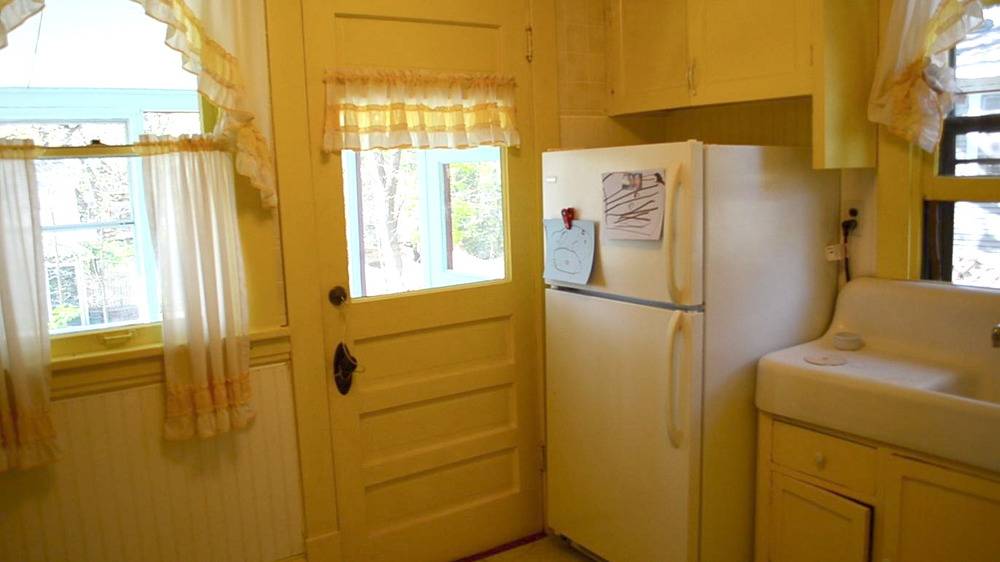
And, it remained like this for far too long, fifteen long months, to be exact (though, to be fair, we actually only lived with it this way for nine months). The picture hardly does the space the hideous justice it deserves. In reality, the space was mostly useless. There were exactly 4 sq. ft of countertop, no oven, no stove, and a kitchen sink that was a whopping 4″ deep. In addition, there was a very small refrigerator with a very unreliable freezer (it vacillated from deep freezing everything to thawing everything depending on its mood).
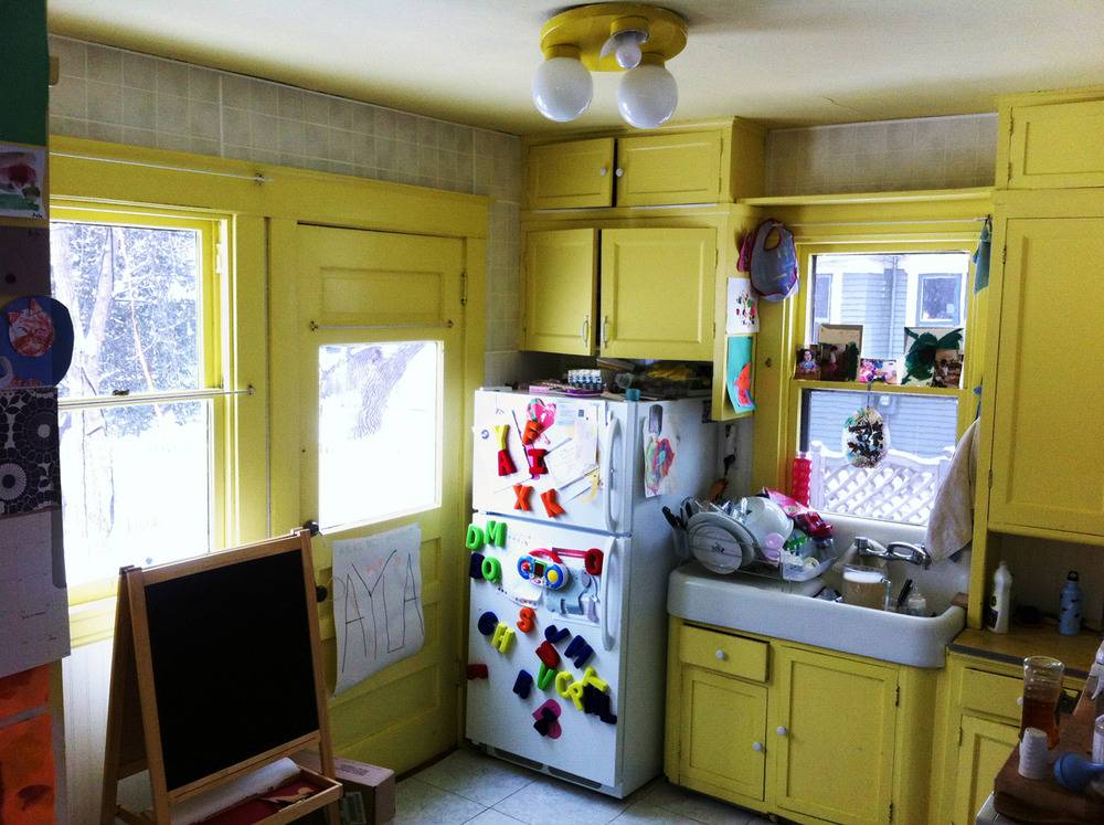
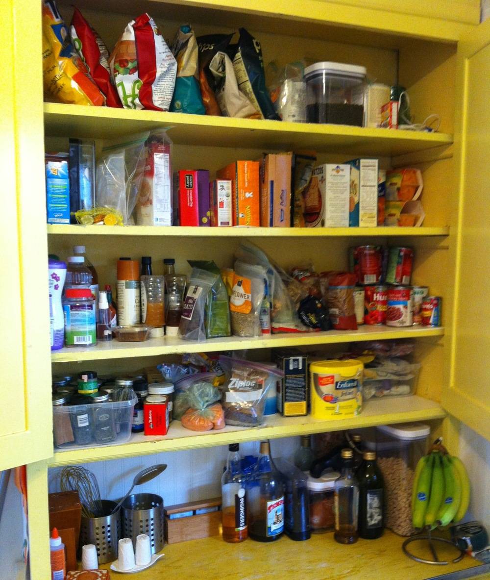
And, how can I forget the two sets of cabinets (two uppers, and two lowers) that we managed to squeeze everything we owned into. There were also five decrepit drawers, but only two of them opened; and when you opened them, you had to wiggle them in a zigzag pattern ala giant slalom. There was nothing charming about this kitchen, unless you like the color dirty lemon-yellow.
Before we even moved into the house, we knew we would have to redo the kitchen. In fact, we made ourselves live with it in that sorry state so that we would be motivated to begin the remodel as soon as our bank accounts recovered from phase one of our work on the house.
After a few months in the house, we were desperate to begin planning our new kitchen. We received the incredible opportunity to work with Aristokraft cabinetry, and through this partnership we were matched up with a wonderful kitchen designer, Jeannine.
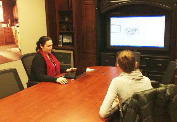
We met with Jeannine (at the beautiful Gerhards showroom in Minneapolis) several times to brainstorm the best layout for the space, and nail down our wish list. We knew we wanted plenty of storage, lots of counter space, and an island with seating. We also told Jeannine that we would like to allot space for a stove and working refrigerator. Fortunately, she was willing to work with these extraordinary demands. 😉
Months and months later, no thanks to Mother Nature who graced us with a winter that just wouldn’t quit, the kitchen that we had obsessed over in 2D form, was right there before our eyes. The amount of work this space required was incredible, but it was so worth it.
And now, prepare for more pictures than a proud grandma can hold in her purse.
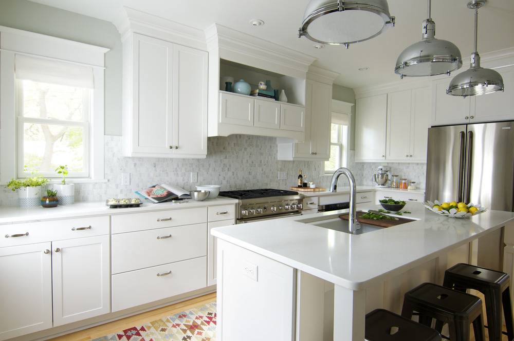
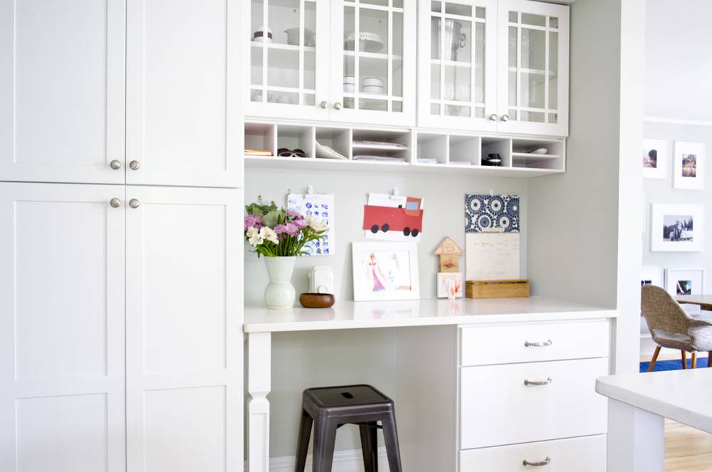
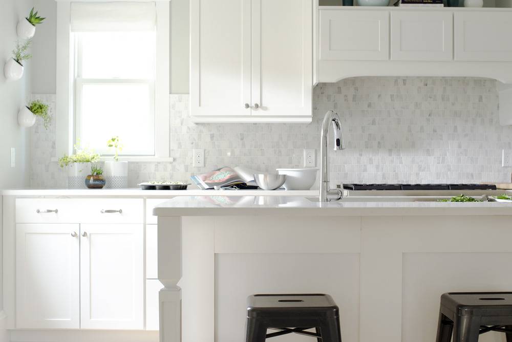
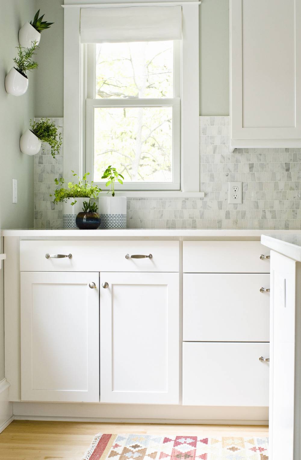
Cabinet Bells and Whistles
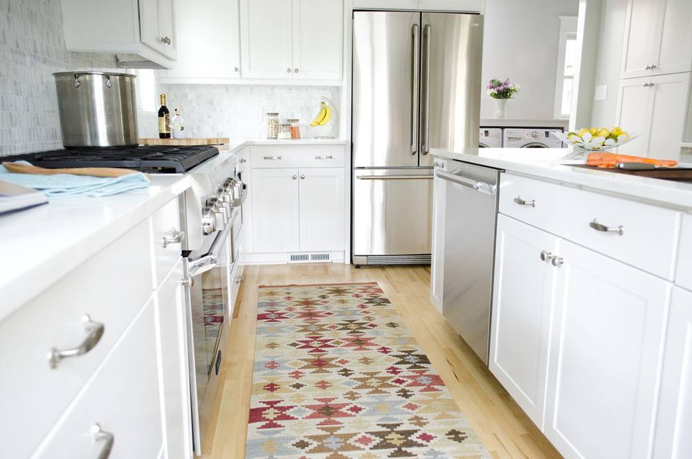
As our kitchen design came in to fruition we found ourselves in the very lucky position to work in some special features that have made a huge difference in the room.
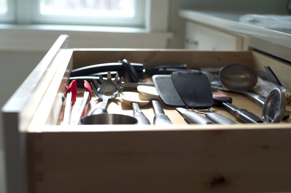
For starters, all of our drawers fully extend and are soft-close. It’s glorious.
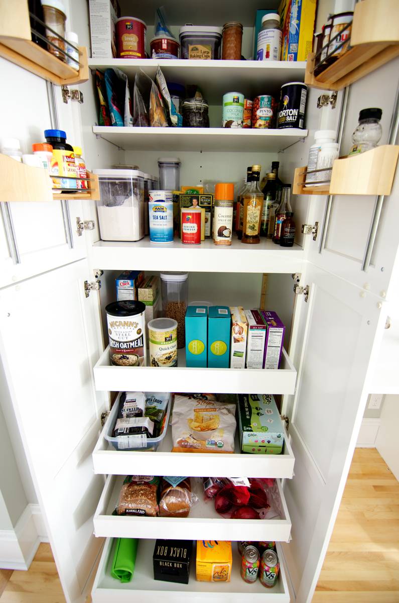
We have a super pantry, and it really is completely super in every way. Just look at the fully-extended drawers and tremendous storage capacity. Hello perfect pantry of my dreams!
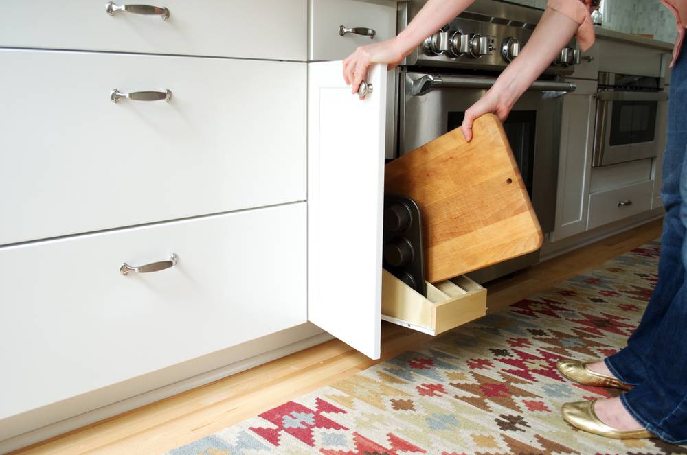
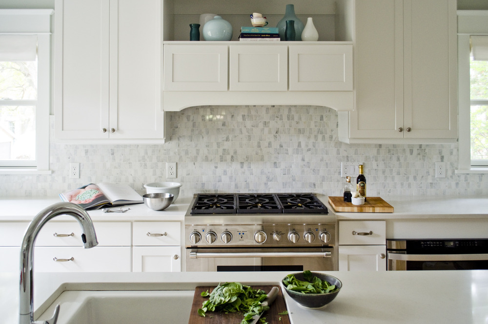
On both sides of the stove we have lower cabinets that come with built-in dividers to house our baking sheets and cutting boards. This level of organization is just what my Type A personality was longing for (Aristokraft has a ton of interesting organization accessories that, frankly, make me lusty).
Countertop and Backsplash
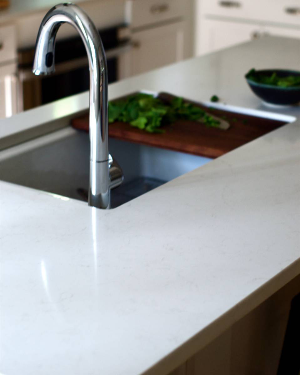
Selecting a countertop was another big decision we had to make during or kitchen planning phase. Once we’d selected white cabinetry, our inclination was to go with something darker on the countertops. We initially envisioned going with a soft gray or cement. However, after looking through dozens of options, we struggled to find just the right one.
We visited a Caesarstone showroom and both Bruno and I were immediately drawn to the marble-y look of Frosty Carrina. We liked the way subtle veins of gray made their way through the white base. If you ever find yourself in the market for new countertops, please do yourself the immensely helpful favor of finding a showroom that stocks the countertop you love. It makes a huge difference to see it in person on a real-life large scale. The Caesarstone showroom we visited was in a Best Buy(!), and seeing the countertops in action made us fall even more in love with our selection; and thus our kitchen countertops were born. Plus, Bruno bought the new Taylor Swift CD on the way out (ok, no he didn’t, but only because I stopped him).
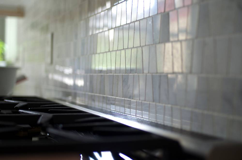
Once the cabinet and countertop decisions were in place, we needed to select a backsplash. This was by far the hardest decision for us. We searched for weeks for one that would be both interesting and timeless. I was leaning toward a stainless steel penny tile, which was interesting. Bruno feared it would be too shiny and bold in our bright white kitchen. He was pulling for a classic white subway tile, and although I love a subway tile, I feared it would be too predictable.
On our very last stop of our backsplash hunting marathon we stopped by a local tile distributor, Kate Lo, and saw this little gem called “Boutique Oriental White Echelon” by Olympia Tile the moment we walked through the store. We both loved it. We had nary a countertop or cabinet swatch in our hands, so ordering it was risky. But, we like living on the edge and ordered it on the spot.
Fixtures & Lighting
We were so excited to get the opportunity to work with Kohler again on this project (remember we teamed up last year for our first bathroom makeover?). Not only are their products beautiful, they are incredibly well made.
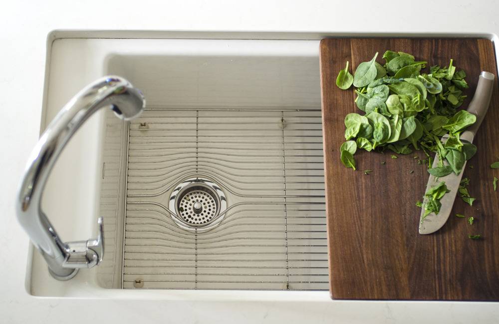
For our kitchen sink and faucet we chose the Indio sink and the Sensate faucet. The Indio sink is farmhouse-esque, but with no apron. It’s pretty huge and comes with a stainless steel grill that prevents pots and pans from scraping the porcelain. It also has a custom cutting board that fits right over the sink; it’s the most convenient, brilliant accessory ever. No sink should be without one. Period.
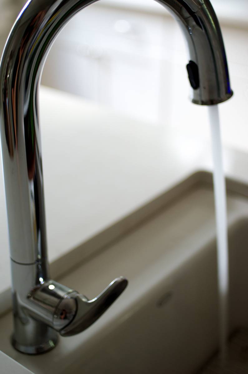
The Kohler Sensate faucet; aka magic times. It turns on with a wave of your hand. Convenient when your hands are covered in chicken guts, etc.
We went back and forth over the look and size to go with for our pendant lighting. In the end, we chose the Hinge Pendant No. 804 by Quorum International (on sale at Lumens.com). The pendants are huge and we love them because they make a big statement in the room.
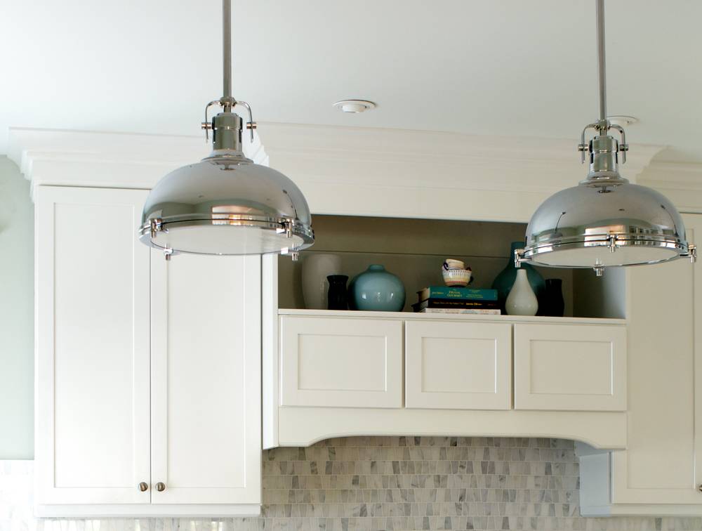
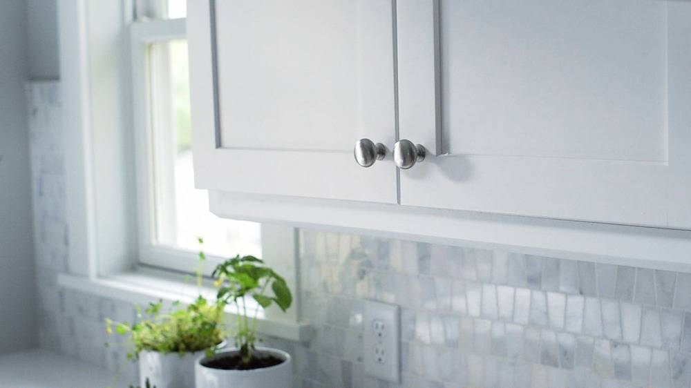
For task lighting, we installed can lights and cabinet lighting. We were completely sold on the idea of doing under-mount cabinet lights when we realized everything would be concealed by this pretty light rail at the cabinets’ base.
Work Area
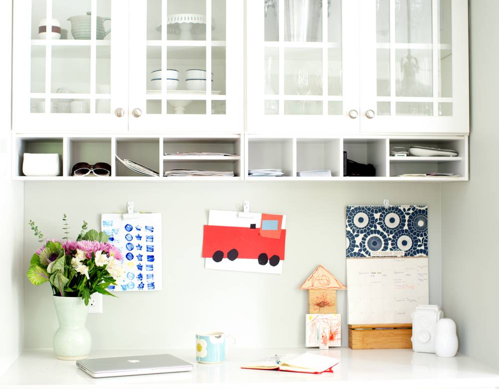
We hemmed and hawed over having a work area in the kitchen, and decided to go for it because we liked the idea of having a place for our kids to work and have computer time down the road. The space ended up being a sweet little nook that has a small work area and a beautiful display of glass cabinetry that I dream of filling with pretty things.
All in all, we are thrilled with the way the kitchen turned out. All the planning and luck that went into it resulted in a simple, airy space that feels like the perfect place for our family to gather.
For those who want to know, here’s a complete source list:
- Cabinets: Winstead Maple in White from Aristokraft
- Pulls & Knobs: H314 Pull and H316 Knob from Aristokraft
- Paint: Sherwin-Williams Aloof Gray SW 6197 (walls) and Sherwin-Williams Pure White SW 7005 (trim)
- Sink: Kohler Indio Under-mount single bowl kitchen sink in white
- Faucet: Kohler Sensate Touchless Kitchen Faucet
- Countertops: Caesarstone Frosty Carrina
- Shades: Laura Ashley Flat Fold Roman Shades from Blinds.com in Casualle Milk Sugar
- Pendant Lights: Hinge Pendant No. 804 by Quorum International
- Runner: Indo Hand-Knotted Kilim runner from Overstock
- Stools: Tabouret Charcoal Grey counter-height stools
- Planters: Threshold Stoneware Geo Print Utensil Holder from Target
- Wall Herb Planters: Arcadia Round Wall Planter from Wayfair
Appliances: Oven and dishwasher are from Thermador, and they’re terrible – don’t buy a Thermador appliance! We’ve had nothing but trouble from them in the six years since we remodeled, and their customer service has been rude and unhelpful. Looking forward to buying another brand as soon as we can justify it.
Note: This post was sponsored by Aristokraft and we received product donations from Sherwin-Williams, Kohler, Blinds.com, and Caesarstone. All opinions are my own. Thanks for supporting the partners that make these posts possible!
Hi Alicia!
Your kitchen reveal absolutley stunning! Great work 🙂
I have a question for you regarding your countertops. We just built our new home and chose a quartz countertop through the builder, due to our incredibly good experience with Caesarstone quartz (a pebbled grey and white finish) in our last home of 5 years. Verrrry long story short, the quartz was not Caesarstone and is staining quite terribly. The supplier has agreed to replace the countertops because they appear to be defective. For the replacement countertops, we are planning on going with either Caesarstone London Grey or Caesarstone Frosty Carrina. Just wondering how you’re liking them so far and how well they’ve stood up in terms of stain resistance and durability. Would love to hear your thoughts.
Thanks so much!
Carli
Hey Carli! Thank you for the sweet comment.
Per your question about our countertops (Frosty Carrina): Overall, we’ve been very happy with them. However, we have had stain issues with red wine. We’ve been able to get the stains out with A LOT of elbow grease, Magic Erasers, and a stain remover called “Grandmas’s Secret Spot Remover”. On the occassions we’ve had trouble with the stains, the wine stain has sat on the countertop for about 10 minutes before we realized it. For simple spills that have been noticed immediately, we’ve had no trouble with staining or the liquid setting in, but red wine stains that have had a chance to sit have been a problem for us. The London Gray counterops are a much grayer option and might not cause you any trouble. For now, we’re getting by just fine with our stain removers and switching to white wine ;)!
I love it! The hubs and I just finished drooling over the pix you posted. Congratulations on the completed project.
Selena
Thanks, Selena!!!
Hello,
Lovely space! I noticed your interesting sink — it’s much like mine. I’ve had a hard time living with it and have regarded it as a mistake made by a “friend” who cut the hole into the butcherblock. I have always wondered how he could have mismeasured for the opening causing the countertop to sit an inch back from the sink all the way around. I’ve been annoyed by the ledge it created on the sink itself. I can’t seem to keep it clean and it always catches grime and drops of water. How do you deal with this? Do you still love it or do you have regrets, like me?
I was excited to see the cuttingboard that sits so neatly on the ledge of your sink. This looks like a hopeful solution for my dilemma. I knew I kept that cutout piece for a reason…
Cheers,
Ellen
Gorgeous! First thing that caught my eye was the beautiful backsplash tile. Can you please tell me where it’s from! Thanks!
Really lovely design. I’m wrestling with the backsplash behind my range. I see you have small tile – it looks like you have a professional range so I assume you cook a lot; is it a constant struggle to keep the grout clean behind the range? Did you use any particular type of grout and/or sealant that will resist grease, etc.? I agree about the Frosty Carrina – I saw it at an Ikea in MA and decided on the spot that it was the one!Thanks for sharing!!
5 years later and this kitchen is still modern and clean looking, so beautiful! do you remember what colour grout you used for the backsplash? we have picked out the same one but are struggling with the grout colour! thanks!
Hi, Nicole! Thank you! I don’t recall the color of our grout, but it’s a pretty true white. We sealed it after grouting and we haven’t had any issues with stains. Good luck with your beautiful kitchen remodel!