For the last few weeks, we’ve been sharing all the amazingness Emily Henderson is going to bring to the Curbly House. We hooked up with Emily, her assistant Orlando Soria, and Sherwin-Williams to bring a calm, airy, elegant do-over to our master bedroom, dining room, and living room. This week we’re back to introduce our final room makeover, and it’s our most loved (and most perplexing) space: the sunroom.
When we first toured the house (by light of our cell phones, because not one light in the house would turn on), the sunroom was this amazing, intriguing place. It was full of windows (never mind that they had enormous, animal-chewed holes in the frames, holes so big you could reach you hand through and check the weather).
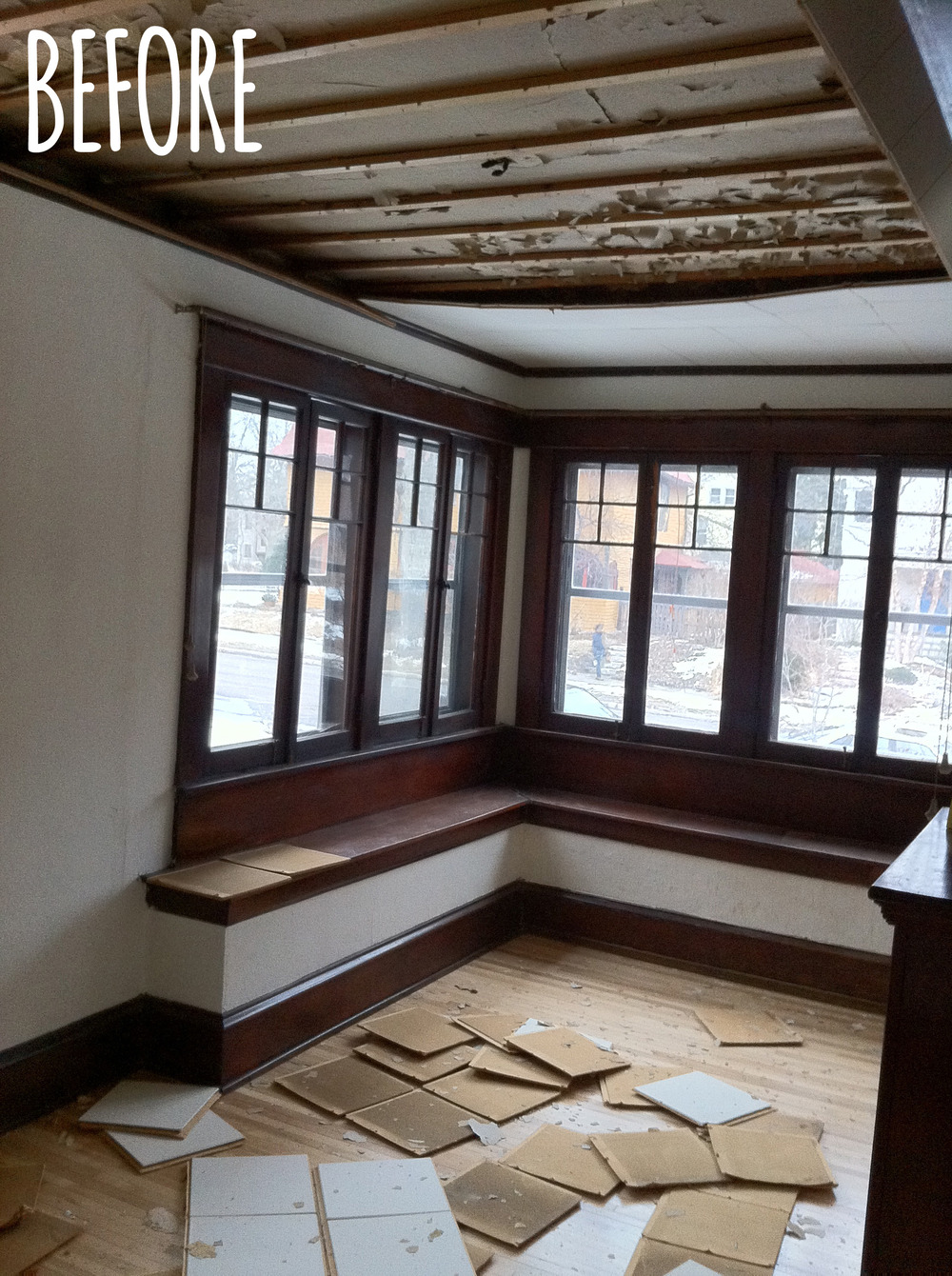
We loved the room because we knew that by the light of day, it would be sun-filled and cheery. We imagined it would serve as a perfect place for our kids to play. To this day, it’s where they spend most of their time. They love to climb up on the bench and watch the world go by, and sprawl out on the floor amidst and explosion of toys. It’s a great room, for sure. But design-wise, it’s a hot mess. Have a look:
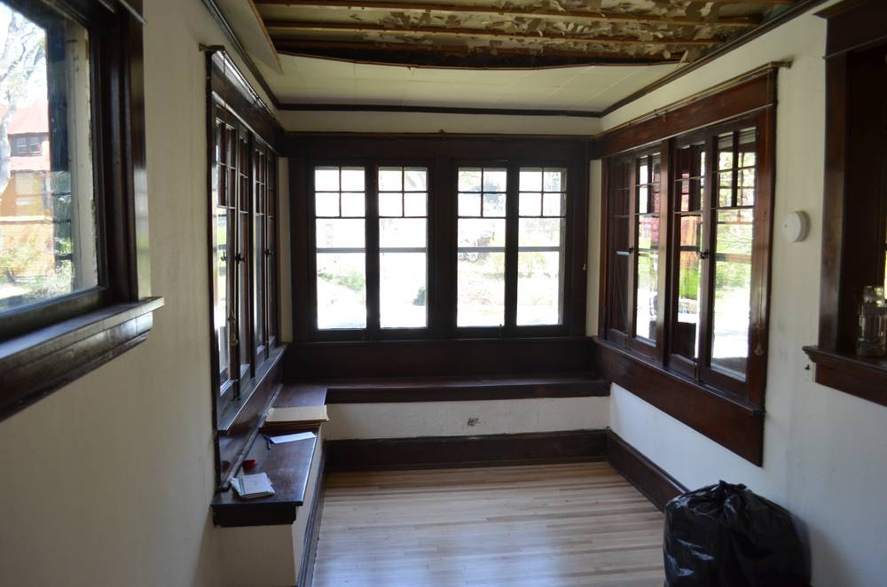
This is the day we closed on the house.
We started out right away by tearing down the tiled ceiling. Over the next few months, we installed a new ceiling, and added overhead lighting. We also put in some new, energy-efficient Anderson windows that matched the original grilles. Then, of course, we painted the room from head to toe. The transformation was dramatic.
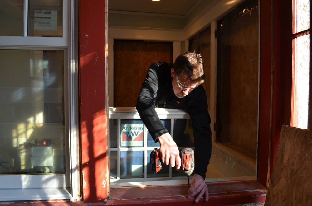
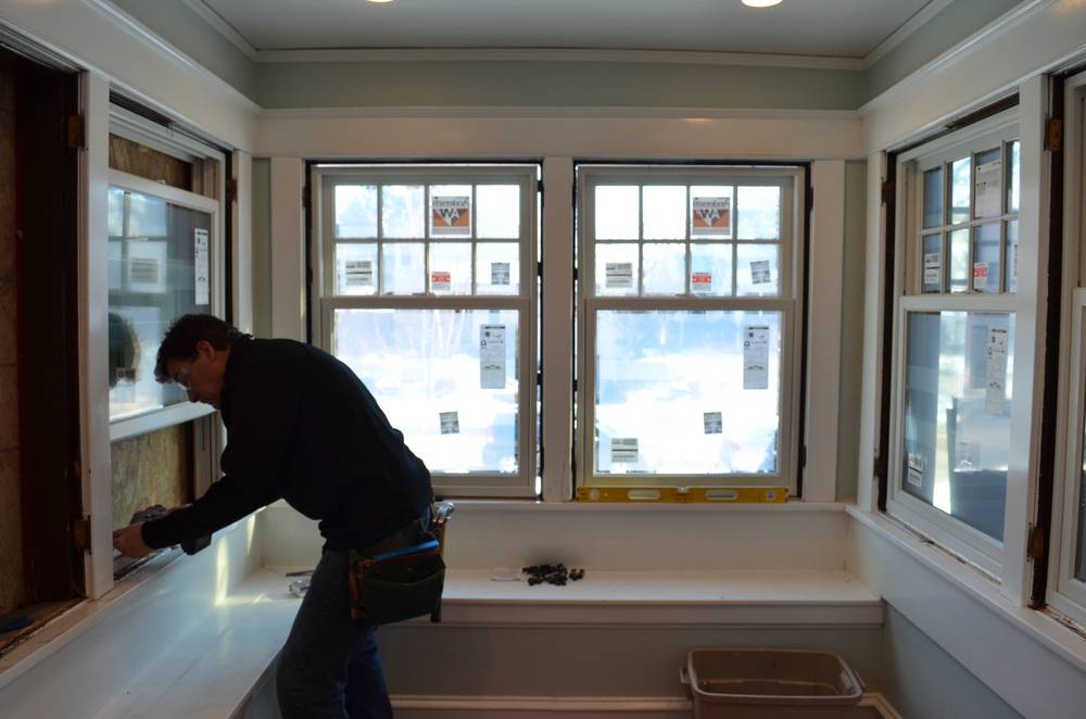
Andersen Windows is a Minnesota company, so I got to tour the facilities. It was really cool! Check out my post about it.
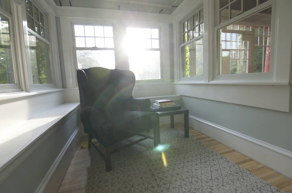
We wanted the walls in this room to have something ethereal about them. We chose a color by Sherwin-Williams called Sea Salt (SW 6204) because it looks like the ocean and the sky met and had a perfect baby. It’s soft and stunning, and sets this little room apart from the rest of the first floor in very special way.
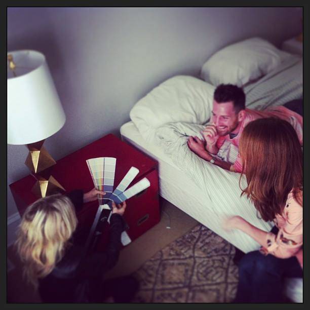
We found a gray for the dressers that looks lovely with our Sea Salt walls.
Like many of the rooms on our first floor, the room is virtually wall-less. It’s filled with windows (a plus!) and half-walls that make it nearly impossible to hang artwork or arrange furniture. It’s long and lean, making rugs difficult to fit, and no matter how we set it up, the room seems to be split in half.
Emily has been extremely helpful in brainstorming ideas for arranging the room, but the space is so awkward that we’ve decided to wait to completely put it together until she arrives. So, this room will be a true surprise for all of us, my friends!
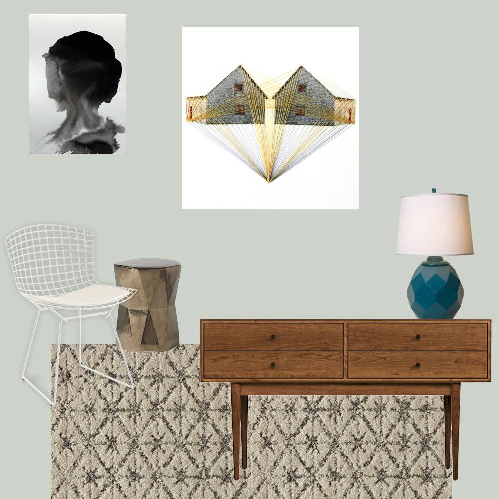
Here’s our working mood board:

We found a pair of Knoll Bertoia chairs (I’ve been coveting them for years), on Craigslist. They were a lucky find (with an even luckier price of $200 for the pair), but they were in rough shape (chipping finish and just starting to rust). So we called around and found a sandblaster and powder coater within a few blocks of one another, and had them sanded and painted in a week. Now, they look brand new and I am smitten.

1 – Bought on Craigslist for $200. 2 – Sandblasted for $100. 3 – Powder coated for $75.
Emily helped us choose FLOR tiles for the room, and they have made an enormous difference, because they allowed us to build a custom rug that fit our space. We went with the Vintage Vibe tiles, and we are already pleased as punch with the rugs’ durability and softness. You should definitely check out FLOR’s new fall 2013 collection; you’ll be blown away by some of the amazingly beautifully styles.
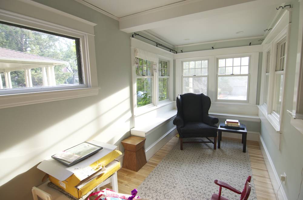
Here we are, looking a bit more put together, with our ‘Vintage Vibe’ FLOR tiles in place.
We ordered custom cushions for the window bench, which will soften that corner, and installed roman shades on all the windows. Initially, we had installed curtains in this room, but they added so much bulk, making the windows look heavy. Our new flat-panel shades from Blinds.com don’t add any bulk to the window-full walls; instead, they sit snugly inside the frames.
Lighting-wise, the room doesn’t need much help (hello sun!) but we’ll add some table lamps as a decorative accent that brings in some soft light. Here are some of the options we chose from:
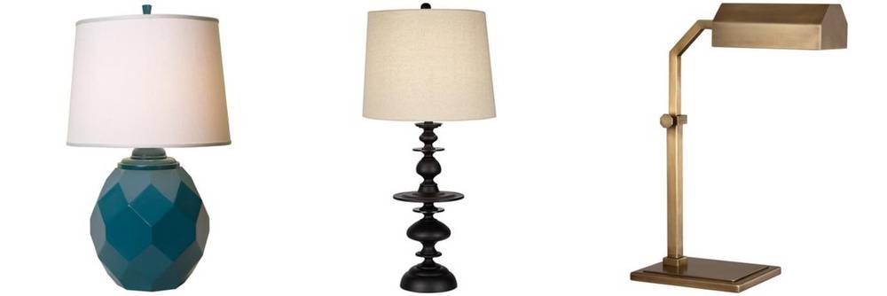
Thumbprints Jewel Cast Metal, Gemeto Black Metal, and Robert Abbey Jackson Aged Brass tables lamps from LampsPlus.com
As it stands, there are three functional possibilities we’re planning for the room. Here they are:
1 – Library. Bruno and I love the idea of filling this room with books. We’ve toyed around with the idea of adding floor-to-ceiling bookshelves on the one full wall we have, but the half-wall that runs perpendicular to it will force the shelves to have a very narrow depth, so the books will have to be very small or we’ll have to be very creative.
2 – TV Room. When we first moved into the house, we set our television and its accoutrements against the full wall, which meant that approximately two people could watch a movie together whilst wedged into our wingback chair. This was cozy for about 20 minutes, and then someone inevitably went to fetch another chair.
3 – Play Room. Perhaps the most practical solution for this room will be to treat it as the room it has already become, a play room. We could add a table to the bench area, and add low storage on the full wall. There could be a small seating area under the high picture window. Those Bertoias would look lovely with a side table between them, wouldn’t they?
The surprise factor of what’s in store for this room is so exciting. I can’t for all of us to see the reveal in a few weeks on Emily’s site!
While we’re all waiting, why not check out that mood board again? Don’t forget to pin it! Or, better yet, follow us (@curbly) and Emily (@em_henderson) on Pinterest. You won’t regret it!
Of course, you should also definitely check out the first three posts in our series:
Our Living Room, Styled by Emily Henderson
Our Dining Room Makeover with Emily Henderson
Designing Our Master Bedroom with Emily Henderson
(Do you sense a pattern?)
This post was sponsored by Sherwin-Williams, but all opinions are mine. Aaaalll mine! Mwah hah hah hah! No, but seriously, all opinions are mine alone.
Can you tell me where you got your chairs sandblasted and powder coated? I’m in Minneapolis and looking to do the same. Yours look great!