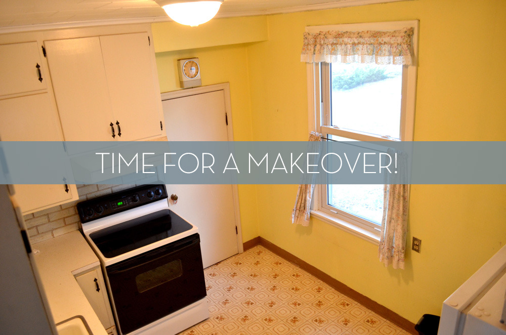
We’re so excited to share the big reveal of our Wilsonart affordable kitchen remodel today! To refresh your memory, this is the kitchen in my dad’s new house, a few blocks from our own:
It was (clearly) in desperate need of some help. But, since my dad’s not a huge foodie (he spends more time at museums than in the kitchen), we didn’t want to spend a ton to refresh the look.
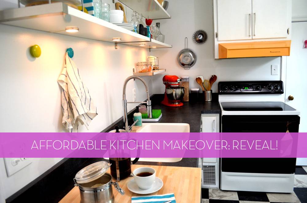
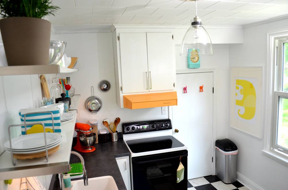
We teamed up with Wilsonart to incorporate their Wilsonart® HD® High Definition Laminate countertops into the project. Wilsonart’s laminate surfaces are stylish, affordable, and quick to install. We chose the Salentina Nero style, which has a realistic texture and a nice, reflective sheen.

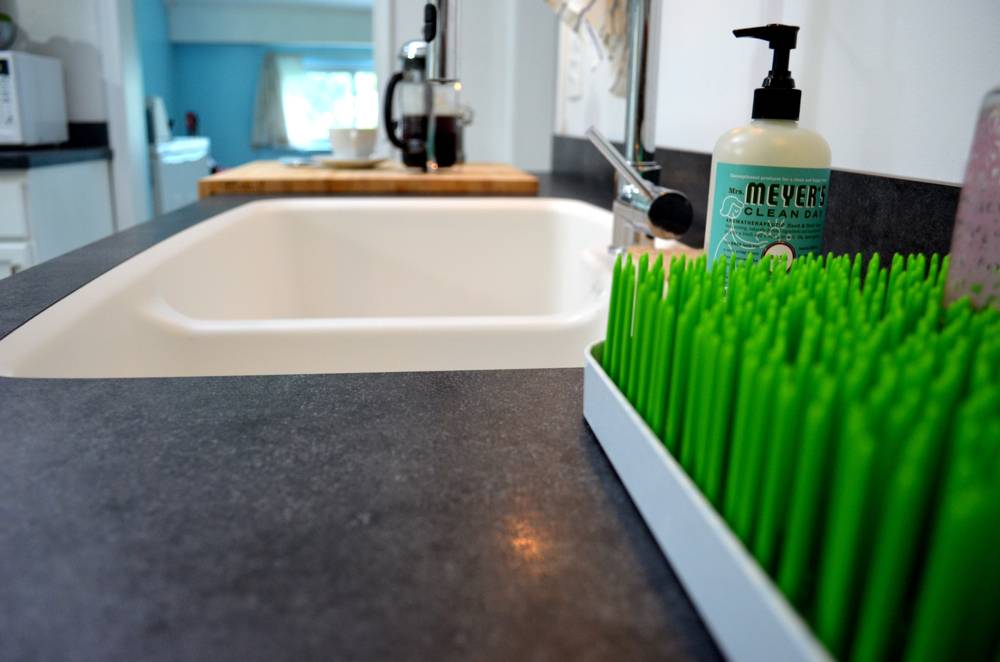
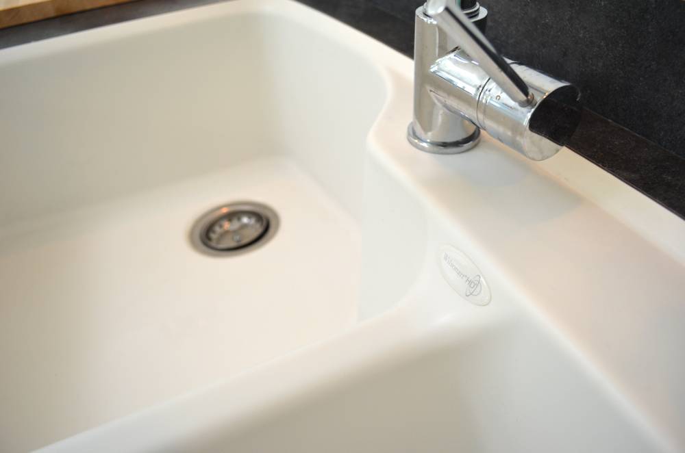
Wilsonart also sent us a Wilsonart® HD® Integrated Sink, which we really love. The integrated mount means there’s a seamless transition from countertop to sink; no groove or lip where gunk can get caught. We finished the sink off with a new, restaurant-style faucet.
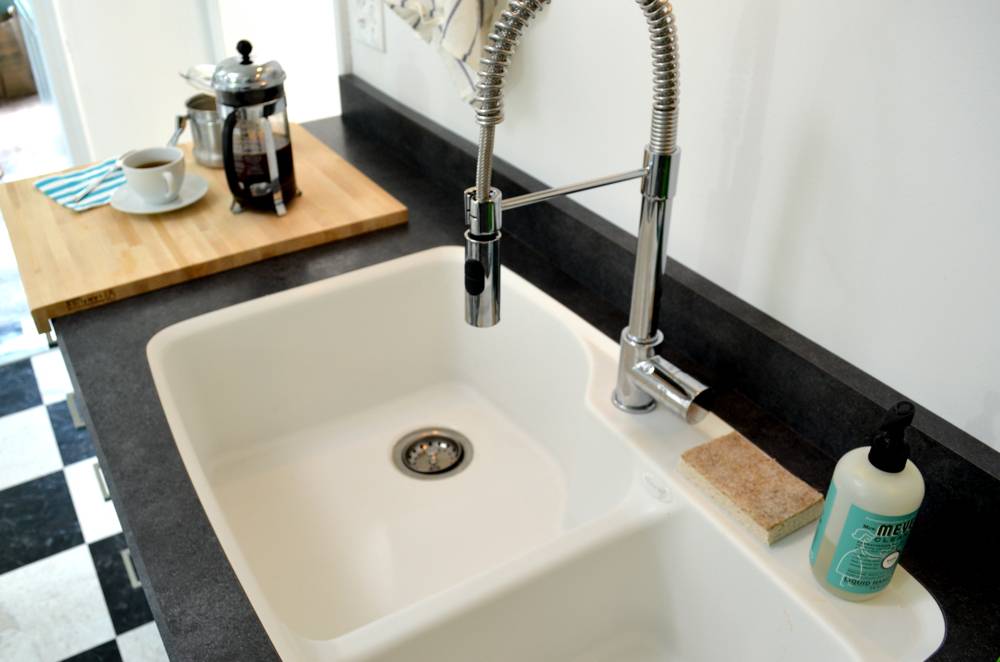
In addition to the new countertops and sink, we knew we had to do something about the cabinets. They were all painted a dingy off-white color, and the huge wall of uppers made the room feel cramped.
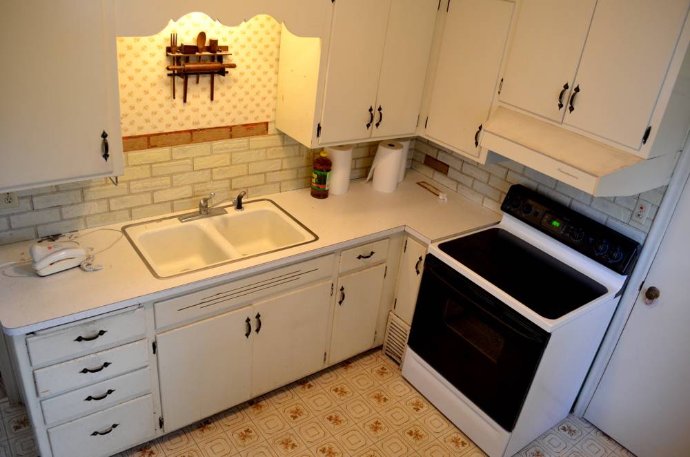
Before.
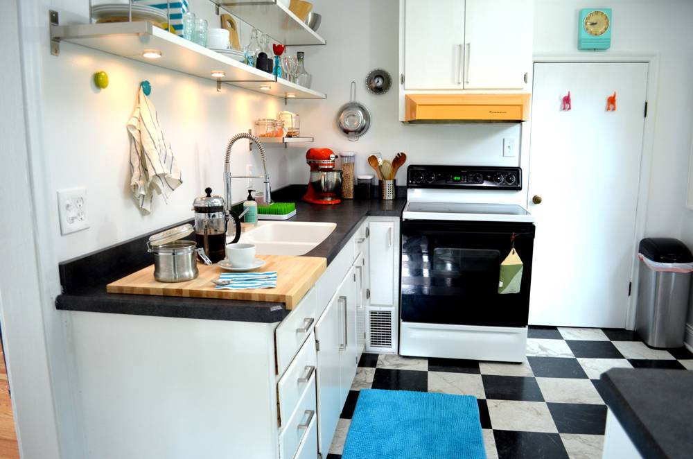
So we ripped out the upper cabinets, re-sheetrocked the wall behind them, and replaced them with open shelving. In the process we got rid of that horrible faux-brick backsplash, and repainted the remaining cabinets with a fresh coat of white paint from Sherwin-Williams.

During.
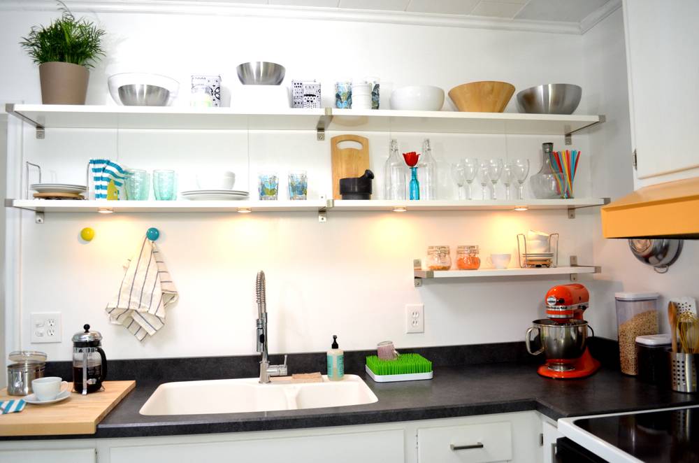
After.
We finished the refreshed cabinets with new pulls from IKEA and new hinges from the hardware store.
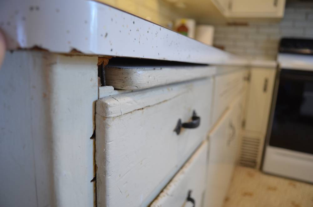
Before. Obviously.
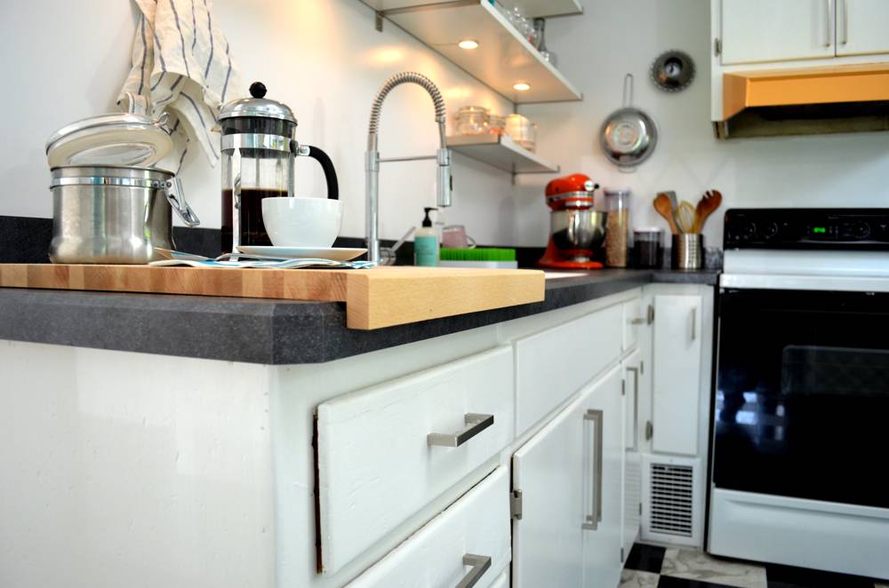
Same shot: after.
The floor was the other major project we tackled; the old linoleum was dirty, chipped, and, well … ugly. Chris and I tore it out and put down some easy-to-install self-stick vinyl tiles in a black and white checkerboard pattern. We felt the pattern would match the retro-vibe we were shooting for, and having white on the floors would help bring more light into the space.
We did another thing that really helped open up the floor plan: we flipped the location of the refrigerator with the base cabinet beside it. In the previous configuration, the fridge cut into the room and made the entry circulation really tight. Plus, the cabinet and countertop on its left was rendered almost useless.
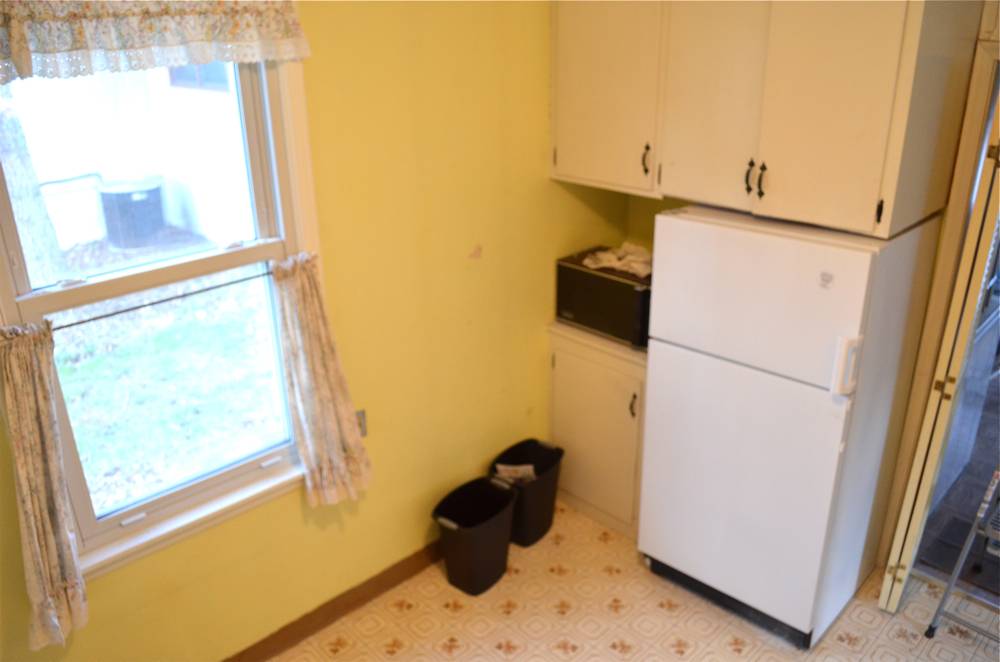
Fridge on the right.
By putting the fridge on the left, and putting in a new base cabinet (with fresh countertop on top) on the right, we created more usable space.
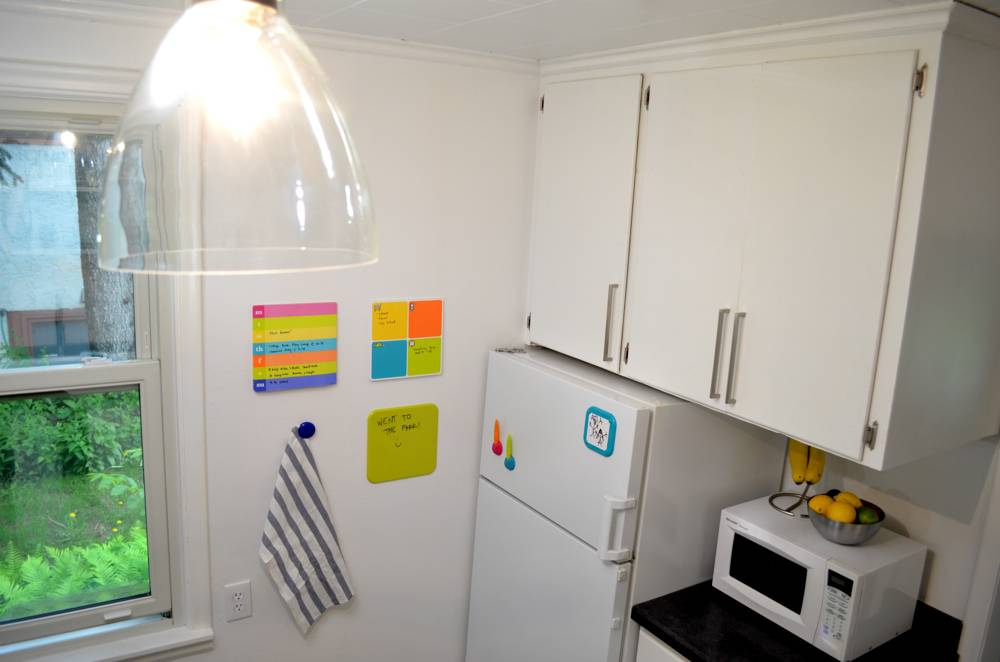
Fridge on the left.
We went with white on most of the surfaces (walls, shelves, ceiling), because the space is so small and doesn’t get much natural light. We then went crazy adding pops of bright color with accessories and accents.
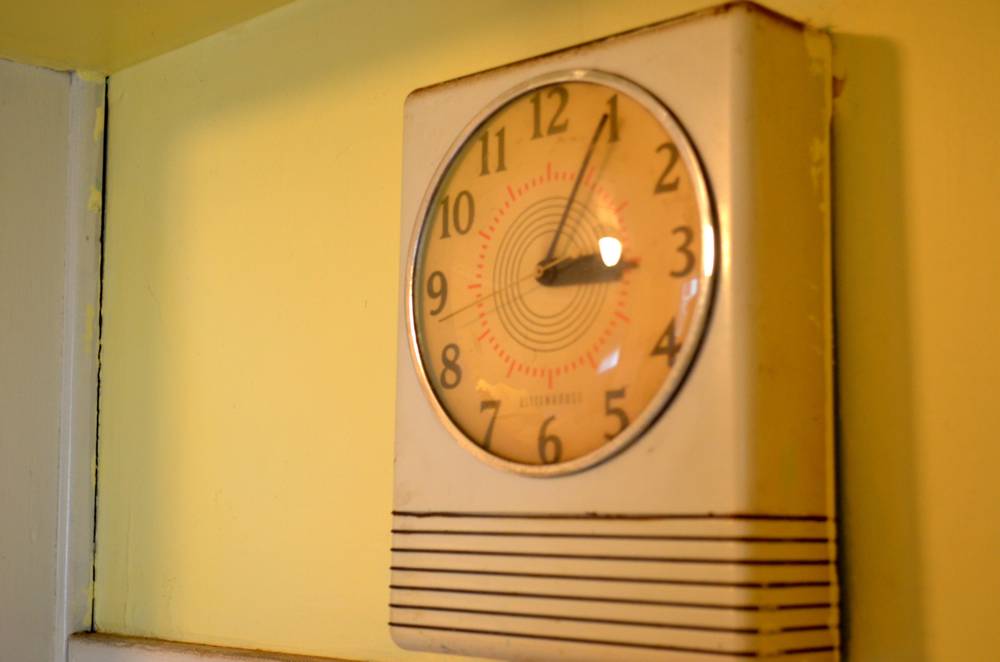
First up: that vintage wall clock we loved so much. We gave it a bright coat of Sherwin-Williams ‘Tantalizing Teal’, and then went over the striped accents with a paint marker to make them pop.

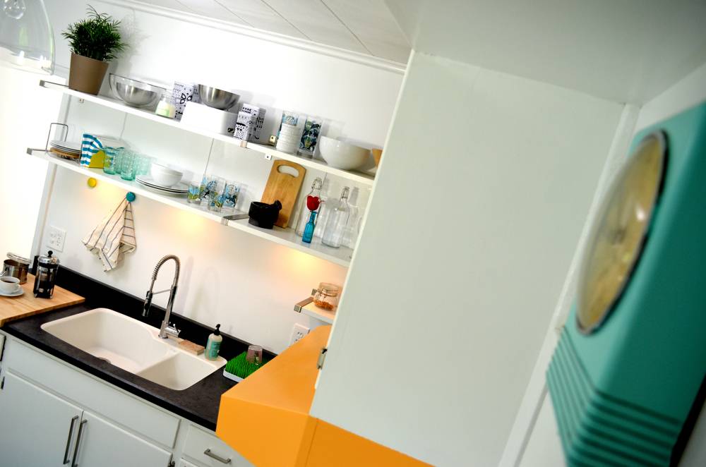
The wall clock set the tone for the whole room.
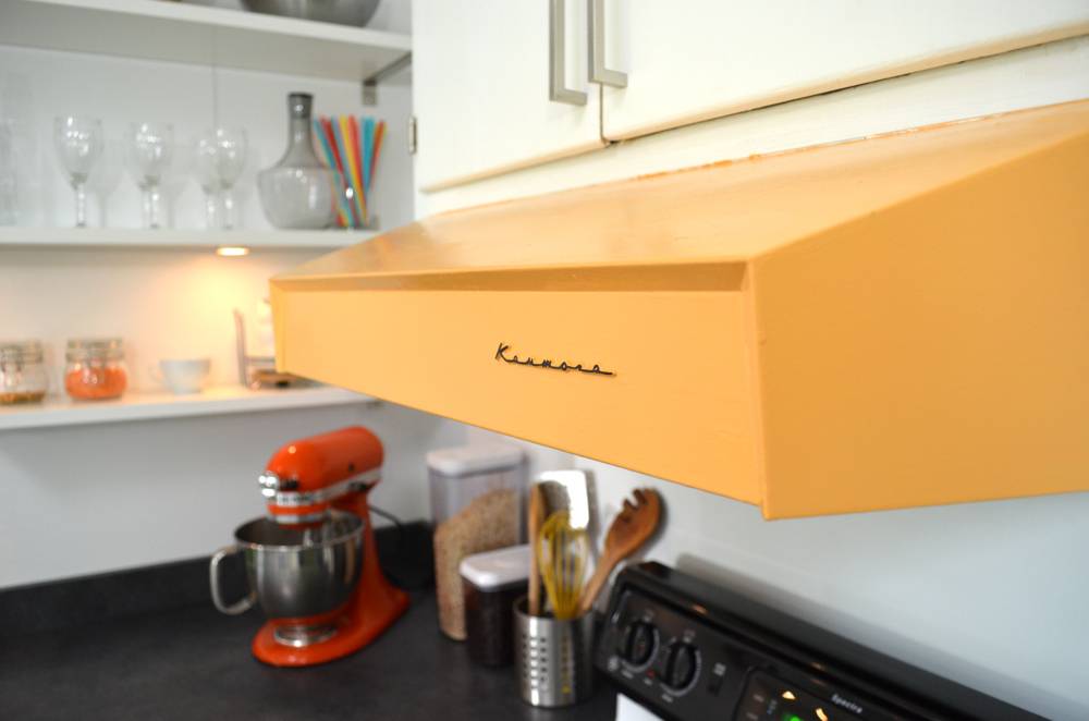
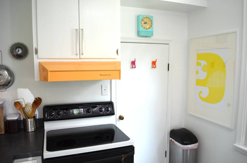
Next came the range hood. We loved the lines, so we decided to keep it in place, repainting it with Sherwin-Williams ‘Stirring Orange’. Again, we used a marker to go over the ‘Kenmore’ brand name; the whole thing looks like new!
We used a bunch of clips, frames, and note pads from LuLaLu to add color and function to the kitchen. These pops of color break up all the white in the kitchen and make it more playful.
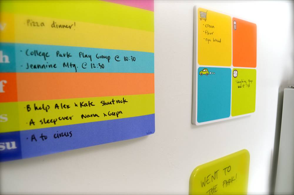
This space is a little calendar/message center. The cool thing about the LuLaLu accessories is that they’re NOT magnetic! They stick to any smooth surface without leaving a sticky residue. And they can be moved again and again (you just refresh the sticky pad with a few drops of water).
The ceiling light that was in the room to begin with was actually pretty new, but it was just one of those stock dome lights you find in packs at the big box hardware store. We picked up this great Industrial Pendant ceiling light from West Elm, and we love the way it completes the look.
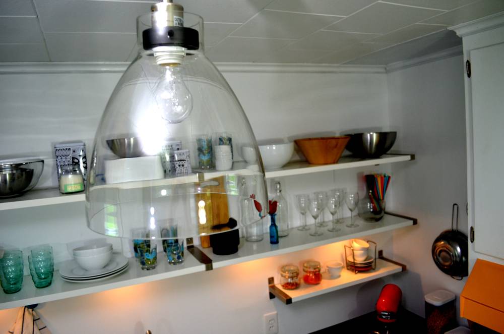
Here are some other touches we really like:
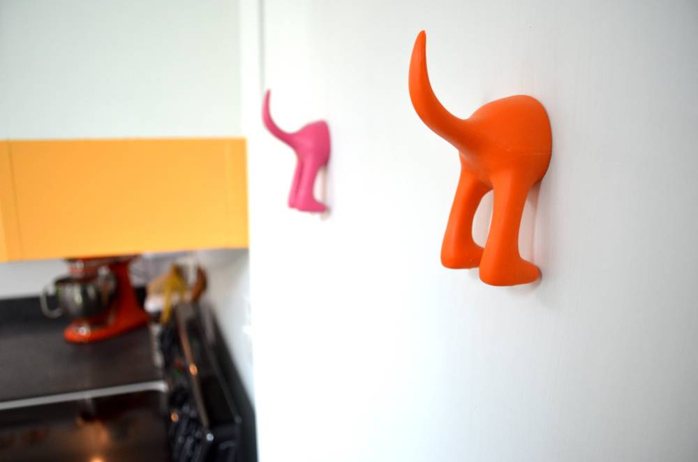
The puppy-dog tail apron hangers give the pantry door a splash of fun and color.
The huge elephant print fills up the space to the left of the window without being overwhelming. And who says elephants can’t do handstands?
The orange KitchenAid stand mixer was a lucky fit in this space. My dad purchased it on clearance years ago, and the color completely works in his new kitchen.
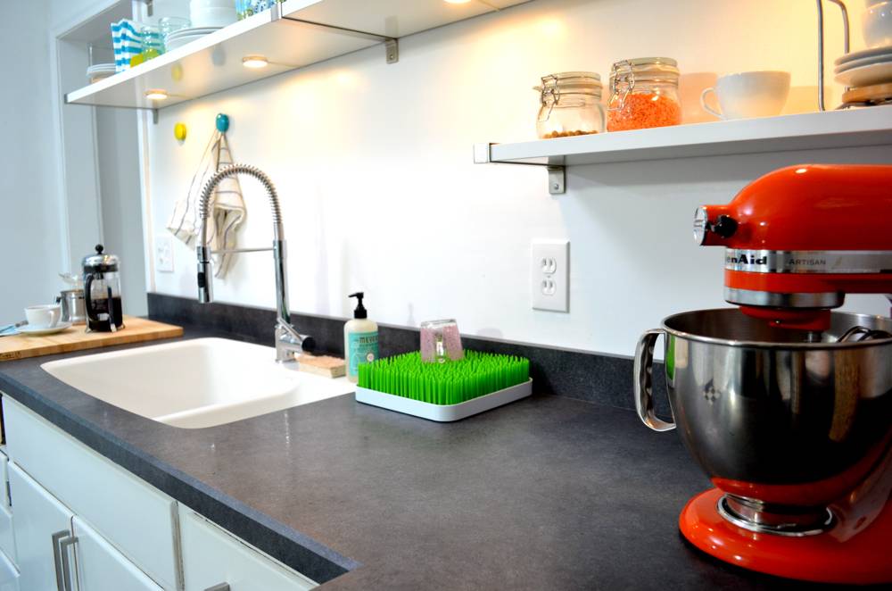
We’re thrilled with how the makeover turned out! I love how the white opens up the space, and the bright colors make the room feel fun and not-to-serious.
What do you think? Let us know in the comments!
This post was sponsored by Wilsonart, LLC. All opinions are mine alone
Hi I really like your countertop choice. We are considering it. How do you think that it has held up?
Looks fantastic! How has the counter top worn? Holding up well? Is it super shiny?