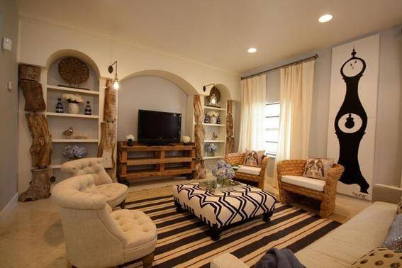
This month, Curbly is excited to team up with designer and TV host David Bromstad, of HGTV’s Design Star and The White Room Challenge. David is offering his professional tips about one his biggest passions: using color to transform everyday rooms into something extraordinary.

In case you haven’t heard, neutrals don’t have to be boring. Not even beige. You can still bring interest and depth of color in your home without adding brights or anything crazy… When selecting paint and color palettes, I love to use Sherwin Williams for your Home collections. They have an incredible selection of colors! You can use one of their pre-made color palettes, or you can make your own (like me)!
Here are three examples of neutral palette’s I’ve put together that I just love.
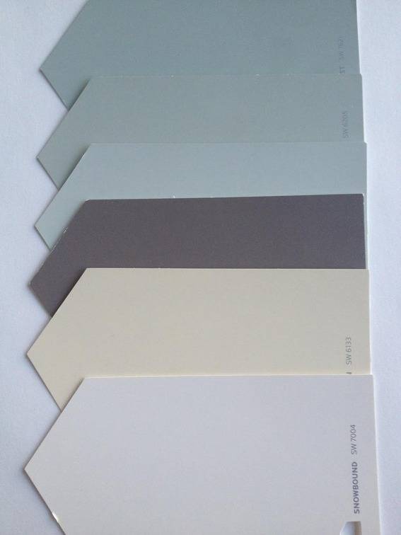 Color Palette #1: Using similar tones of one color is a great way to keep a cohesive look. I love pale pale greens, so close to beige and taupe but with a little more interest! I don’t have an exact example of this color scheme, but this room from Color Splash is extremely similar.
I went for a darker shade of brown, but to keep the palette in neutral territory, this muted shade works perfectly!
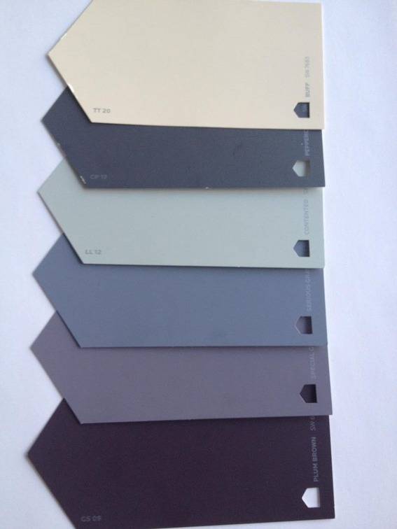
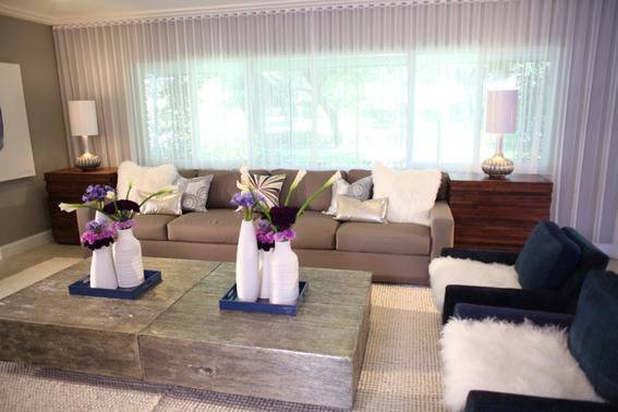
Color Palette #2: This one is similar to the color scheme I used for the Feather Room on Color Splash. Smoky tones of grey, purple, sage, cream all look super fabulous together. Greens and purples are always complimentary, and muted tones of it are scrumptious.
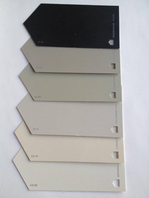
Color Palette #3: Black is a popular neutral in clothing, but it’s also a great neutral for your home! Use it in moderation, and pair it with creams and taupes for a sophisticated look. I absolutely love it with added natural elements like raw wood…
