Bruno and I have some big news brewing – we’re having a baby! Our first, Ayla, was born in 2009, and has been our greatest joy. So we’re ridiculously excited to add to the family. Of course, a new baby means a new nursery, so for the last few months I’ve been dreaming up color schemes and pinning favorites left and right. Turns out, the third week in April is National Painting Week, so it’s a perfect time for a paint-inspired redo!
We decided not to find out the baby’s gender this time around, and knew we wanted to go with a neutral and gentle palette in the nursery. I have been in love with the combination of gray and yellow for the last few years, and it seemed like the right combination for our new nursery.
Read on to find out how we turned a ho-hum office space into a happy home for a new baby.
Sherwin-Williams kindly offered to collaborate with us on our new nursery, so checked out their Web site to get inspired by some of their collections. Let me confess here: as much as I love color and painting, I always dread choosing colors. I get overwhelmed by all the options and go home with too many swatches. On more than one occasion, this has resulted in me painting a room over and over again (just ask Bruno about the four different shades of blue that were on our living room walls in the span of eight months!).
One of the most helpful parts of choosing a paint color from Sherwin-Williams was the fact that they had ideas for me. I honed in on their Kids’ Collection, which offers color palettes that are designed to grow with children. The color combinations complement a wide range of designs that can be easily updated as children develop.
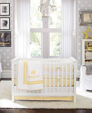
Color is a key part of nursery design, and I found Sherwin-Williams’ color palettes to be flexible and beautiful. The one I was most drawn to was in the “Teen Space” (called “Glam“). It featured gray, yellow, pink, light blue, and white. This image from a Pottery Barn catalog stuck with me and definitely inspired the rooms color palette:
Warning…a soapbox moment on painted trim: I love it. Brightly-painted white trim brings lightness to a room, no offense to those who cringe at the thought of painting natural wood work. The trim in this room was already white, but it had been hastily done, and looked sloppy. The baseboards had no quarter round, so in places you could see exposed sub floor at the edges of the room!
We took a few days to freshen the trim up with a new coat, making sure to fill in all the gaps with painters’ putty (don’t skip this part! It makes all the difference!). Bruno also installed some new quarter round, being careful to make sharp miter cuts for the corners. As always with painting, prep work is most important, so we cleaned and taped the wood before starting. The other important thing when painting trim is to avoid brush strokes and drips. Make sure you smooth the paint out while it’s still very wet, and start your strokes on unpainted areas (pulling toward the already-painted areas).

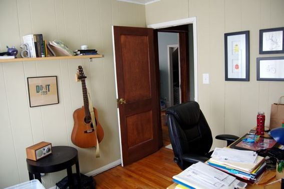
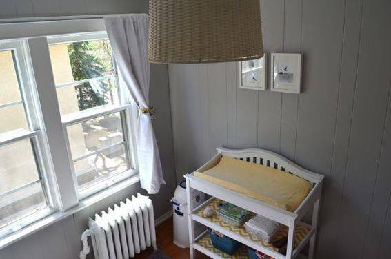
We have a three-bedroom home, and Bruno’s office (which had somehow morphed into a general storage dump) was our best option for the nursery. It’s a small room (about 9×10 feet), with painted wood-paneled walls. We were careful to go with something simple, to keep the room from feeling crowded.
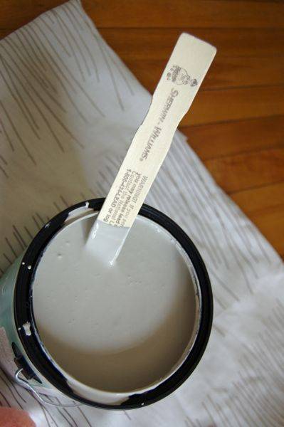
After painting all the woodwork, ceiling, and radiator in Sherwin-Williams’ Pure White, I painted the walls with Sherwin-Williams’ Light French Gray. This gray is perfection!
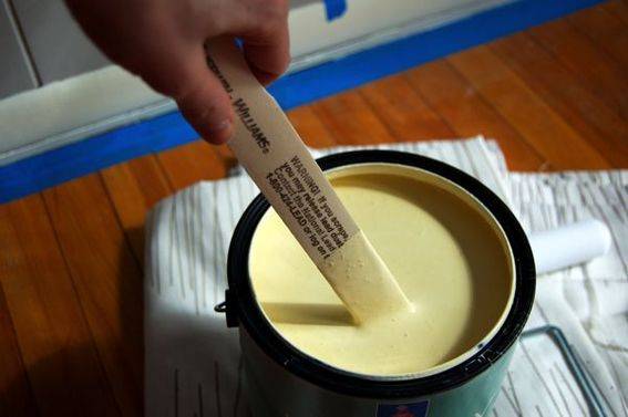
In the spirit of trying something new, I then taped similarly sized panels off (there are three different widths in the paneling on the walls!) and then added vertical stripes in Sherwin-Williams’ Friendly Yellow.
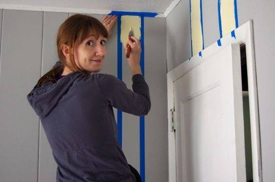
Sadly, these stripes did not work well in this little room. I think the combination of the oddly spaced panels, the small size of the room, and the fact that the stripes were painted vertically, made the room feel like a tiny jail cell. Sigh.
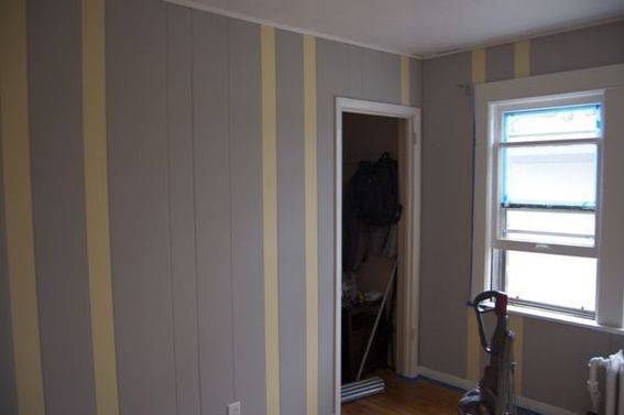
Had the stripes been painted wide and horizontally, I think I would have been in love with them, because the paint colors really do go beautifully together. But alas, such was not the case for our little nursery, so I untaped the wall, and repainted the yellow stripes gray. All was well again, and although the yellow stripes didn’t work, the combination of yellow and gray was a definite winner and served as the inspiration for the rest of the room.
We had a lot of existing furniture and decor elements from Ayla’s nursery, but changing to the neutral gray paint for the walls made this an entirely different space for our new guy or gal. It set the tone for the room and allowed us to get colorful and creative with our accessories and accents, and I think the result is just perfect!
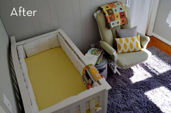
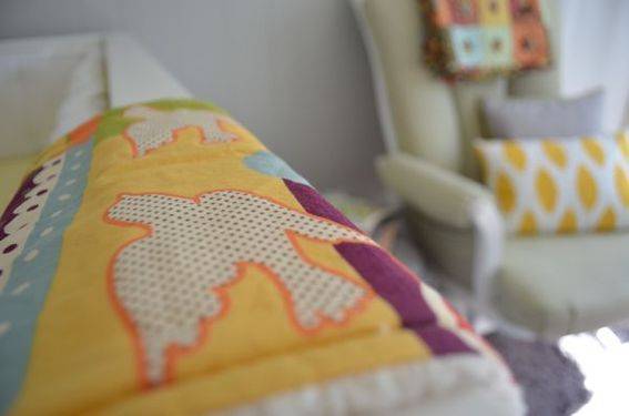
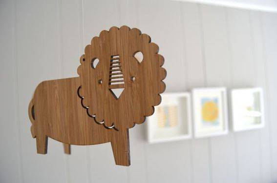
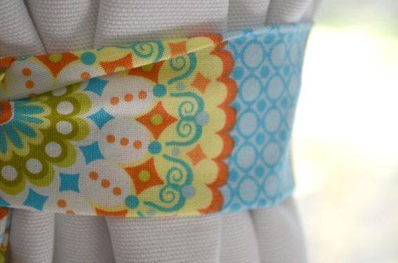
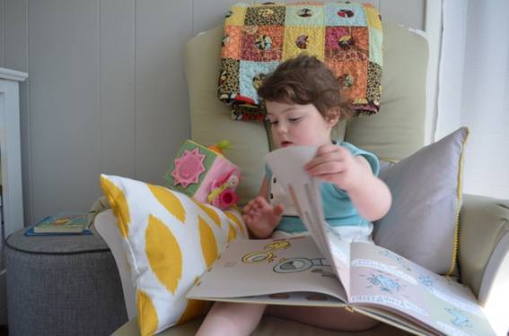
Rather than use yellow on the walls, we decided to use it as an accent color throughout the room. We are so excited about our new baby’s nursery. We love the combination of colors and the soft, neutral feel the room has. We’re also thrilled that Ayla is already smitten with the room; it’s her new favorite place to read!
Thanks for checking out our new nursery; watch for another National Painting Week project from Kirsten at Simply Grove – that’ll be posting tomorrow!
Source List:
Wall Color: Light French Gray from Sherwin-Williams
Trim and Ceiling Color: Pure White from Sherwin-Williams
Rug: Hand-woven Bliss Grey Shag Rug from Overstock.com
Rectangular Pillow: Homemade with this fabric: Premier Prints Chipper Slub Corn Yellow from Fabric.com
Square Pillow: Homemade with this fabric: Premium Broadcloth Silver and this trim: Riley Baby Pom Pom Trim in Yellow from Fabric.com
Fabric on Changing Table Shelves: Homemade with this fabric: Premier Prints ZigZag Slub Yellow/White from Fabric.com
Multi-colored quilt on the rocker: Hand-made by my mom, Lin Lacy.
Mobile: Jungle Friends Bamboo Mobile from Petit Collage on Etsy
Crib Bedding: Harper Nursery Bedding in Yellow from Pottery Barn
Curtains: Sailcloth Panel in White with Blackout Panel from Pottery Barn (blackout panels in a baby’s nursery will be your best friend forever and ever, I promise)
Curtain Tie-Backs: Homemade with this fabric: Green Palm Springs (JM29) from the California Dreamin’ line by Jenean Morrison
Colorful Burp Cloth: Superfly Lullabies on Etsy
Print: You Are My Sunshine from Yellow Button Studio on Etsy
Print: Letters ‘L’ and ‘Z’ from The Handmade Home (Free!)
Crib: We bought ours 3+ years ago, but here’s a similar one.
Changing Table: Again, this one was purchased 3+ years ago, but here’s one could be its fraternal twin.
Glider: Also purchased 3+ years ago from Dutailier. It’s not the prettiest glider, but it is incredibly comfortable and tall-people friendly.
Pendant Light: From Land of Nod (no longer available on-line)
Storage Bins: From Target and HomeGoods (not available on-line)
