The carpet is down. The furniture is in. The original Curbly House is officially on the market! We spent the last few weeks putting in long hours to get the living room (and the rest of the house) ready for showings, and we’re excited to share the reveal with you today! Read on to see how we designed a cozy living space that will (hopefully) help us sell the house quickly to a lucky new family who will enjoy it for years!
Before we get into all the details of the reveal, let’s take a peek at where we started. The room began here:
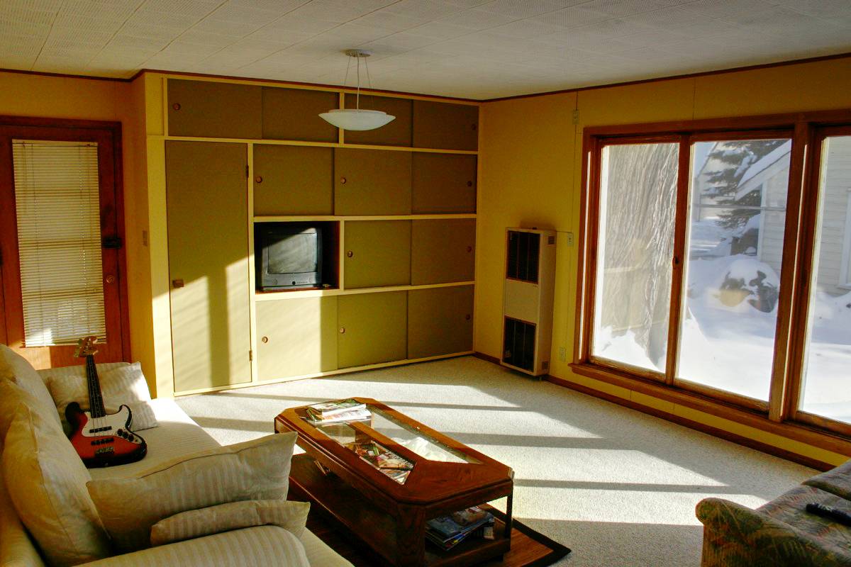
As you can see, the room always had really good light. Those huge picture windows are a gift. But for some reason, in this first iteration, we decided to smear pea-green paint all over the place. And top off the whole aesthetic with a carefully-placed bass guitar. I’m actually weirdly fascinated by this picture. It’s a snapshot of a different time in our lives, when things were much different and most meals were Ramen based.
Months later, we we did this:
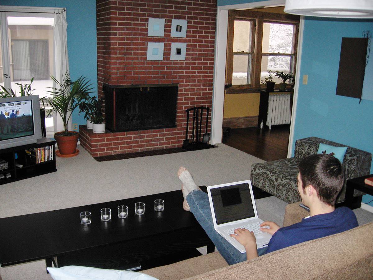
Woot! Take that, things that make sense! Here are some tiny mirrors above the fireplace, so you can scorch your face while fixing your hair! Want some neon blue walls? I got neon blue walls. On sale. C’mon. Half price! Evidently, these are the clever things you do when you’re in college, working full time, and trying to design a space on a budget that feels like a hybrid between Trading Spaces and The Royal Tenenbaums.
Moving on, we did this:
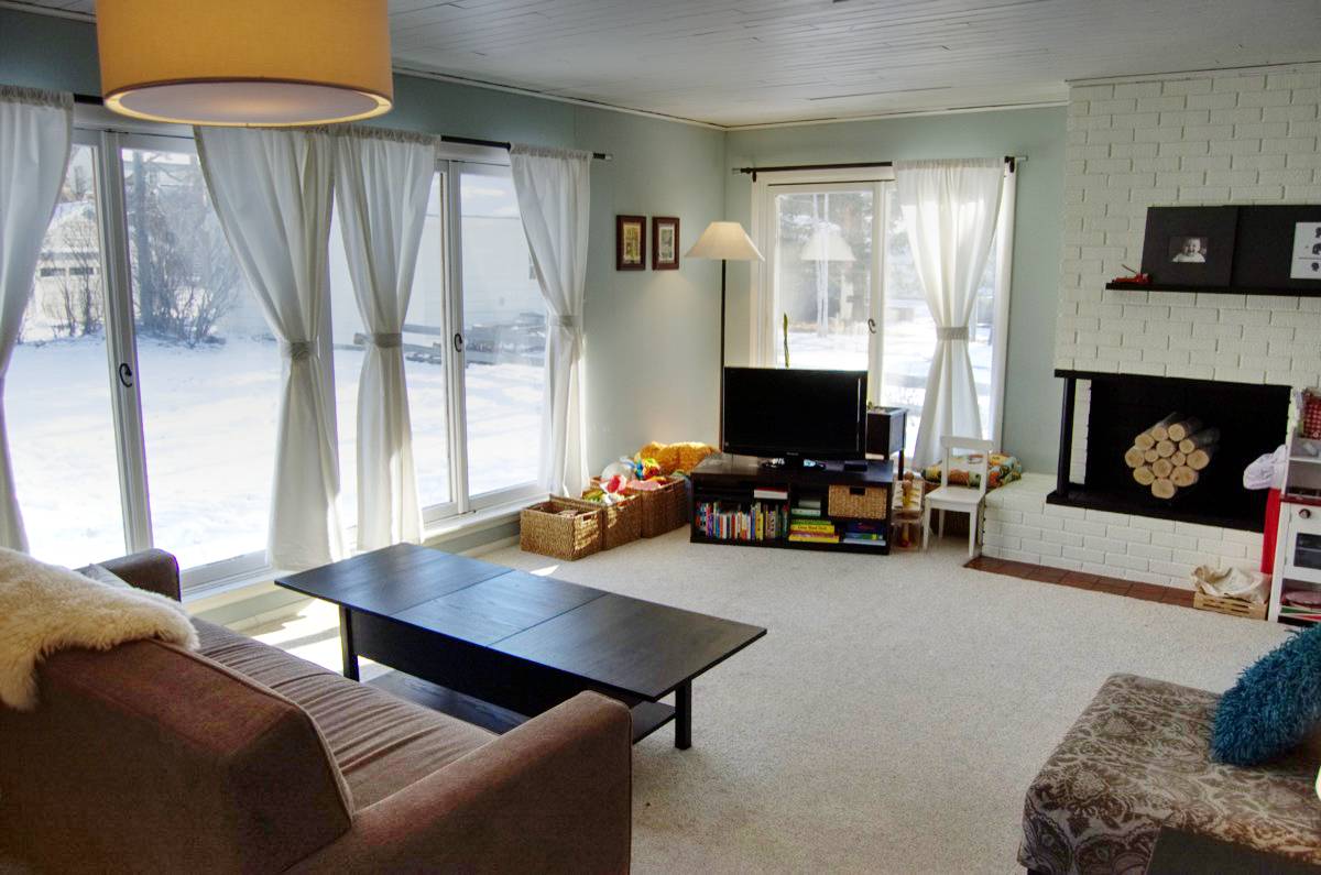
Which is noticeably better, despite the way-too-short-curtains. Clearly we had a baby around this time. Clearly the baby was on vacation or something, because otherwise the living room would not look this clean.
Now what?
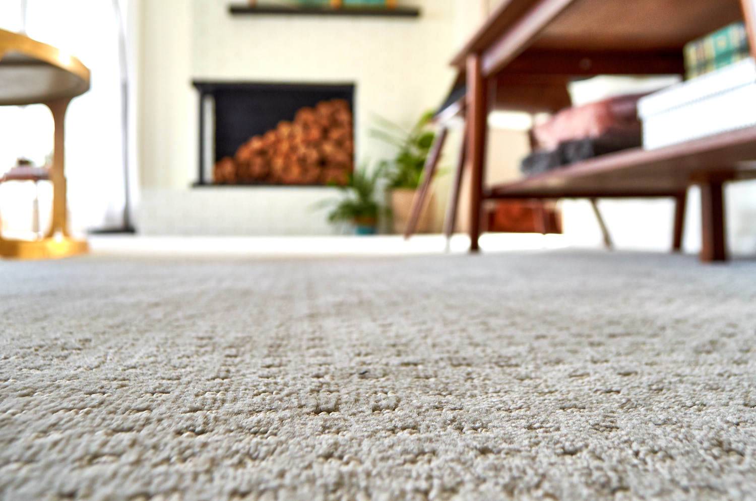
When we decided to sell this home, we knew we wanted to create a space that was carefully designed, welcoming, and resilient. So we swapped out the old carpet, replacing it with Shaw’s Life Happens line, which has a waterproof backing that keeps 100% of spills or accidents above the surface so that they can be completely cleaned and removed. It also features Shaw’s R2X Stain & Soil Protection. It’s the perfect choice for a space that will have a lot of traffic, but still needs to look great. We went with the ‘No Worries’ pattern in the color ‘Opulence’; it has a really soft, rich texture that’s perfect for bare feet.
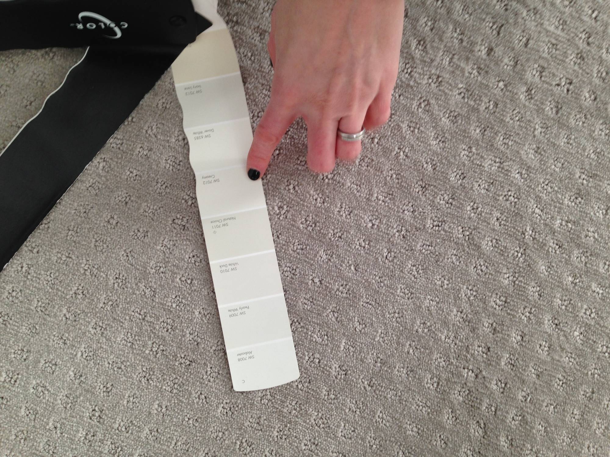
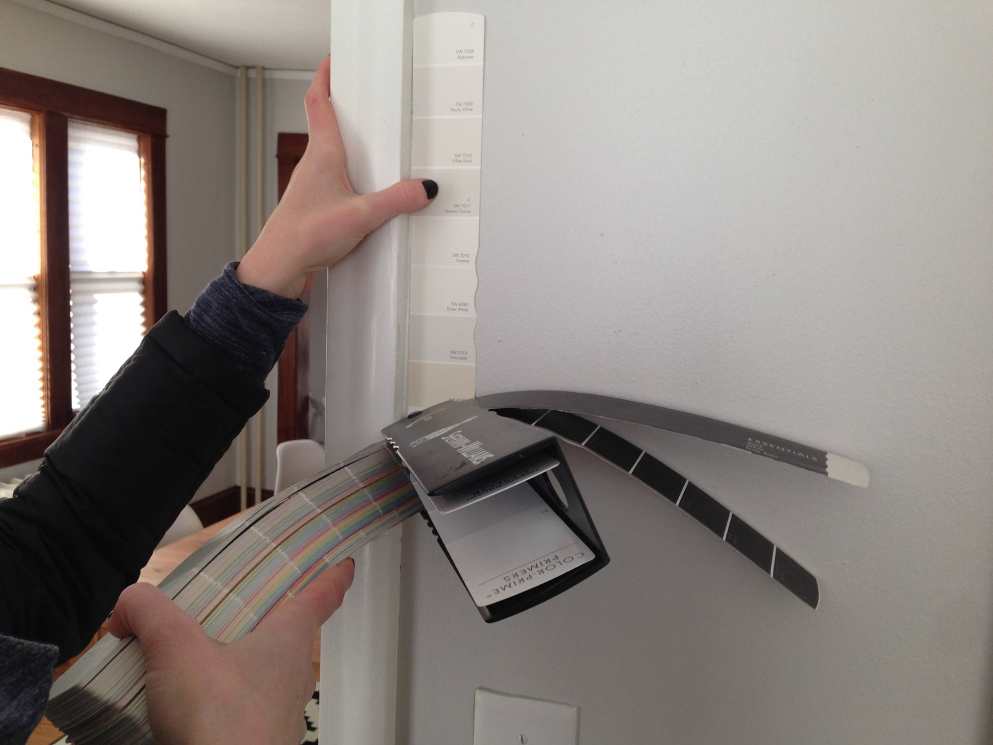
Then we re-painted, partly because we wanted a color that worked better with the carpet, and also because a fresh coat of paint always makes a room look good. We went with our favorite paint on the market, Sherwin-Williams Emerald paint, in a color called Creamy (SW 7012). It offsets the gray in the carpet without adding green or yellow undertones.
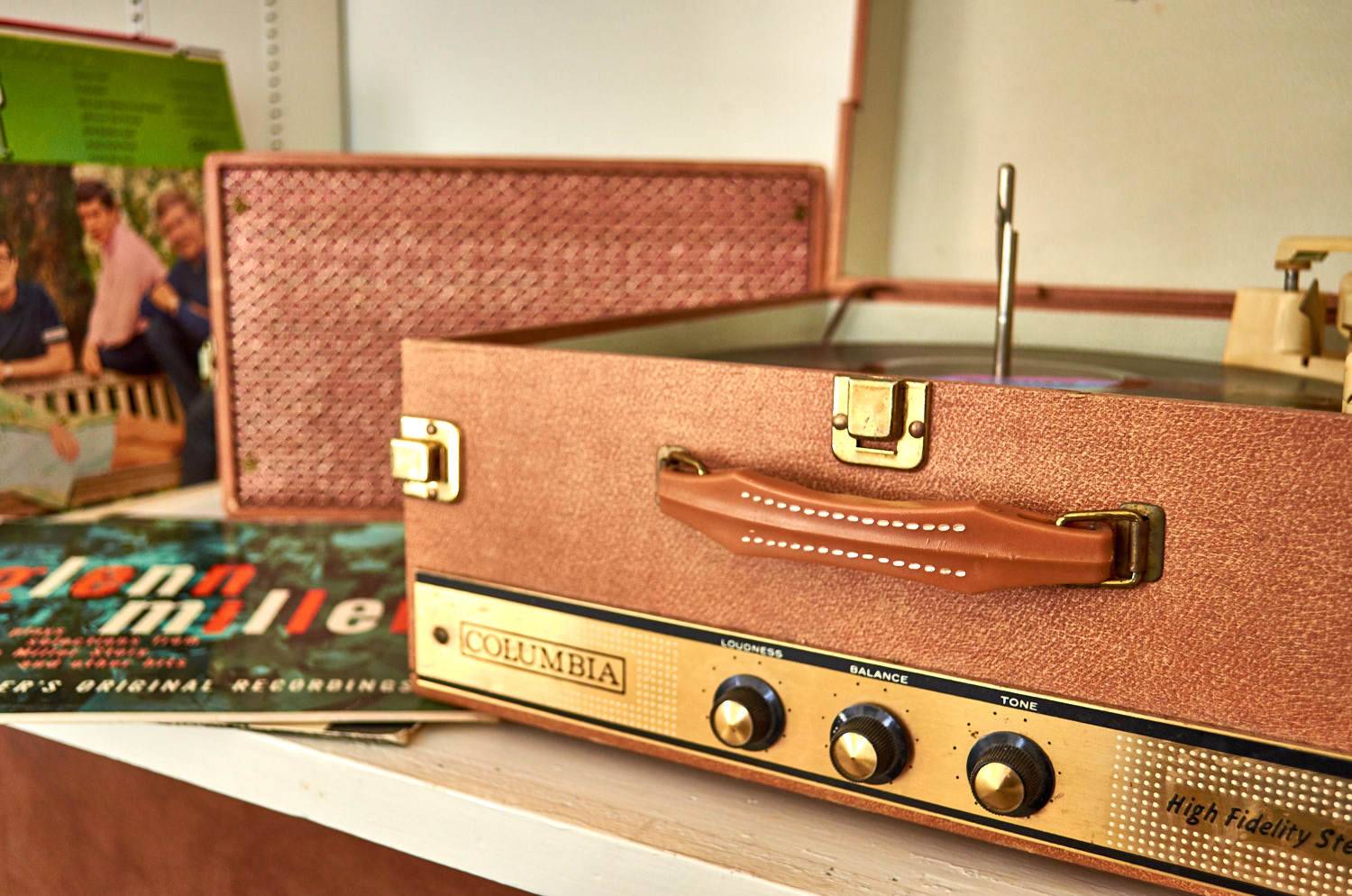
Next came my favorite part of every room makeover: shopping! We made a trip to some of our favorite vintage stores in Minneapolis and St. Paul, and came away with a few pieces that I think really make the room work. One of my room makeover rules is: you gotta have some old stuff (I know, I know, it needs better wording). But seriously, it’s hard to make a new room feel lived-in and comfortable when everything is new. Even a few small vintage pieces will help set the right tone.
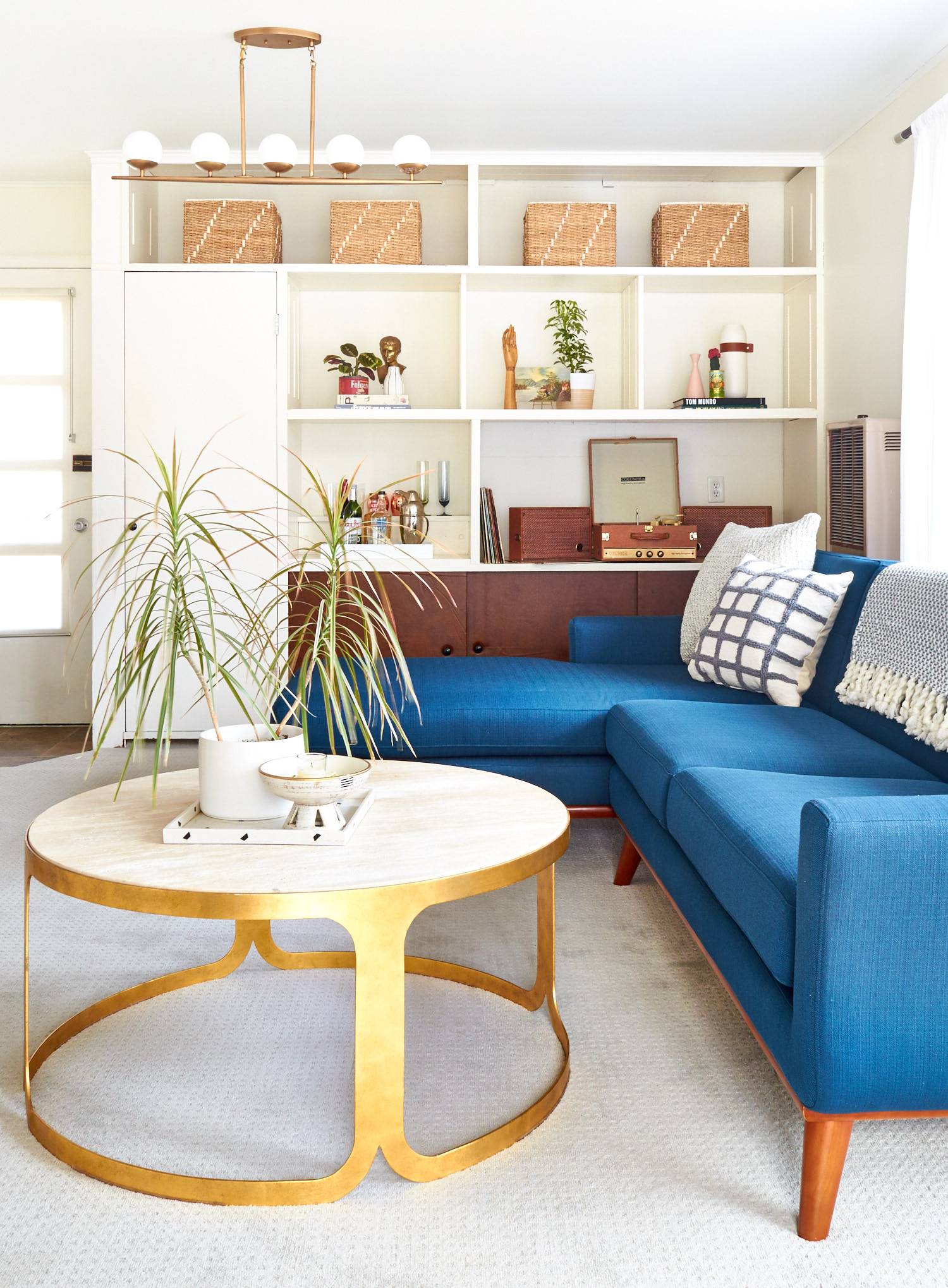
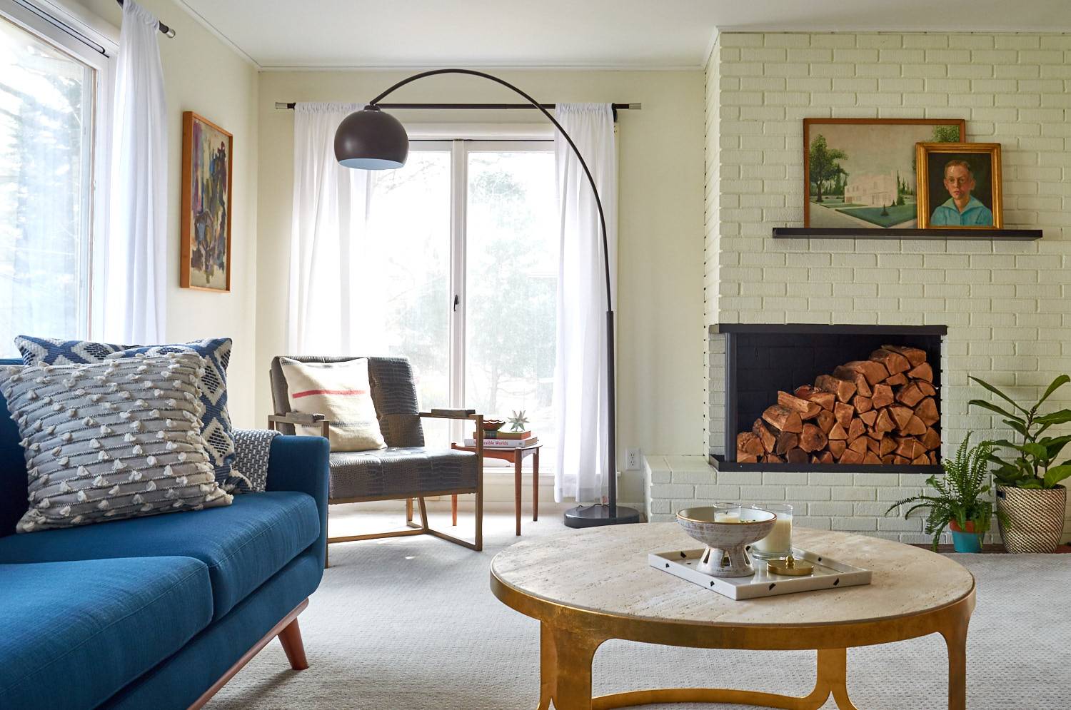
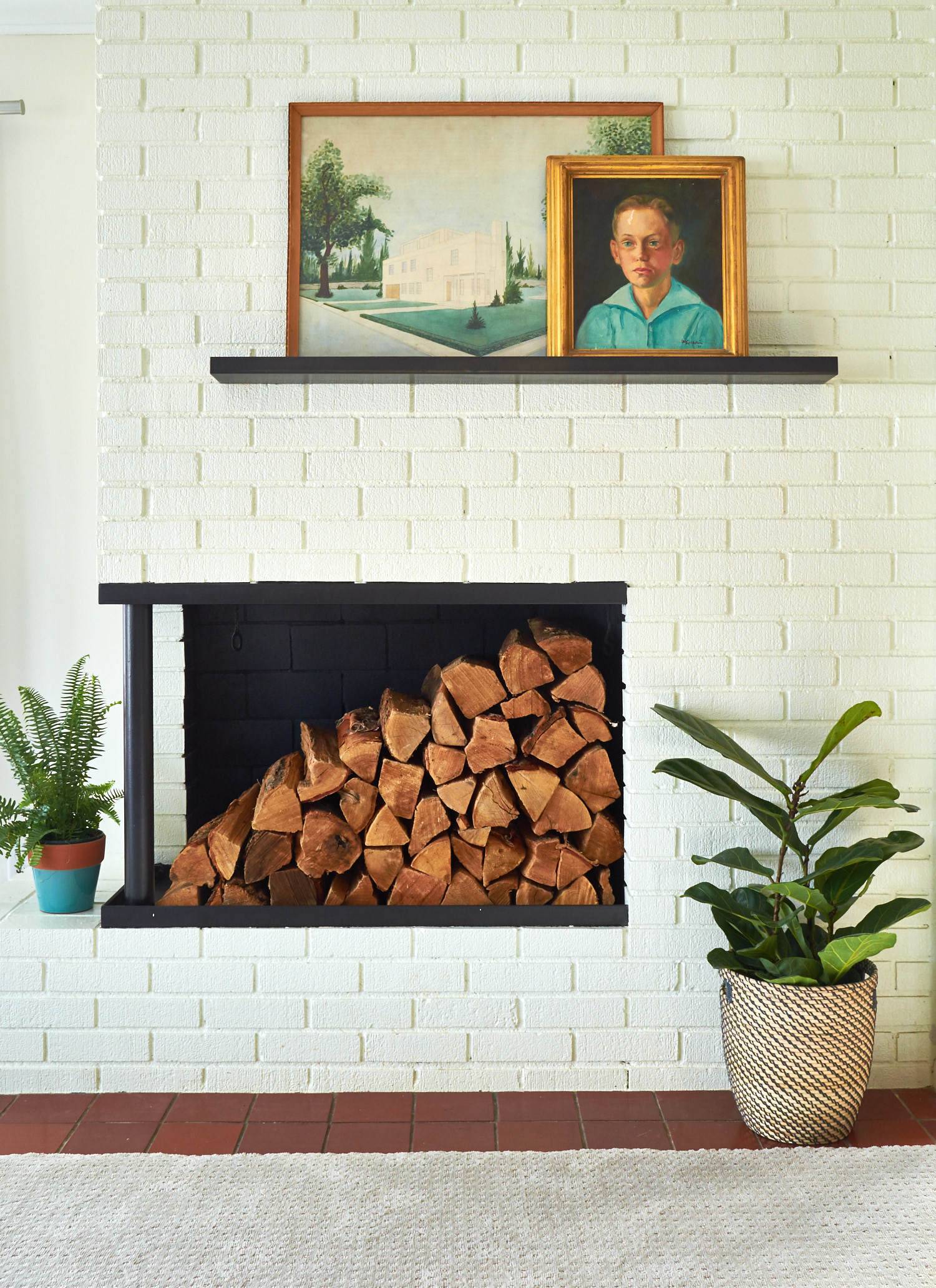
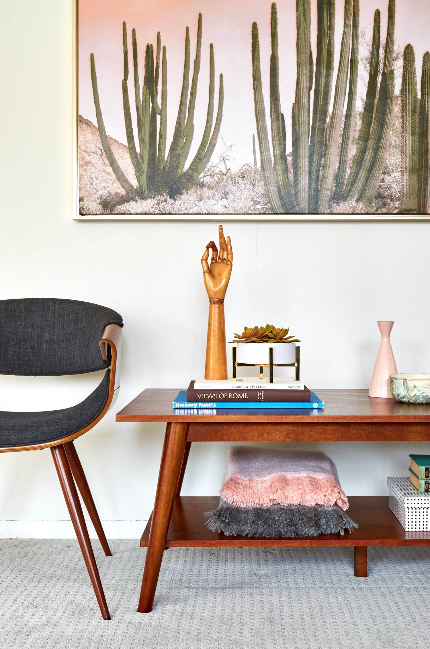
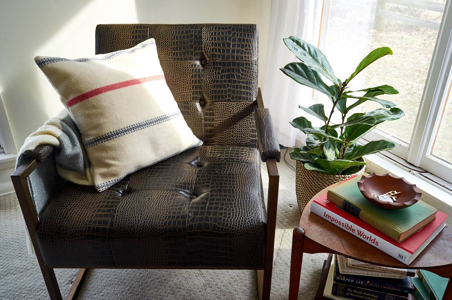
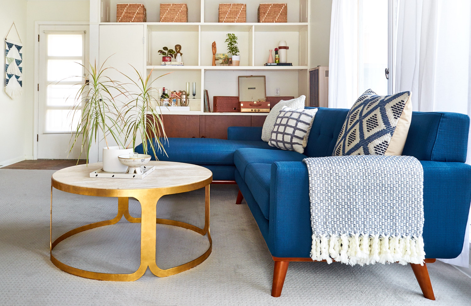
After adding new carpet, new paint, new furniture, and several new pieces we finally created a complete, cohesive room. Have a look!
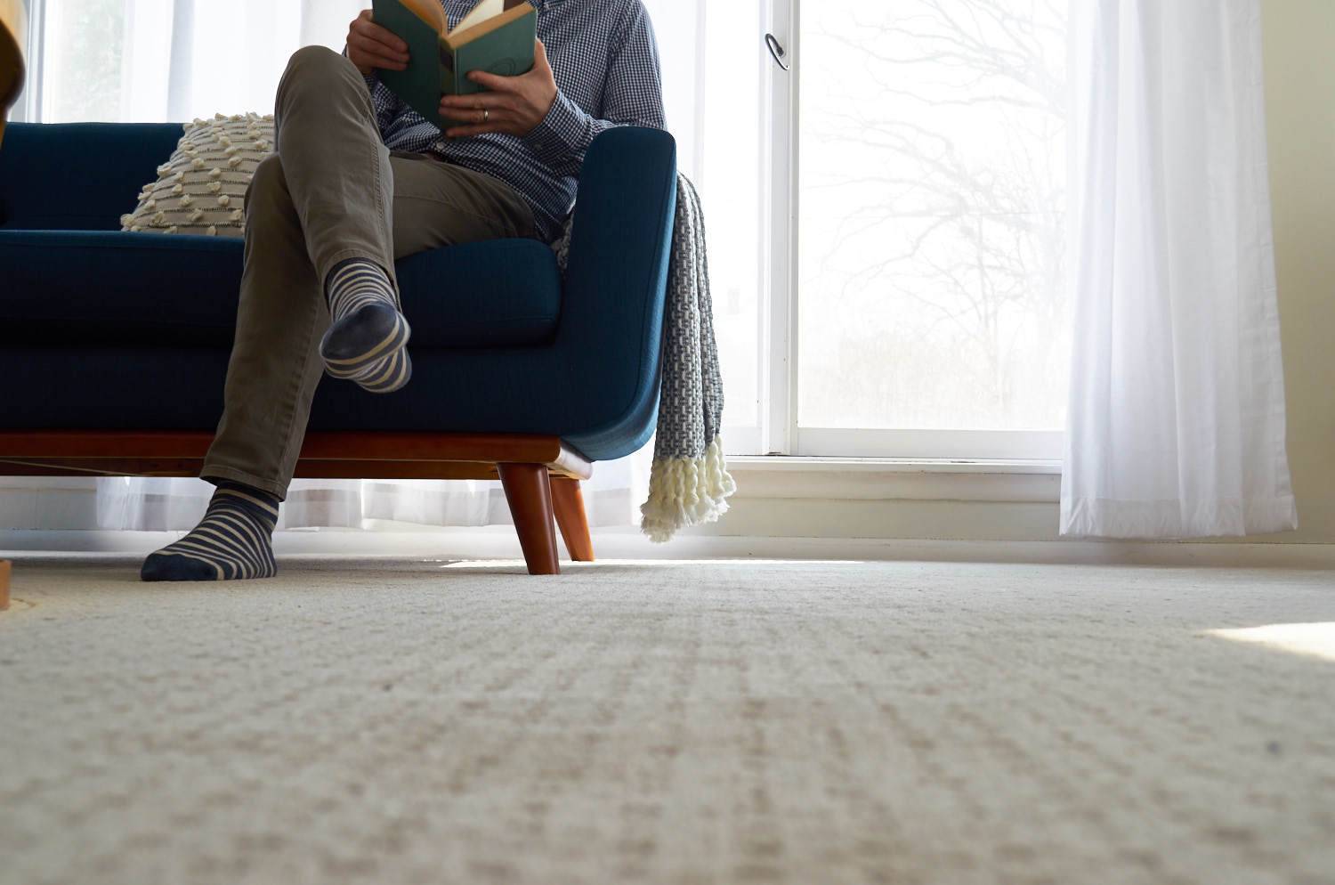

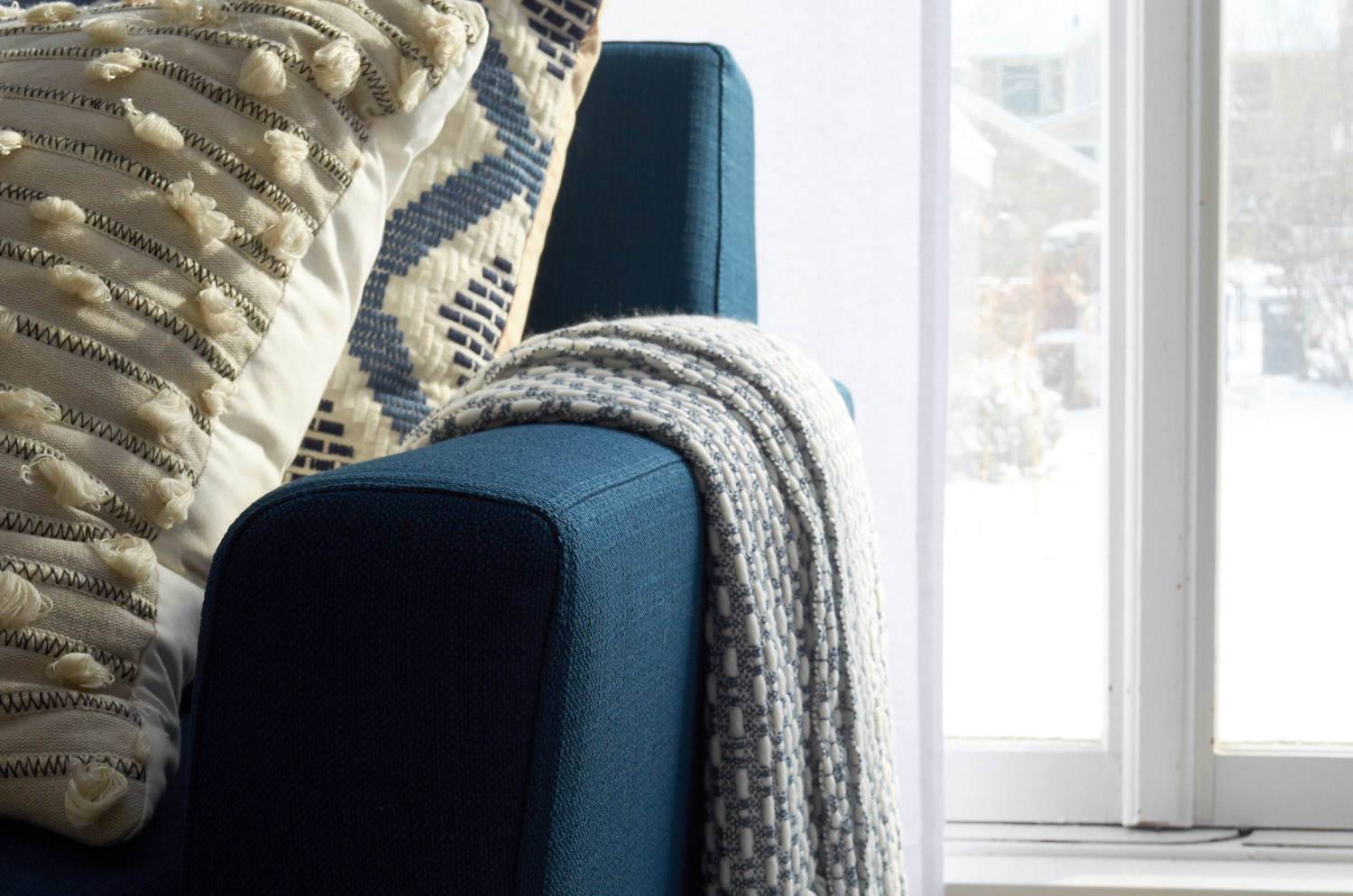
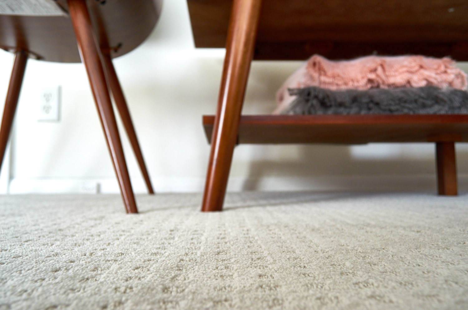
Product list
- Carpet: Shaw Carpet Style: LifeHappens ‘No Worries’ in Color: Opulence
- Paint: Sherwin-Williams Creamy (SW 7012)
- Sectional Sofa: Engage Azure Tufted Loveseat + Chaise from Lamps Plus
- Reading chair: INK + IVY Waldorf Alligator Chair from Lamps Plus
- Side chairs: Gray Butterfly Chair from Lamps Plus
- Coffee table: Dwell Studio Bennett Travertine Antique Gold Coffee Table from Lamps Plus
- Side table: Vintage, Similar here
- TV/coffee table: Porter Mid-Century Modern Table
- Pillows: Target Threshold Sweater, Diamond, Woven
- Throws: Threshold Woven Throw + Cozy Texture Throw
- Light fixture: Kichler Jasper Brass Chandelier from Lamps Plus
- Floor lamp: George Kovacs Dorian Bronze Arc Floor Lamp from Lamps Plus
- Artwork (above table): Cactus with Gold Frame
- Painting above chair: Vintage
- Art above fireplace: Vintage
- Curtains: Cotton Canvas Curtain
- Bar: Champagne flutes (Anthropologie past season – I regret not buying every one on sale!); Penguin Cocktail Shaker; Lacquer Tray
This is a sponsored conversation written by me on behalf of Shaw Floors. The opinions and text are all mine.
Ok. I have been searching out living room curtains for months now. what made you decide to go with white? Even though my walls are a pale off white, I never thought to go with white curtains. It just seems to me not to blend very well. No negative towards your curtains, but wouldn’t it have been better to get something in the same tint as the walls so they blend better?
The room looks amazing by the way.
@troutay, That’s a very interesting point. In person, I like the way the curtains work with the wall color and white trim (I think it reads a little differently in the photos). BUT, I think you are totally right on with the thought that a more matched curtain would look great. I think a flaxed off-whited with some texture would be amazing — and now all I want to do is start looking for them! Thanks for your comment!
Ahhh. I didn’t notice the trim. that would blend with the white curtains then. Makes sense. I just didn’t see that
Do you happen to know what the light teal-ish color was before it was painted “Creamy?”